

Composants · 409 éléments
Des composants d’interface réutilisables pour des sites modernes
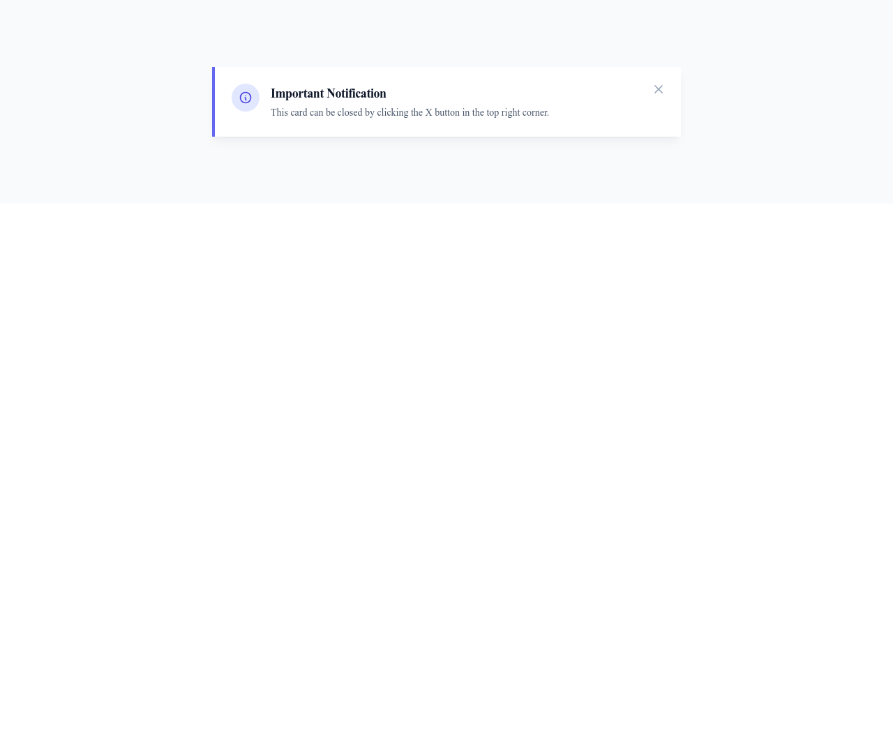
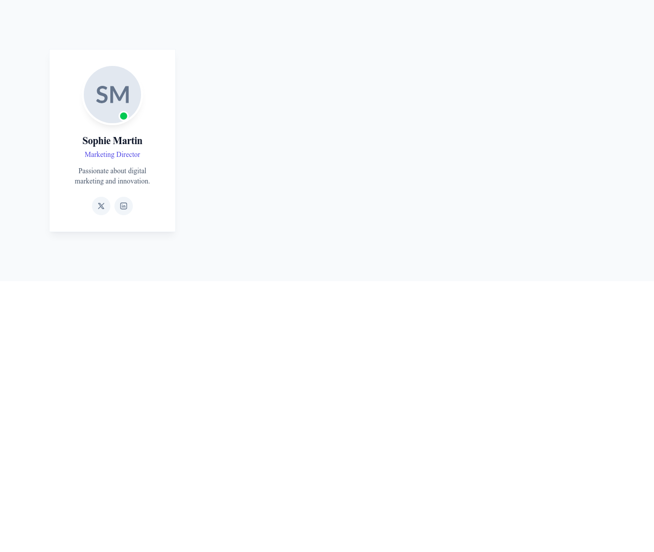
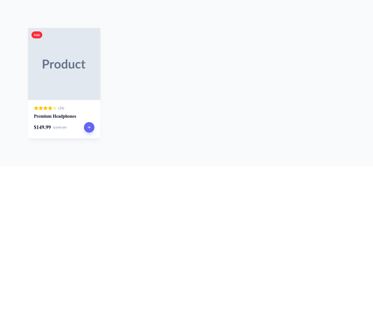
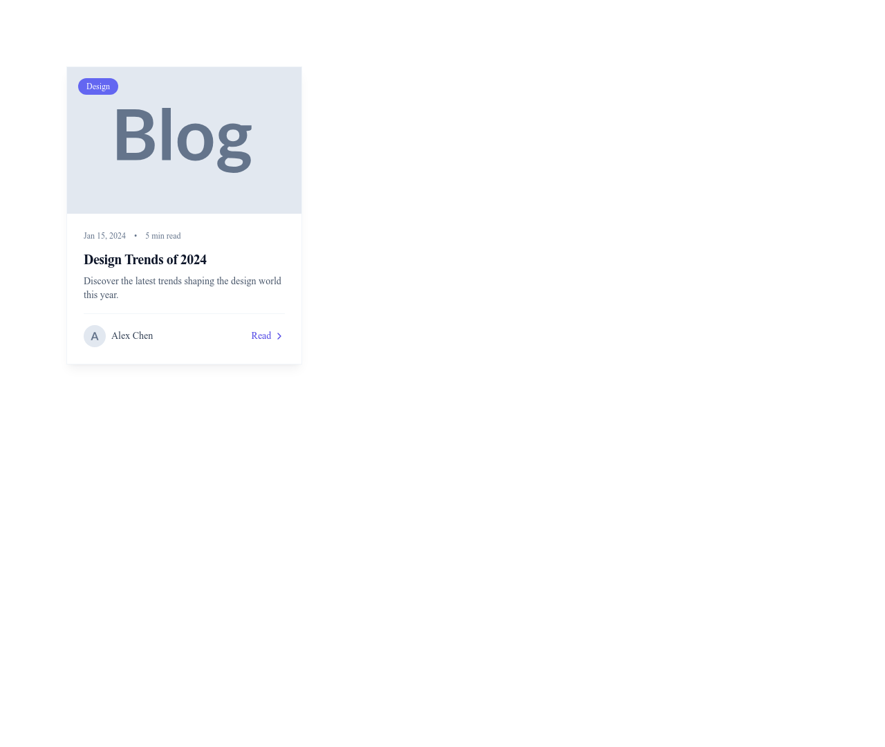
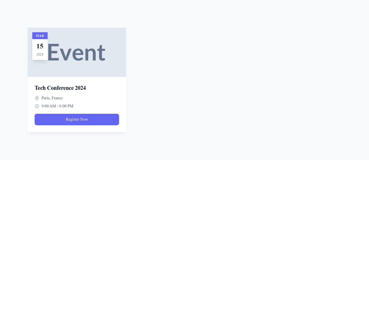
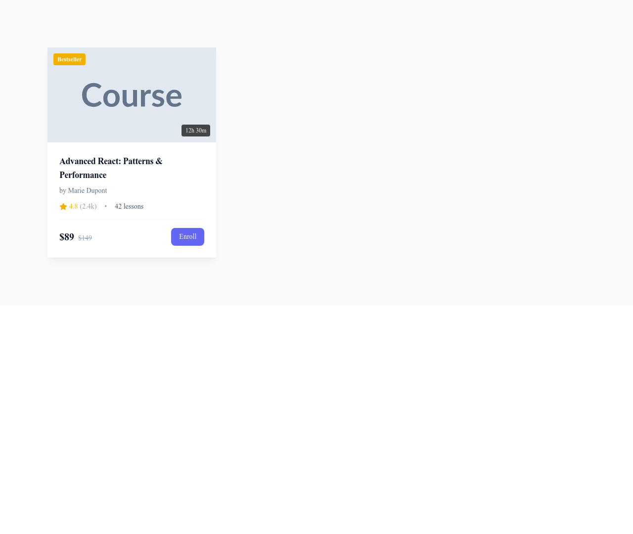
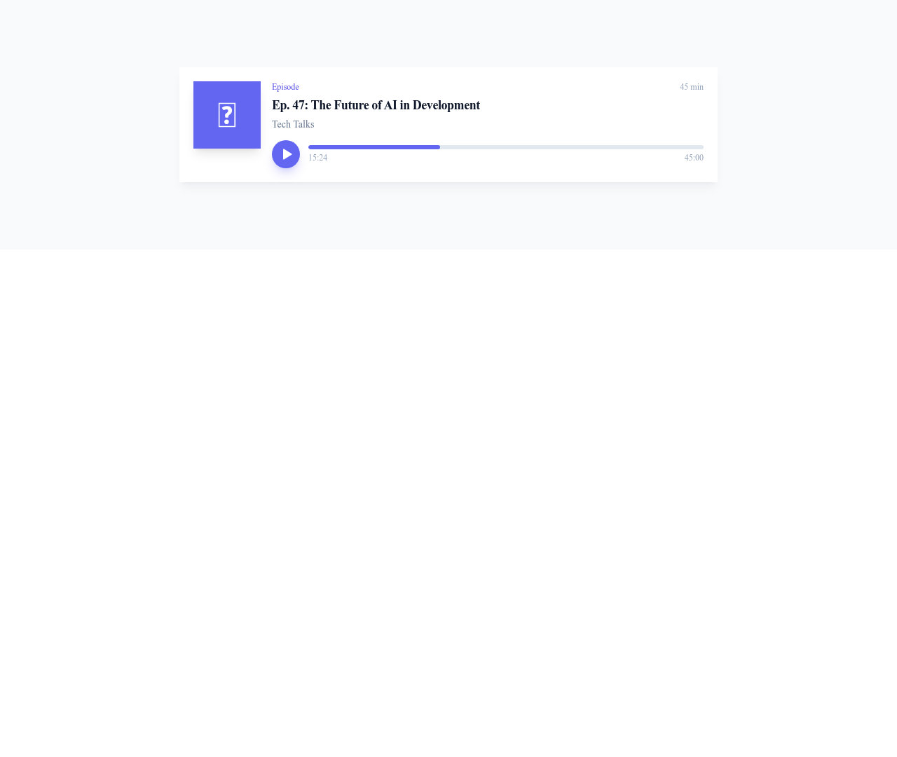
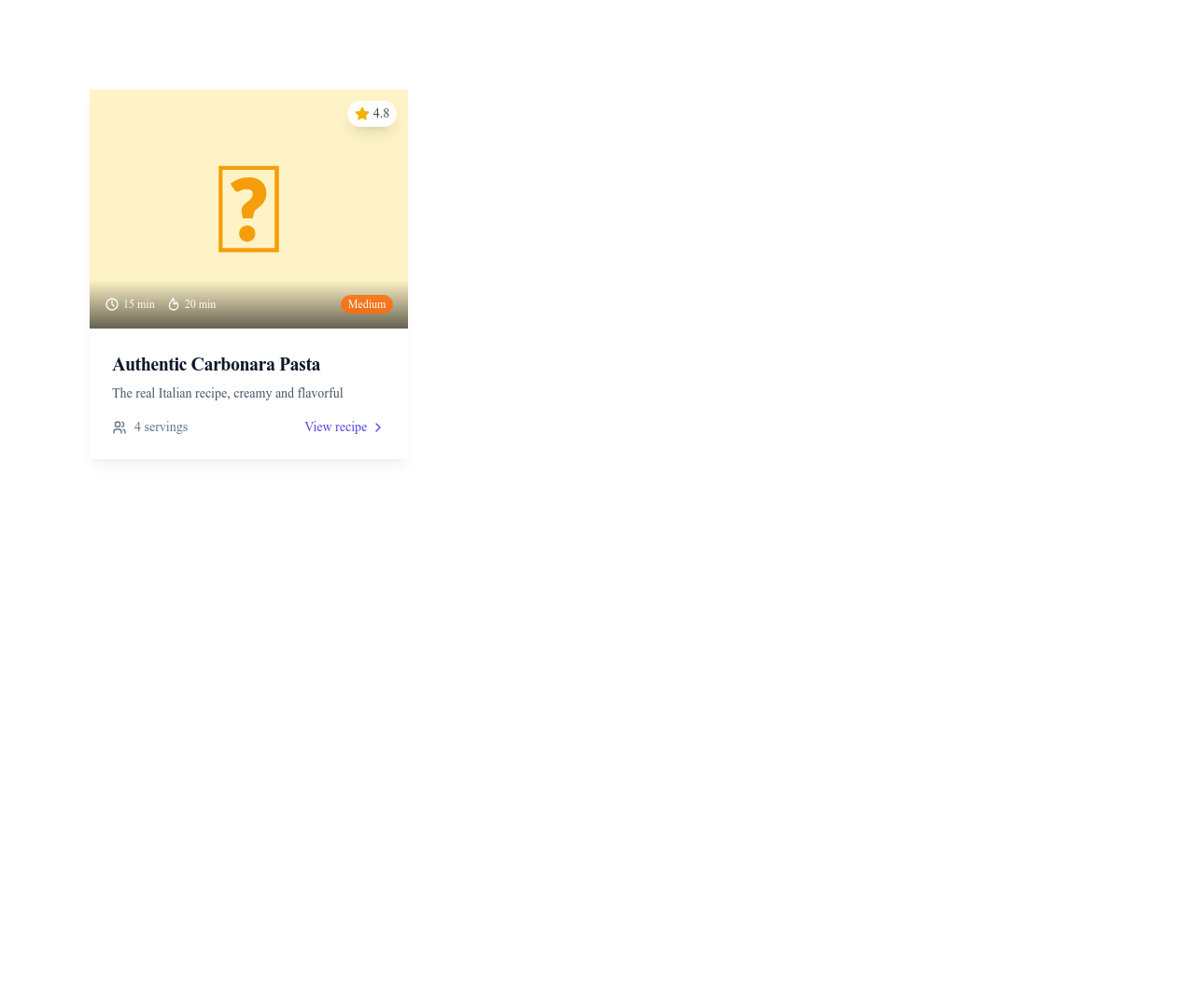
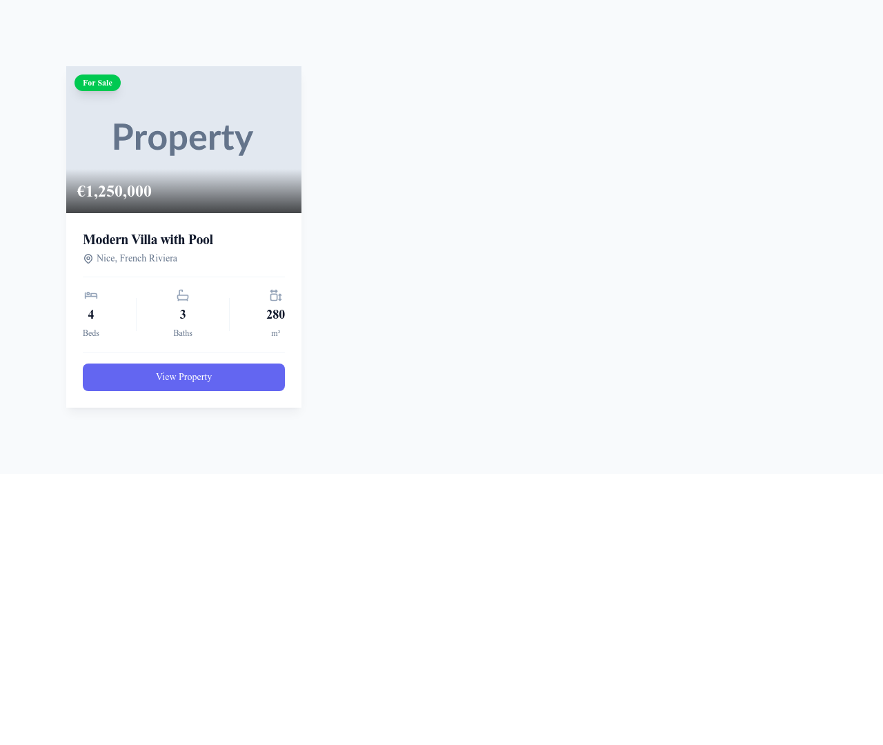
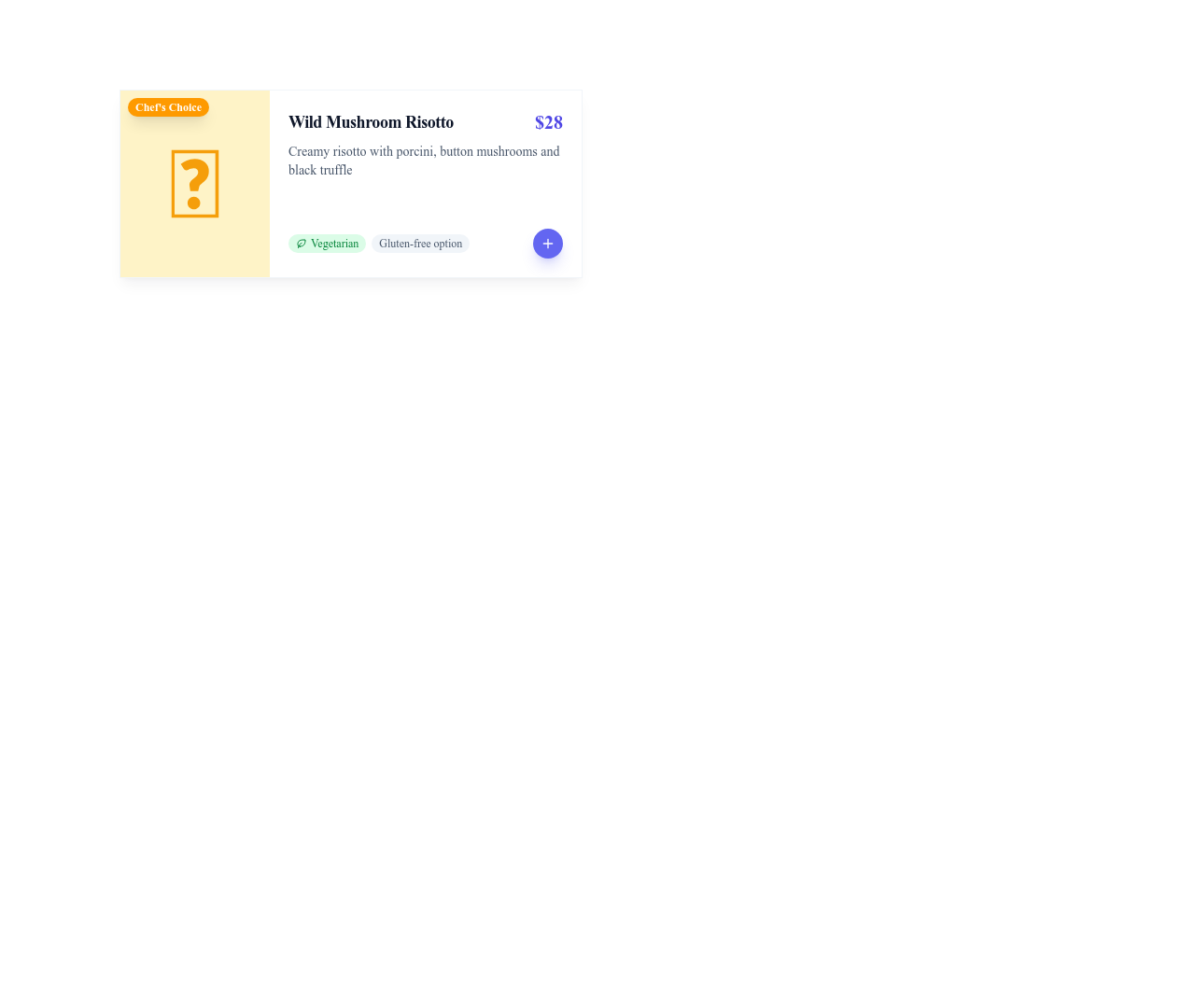
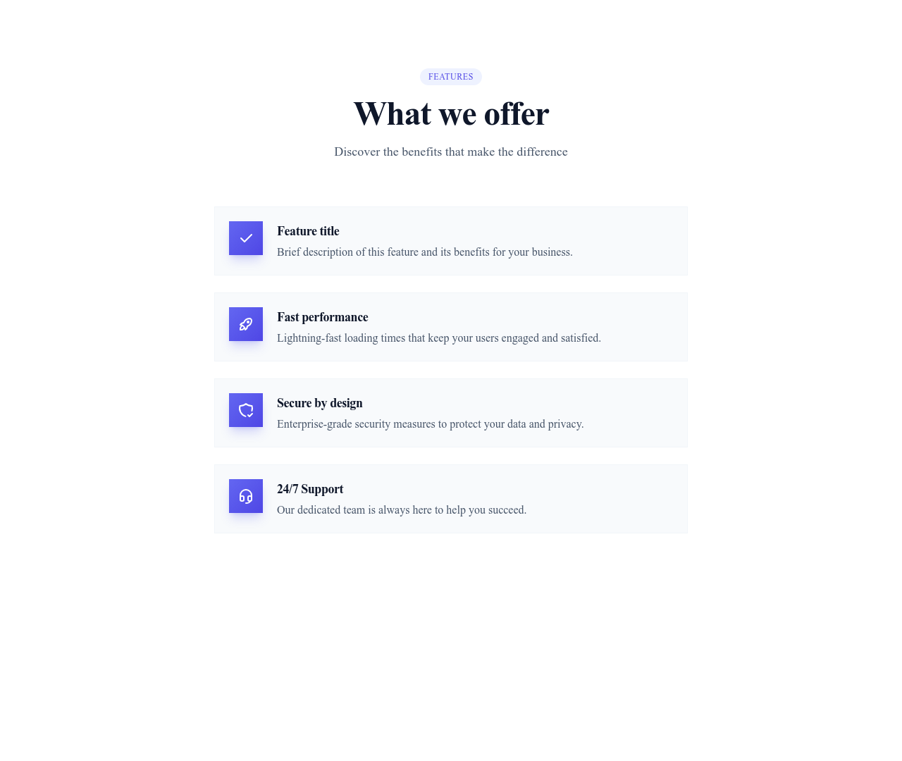
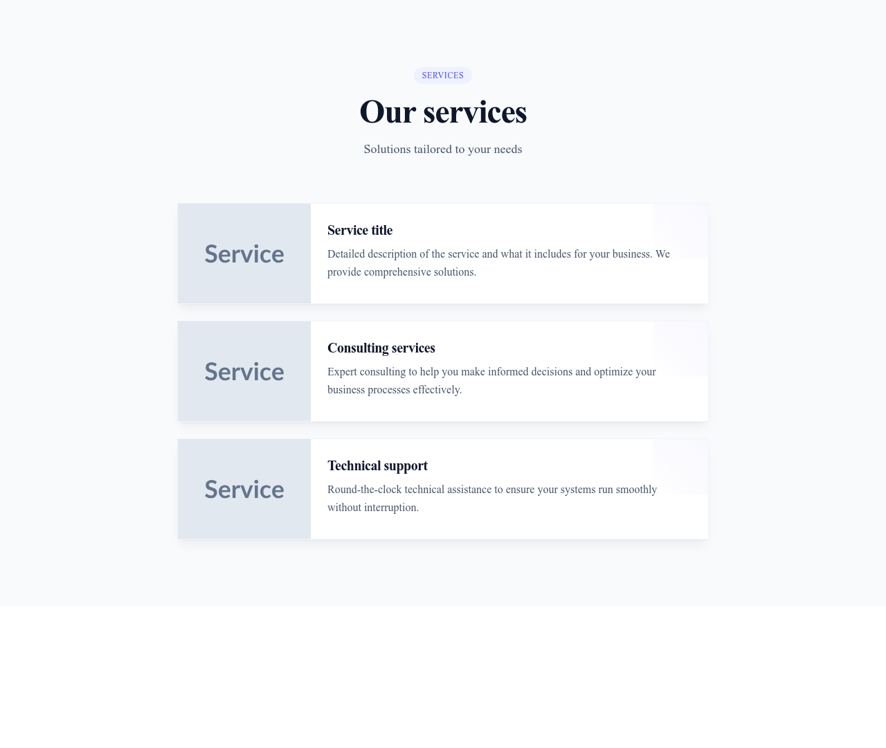
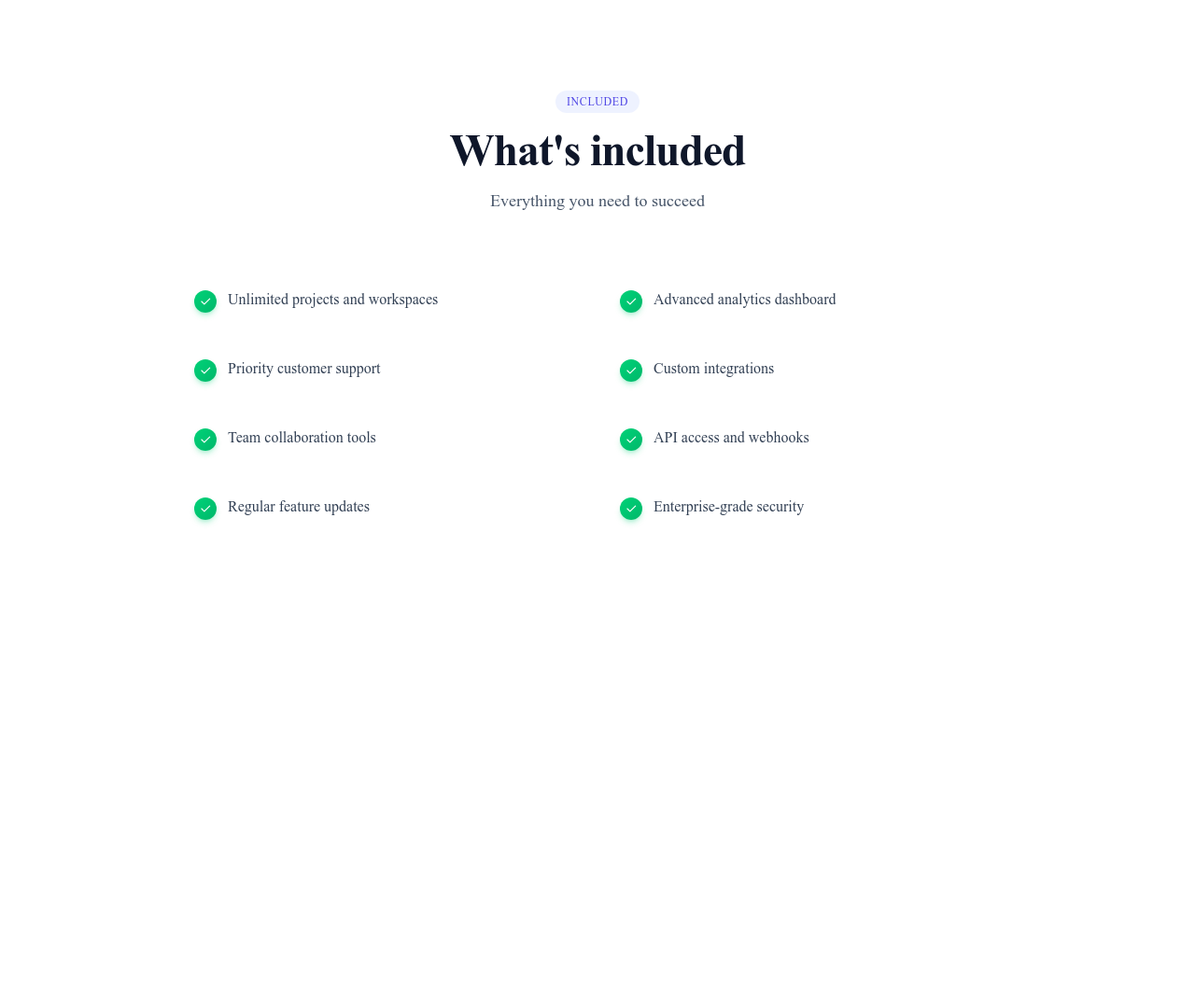
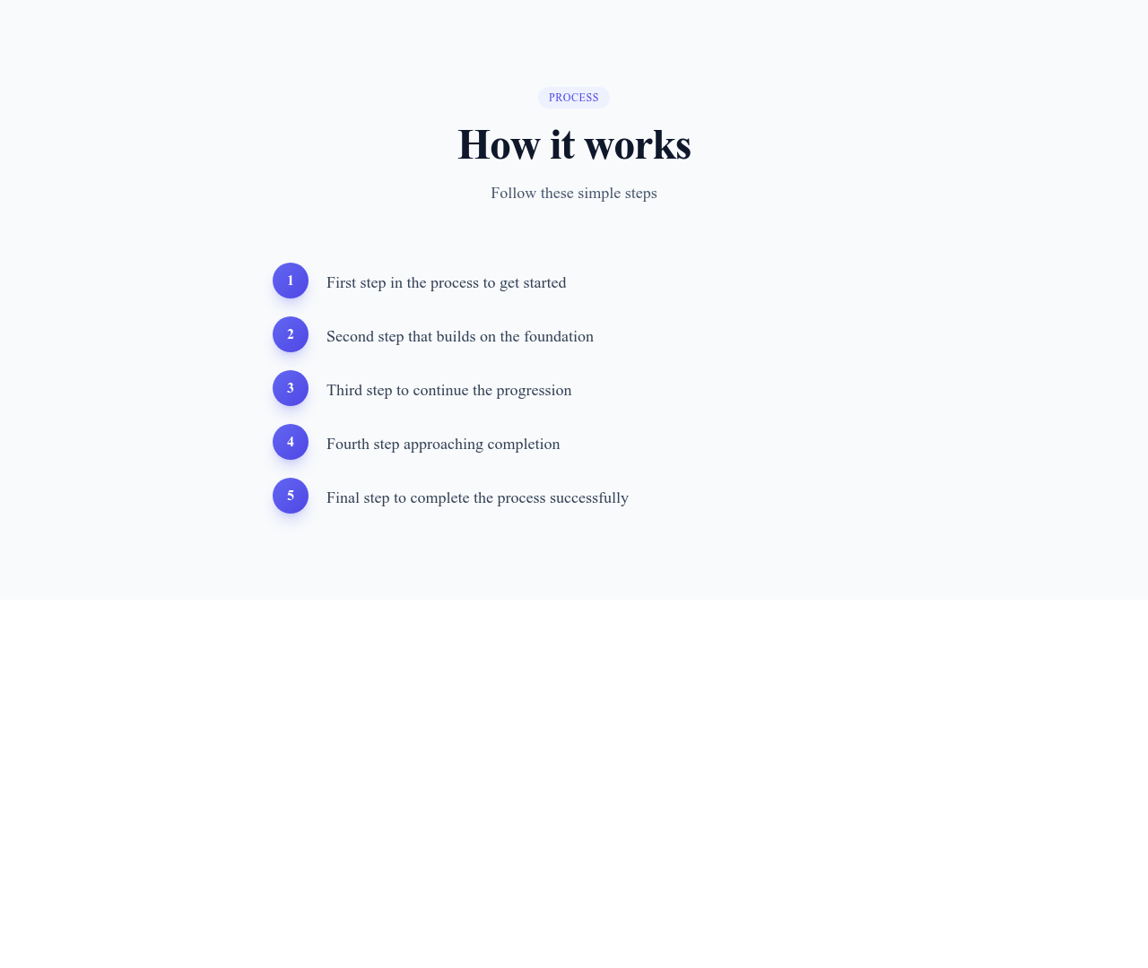
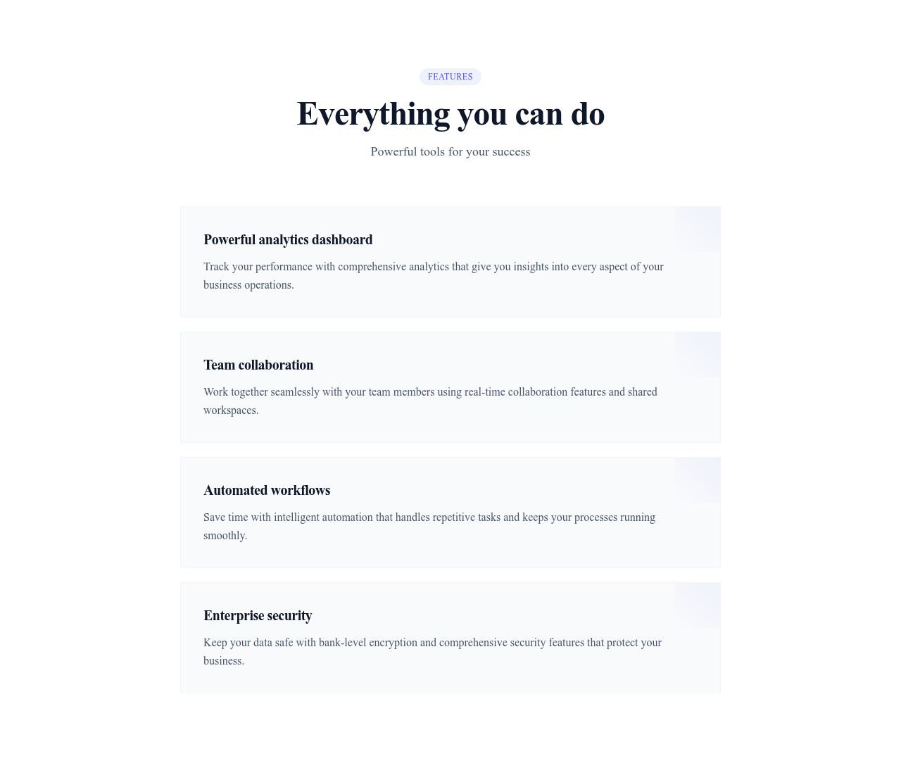
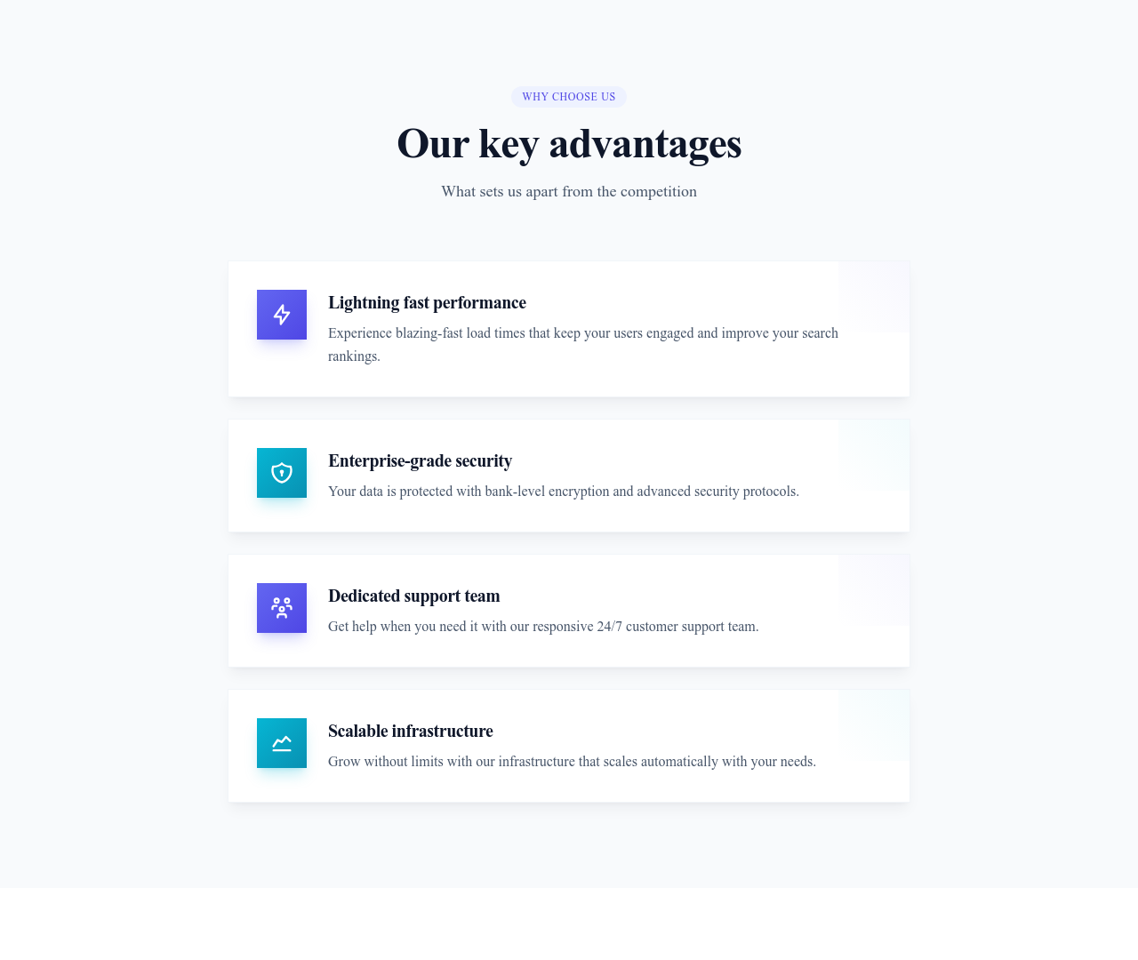
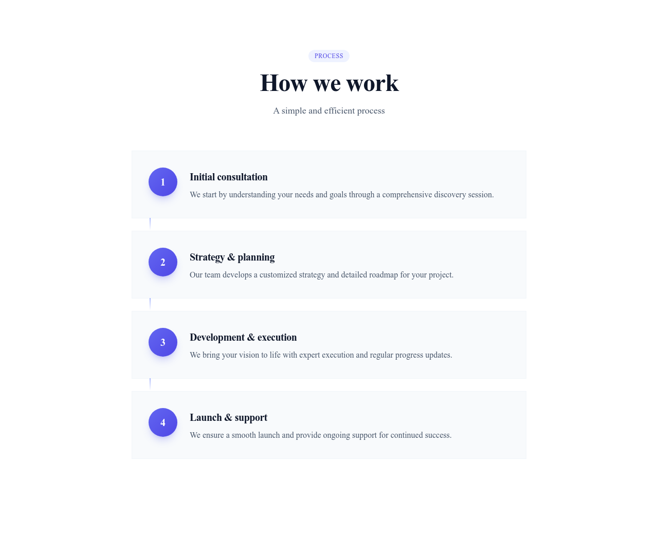
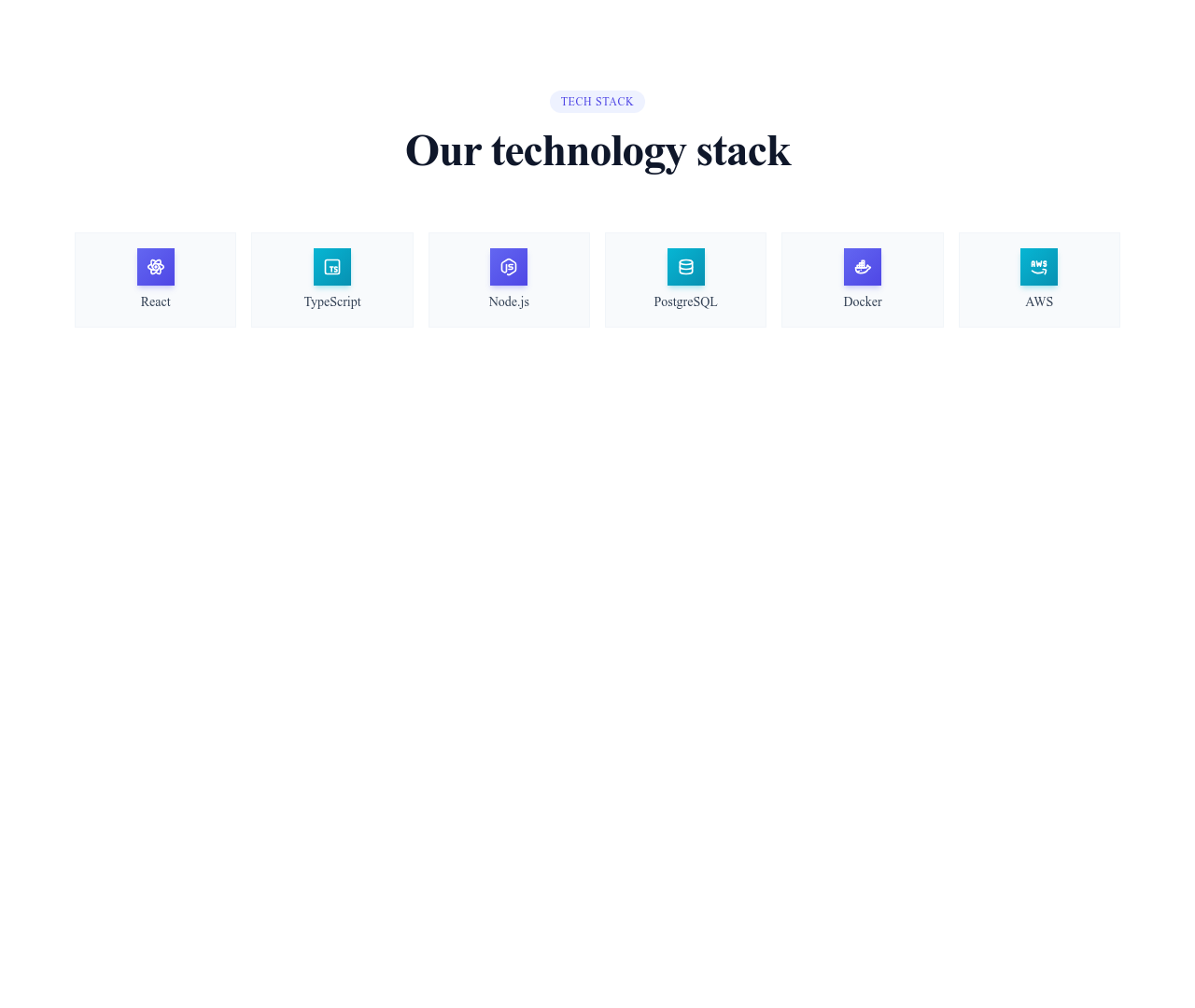
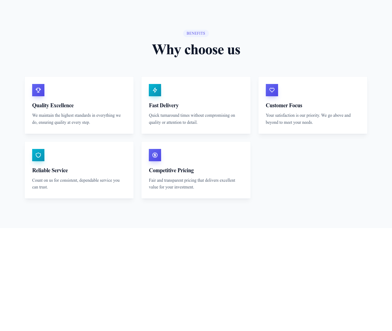
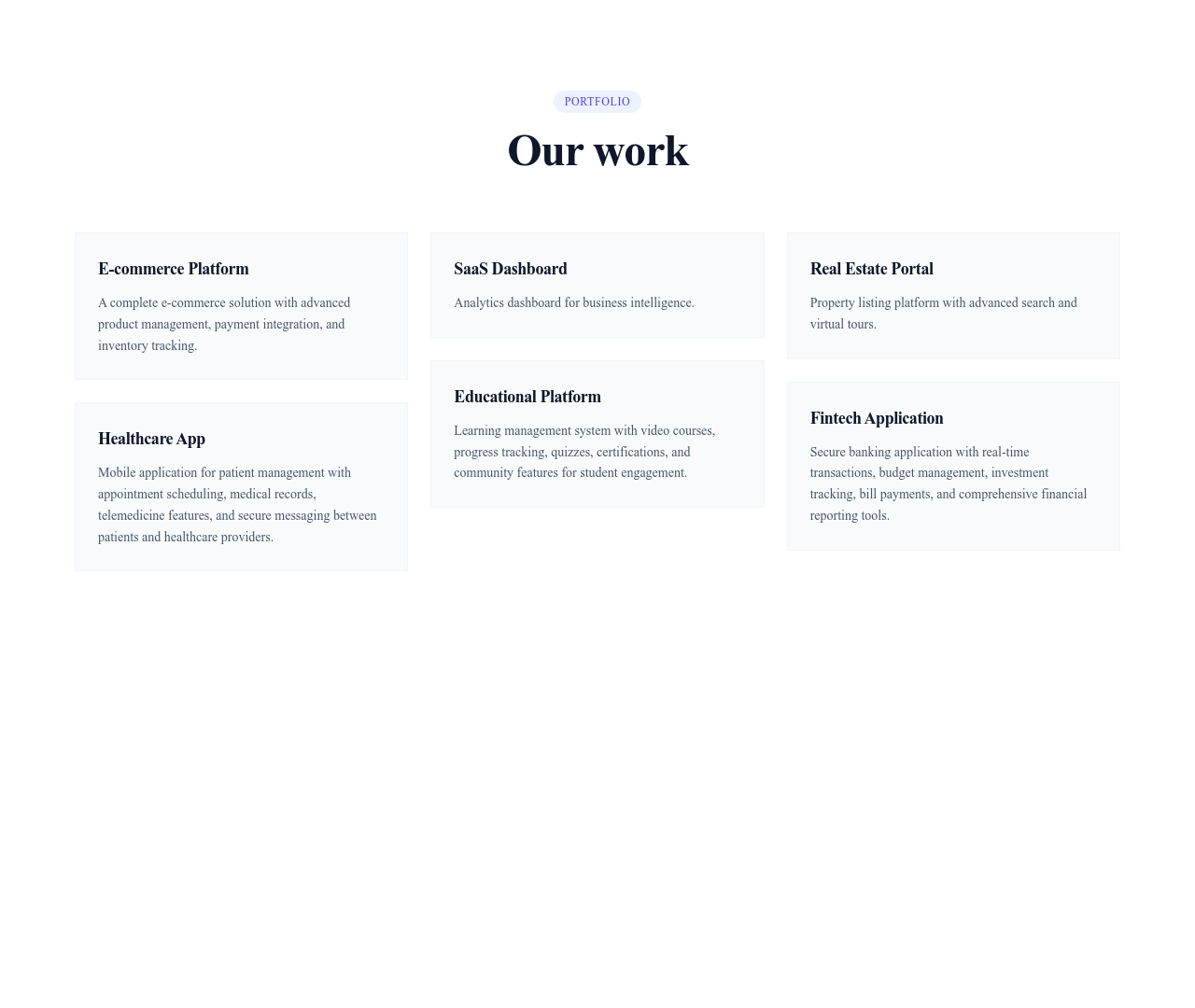
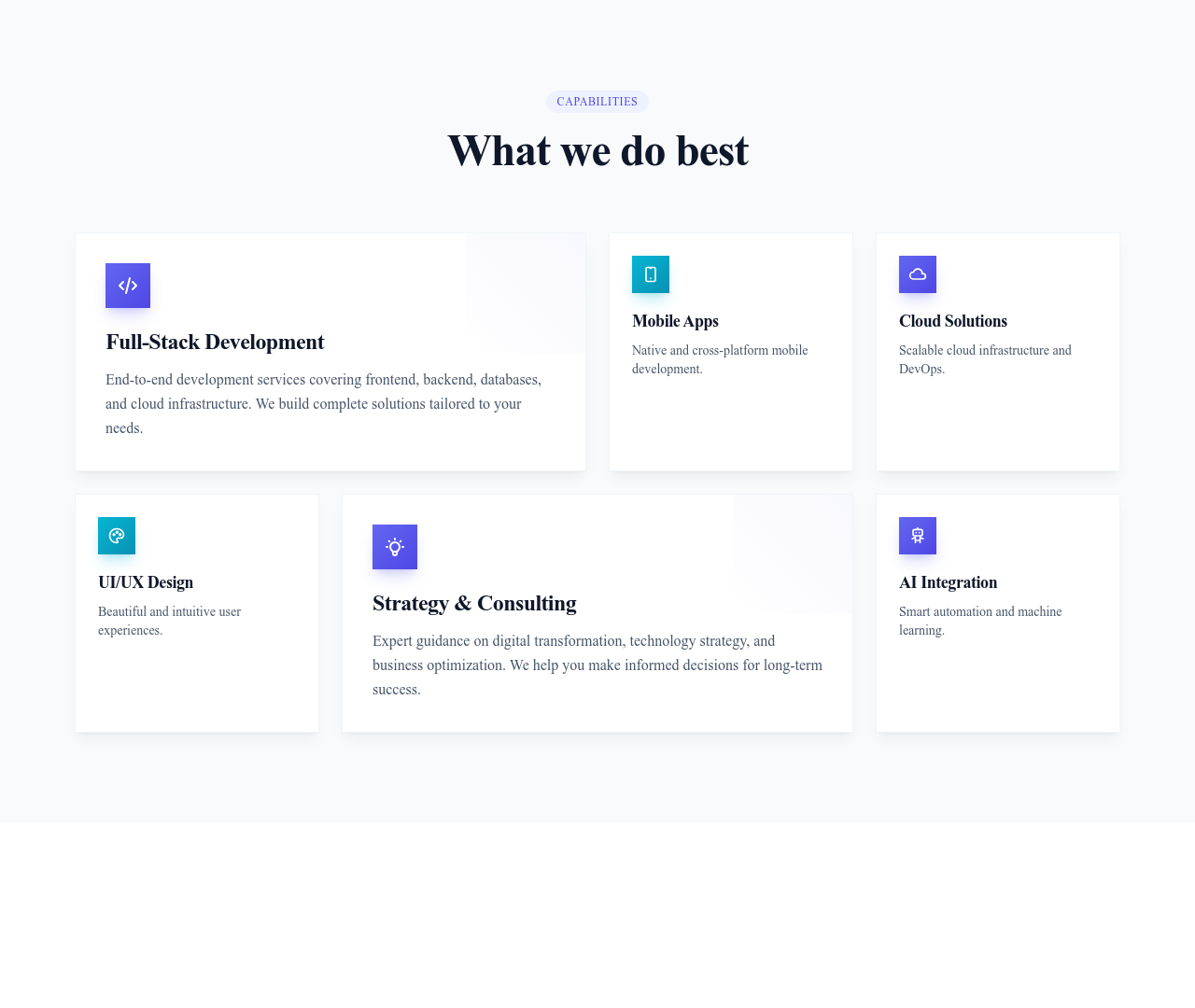
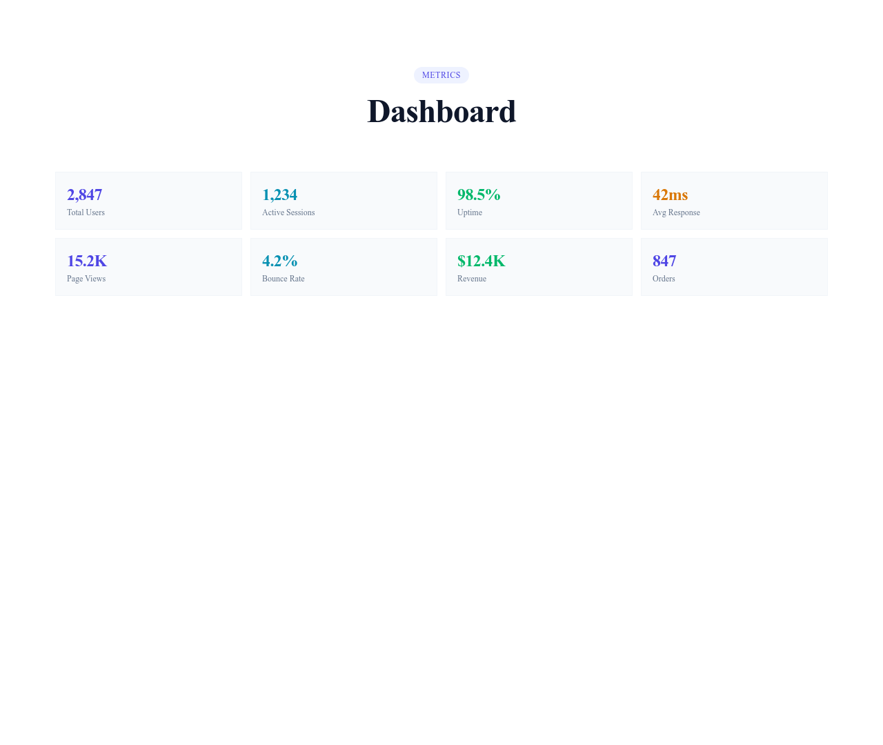
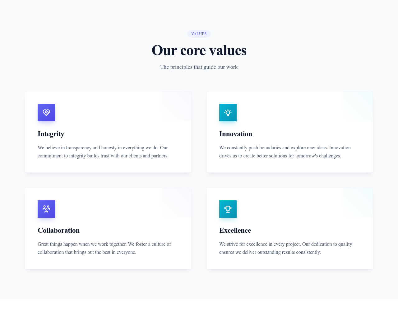
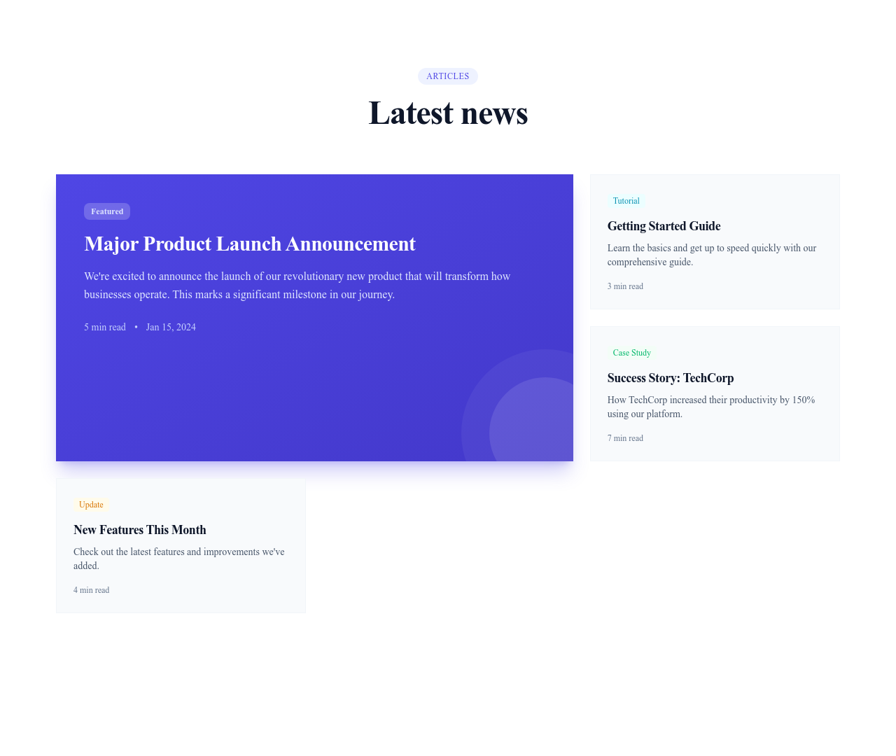
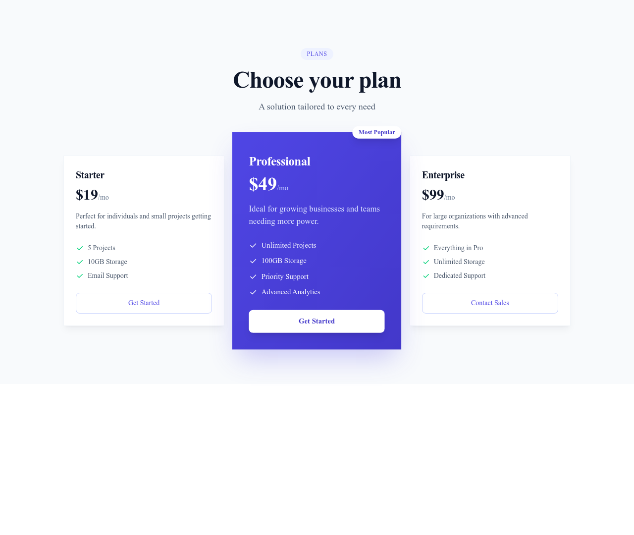
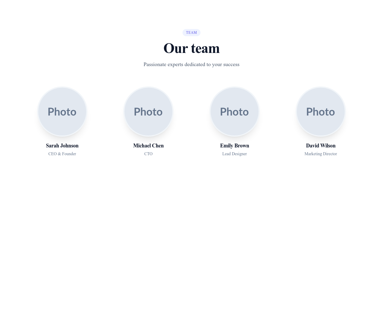
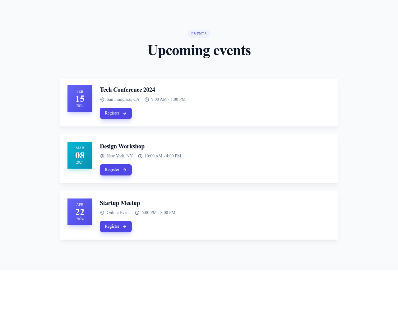
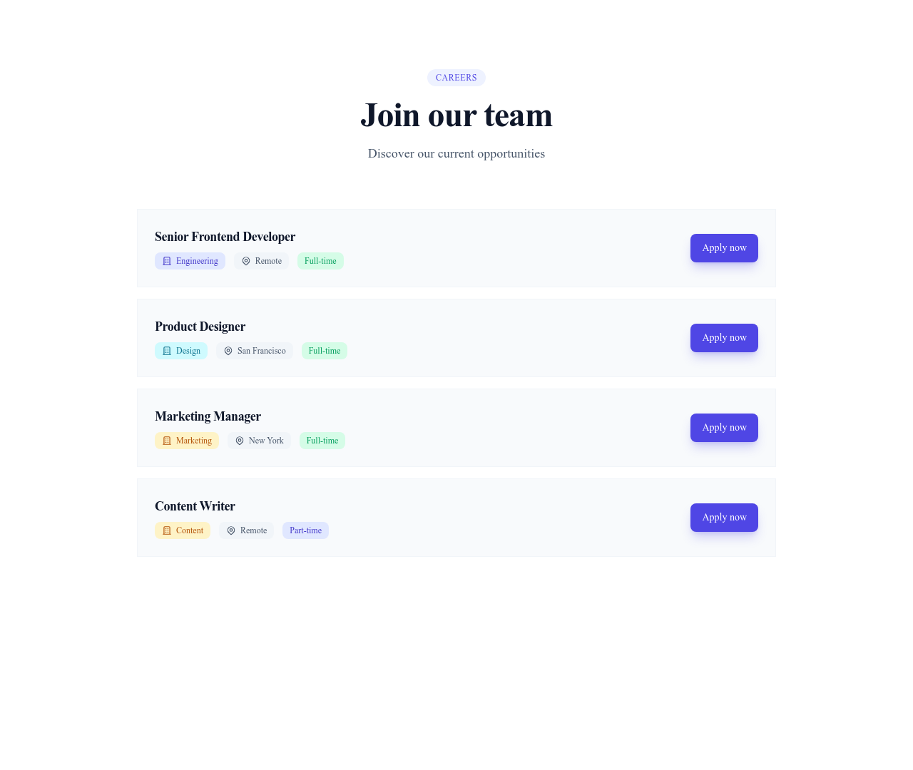
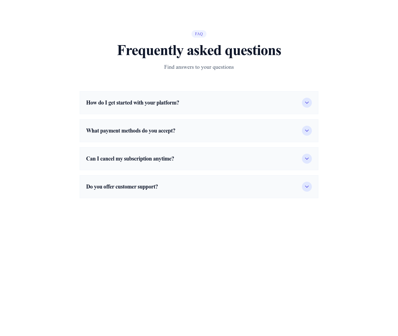
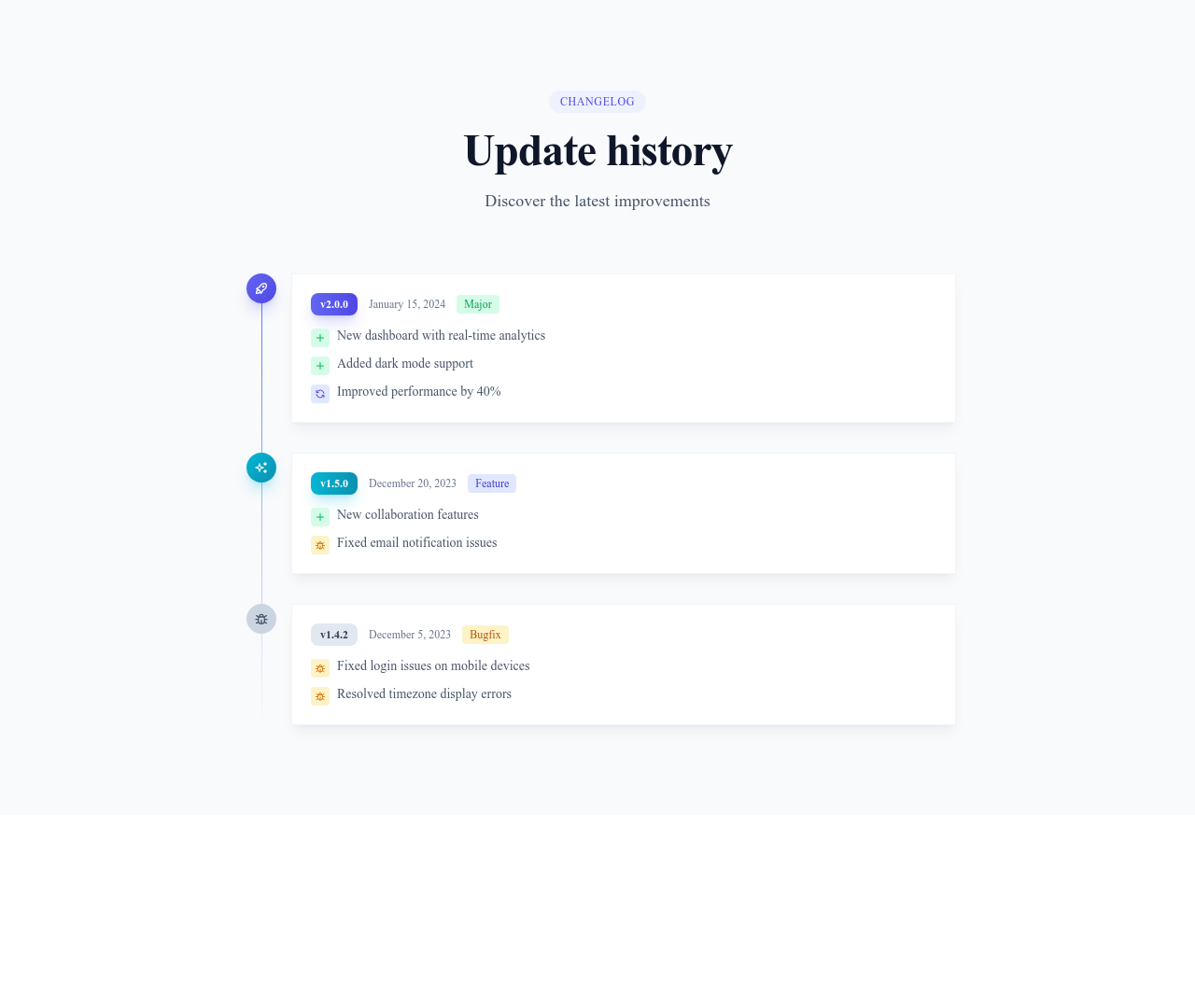
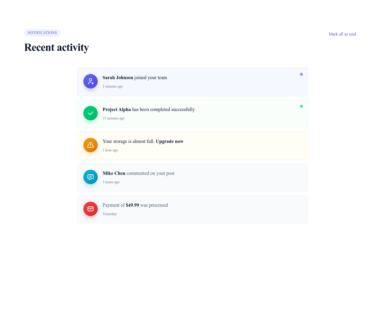
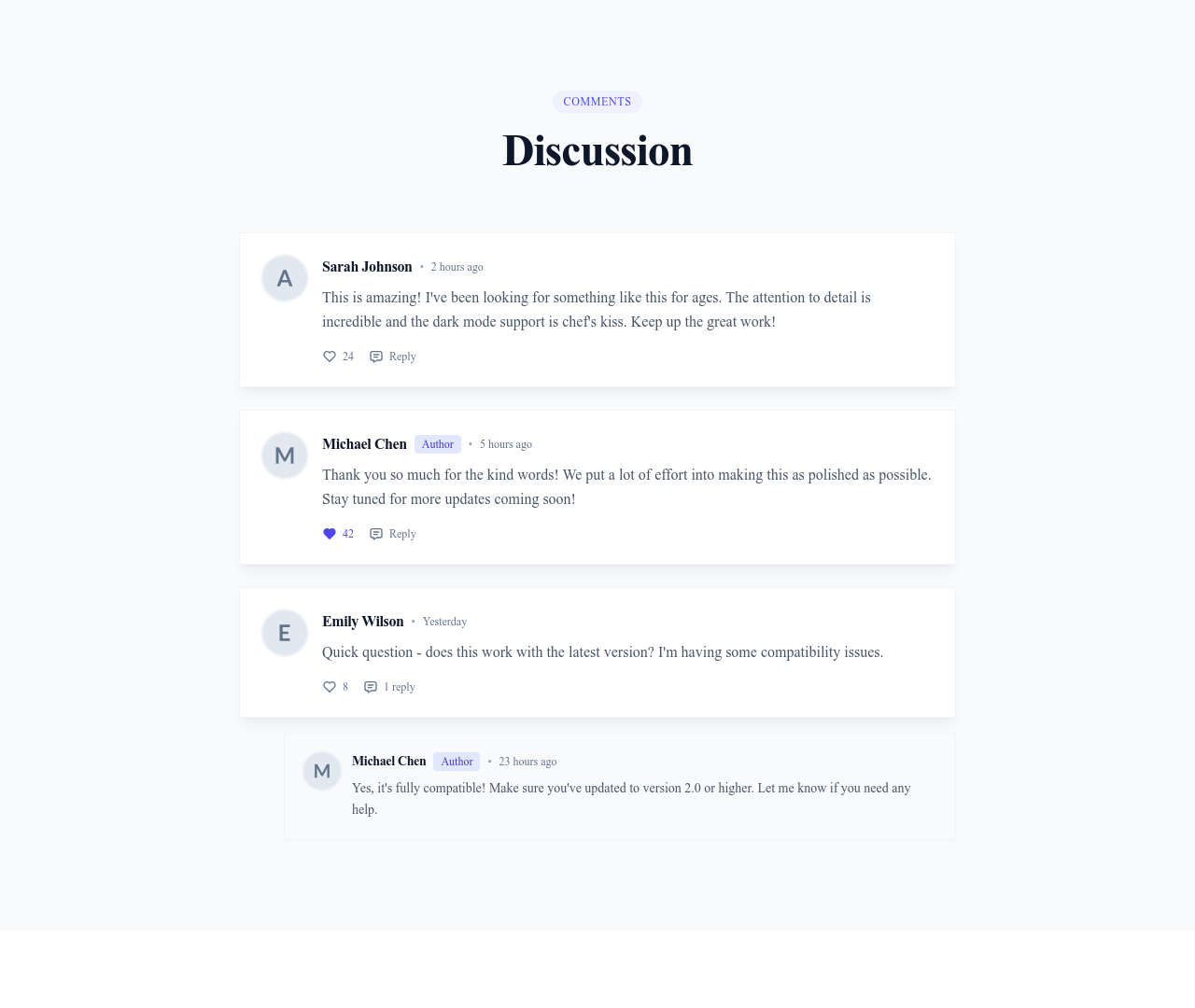
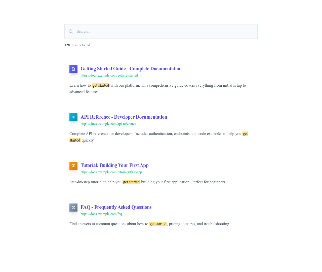
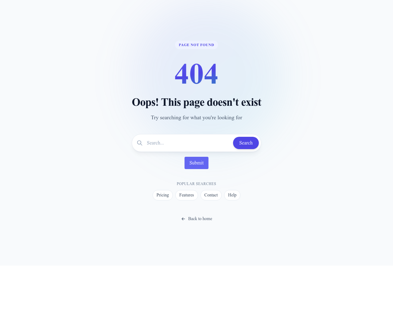
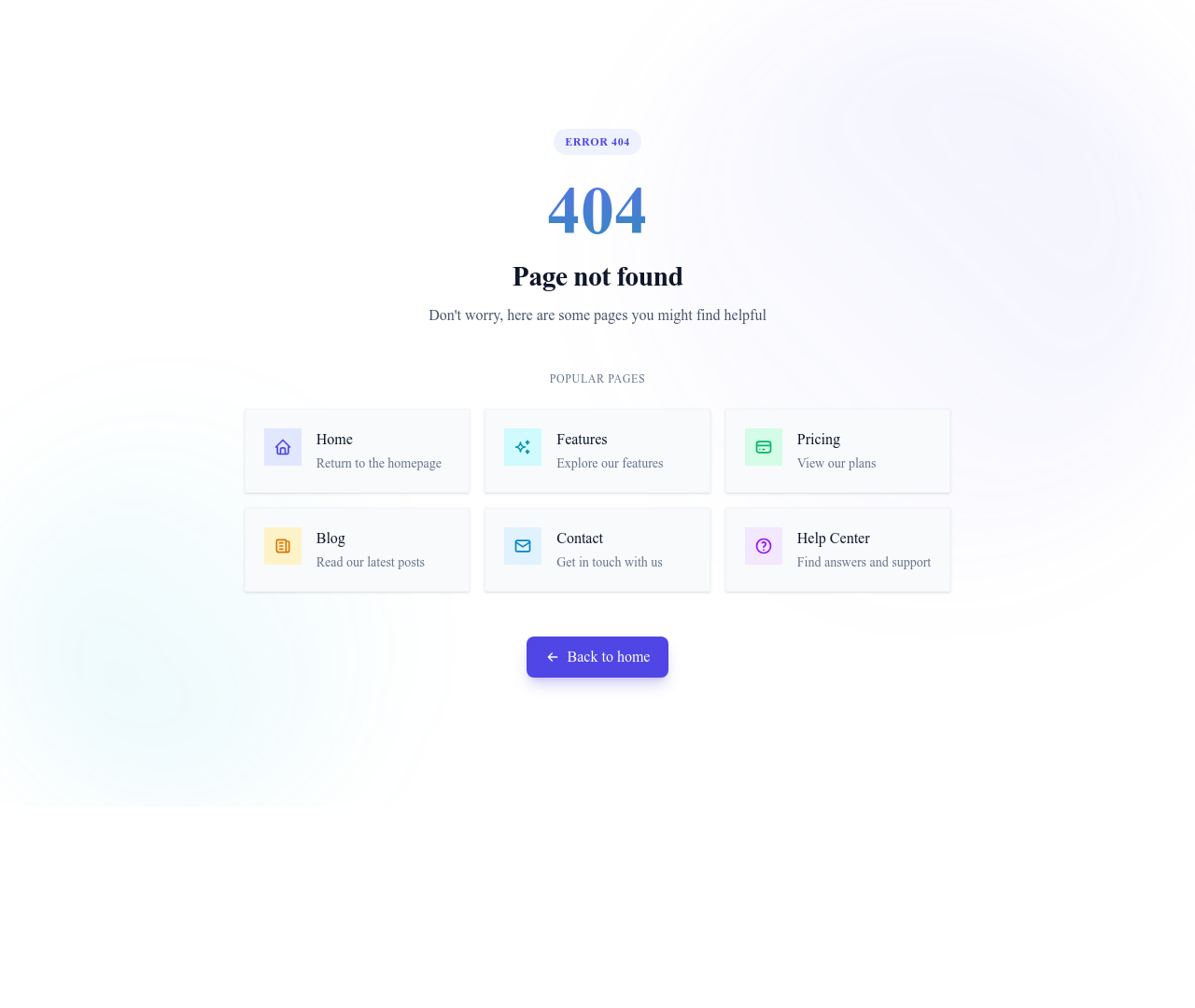
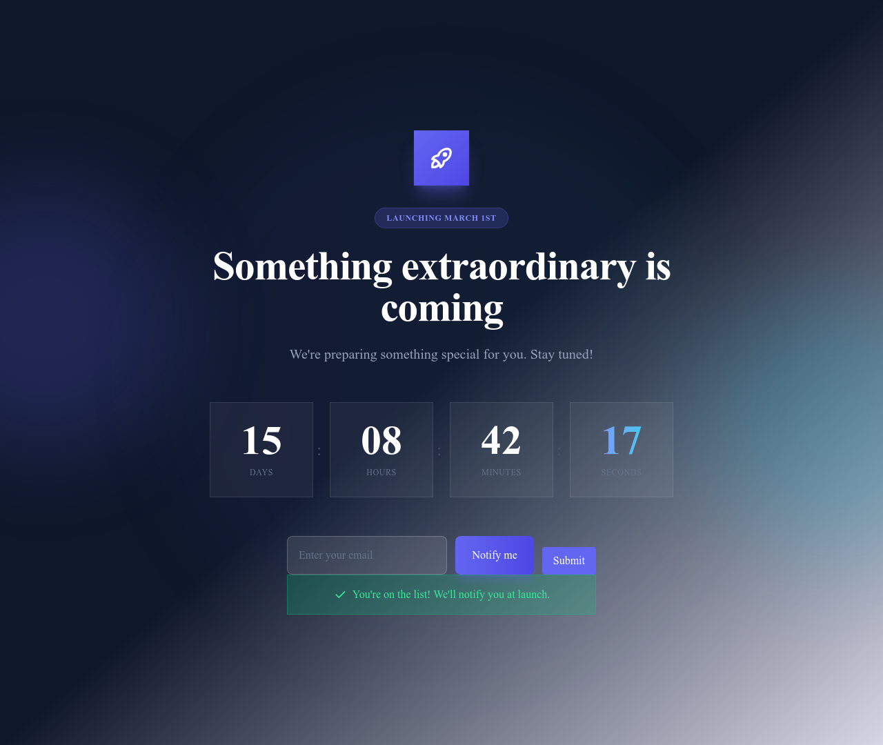
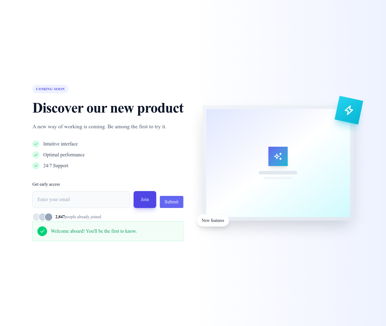
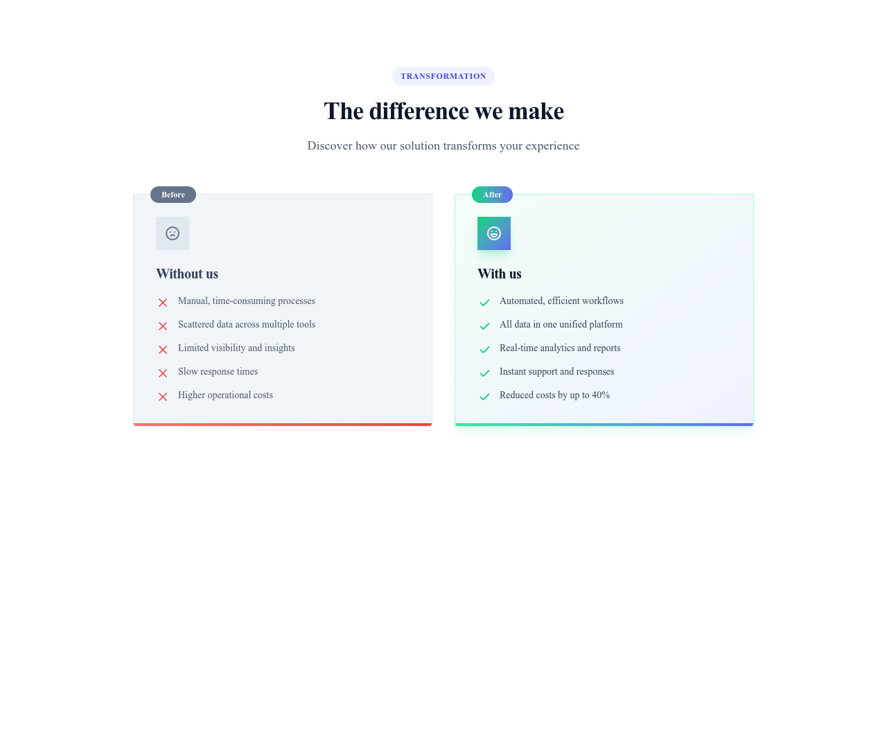
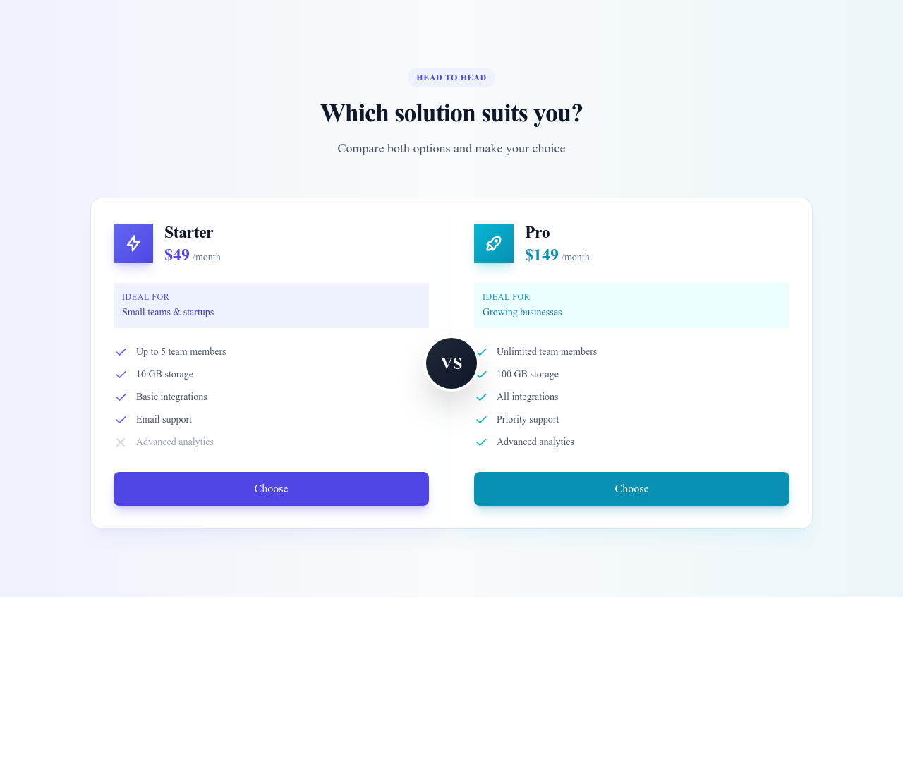
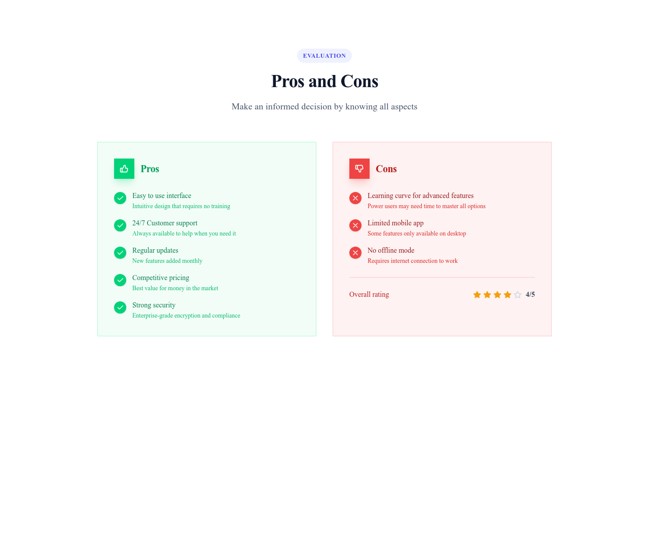
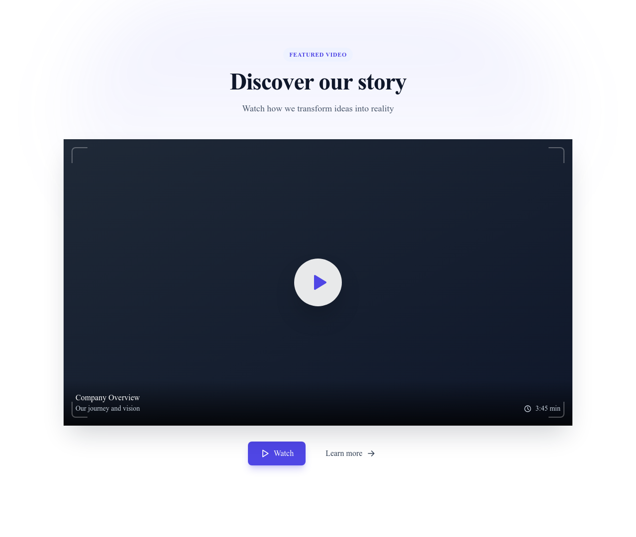
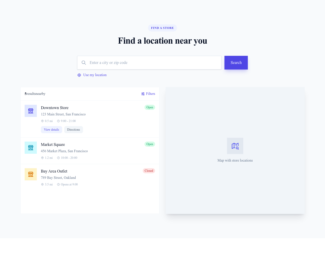
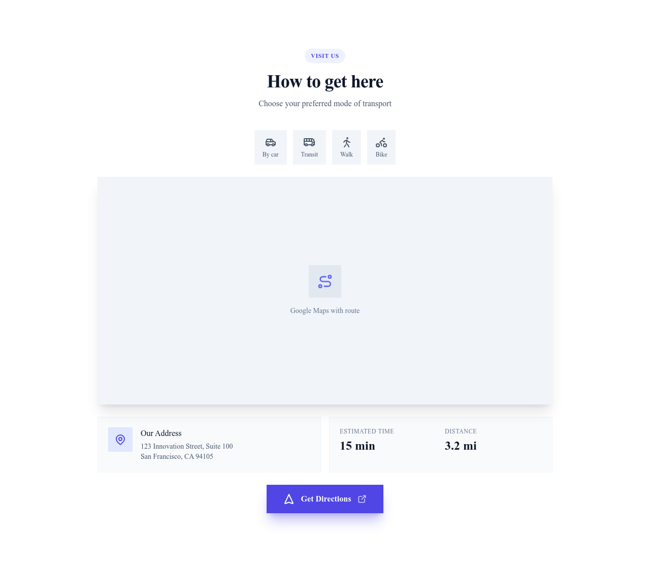
Des éléments de design plus petits et réutilisables (cartes, badges, boutons, champs, fenêtres modales, etc.) qui prennent place dans les sections pour construire des interfaces riches.
Parcourir · Catégories
Des composants d’interface réutilisables pour des sites modernes
409 éléments

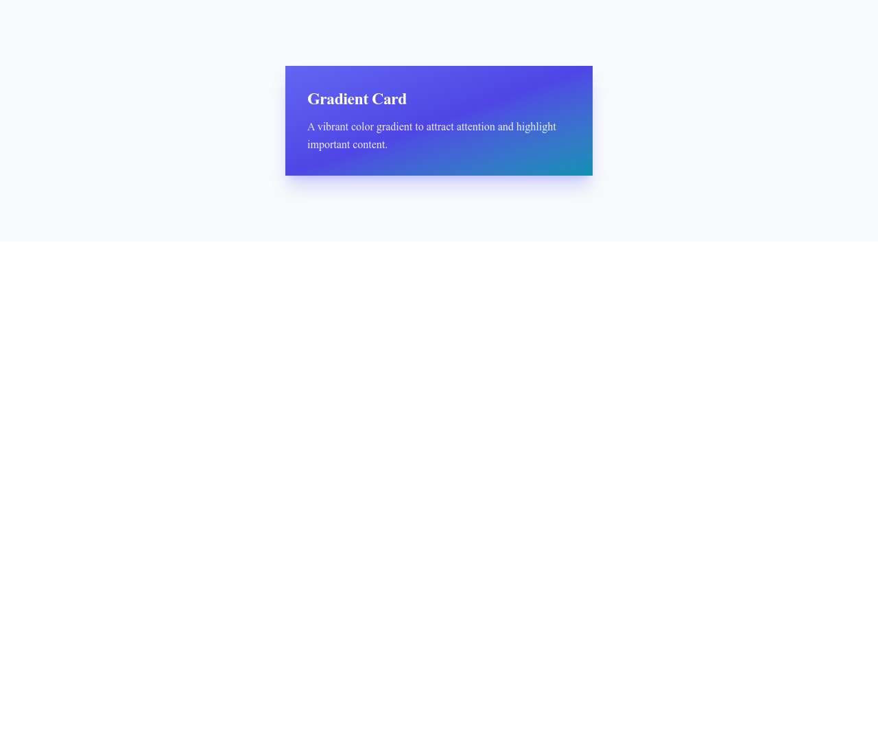
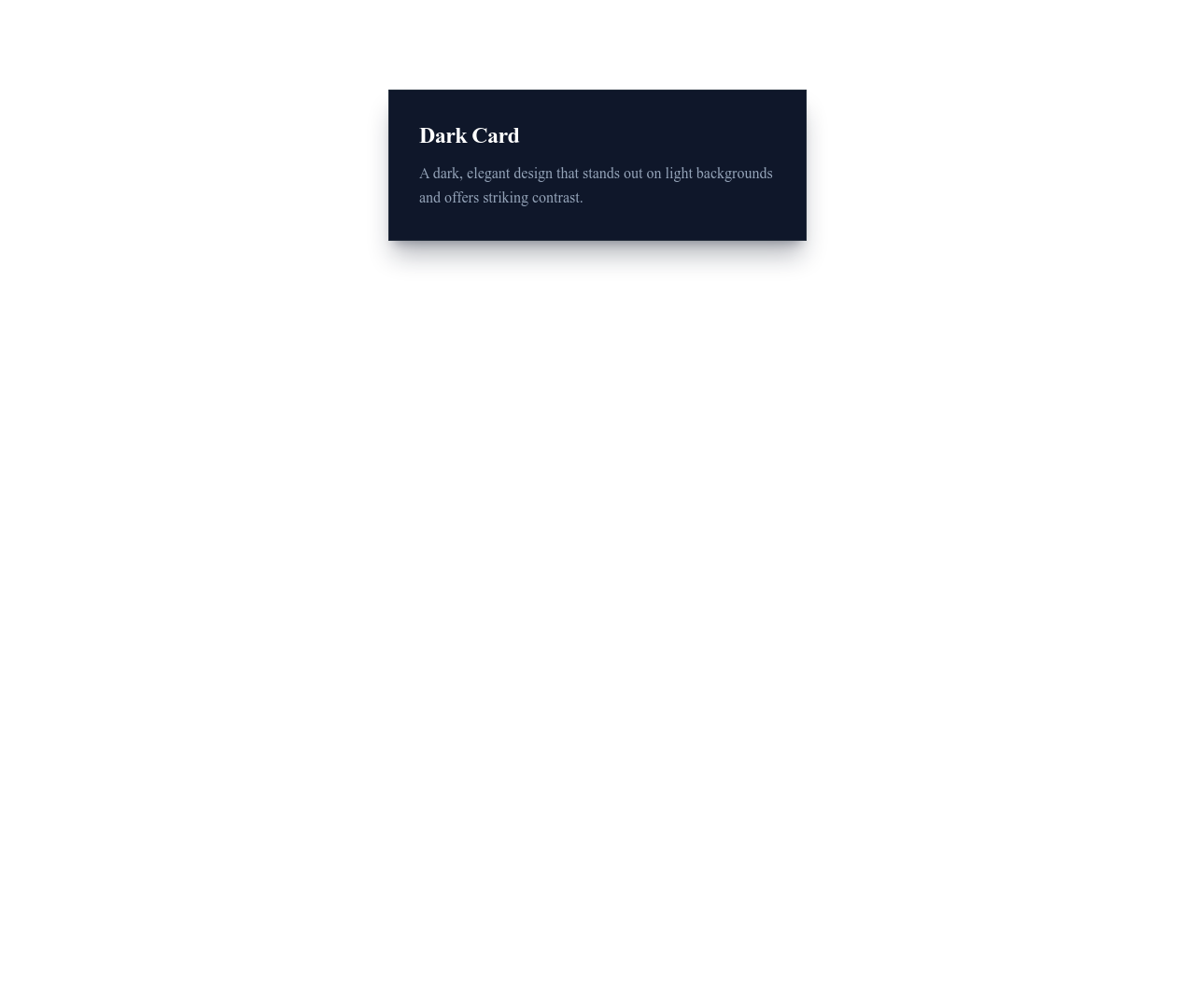
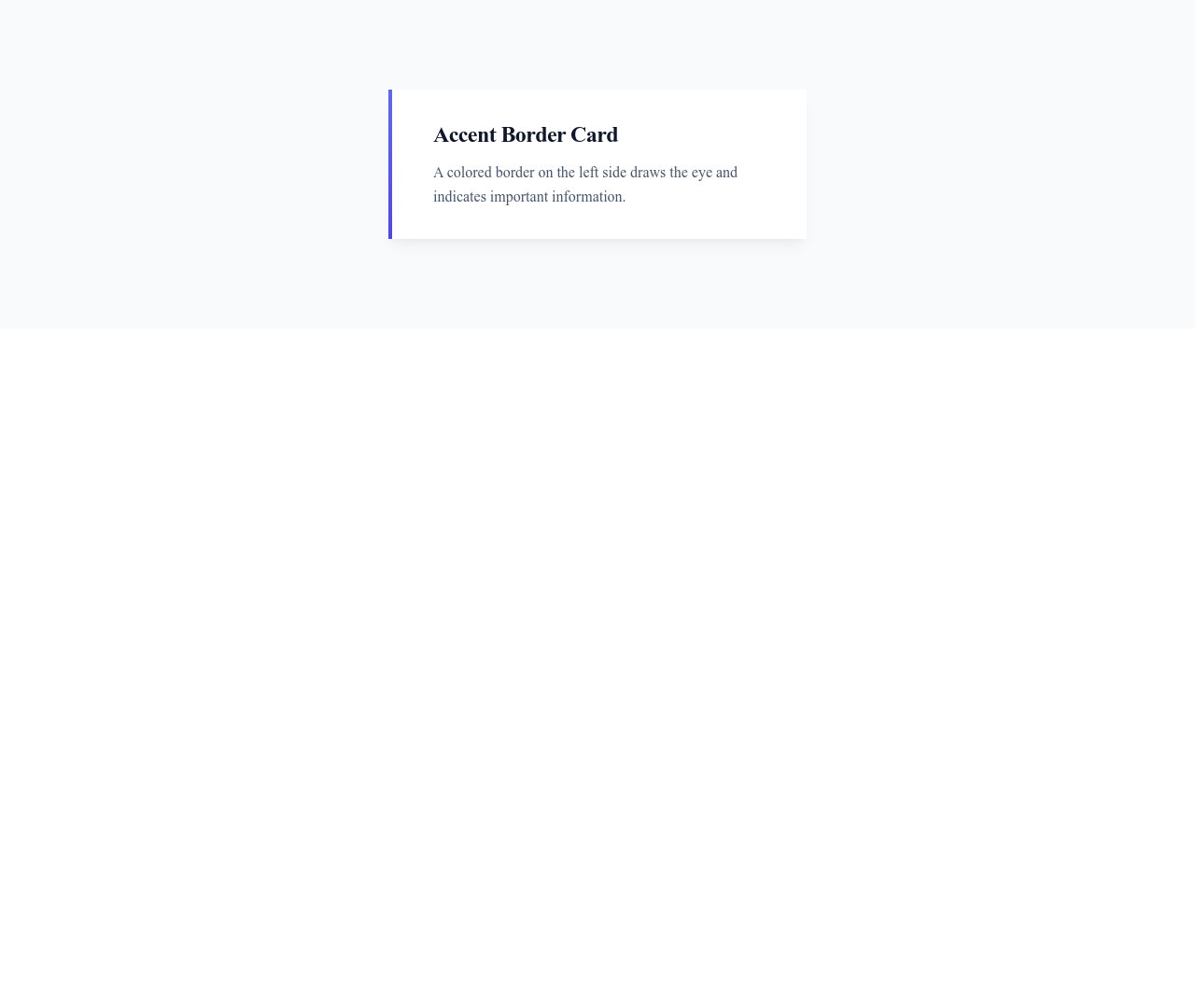

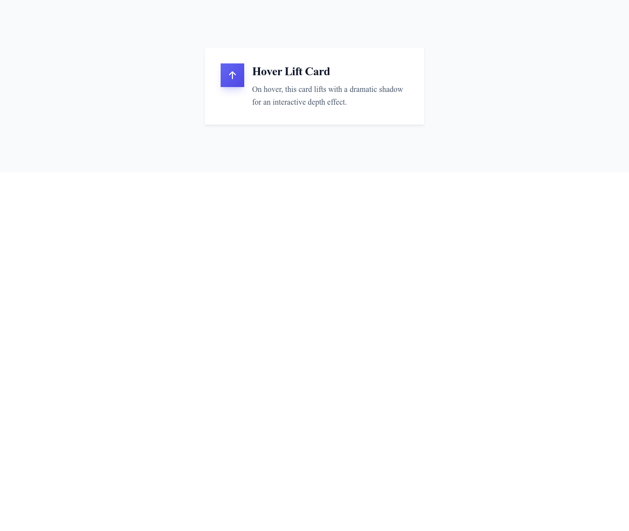

























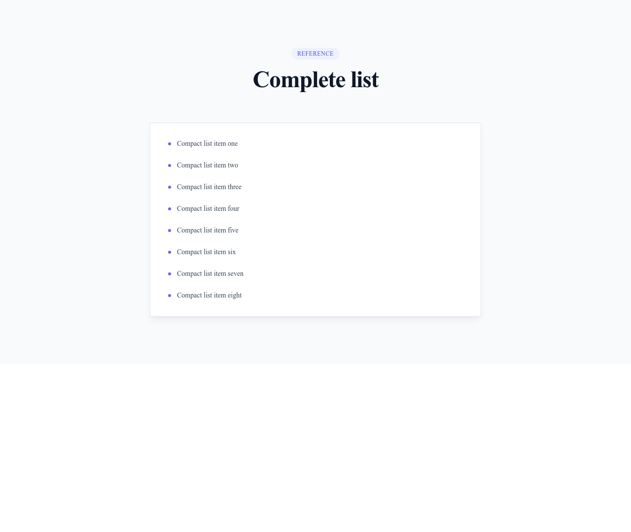
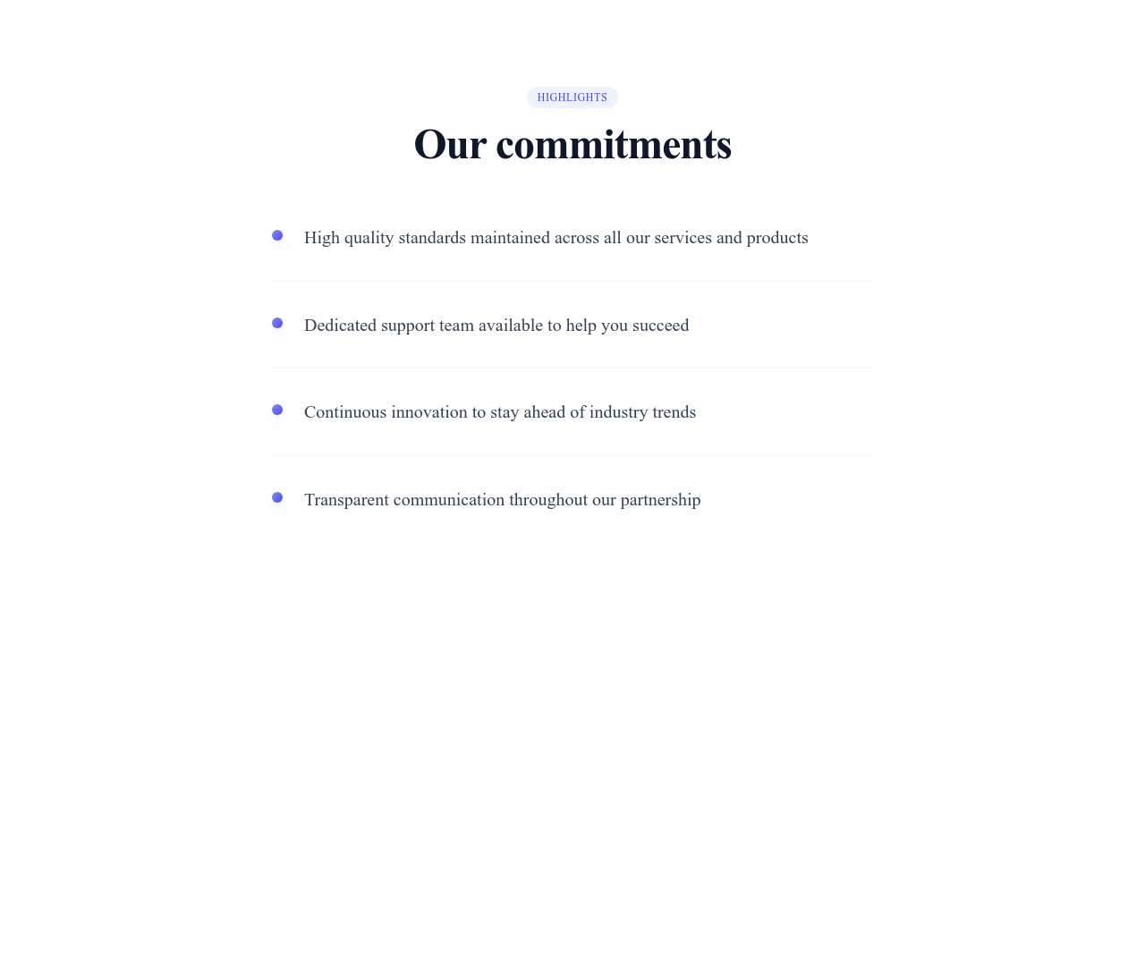
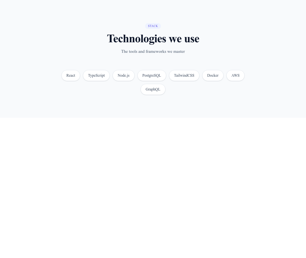
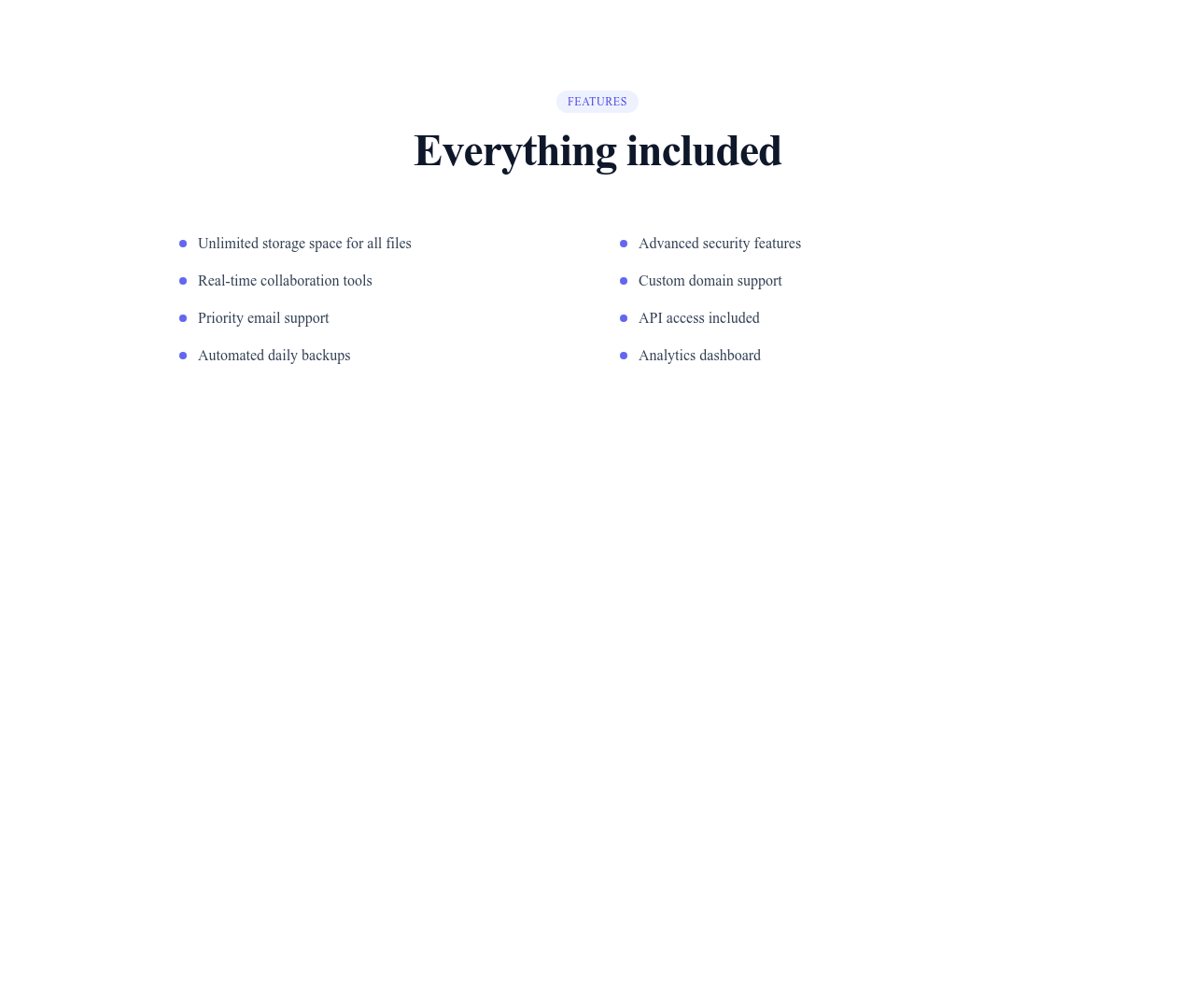
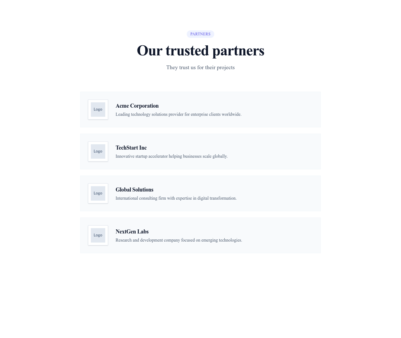
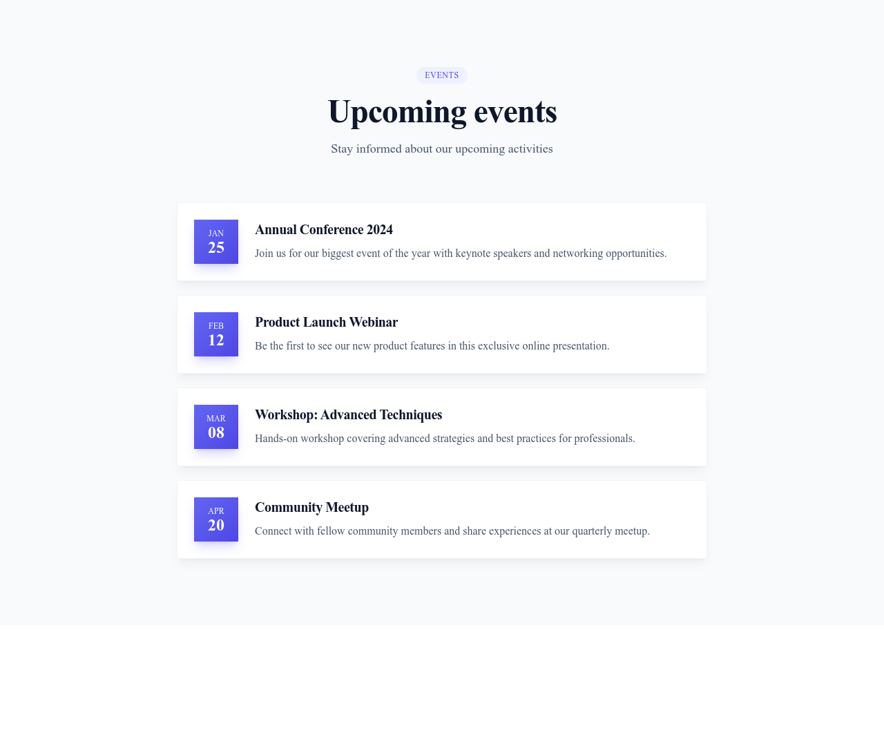
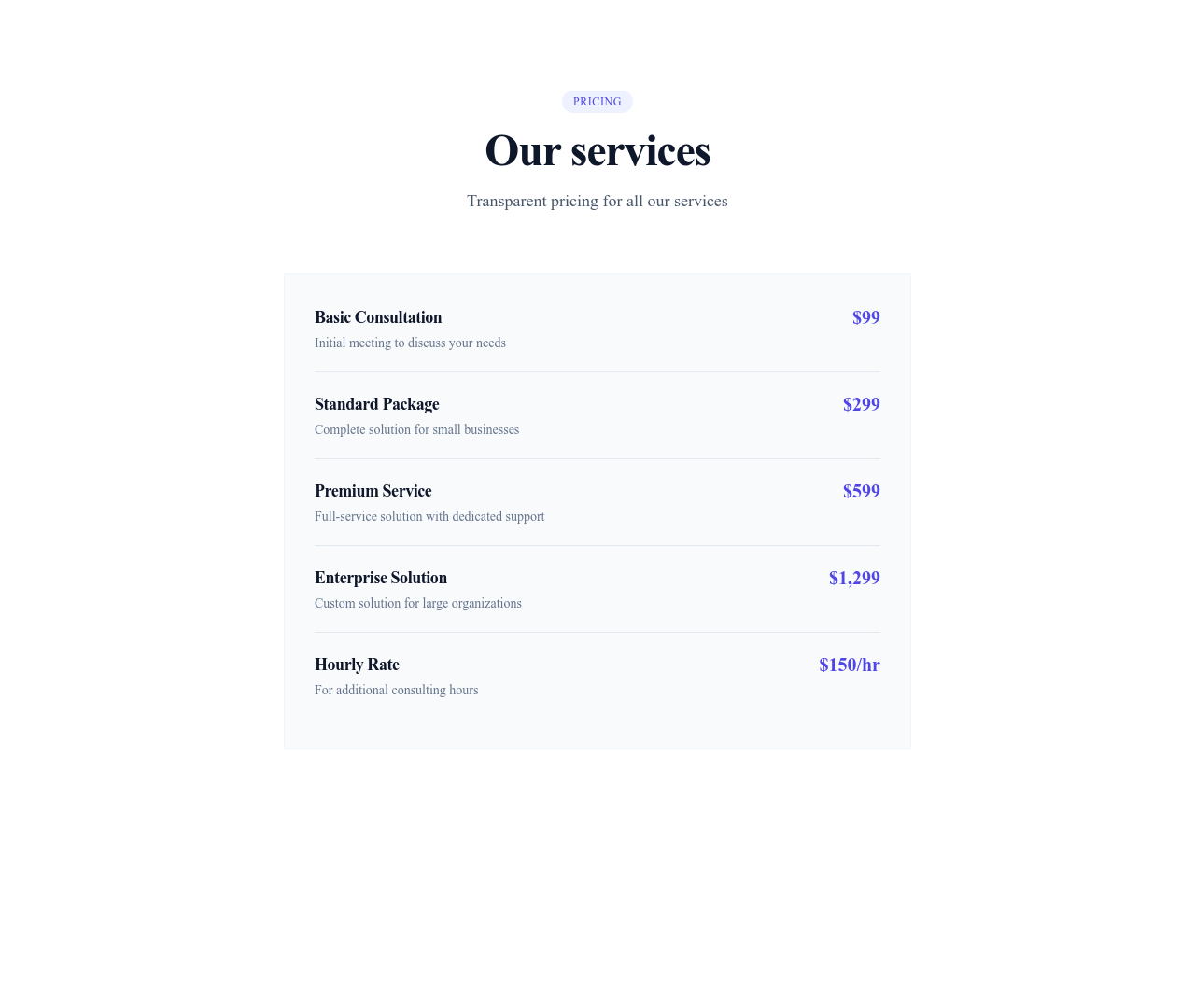
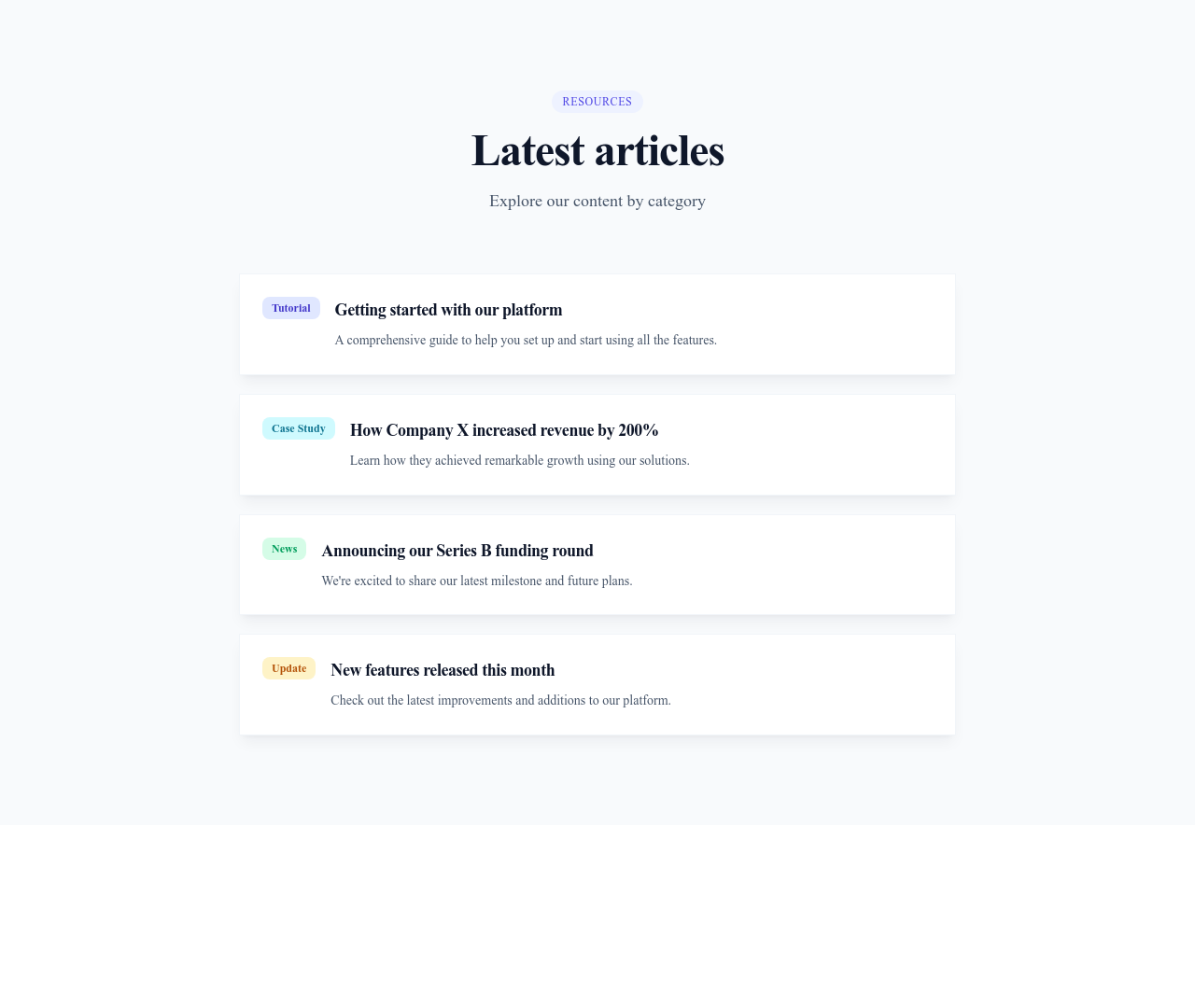














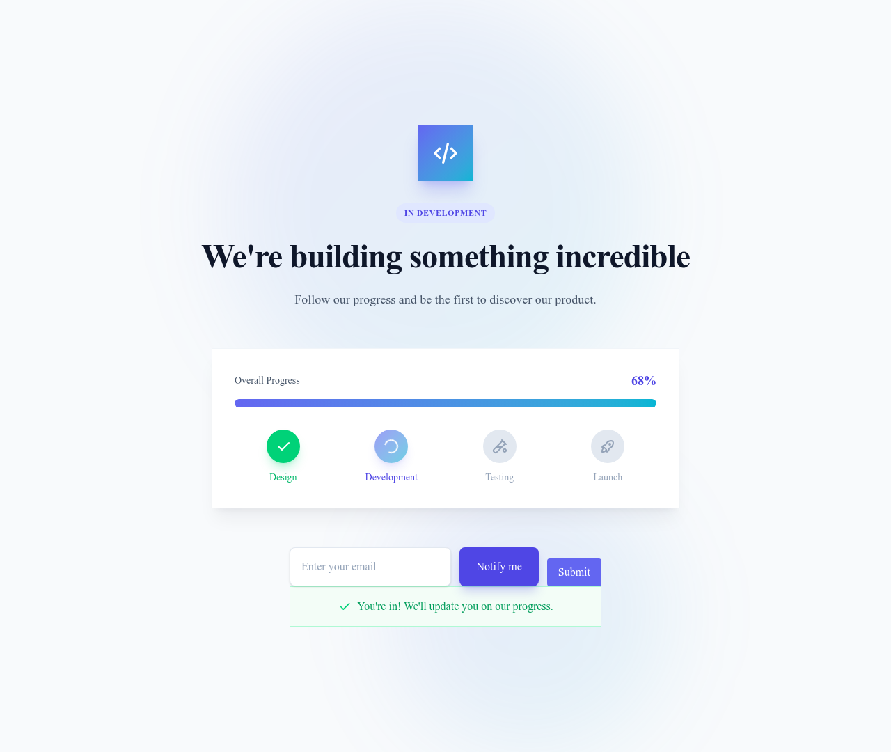
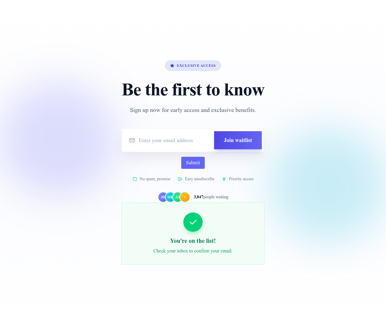
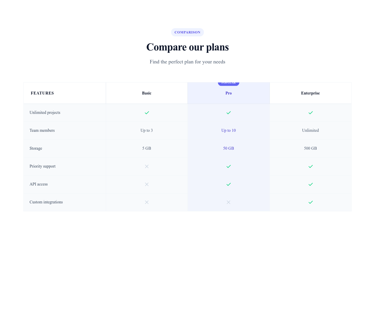
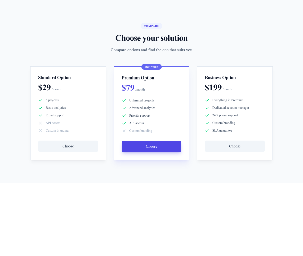











Rien ne correspond à ce filtre.
Guide
Si les sections forment le squelette d’une page, les composants en sont les organes qui la font fonctionner. Notre bibliothèque de composants d’interface propose plus de 300 éléments à déposer dans n’importe quelle section ou page pour construire des interfaces riches et interactives, sans écrire de CSS sur mesure. Chaque composant est autonome, responsive et conçu pour s’harmoniser avec les autres.
Les catégories de composants
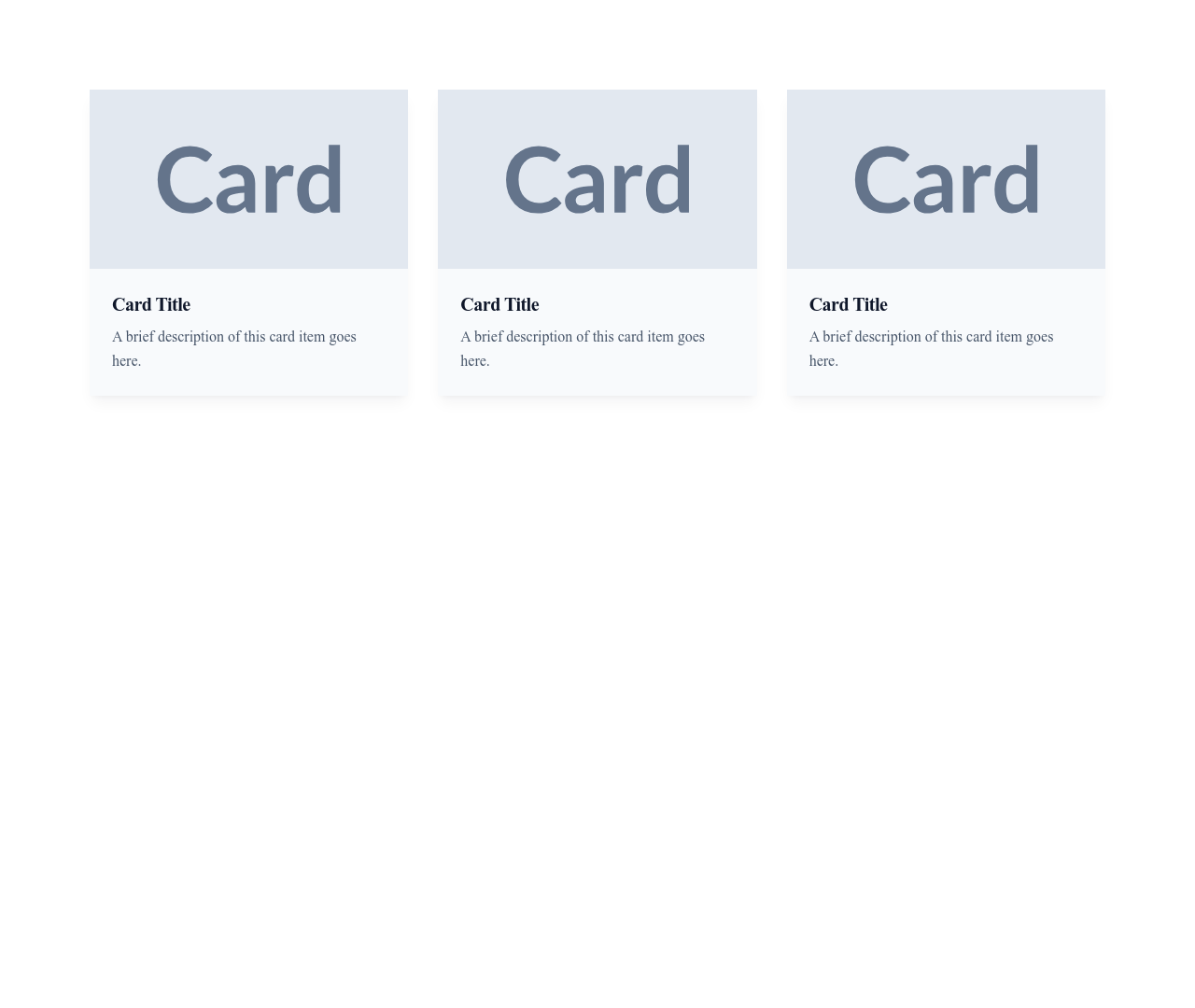
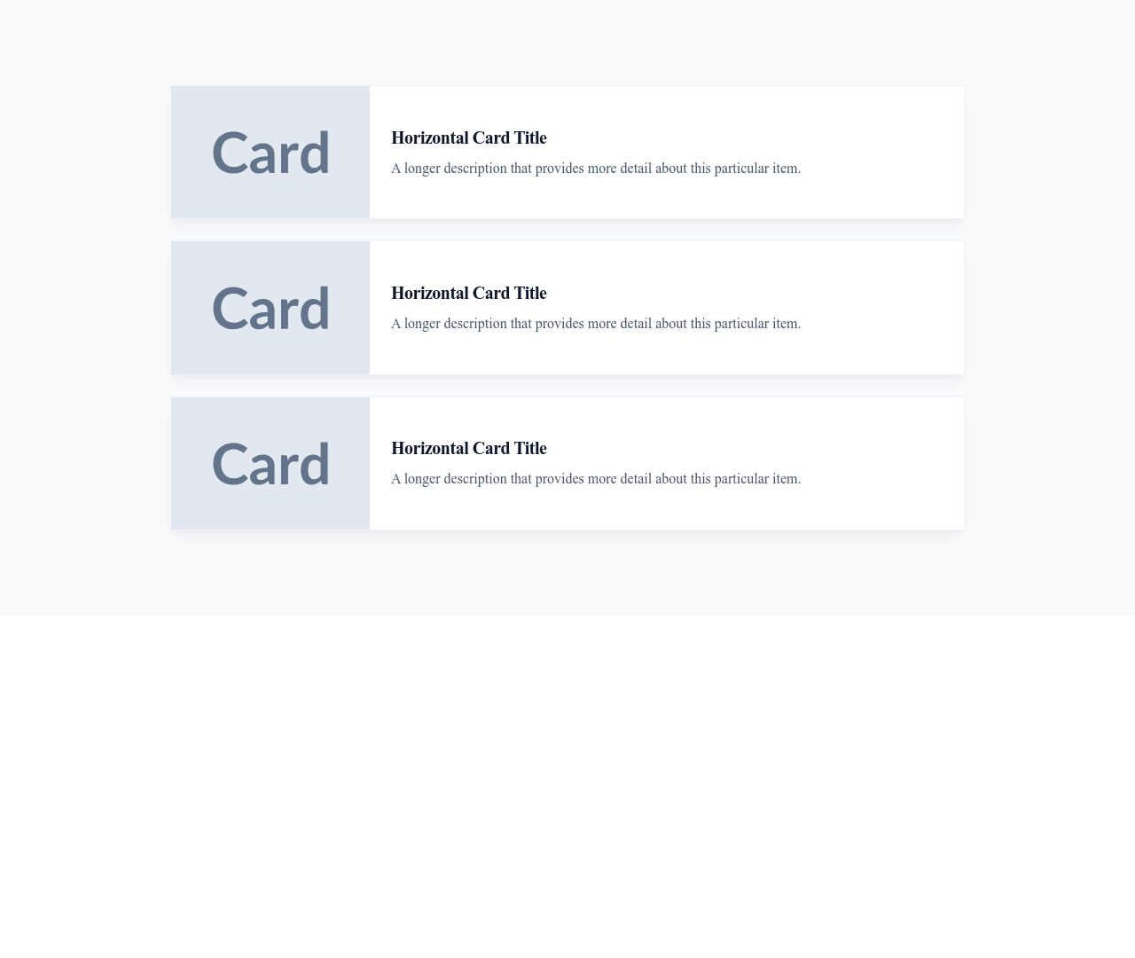
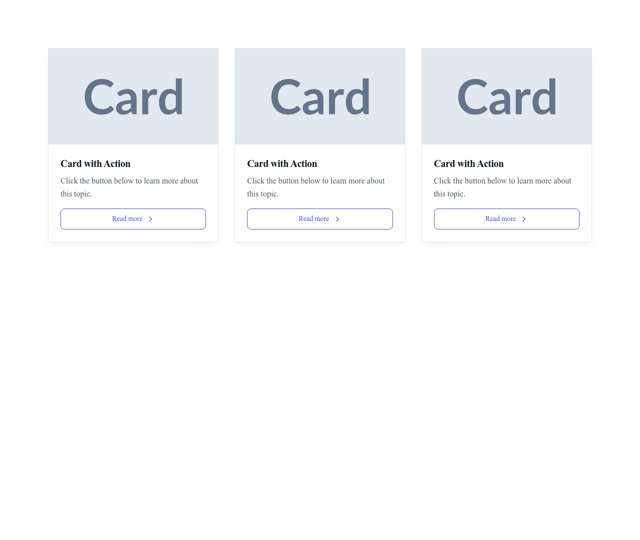
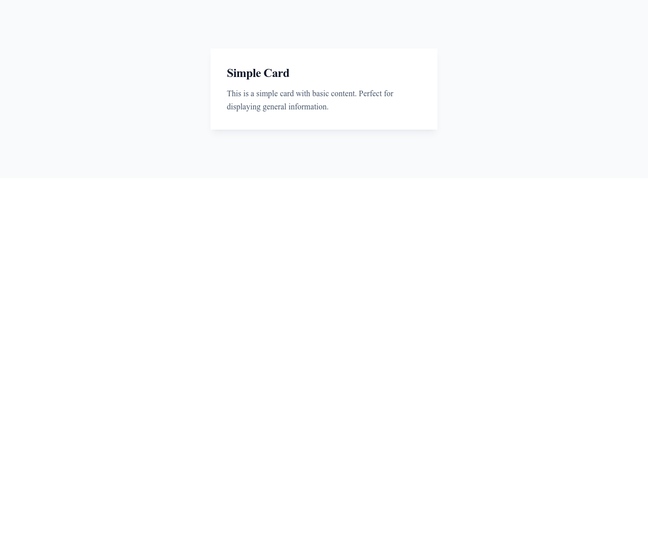
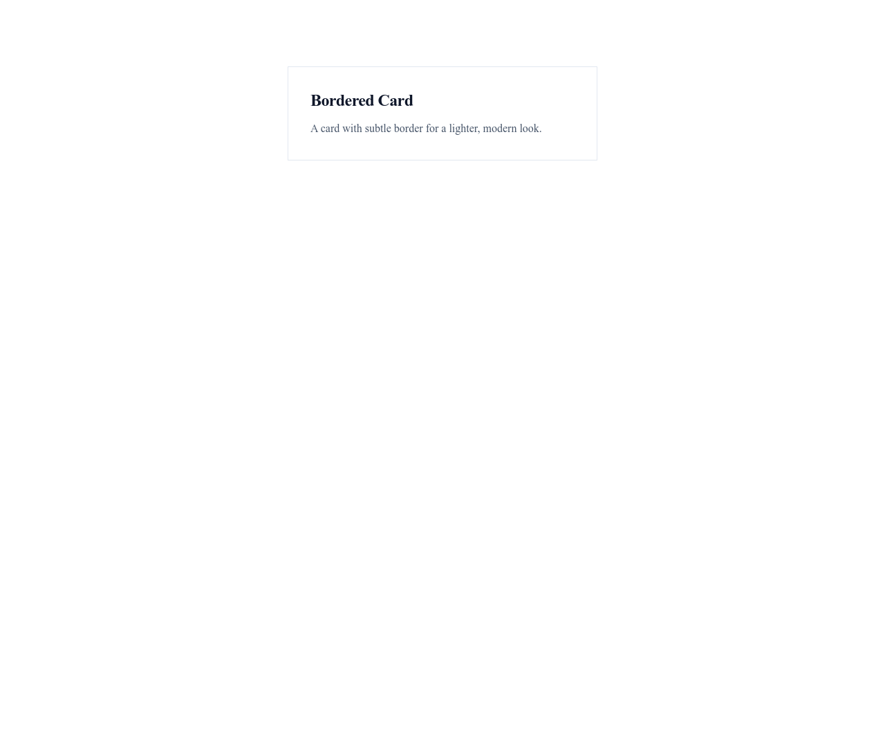
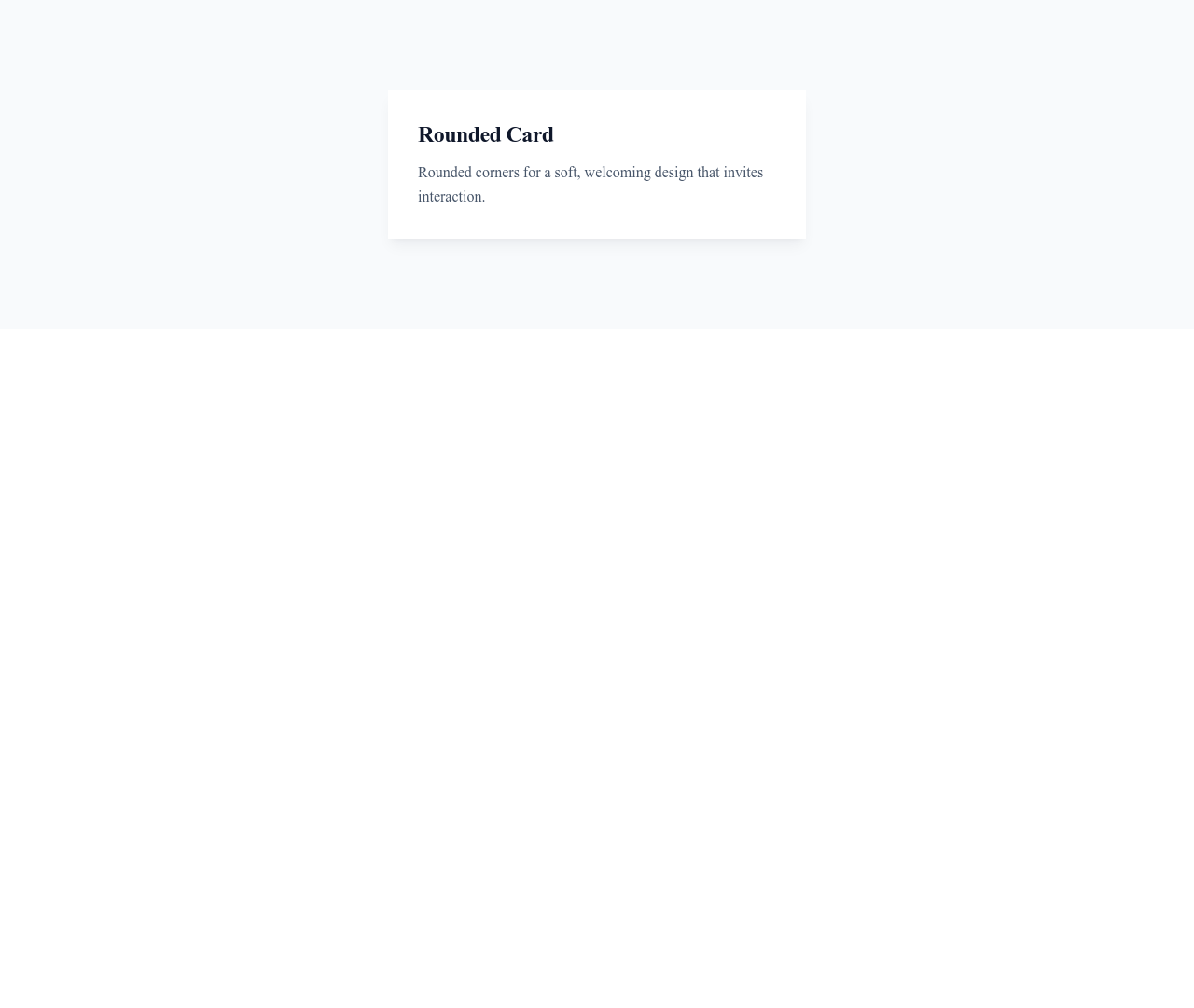
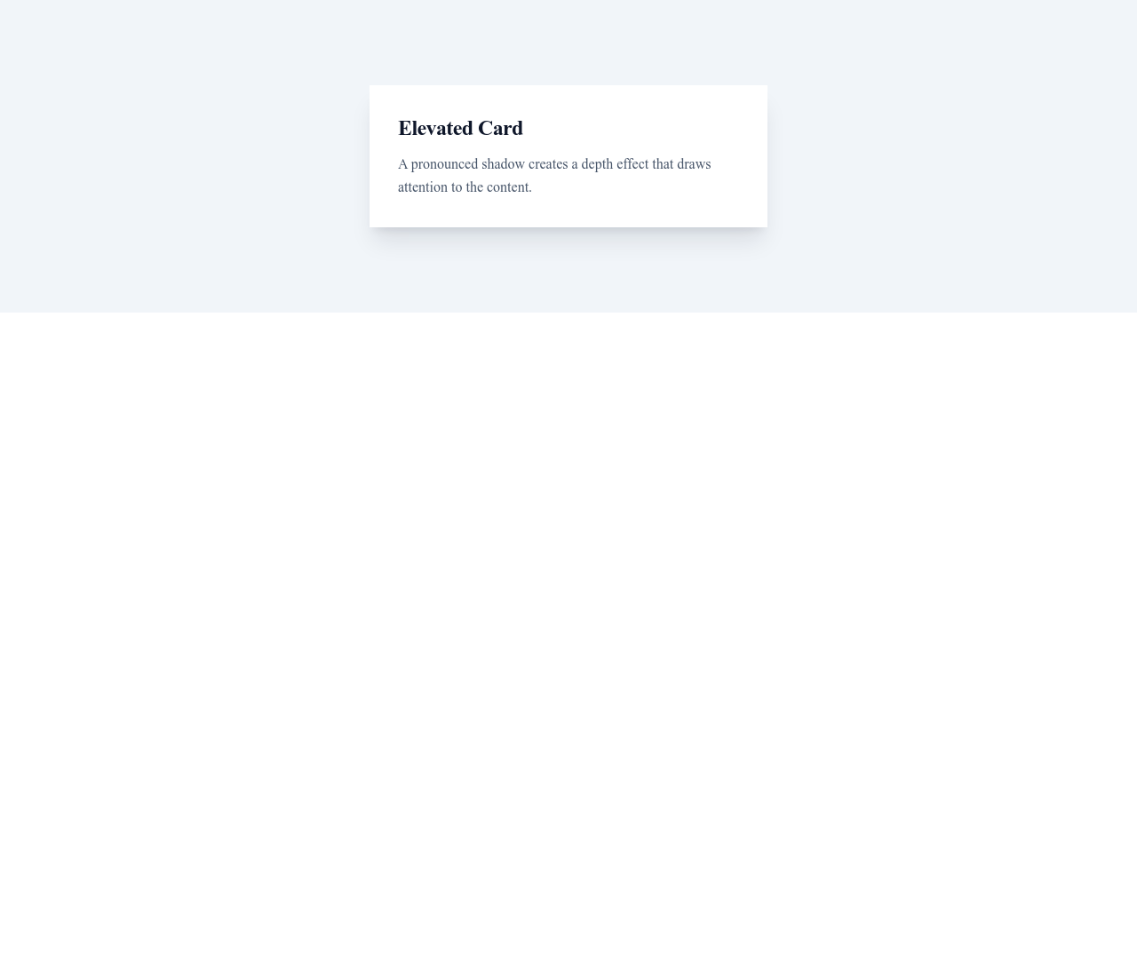
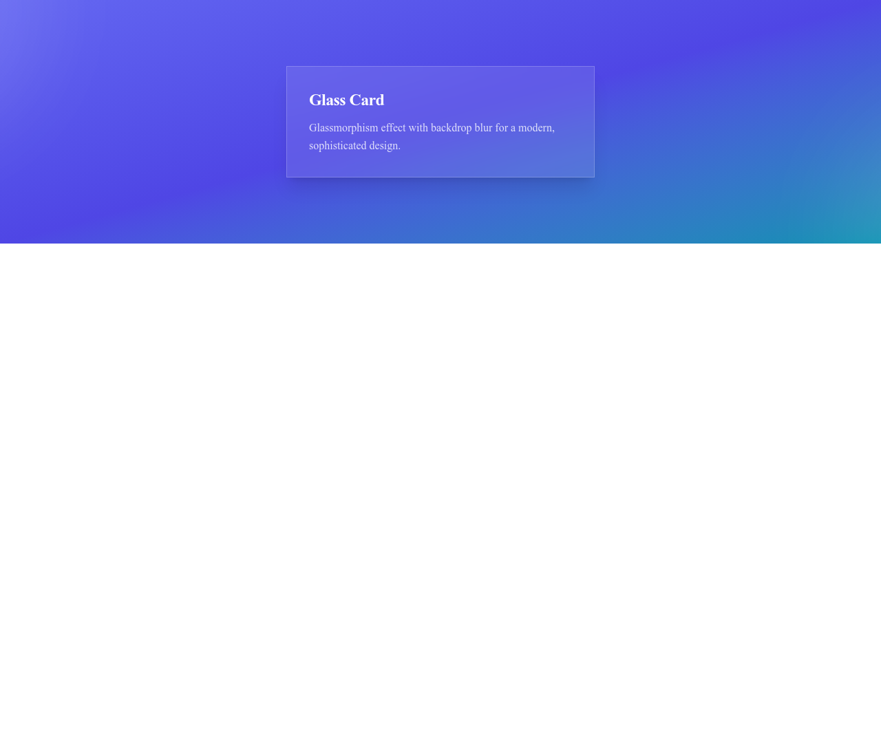
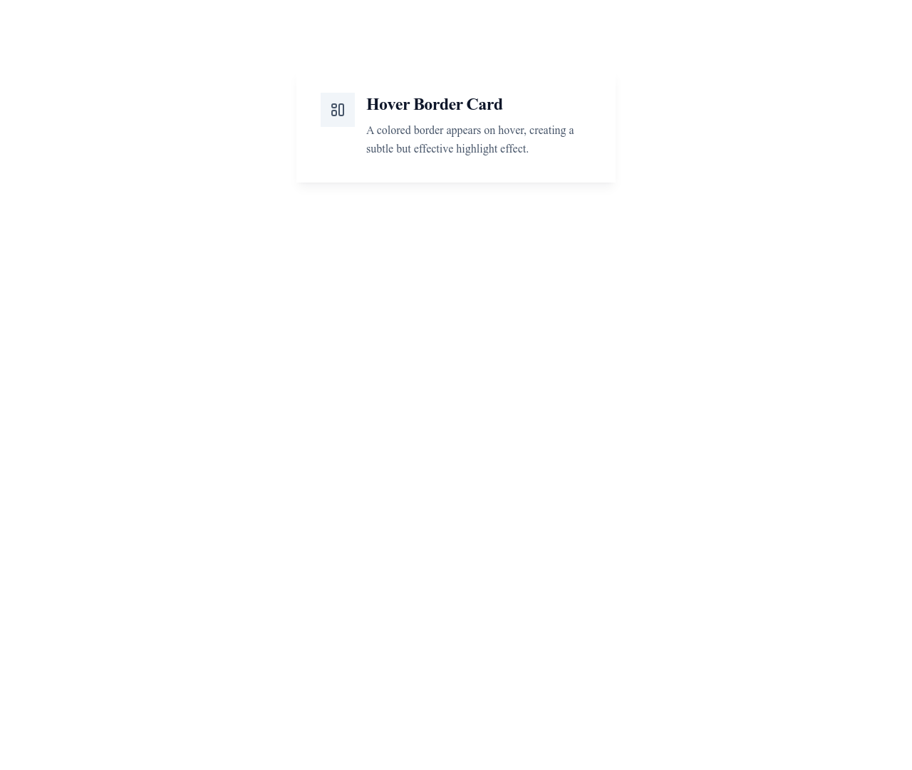
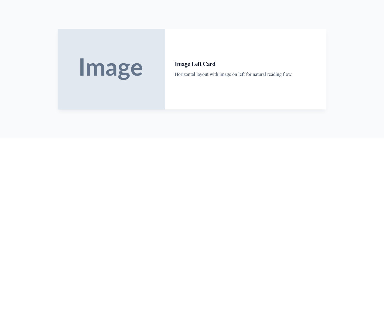
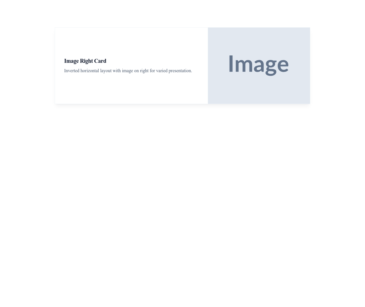
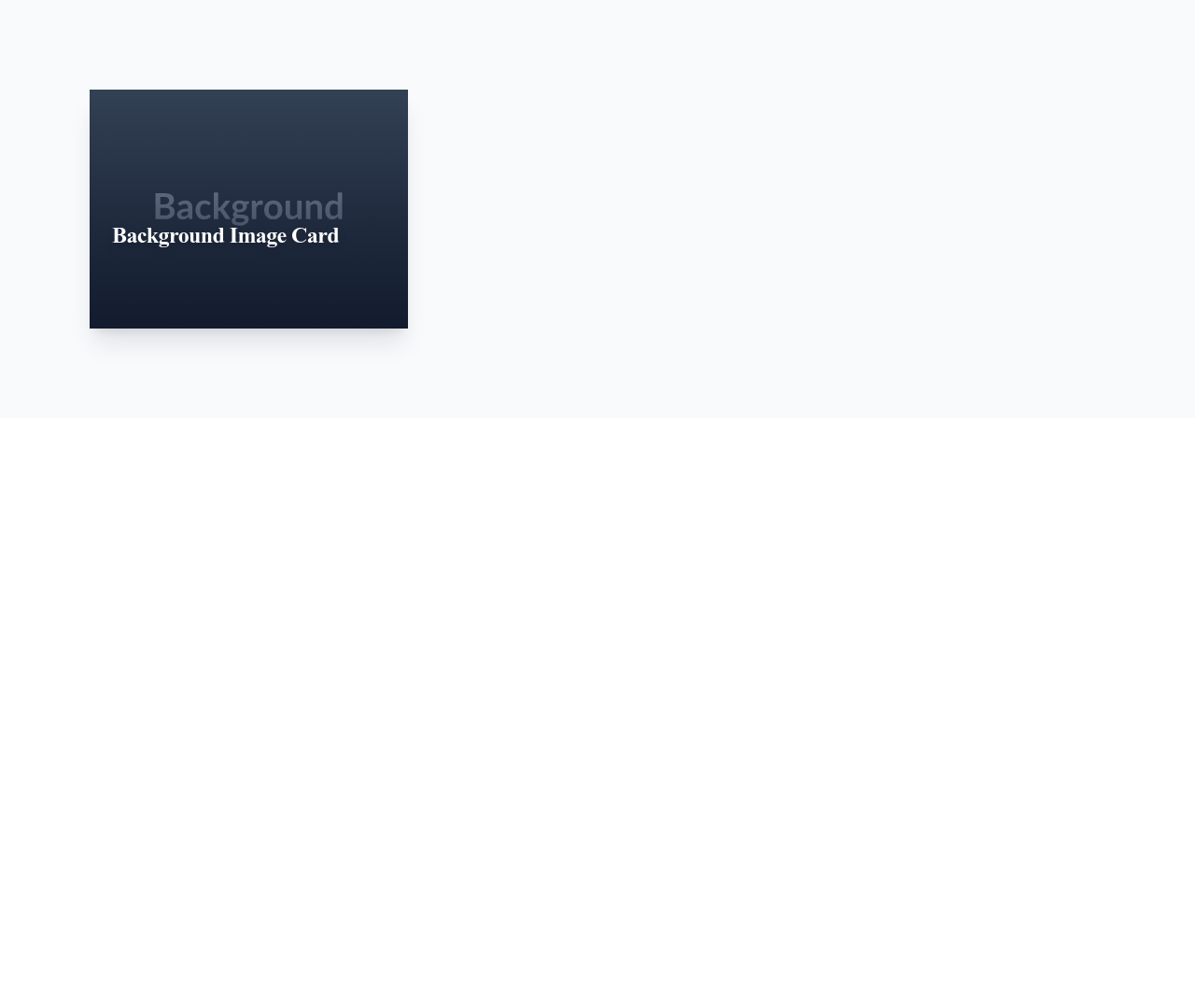
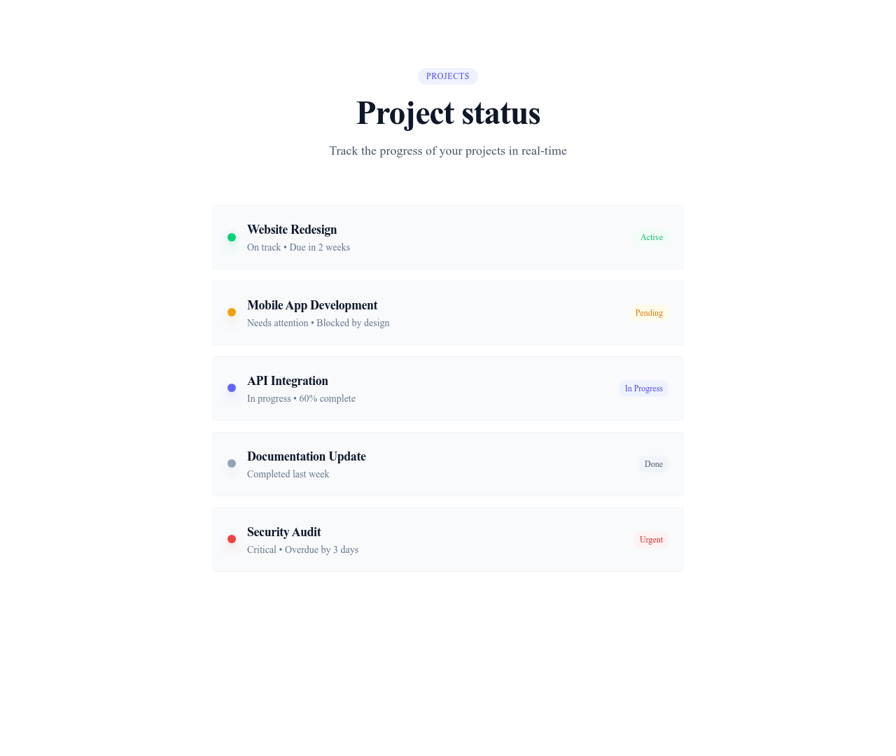
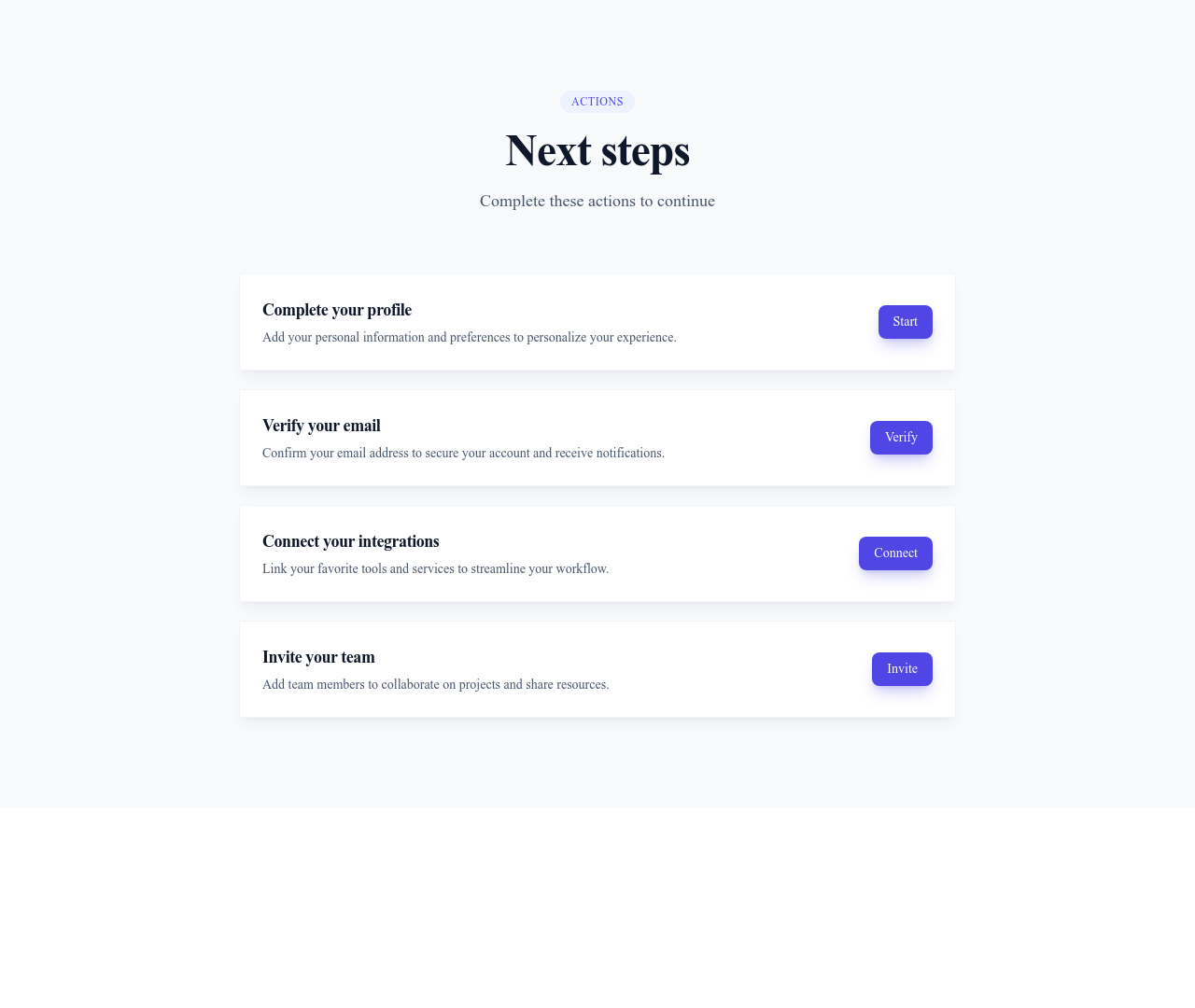
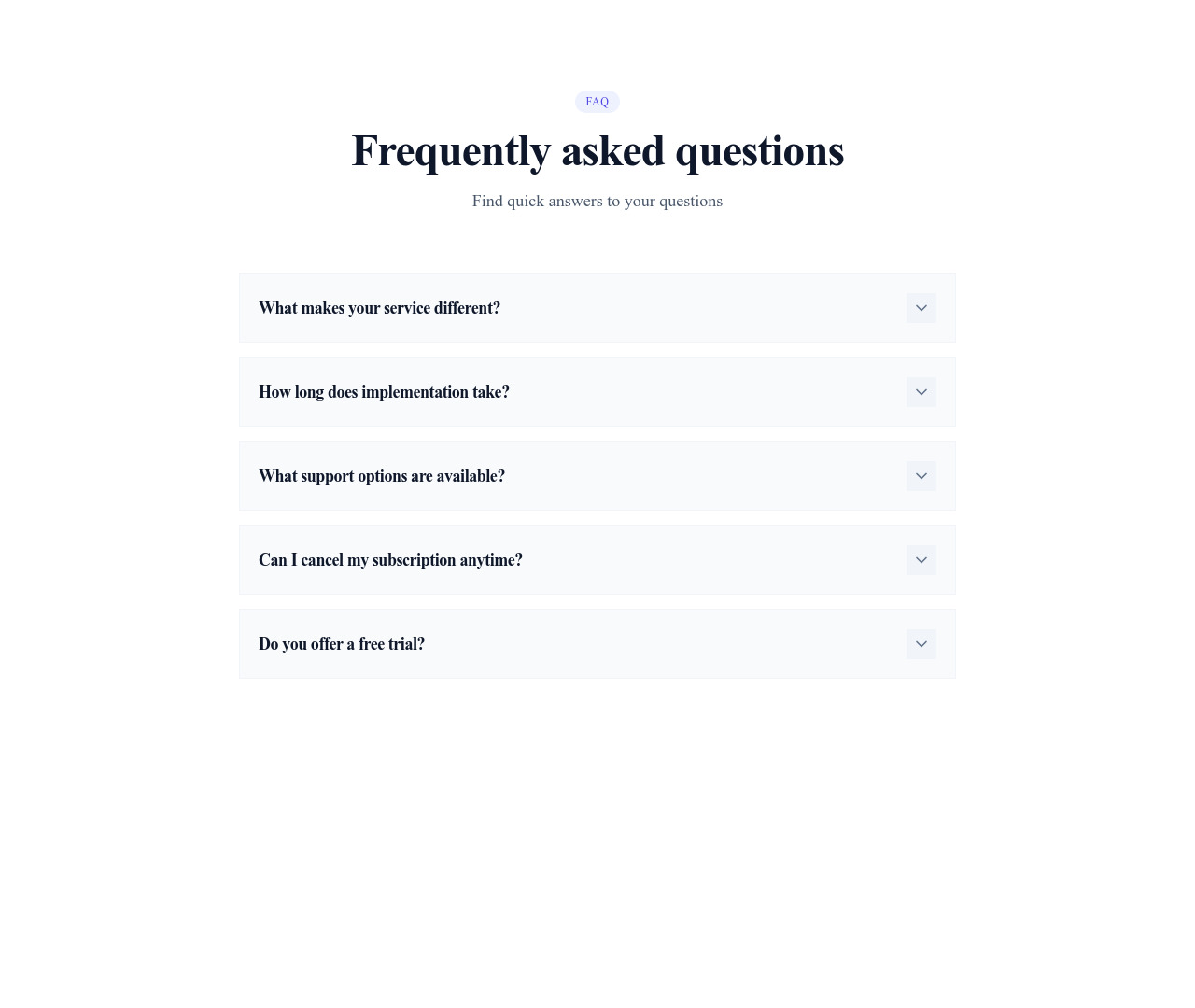
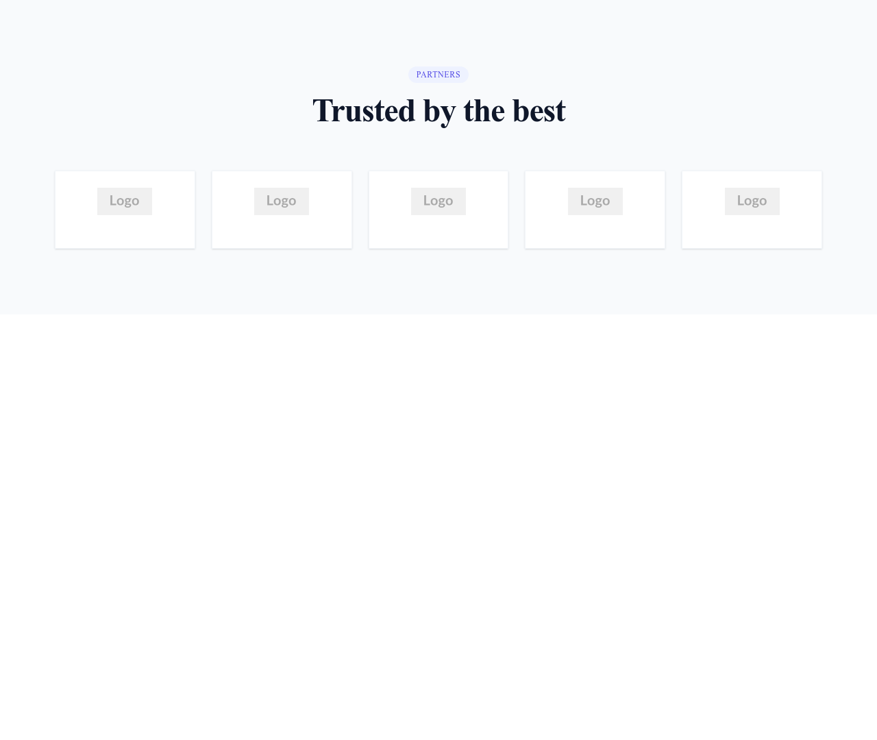
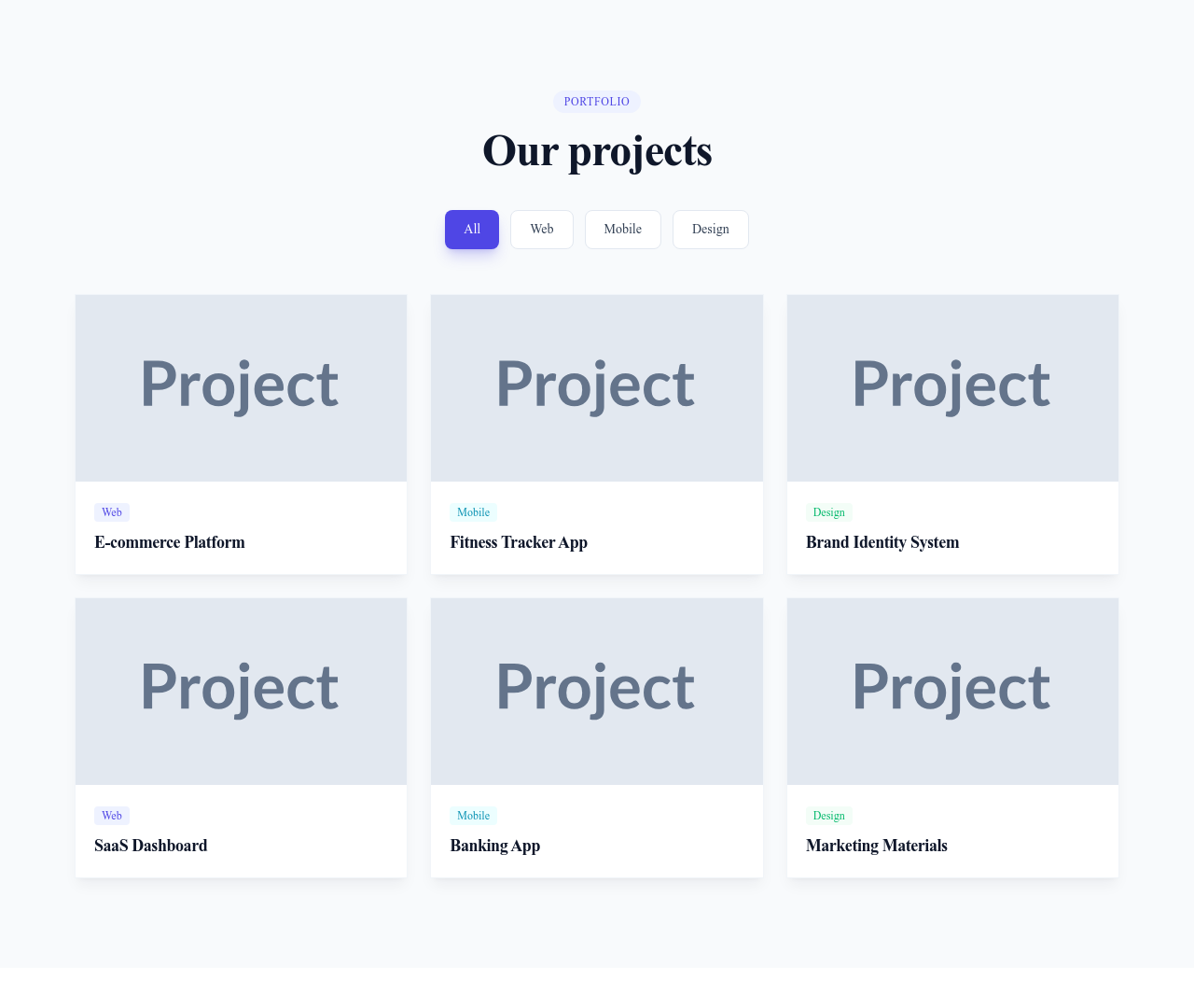
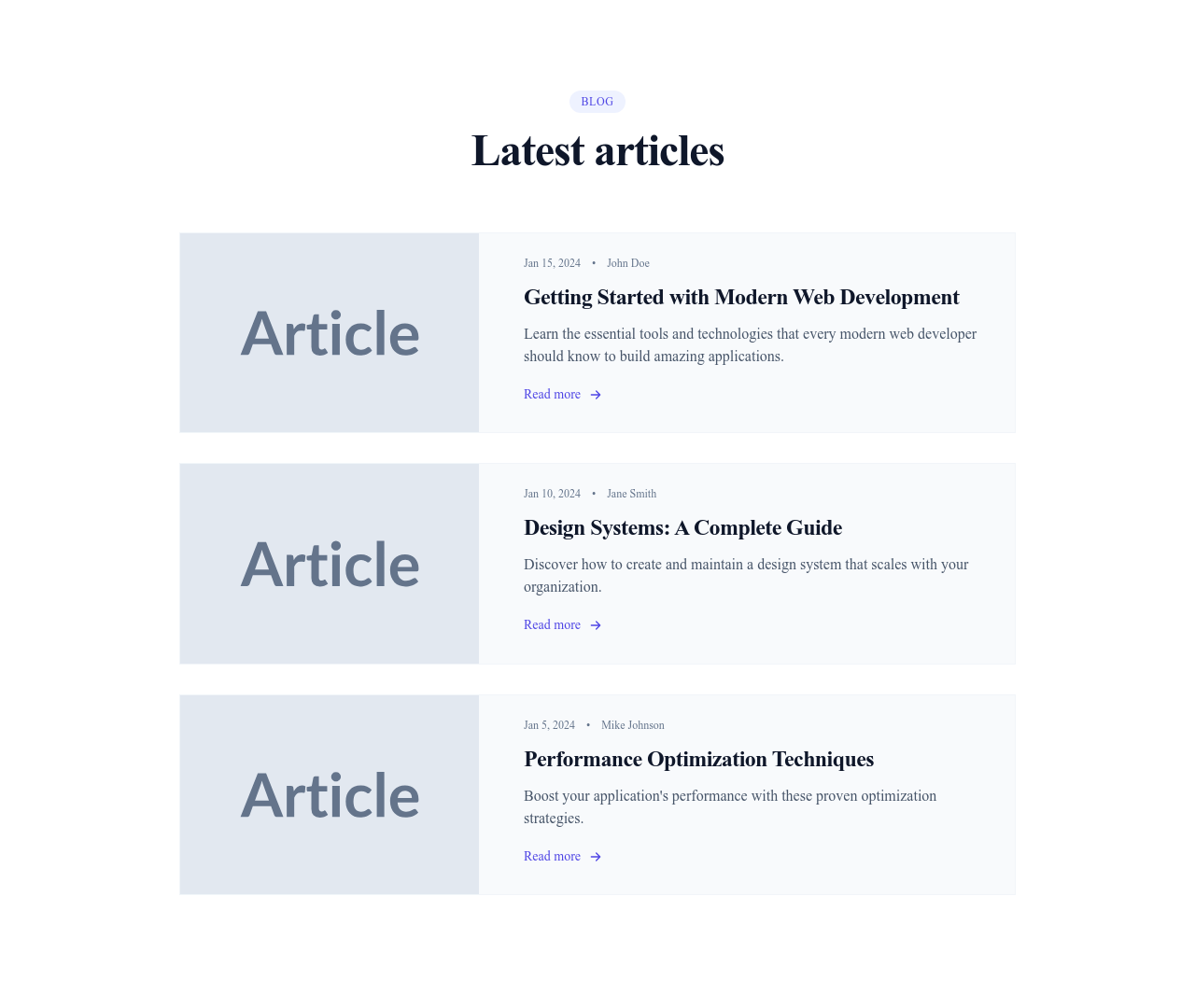
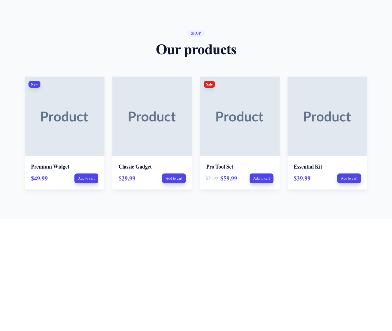
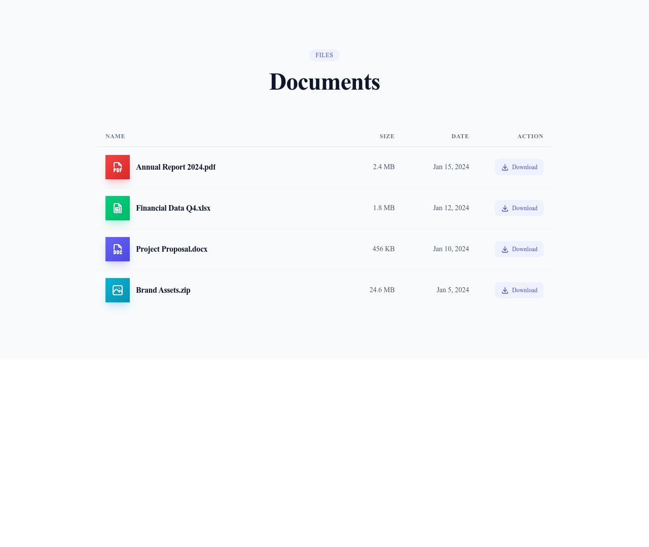
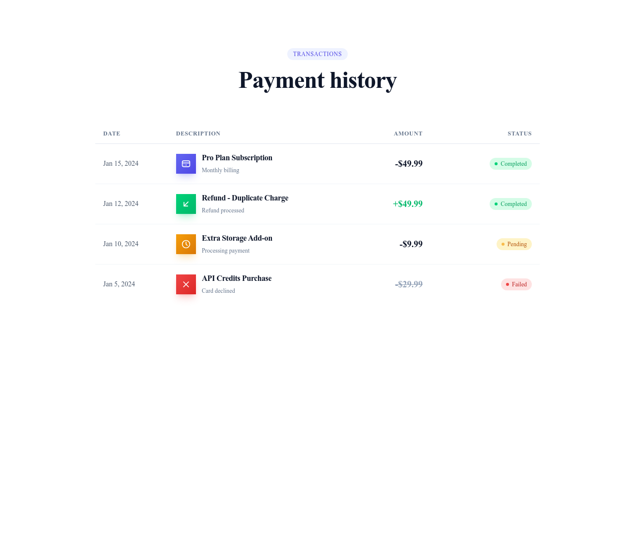
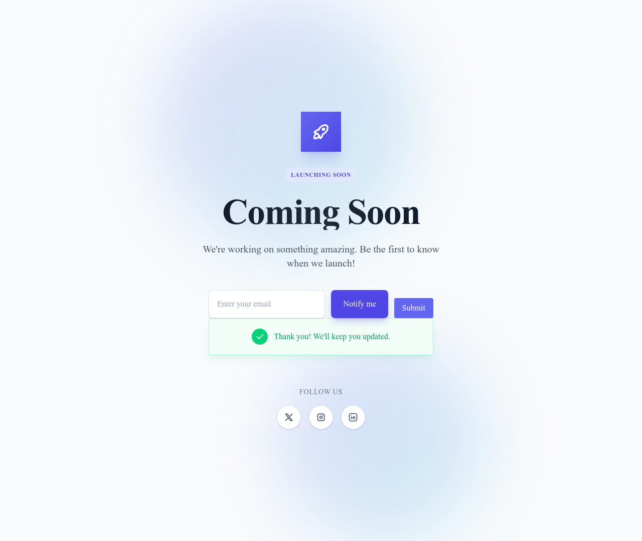
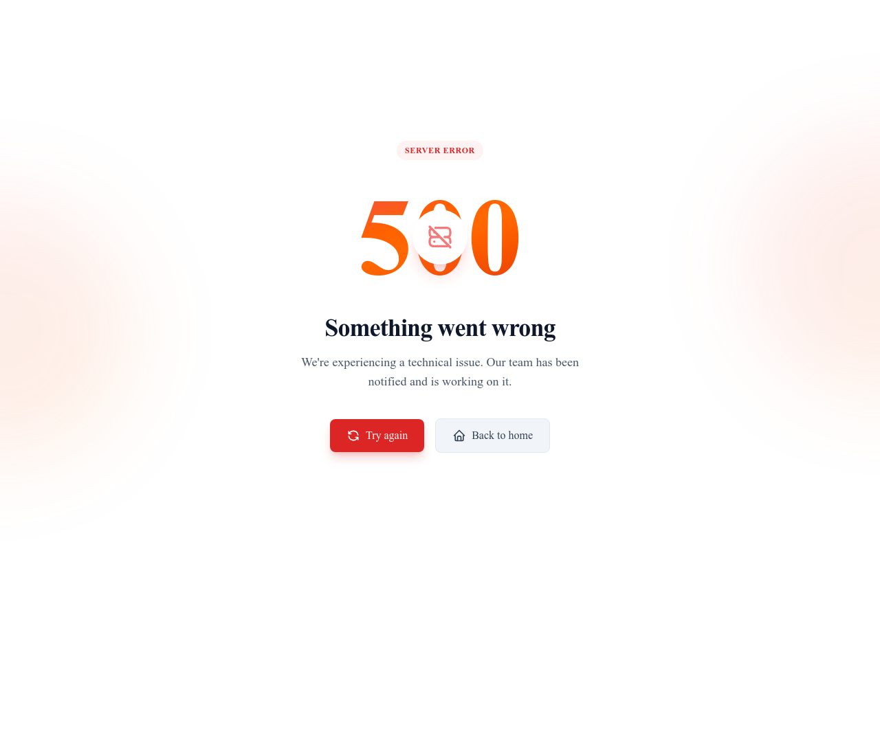
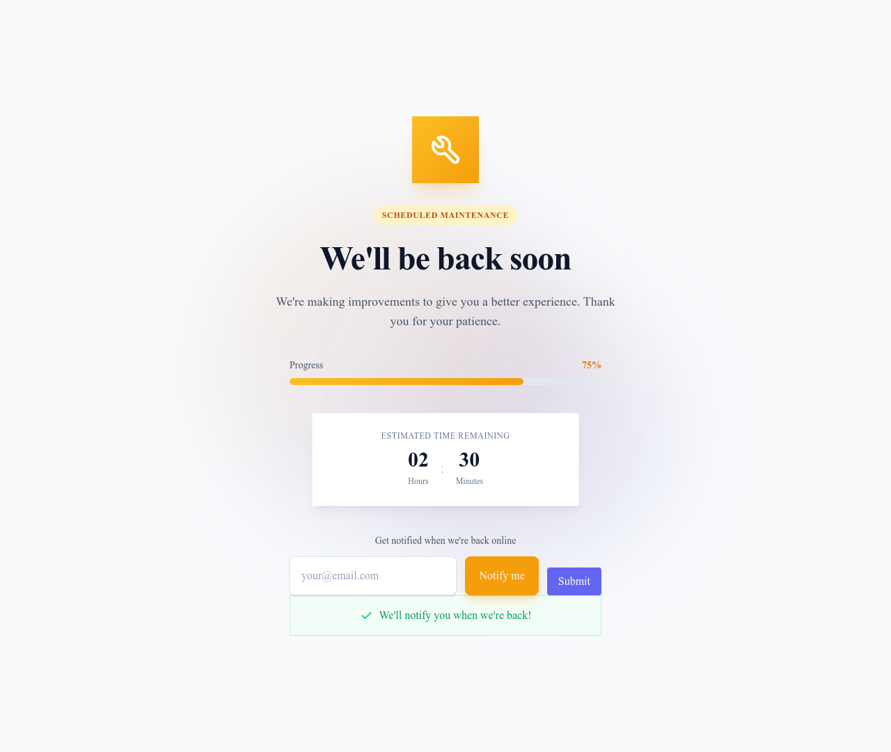
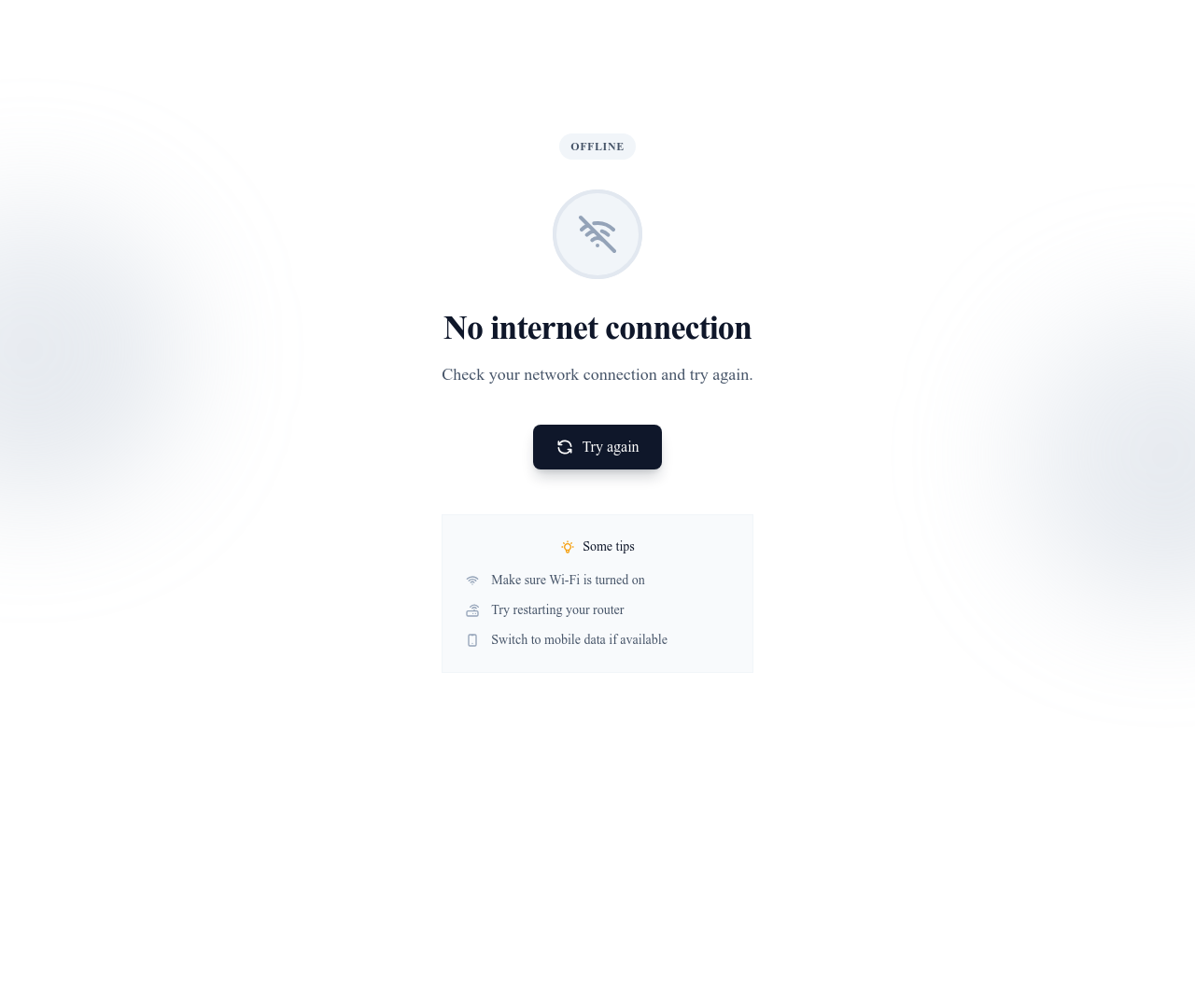
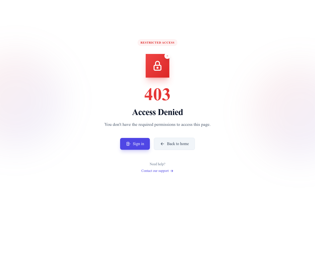
Les composants de cartes sont les plus polyvalents : utilisez-les pour des articles, des produits, des membres d’équipe ou des fonctionnalités à mettre en avant. Les champs de formulaire gèrent textes, listes de choix, interrupteurs et envois de fichiers, avec un style homogène d’un navigateur à l’autre. Les fenêtres modales et boîtes de dialogue présentent un contenu ciblé sans quitter la page. Badges, étiquettes et avatars ajoutent des informations visuelles aux listes et aux profils. Les tableaux affichent des données structurées, avec tri et défilement horizontal responsive sur mobile. Boutons, alertes, indicateurs de progression et séparateurs complètent la collection avec les éléments d’interface essentiels.
En quoi les composants diffèrent des sections
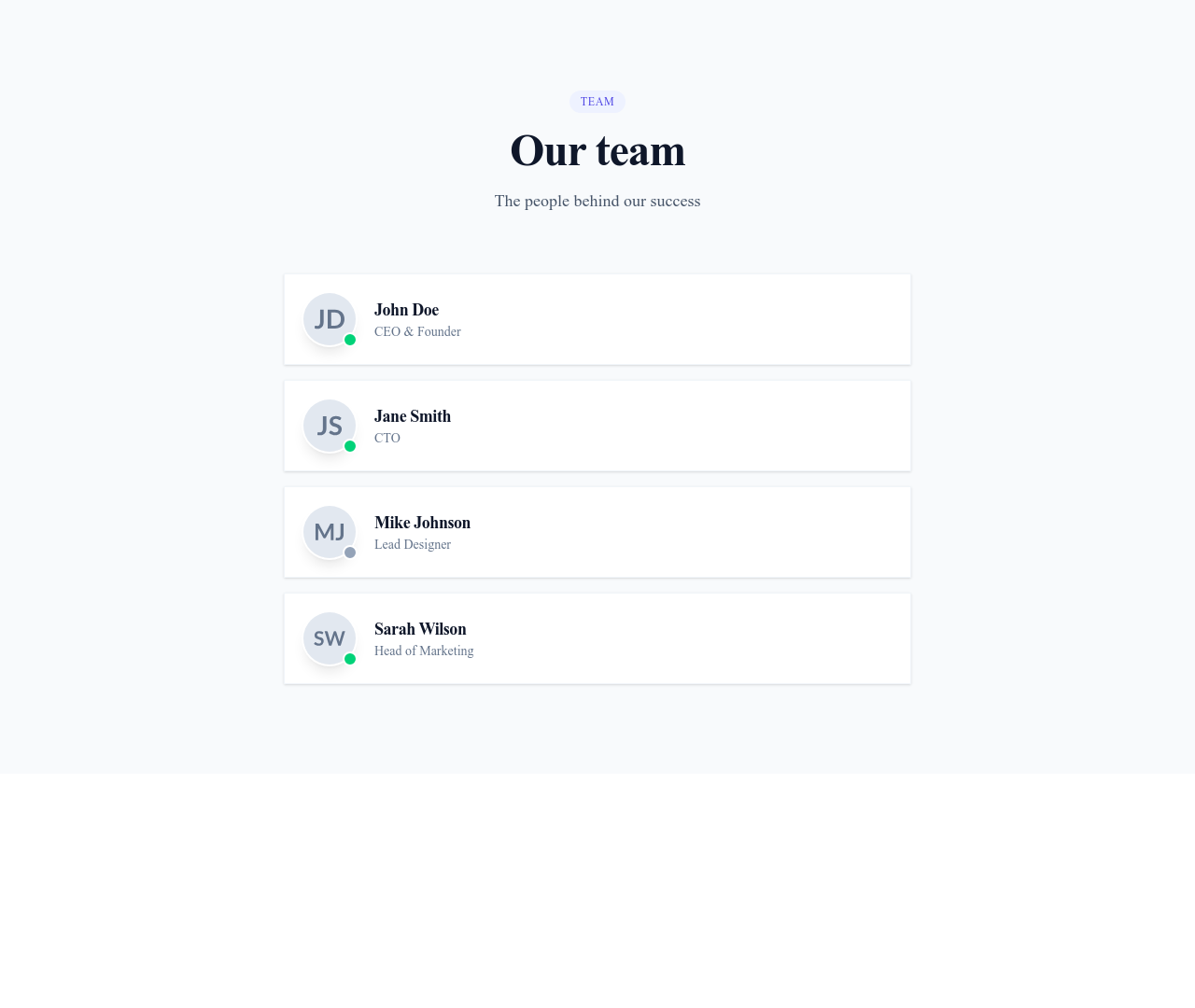
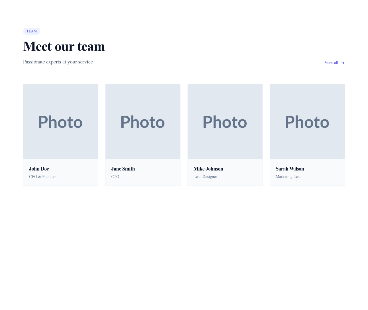
Les sections sont des blocs autonomes pleine largeur (par exemple une grille tarifaire qui occupe toute la largeur de la page). Les composants sont des éléments plus petits qui vivent à l’intérieur des sections. Une « section équipe » peut utiliser un composant de carte pour chaque membre, des badges pour les rôles et des avatars pour les photos. Cette approche modulaire permet de personnaliser les sections dans le moindre détail sans tout reconstruire.
Construits avec Tailwind CSS
Chaque composant utilise les classes utilitaires de Tailwind CSS, ce qui les rend faciles à personnaliser directement dans le code. Envie d’un arrondi différent pour une carte ? Remplacez rounded-lg par rounded-xl. D’autres espacements ? Ajustez les classes de padding. Ce système de styles cohérent garde tous les composants en harmonie, que vous construisiez un tableau de bord SaaS, un catalogue de produits ou un portfolio créatif. Les composants héritent aussi des couleurs du thème de votre site : ils s’adaptent quand vous passez d’un style sombre à un style minimaliste.
Questions
Quelle différence entre un composant et une section ?
Une section occupe toute la largeur de la page et constitue un bloc de contenu autonome (hero, tarifs, pied de page). Un composant est un élément plus petit et réutilisable (carte, bouton, badge) placé à l’intérieur d’une section. Les sections se composent de composants.
Puis-je utiliser ces composants en dehors de Communik ?
Oui. Les composants sont construits en HTML standard avec des classes Tailwind CSS. Vous pouvez copier le code dans tout projet qui utilise Tailwind CSS : ils ne sont pas liés à la plateforme Communik.
Comment personnaliser les couleurs d’un composant ?
Les composants héritent des couleurs du thème de votre site (principale, secondaire, neutre). Pour modifier un composant précis, éditez ses classes Tailwind dans l’éditeur de code, par exemple en remplaçant bg-primary-500 par bg-blue-600 ou toute autre couleur de votre choix.
Continuer l’exploration
Accordions Components
Browse accordions components templates
Alerts Components
Browse alerts components templates
Avatars Components
Browse avatars components templates
Blog Module
Complete blog feature with multiple design variants
About Page Templates
Full page layouts in the about category
Templates for Healthcare
Templates designed for healthcare businesses
Stripe Templates
Templates with Stripe integration support
Votre prochain site commence ici.
Tout ceci est à un clic.
Chaque section, composant, page et module de cette bibliothèque est prêt dans l’éditeur Communik, aux couleurs de votre marque.
Gratuit pour commencer. Sans carte bancaire.