Prepare component options for clients
A well-prepared component lets a client change content without rebuilding its design. Prepare the model with Expert visual controls, then offer useful instance properties.
A property is a field in the model. Creating it does not make it appear on the page automatically: connect it to text, a setting, a condition or a repeated list.
1. Prepare useful fields
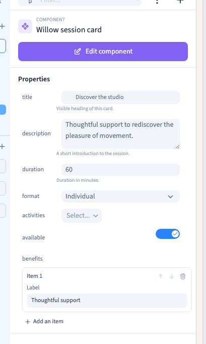
Select an instance, choose Edit component, then Add property. In Properties, enter a stable short name, choose the type, add a useful description and choose Create.
The sample uses title, description and duration. Spaces in names become underscores; use the description to explain what the client should enter.
| Need | Property type |
|---|---|
| Short heading | Text : single line |
| Presentation | Text : multi-line or rich text |
| Whole-number duration | Number without decimal |
| Amount | Decimal number |
| Enable an option | Switch or boolean |
| One answer | Select |
| Several answers | Select multiple |
| Structured repeated items | Group: list of items |
Set useful defaults so a newly inserted instance already makes sense.
2. Prepare choices
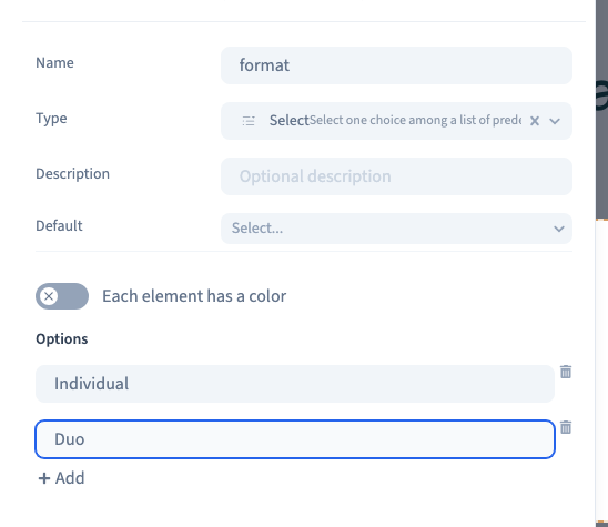
Create a Select property and open it in the property list. Under Options, use Add for each choice and enter its label. The demonstration prepares Individual and Duo.
Use Select multiple when several answers may coexist. Its choices are prepared in the same way. The builder manages their identifiers.
Prefer renaming a label to deleting and recreating an option already in use. Recheck defaults and existing instances after changes. An option colour distinguishes choices in their editing interface; it does not automatically recolour your page.
Could not play. Try the video controls.
Could not play. Try the video controls.
3. Prepare a visual list
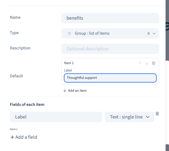
Create Group: list of items and open it. Under the item's fields, choose Add field, give the field a label and select its type: short text, multi-line text, integer or switch.
The example creates a Label field and one default benefit, Thoughtful support. Each item has its own fields. Arrows reorder items and the bin removes them; no JSON entry is needed.
The key remains stable after a label is renamed, preserving existing values and bindings. Plan a replacement before deleting a field used by the design.
Could not play. Try the video controls.
4. Connect the fields to the result
While editing the model, select the text or setting and use its data selector to choose the component property. Save and test an instance.
For a list, configure the repeated container's loop to read the list property, then bind its texts to the current item's fields. A list in the property panel does not automatically repeat a section.
For conditional visibility, add Condition to the relevant element and select the controlling property through its data selector. Test enabled and disabled values. A boolean is appropriate for a simple show-or-hide option.
The media here focuses on field preparation and instance controls; data connections and conditions have their own reference articles.
5. Allow translation
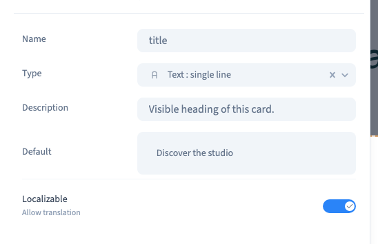
For suitable types, enable Allow translation under Localizable for content that should vary by language, such as a title. Type-specific settings appear after property creation.
This permits translation; it does not translate the words. Save, reopen and check the setting, then inspect the languages used on the site and longer phone text.
Could not play. Try the video controls.
6. Test the client's experience
Leave model editing and select an instance. Change its title, duration, choices and list. Confirm another instance keeps its own values. Reset a field to recover the model or selected variant's default.
Switch to Easy and check the actual selection and available commands there. Save, reload and inspect staging on desktop and phone. For connected lists and conditions, test empty as well as populated values.