
Compare screen sizes and use the preview
Comparing screen sizes helps you spot reading and layout problems before changing the design.
Could not play. Try the video controls.
1. Display several sizes
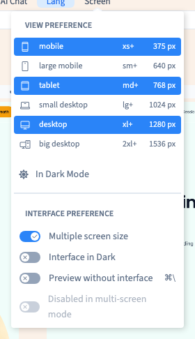
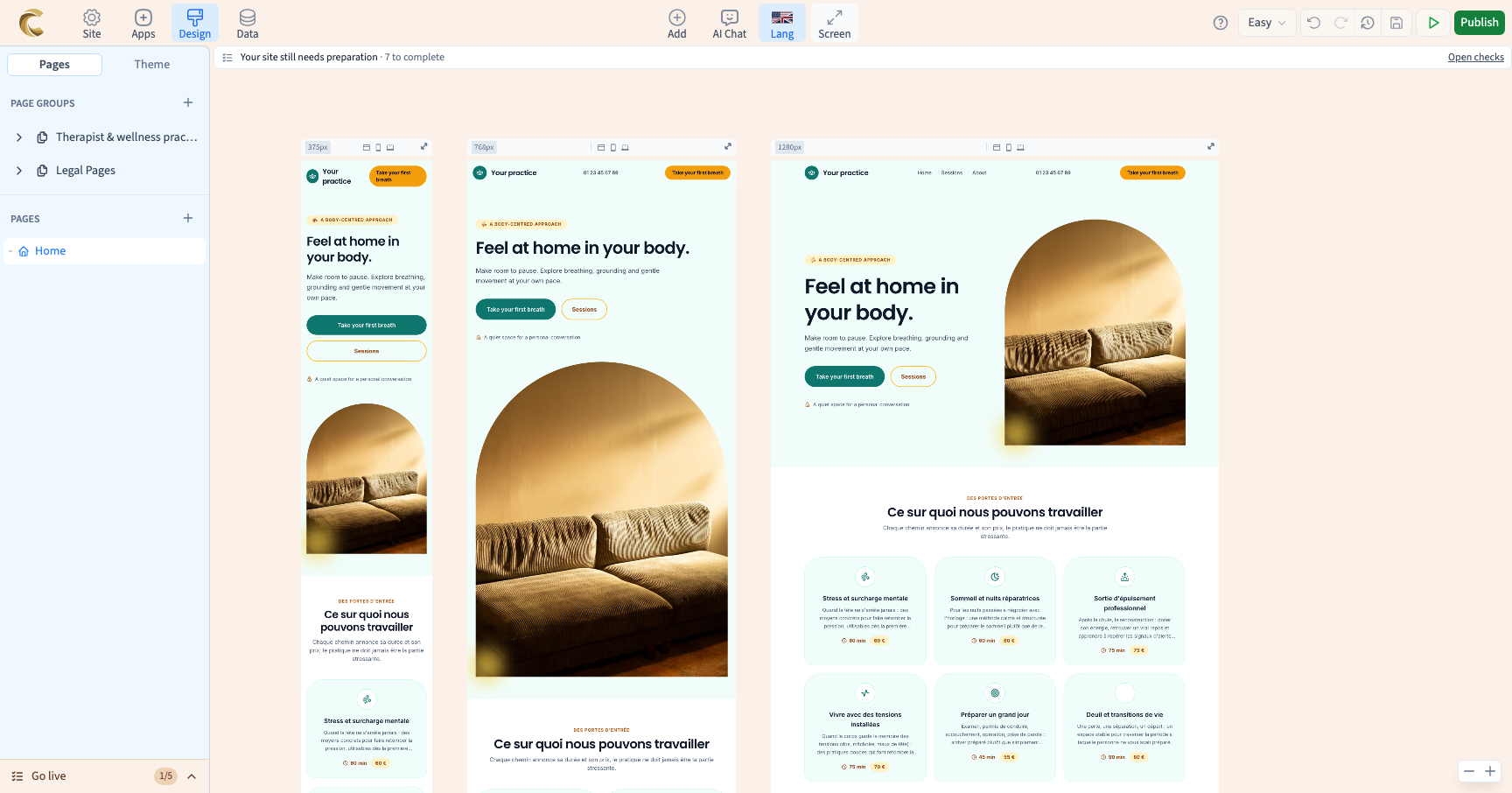
Open Screen in the top bar. Enable Multiple screen size. Several frames appear side by side: they show the same page at different widths.
The demonstration starts with one frame, enables the three selected sizes, then returns to one frame before opening the visitor preview.
2. Choose useful frames
Use the sizes in Screen to show or hide a frame. For example, keep desktop, tablet and mobile to compare headings, images and buttons.
A frame's width lets you observe the page. It does not automatically create a style rule for that width.
3. Check what matters
Look at heading lengths, line breaks, image crops and the space around buttons. The content is shared by the frames in the same language. Editing text can therefore change what appears in several frames.
4. Try the visitor preview
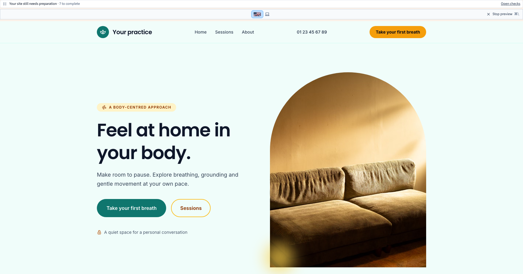
Return to one frame and choose the width you want to test. Enable Preview without interface in Screen. Try your links and in-page navigation, then leave the preview to continue editing.
The preview command is disabled while multiple screen sizes are enabled. Turn off Multiple screen size first.
If you need to adapt the design
Use the visual style controls and screen rules to change a value for particular widths. Check existing conditions: another rule may take priority. Resizing a frame and changing a style condition are separate actions.
A preview is useful for checking interactions, but you should also check a published preview version before making your site public.