
Choose a mobile or tablet frame
A frame shows the same page at another width. Use it to check whether headings still fit, buttons remain visible and a grid reads clearly on a phone before publishing.
Changing the frame does not create another page or add a style rule.
1. Choose a screen format
In Design, open Screen. For one working frame, disable Multiple screen size if enabled, then choose the width.
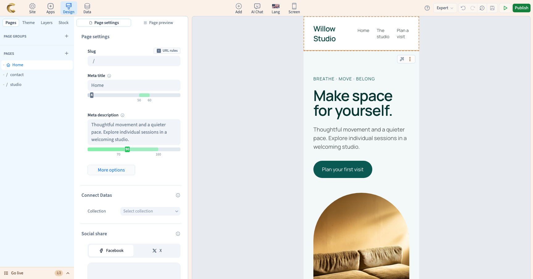
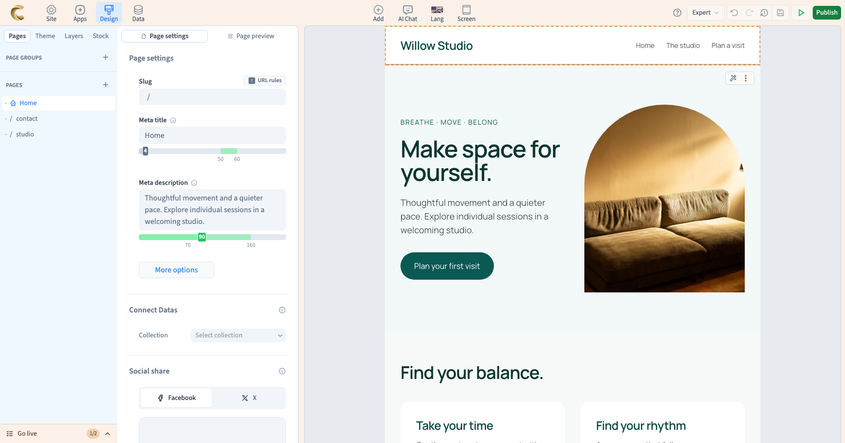
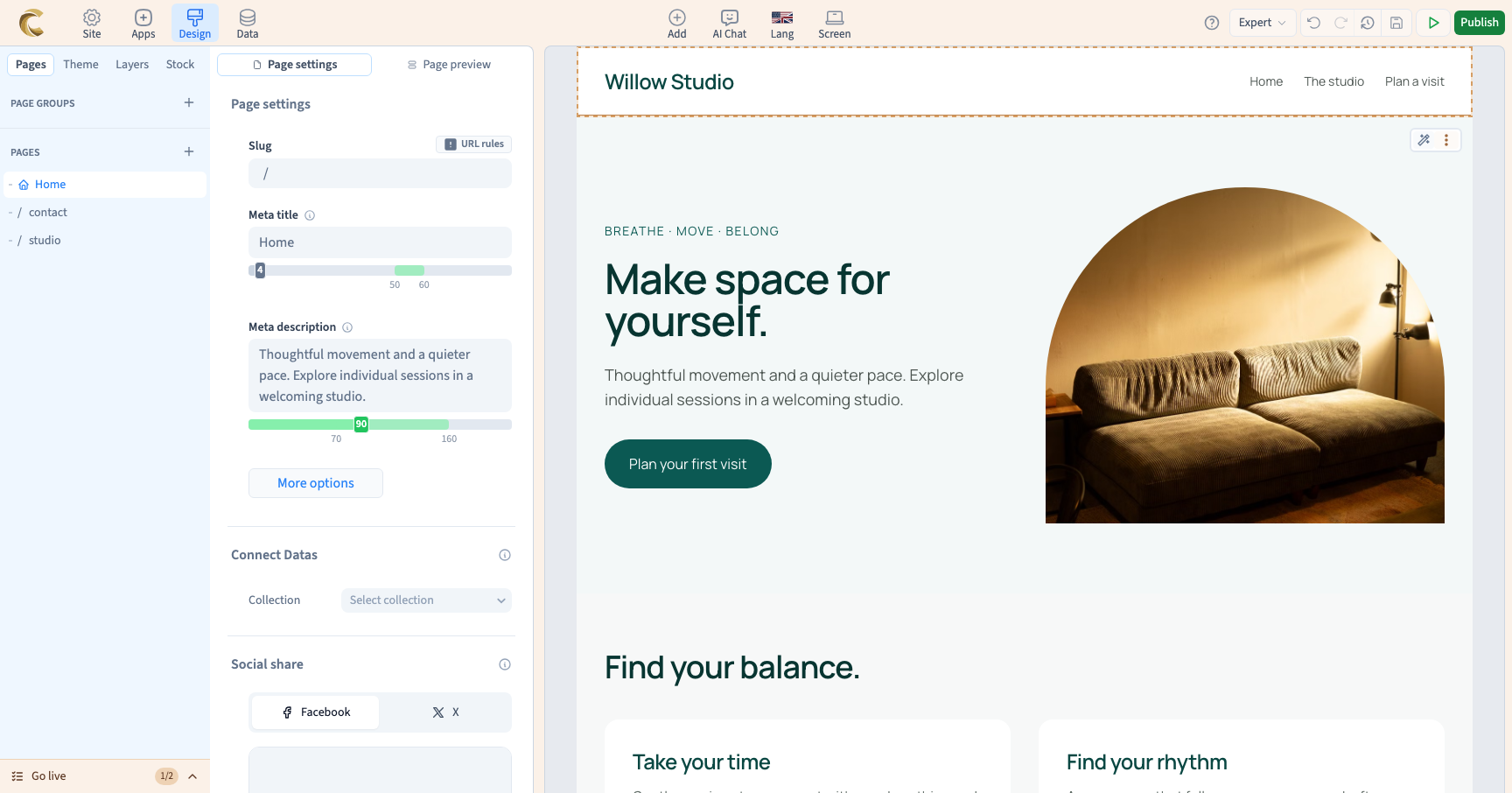
The demonstration visits a 375 px phone, a 768 px tablet and a 1024 px desktop frame. The content stays the same; existing styles adapt its layout to the available width.
These formats are useful checkpoints, not a list of every visitor device. A phone or browser window may use an intermediate width.
Could not play. Try the video controls.
2. Check intermediate widths
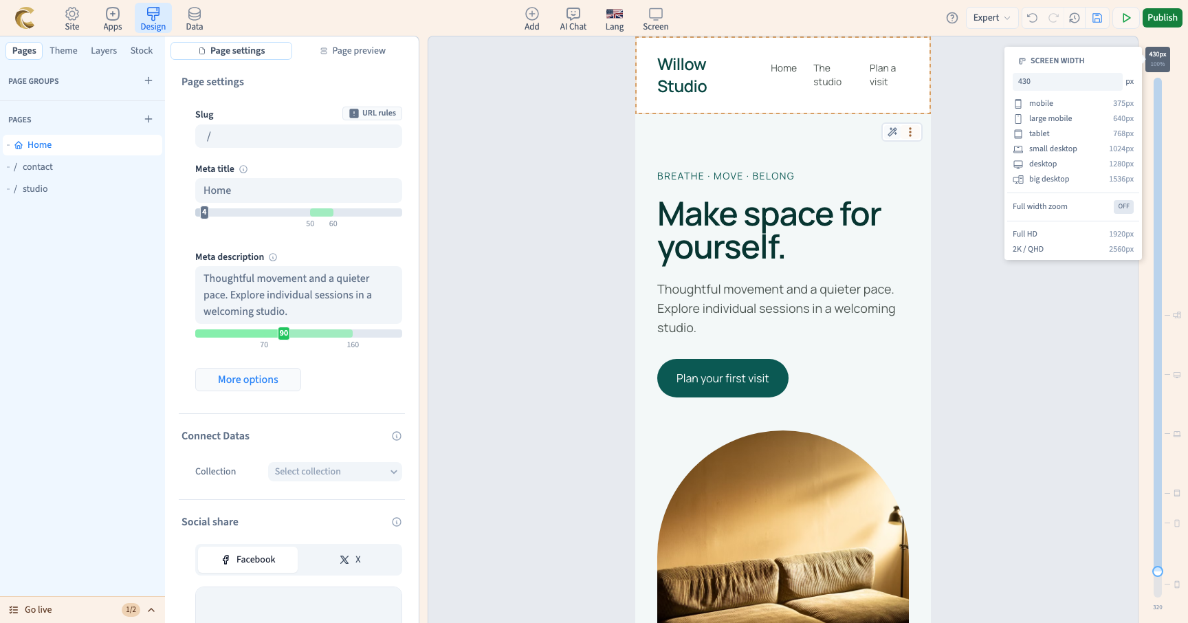
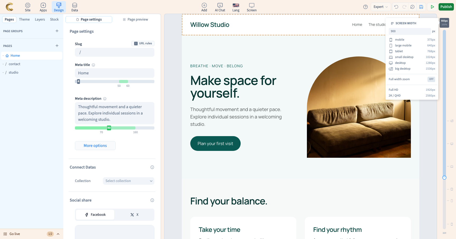
Two successful presets do not prove that every width works. In Screen, choose custom. A ruler appears beside the page. Click the width label, enter a pixel value and press Enter.
The demonstration checks 430 px and 900 px. Inspect heading wraps, buttons and images. You can also drag the ruler to explore widths between presets. The field accepts 320 to 2560 px.
Frame width and working zoom have different jobs: width controls layout calculations; zoom controls how large the frame looks on your screen.
3. Return to the browser frame
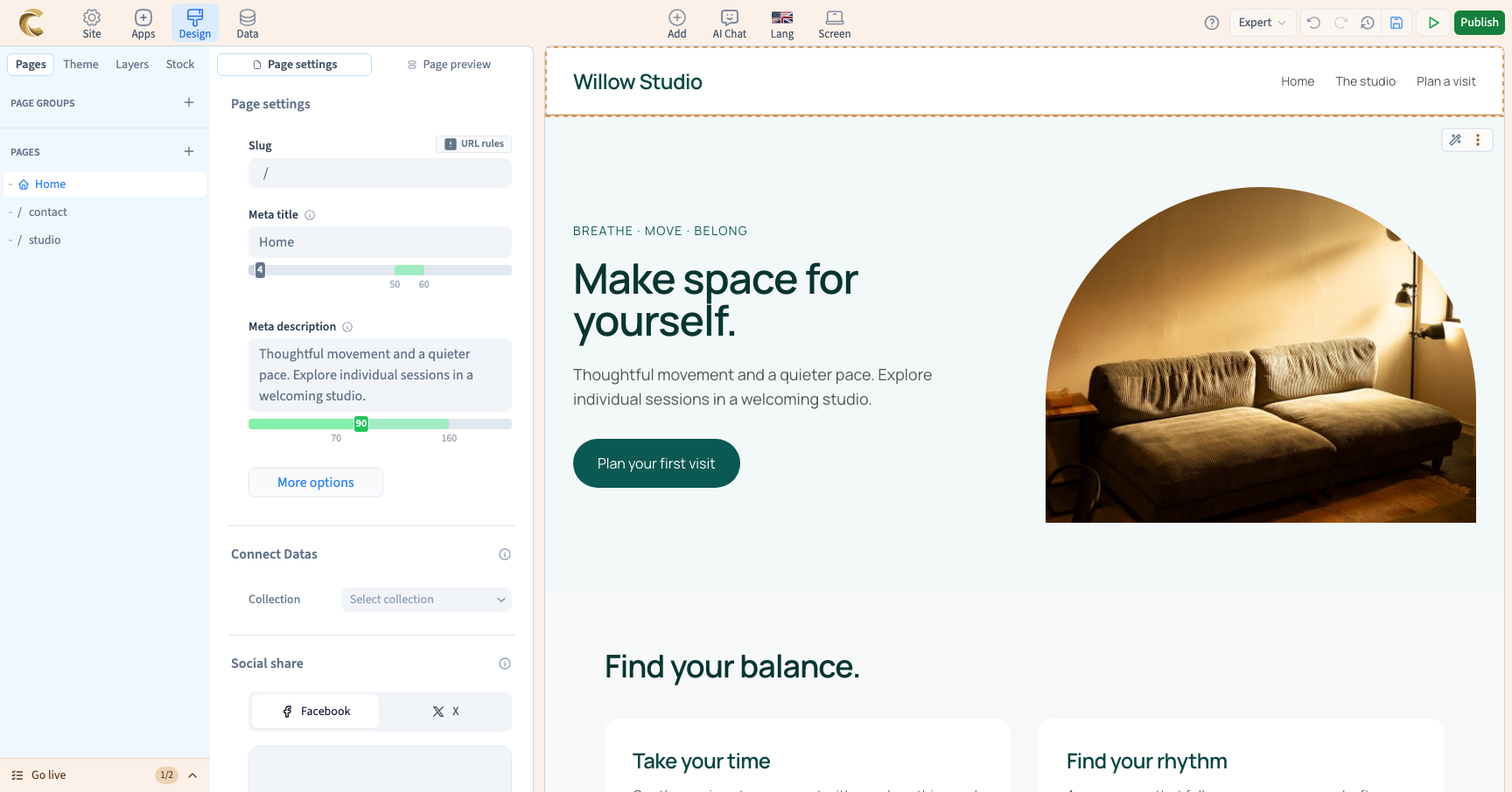
Open Screen and choose navigator (the browser width). The page uses the width available in your workspace again. Alternate between this frame and fixed formats as needed. These working preferences do not change page content.
4. Understand what actually changes
A frame shows the result of existing styles. Adding a colour or size without a condition can affect several widths. Looking at the phone frame does not automatically restrict an edit to phones.
Use screen rules to change the design by width. Use side-by-side frames to compare several layouts at once. Before publishing, inspect both presets and intermediate widths, especially headings, images, menus and buttons.