
Structure headings and name elements for accessibility
1. Give headings a meaningful order
Choose one main heading for the page, then use level-two headings for its main sections. Add a level-three heading when it belongs inside a level-two section. Use the visual styles separately to change size, weight or spacing.
2. Check the selected element in the builder
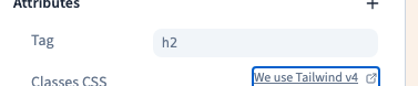
In the no-code element settings, open Attributes and inspect its type. Choose the heading level that fits the structure. The example shows a section heading changing to H3 and then returning to H2 under the main page title.
Could not play. Try the video controls.
3. Name controls and images when needed
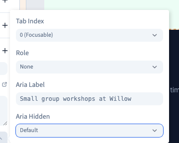
Use descriptive button and link text. Add an accessible name where a control, such as an icon button, needs one. Add alternative text to informative images. Keep accessible labels concise and aligned with any wording visible on the page.
4. Verify the generated page
Publish a test version. Check the heading order and accessible names in the browser. Use the keyboard to follow links and reach important controls without the mouse. Test the content at a narrow width as well.