
Set typography and readability
Typography gives a page its hierarchy: a heading attracts attention and a paragraph should be easy to read. These settings apply to the entire selected element, using visual controls.
1. Open the text settings
In Design, choose Expert and select the heading or paragraph. Open Text in the element panel. It includes Size, Weight, Font family, Color, Line height and letter spacing.
If a setting is not shown yet, add it with the group's plus button. Leave typing mode before changing the element's styles.
2. Choose the font family
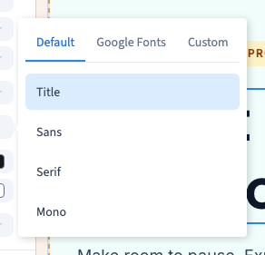
Click Font family. The selector offers three sources:
- Default: theme choices and basic families such as Title, Sans, Serif and Mono.
- Google Fonts: a searchable font library.
- Custom: font files imported into the project.
Click a font and inspect the page. In the video, Serif changes the heading's family without changing its words.
A theme choice helps maintain a shared appearance. Choosing a family directly for an element customises that element; it does not redefine the fonts of the whole site.
Could not play. Try the video controls.
3. Set size and weight
In Size, choose a preset or enter a manual value with an available unit. px gives a fixed pixel size; rem relates it to the reference text size. Start with presets if these controls are new to you.
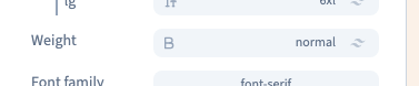
In Weight, choose the thickness. Normal suits ordinary text; semibold and bold add emphasis. The chosen font needs to offer a weight for its exact design to be available. Greater weight does not replace a useful size difference between heading and paragraph.
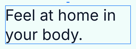
The video applies Normal to the whole heading. To make just one word bold, return to typing mode, select the word and use the text toolbar.
4. Allow space and keep good contrast
Line height controls the distance between lines. Increase it if a paragraph feels cramped. Letter spacing changes the gap between letters; very tight spacing can make small text hard to read.
Color sets the element's colour. Check it against the real background, especially if there is a photograph behind it. Prefer clear contrast over a colour close to its background.
Change one setting at a time and inspect a full sentence, not one isolated word. The text area's width also affects line breaks.
5. Check mobile, then save
Open Screen to compare mobile, tablet and desktop. If a heading is too large on mobile, choose a suitable base size and add a screen rule for larger widths. Use the visual controls.
Click Save after checking. Saving and publishing are separate actions.
If some words do not follow the setting
Words may already have their own colour or size. Those local formats can remain when you change the whole element. Edit the selected words or use Aa → Clear formatting after selecting them.