
Sections · 45 éléments
Des appels à l’action conçus pour maximiser les clics
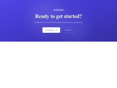
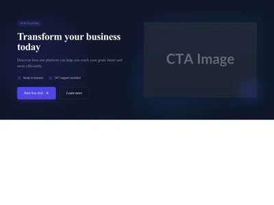
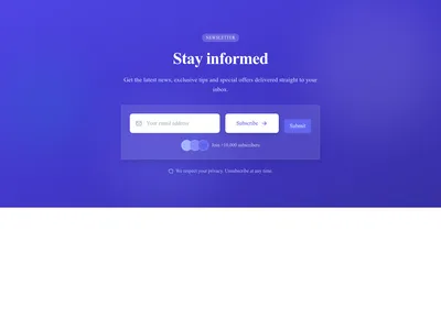
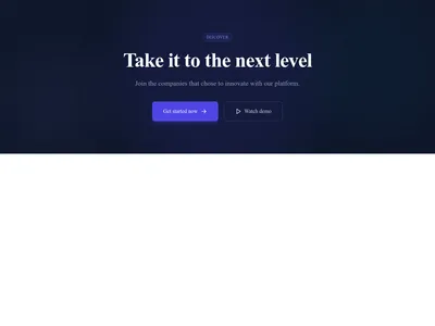
Des sections d’appel à l’action orientées conversion, de la bannière affirmée à l’invitation discrète. Chaque design est pensé pour générer inscriptions, téléchargements et achats.
Parcourir · Catégories
Des appels à l’action conçus pour maximiser les clics
45 éléments
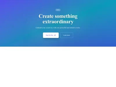
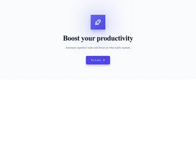
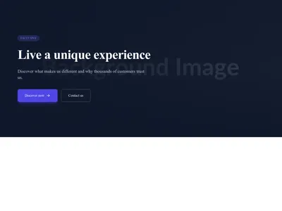
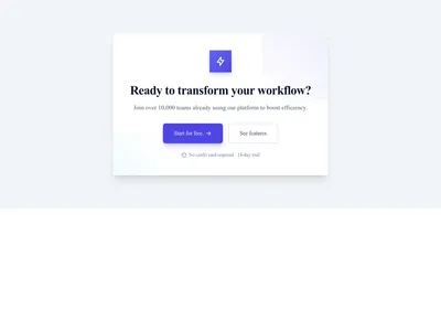
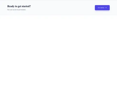
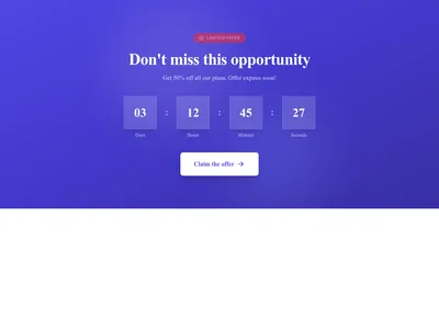
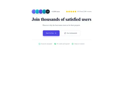
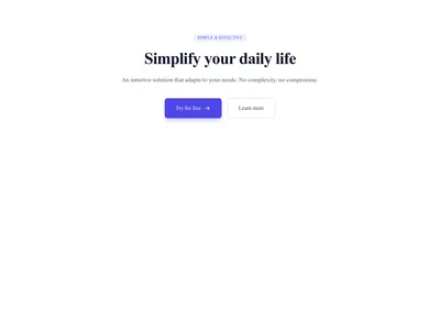
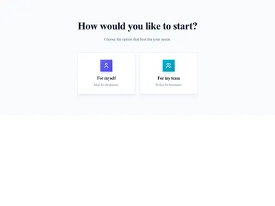
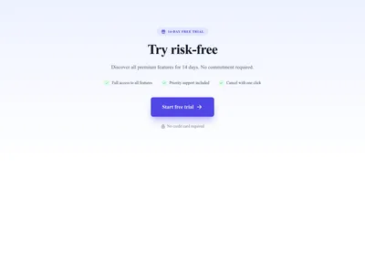
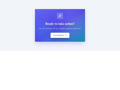
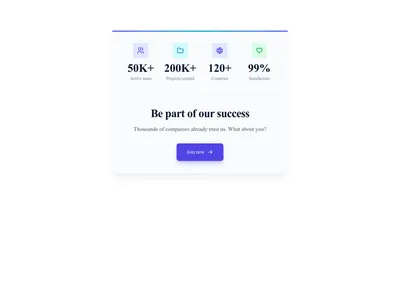

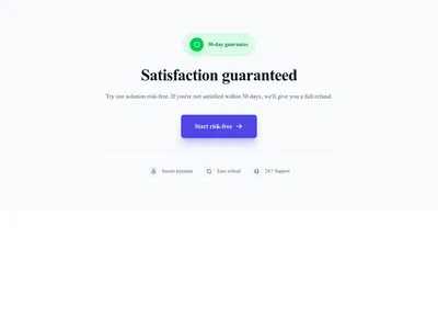
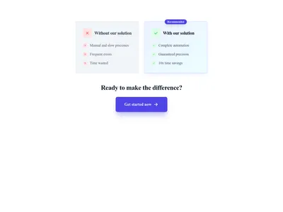
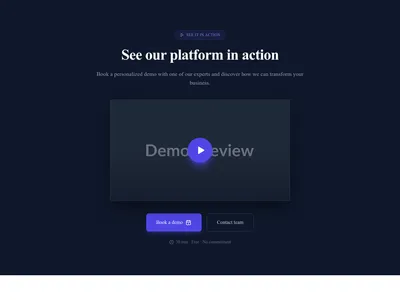
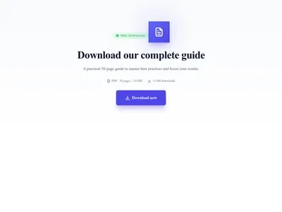
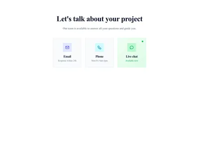
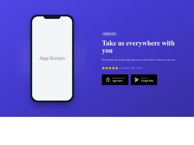
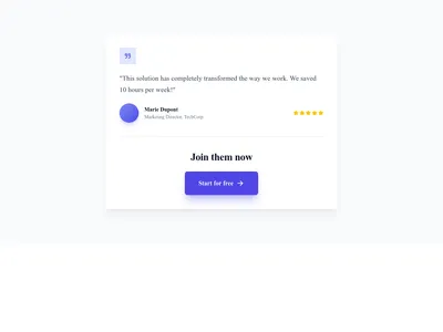
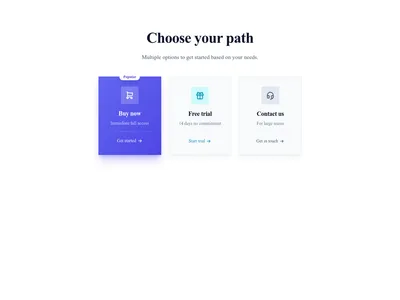
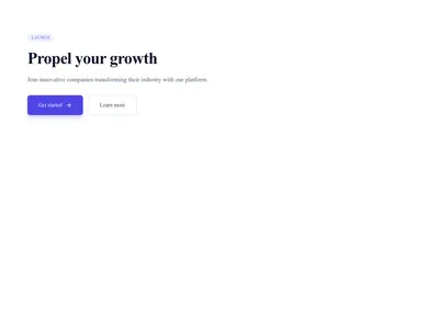
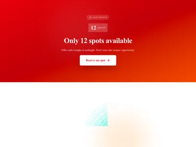
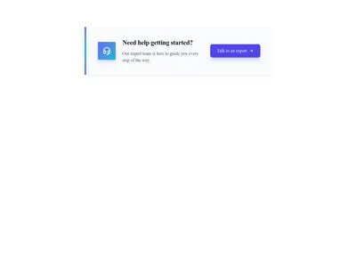
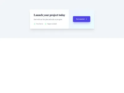
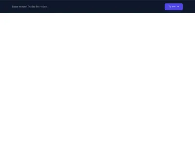
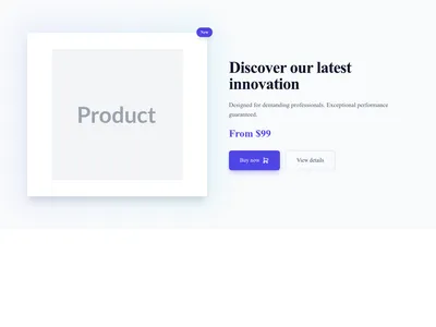
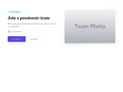


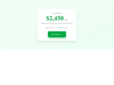
CTA Calculator Result
CTA affichant un résultat de calculateur avec économies potentielles
Appel à l’action
Rien ne correspond à ce filtre.
Guide
Chaque page doit proposer au visiteur une étape suivante claire. Un appel à l’action dit exactement quoi faire : s’inscrire, acheter, télécharger ou prendre contact. Nos 45 modèles d’appel à l’action s’appuient sur la psychologie de la conversion : contraste marqué, texte concis et emplacements stratégiques qui ont fait leurs preuves pour augmenter le taux de clic dans tous les secteurs.
Un style d’appel à l’action pour chaque contexte
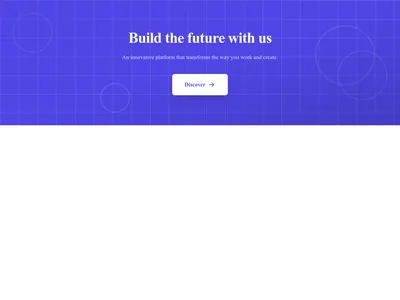
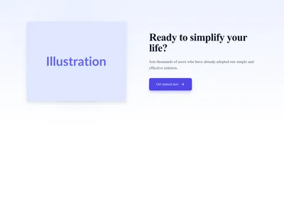
La bannière pleine largeur fonctionne surtout en section de clôture : un récapitulatif visuel fort en bas de page, qui pousse à agir avant que le visiteur n’atteigne le pied de page. L’appel intégré prend place au sein du contenu et paraît naturel dans les pages longues ou les articles de blog. L’appel scindé associe côte à côte une image forte, un titre et un bouton, idéal après une section de fonctionnalités. La barre flottante reste fixée en haut ou en bas de l’écran pour une visibilité constante sans être envahissante : elle reste présente pendant que le visiteur parcourt les autres sections.
Rédiger un appel à l’action qui convertit
Beaucoup d’appels à l’action parlent à la première personne (« Démarrer mon essai gratuit » plutôt que « Démarrez votre essai gratuit ») : une formulation à tester en A/B auprès de votre propre public. Soyez précis sur la valeur (« Recevoir 50 modèles gratuits » fait mieux que « S’inscrire »). Créez de l’urgence quand elle est réelle (« Offre valable jusqu’à vendredi »). Doublez le bouton principal d’un lien secondaire pour les visiteurs qui ne sont pas encore prêts (« En savoir plus » ou « Voir les tarifs »). Évitez les libellés vagues comme « Envoyer » ou « Cliquez ici » : ils ne donnent aucune raison d’agir.
Placer ses appels à l’action
Placez un appel à l’action après votre section hero, un autre après vos témoignages, et un dernier en clôture avant le pied de page. Sur les longues landing pages, répétez-le toutes les 2 ou 3 sections avec une formulation légèrement différente, pour toucher les visiteurs à chaque étape de leur réflexion. Utilisez les grilles tarifaires comme appels à forte intention pour ceux qui sont prêts à comparer les formules, et les formulaires de contact comme alternative peu engageante pour ceux qui explorent encore.
Questions
Combien d’appels à l’action sur une landing page ?
Une landing page devrait en compter 2 à 4 : un en haut de page, un après votre proposition de valeur et un en section de clôture. Garder la même action avec des formulations variées évite la lassitude tout en renforçant l’objectif de conversion.
De quelle couleur doit être mon bouton d’appel à l’action ?
Votre bouton doit trancher nettement avec son environnement. Il n’existe pas de « meilleure » couleur universelle : ce qui compte, c’est la visibilité. Un bouton vif sur un fond neutre attire l’œil. Testez plusieurs couleurs pour trouver celle qui parle à votre public.
Quelle longueur idéale pour le texte du bouton ?
Gardez le texte du bouton entre 2 et 5 mots. Les verbes d’action fonctionnent le mieux : « Commencer gratuitement », « Télécharger maintenant » ou « Voir les tarifs ». Évitez les libellés vagues comme « Envoyer » ou « Cliquez ici ».
Continuer l’exploration
About Sections
Browse about sections templates
Blog Sections
Browse blog sections templates
Commerce Sections
Browse commerce sections templates
Blog Module
Complete blog feature with multiple design variants
About Page Templates
Full page layouts in the about category
Templates for Nonprofit
Templates designed for nonprofit businesses
WhatsApp Templates
Templates with WhatsApp integration support
Votre prochain site commence ici.
Tout ceci est à un clic.
Chaque section, composant, page et module de cette bibliothèque est prêt dans l’éditeur Communik, aux couleurs de votre marque.
Gratuit pour commencer. Sans carte bancaire.