
Sections · 59 éléments
Des sections hero qui captent l’attention immédiatement
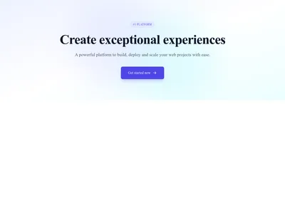
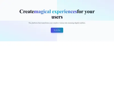
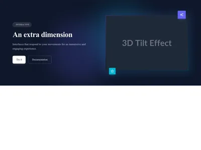
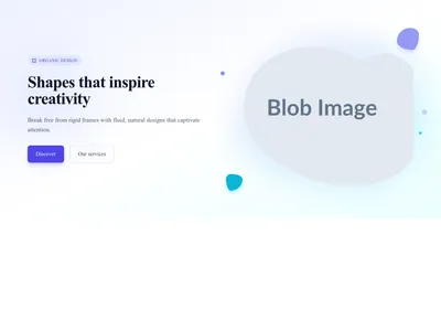
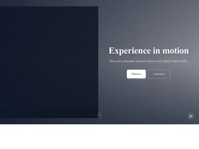
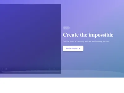
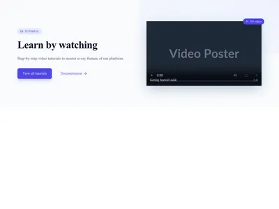
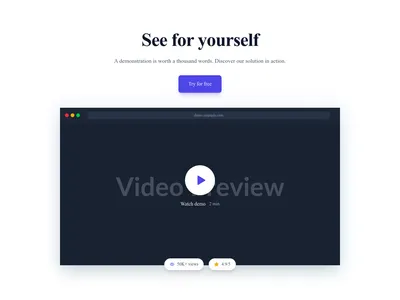
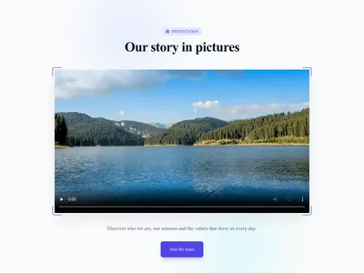
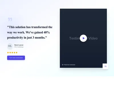
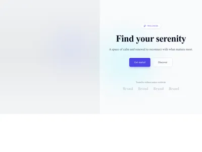
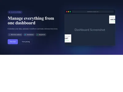
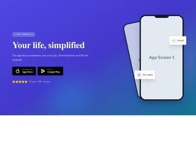
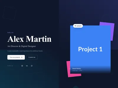
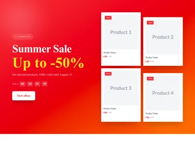
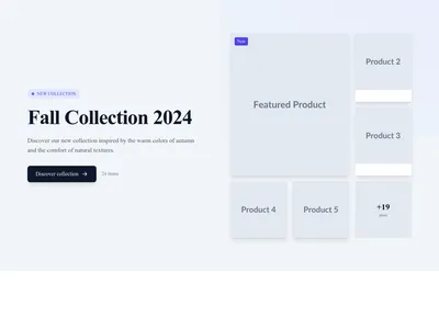
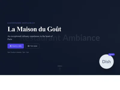
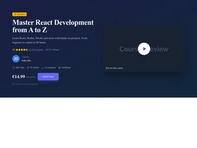
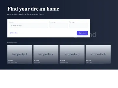
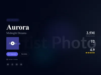
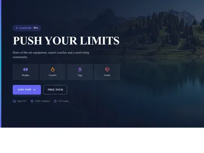
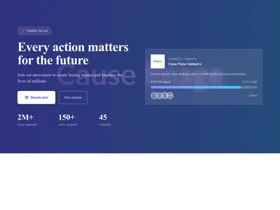
Des sections hero percutantes, conçues pour exprimer votre proposition de valeur en quelques secondes : fonds plein écran, vidéo, mises en page scindées, textes animés et dégradés en surimpression.
Parcourir · Catégories
Des sections hero qui captent l’attention immédiatement
59 éléments



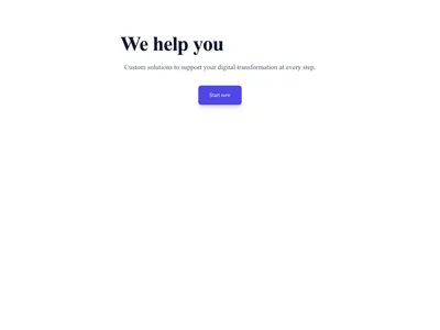
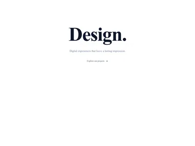
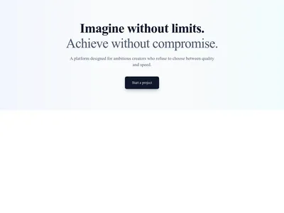
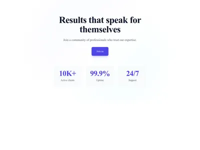
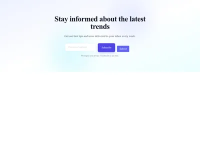

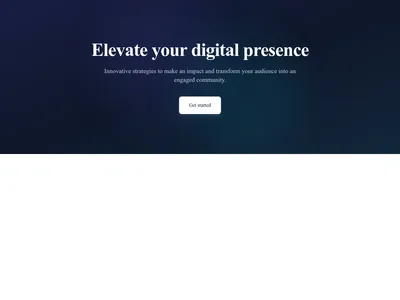

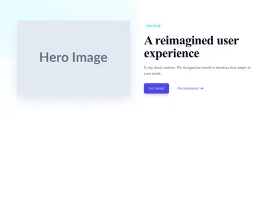
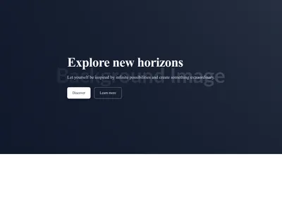
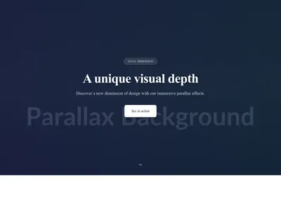
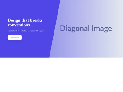
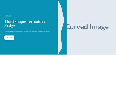




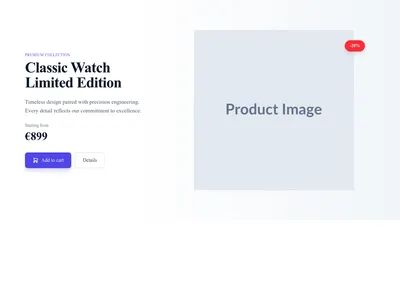
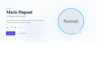
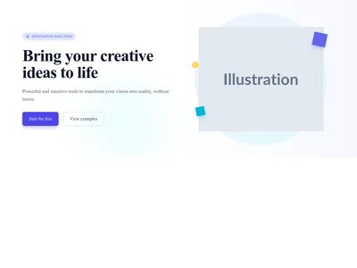
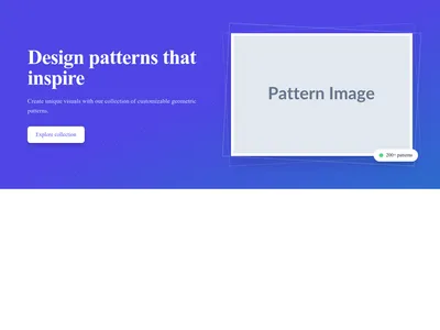





Rien ne correspond à ce filtre.
Guide
La section hero est la première chose que voient les visiteurs en arrivant sur votre page. Selon les études, vous disposez d’environ trois secondes pour convaincre quelqu’un de rester : c’est pourquoi un haut de page bien pensé compte plus que presque tout autre élément de votre site. Ces 59 modèles de section hero vous font gagner du temps avec des mises en page éprouvées, qui allient visuels marquants, message clair et appels à l’action convaincants.
Choisir la bonne mise en page de hero
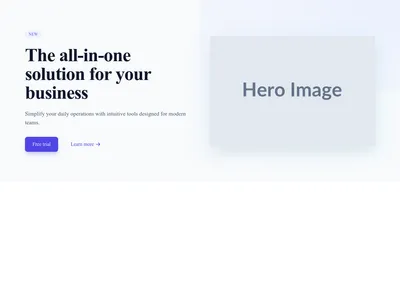
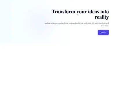
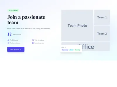
Le hero avec image plein écran produit l’impact visuel maximal et convient aux marques qui disposent de belles photos : pensez aux sites de restaurant qui mettent en avant leur plat signature, ou aux portfolios qui ouvrent sur un projet phare. Le hero scindé place le titre d’un côté et une image ou une illustration de l’autre : c’est la mise en page de référence pour les produits SaaS et les landing pages de startups. Le hero avec fond vidéo ajoute du mouvement et raconte une histoire, idéal pour les agences et les marques créatives. Le hero minimaliste, purement textuel, met le message au premier plan ; il a la faveur des designs minimalistes qui laissent la typographie faire le travail.
Bonnes pratiques pour un hero
Limitez votre titre à 10 mots et assurez-vous qu’il exprime un bénéfice clair. Placez votre appel à l’action principal en haut de page, bien contrasté : le visiteur ne doit jamais avoir à défiler pour trouver l’étape suivante. Préférez une seule image ou vidéo à un collage chargé. Gardez le texte lisible sur les fonds en ajoutant un voile, ou choisissez des modèles qui gèrent le contraste d’origine. Ajoutez un discret indicateur de défilement pour inviter à explorer la suite.
Côté performance
L’image du hero est généralement l’élément Largest Contentful Paint (LCP) de la page, ce qui la rend décisive pour les scores Core Web Vitals. Nos modèles utilisent des images responsive (srcset) au format WebP, le chargement différé pour les hero situés plus bas et des vidéos optimisées avec image d’attente, pour des temps de chargement courts. Associez votre hero à un en-tête de navigation léger au-dessus, et pensez à ajouter juste en dessous un bandeau de logos pour une preuve sociale immédiate.
Questions
Qu’est-ce qu’une section hero ?
La section hero est la grande bannière bien visible en haut d’une page web. Elle comprend généralement un titre, un sous-titre, un bouton d’appel à l’action et une image ou une vidéo de fond. Elle sert à transmettre immédiatement le message principal de la page.
Qu’est-ce qui fait une bonne section hero ?
Une section hero efficace réunit un titre clair et concis, un visuel fort, un appel à l’action bien visible et un chargement rapide. Elle doit faire passer votre proposition de valeur dans les trois secondes qui suivent l’arrivée du visiteur.
Vaut-il mieux une vidéo ou une image en fond de hero ?
L’image convient quand vous avez de bonnes photos et visez un chargement rapide. La vidéo est idéale pour raconter une histoire ou présenter un produit complexe, mais elle alourdit la page. Si vous l’utilisez, limitez-la à 15 secondes, coupez le son par défaut et prévoyez une image fixe de repli pour les connexions lentes.
Comment rendre le texte du hero lisible sur une image de fond ?
Ajoutez un voile semi-transparent (sombre ou clair selon la couleur du texte), placez le texte sur une zone peu chargée de l’image, ou choisissez des modèles avec dégradé intégré qui assurent le contraste automatiquement.
Continuer l’exploration
About Sections
Browse about sections templates
Blog Sections
Browse blog sections templates
Call to action Sections
Browse call to action sections templates
Blog Module
Complete blog feature with multiple design variants
About Page Templates
Full page layouts in the about category
Templates for Education
Templates designed for education businesses
Instagram Templates
Templates with Instagram integration support
Votre prochain site commence ici.
Tout ceci est à un clic.
Chaque section, composant, page et module de cette bibliothèque est prêt dans l’éditeur Communik, aux couleurs de votre marque.
Gratuit pour commencer. Sans carte bancaire.