
Adapt the layout for phone screens
A responsive layout rearranges the same content rather than maintaining separate phone and desktop copies. First make the smallest width readable, then add space and columns where they fit.
Use the visual Expert controls throughout this guide. No code is needed.
1. Select the parent container
Use Layers to select the container that holds the cards. Its layout settings organise its children. Selecting the heading inside a card will not change the arrangement of the whole collection.
Keep the content order meaningful. A visitor should understand the page when the cards stack into a single column.
2. Keep a simple small-screen layout
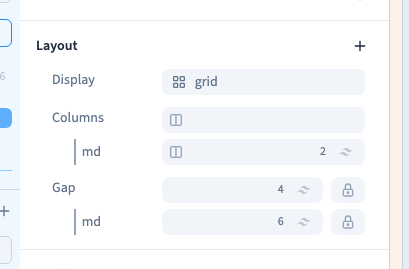
For a card grid, keep a single column in the base layout. Give the cards enough width to remain readable. Add a Tablet condition to the number of columns and choose 2 for md and larger widths.
The demonstration starts from an existing two-column tablet rule, briefly compares three columns, then selects two again before changing spacing. It does not create separate copies of the cards. Clicking an already selected option can remove that value, so read its active state before selecting it.
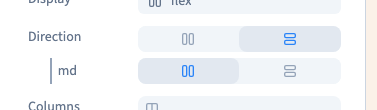
For a Flex layout, select Display: Flex on the parent. Add Direction in Layout if needed and choose Column on the base line. Add a Tablet condition to Direction and choose Row on its md line. You now have a column below 768 px and a row from 768 px upwards, unless another rule overrides it. The second demonstration verifies both widths.
Check wrapping and child widths too; direction alone does not prevent overflow. Changing direction keeps the same content and element order.
Could not play. Try the video controls.
Could not play. Try the video controls.
3. Adapt the gap
In Layout, choose Gap. Set a base gap of 4, or 16 px. Add a Tablet condition to that same setting and choose 6, or 24 px.
Gap belongs to the parent and separates its children. Use padding for space inside the container and margins for an individual element's outside spacing. Avoid combining all three without checking their accumulated space.
4. Compare real widths
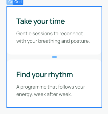
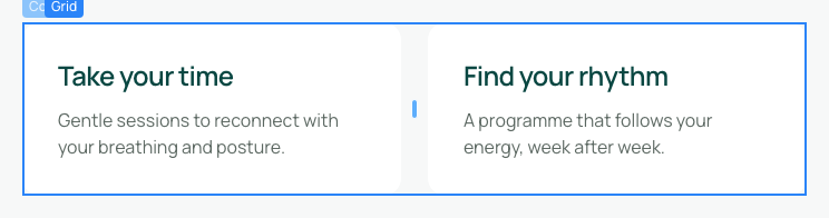
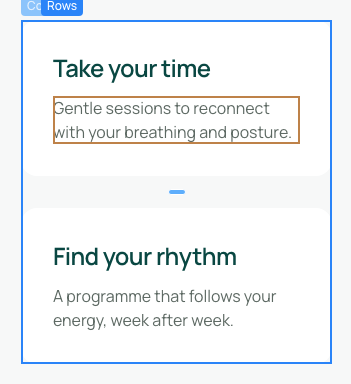
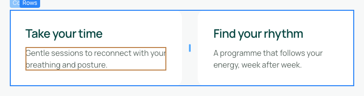
At 375 px, the demonstration verifies one column and a 16 px gap. At 768 px and 1,024 px, it verifies two columns and a 24 px gap. The two cards and their text remain present throughout.
Inspect long headings, images and buttons as well. If a layout overflows, check fixed widths, minimum widths and neighbouring spacing before adding another condition.


5. Save and inspect the visitor preview
Save and reload to verify the rules persist. Test both small and wide previews. Check that controls remain easy to use and that the visual order matches the reading order.
A width rule applies from its threshold upwards until another rule overrides it. It does not mean “only on this named device”.
Continue
Understand screen thresholds · Configure a grid · Choose the display and direction