
Use hover and pressure states
An interaction state changes a setting temporarily. For example, a text can have normal opacity, another value on hover and a third while the pointer is held down.
These Expert settings are visual and do not require code. An appearance state is separate from a link destination or a workflow action.
1. Keep a clear base
Select the element and set its normal value first. The example uses Opacity: 100%. Without a state, that base remains the fallback.
Use restrained differences in a final design. The demonstration uses strong opacity changes only to make each state easy to distinguish.
2. Add Hover
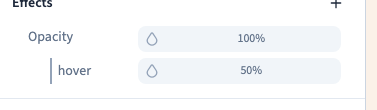
Hover over the setting's label and open its condition menu. Choose Hover, then set the conditional opacity to 50%. Move onto the actual element and then away: it should change only during hover and return afterwards.
The condition belongs to this setting. It does not change every style on the element.
Could not play. Try the video controls.
3. Add the pressure state
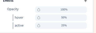
Add Active to the same setting and give it 25% opacity. Press and hold on the element to test it, release while still hovering, then move away.
The demonstration checks the sequence: 25% during pressure, 50% after release while hovered and 100% after leaving. In the editor this is a style test; use the visitor preview to check any associated link or action as well.
4. Edit one state without losing the base
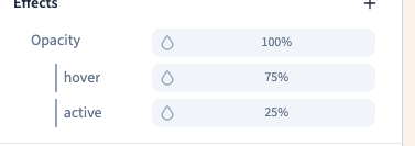
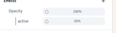
Open the Hover line and change its value to 75%. Remove only that conditional line to recover the base behaviour for hover. Other conditions stay separate. Undo recovers the removed line.
Save and reload to ensure your conditions persist. If values seem contradictory, check the badges and which line you are editing.
5. Keep keyboard and touch use clear
Hover is not a reliable way to expose essential content on touch screens. Keep the base understandable. For keyboard navigation, use a visible Focus state on real interactive controls and test by moving through the visitor preview with Tab.
A paragraph does not usually receive keyboard focus. A Focus condition does not turn it into a button. Test both Tab and Shift + Tab on links, buttons and fields.
To combine an interaction with a screen condition, click the existing badge, select a width and state, then confirm with Set modifier. For example, md + hover requires both a width of at least 768 px and hover. Check above and below the threshold and with the pointer both inside and outside the element. Use the visual condition choices rather than a custom selector.
The recording here demonstrates Hover and Active with a pointer. It does not substitute for a keyboard or touch test of your own page.
Continue
Smooth the change with a transition · Manage setting conditions