
Adapt design with screen rules
Changing a preview width lets you inspect a page. Adding a screen rule changes how a setting behaves at that width and beyond. These are two separate actions.
This guide uses visual Expert controls, without classes or code. Start with the smallest layout, then add only the wider-screen differences you need.
1. Set a base value
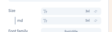
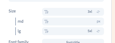
Select the element in the page or Layers and find the setting to adapt. For this example, set the heading size to 3XL, or 30 px, on its base line. The base applies whenever a more specific rule does not override it.
2. Add a screen condition
Hover over Font size, open its condition menu and choose Tablet. A line with the md badge appears. Set that line to 5XL, or 48 px.
The rule applies from 768 px upwards, including desktop. It is not limited to a device called a tablet. The base stays at 30 px below that threshold.
Could not play. Try the video controls.
3. Compare several widths
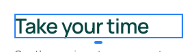
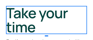
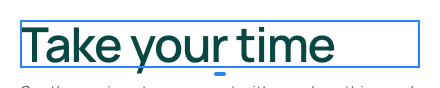
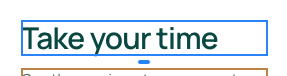
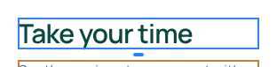
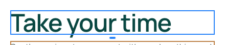
Use Screen to inspect the same page at phone, tablet and desktop widths. The demonstration checks 375 px, 768 px and 1,024 px: the heading is 30, 48 and 48 px respectively.
| Default marker | Applies from |
|---|---|
| sm | 640 px |
| md | 768 px |
| lg | 1,024 px |
These are the default thresholds shown here. If your project defines custom thresholds, use the conditions displayed in its interface. A later applicable rule for the same property can override an earlier one.
Changing the preview frame alone does not add a rule. You can also compare frames side by side when that makes the differences easier to see.
4. Move an existing threshold
Click the md badge, choose lg and confirm with Set modifier. This changes the condition on the existing line rather than creating another rule.
Now the larger value starts at 1,024 px. At 375 and 768 px the heading uses 30 px; at 1,024 px it uses 48 px. Check neighbouring rules if the element already has several breakpoints.
5. Remove just the condition
Hover over the conditional line and use its remove command. Its wider-screen value disappears; the base value stays. Undo restores that condition.
Save, reload and inspect your widths again. Avoid adding rules to every property automatically: a flexible base layout often needs only a few differences.

Continue
Compare preview screens · Adapt layout and spacing · Manage a setting's conditions