Open a dropdown, modal, side panel or tooltip
1. Attach the overlay to its trigger
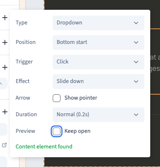
In Design, select the trigger in Expert. Open Events, choose Overlay, then pick the type. For a dropdown, modal or side panel, use Add overlay content element if the trigger does not already contain one. Edit that child in Layers. The Keep open preview option lets you check the content in the builder. Turn it off before testing normal opening.
2. Use a dropdown for a short list
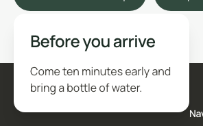
Choose Dropdown when the visitor needs a few options near the trigger. Change Position to fit the available space and keep the content narrow enough for mobile.
Could not play. Try the video controls.
3. Use a modal for a focused task
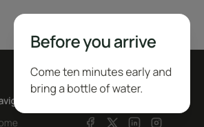
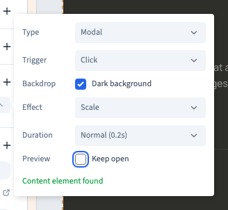
Choose Modal for content that should take focus, such as a short explanation or confirmation. Check the background and opening effect. Test that the visitor can close the modal and return to the surrounding page.
Could not play. Try the video controls.
4. Use a side panel for more detail
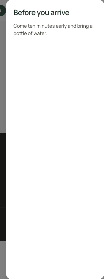
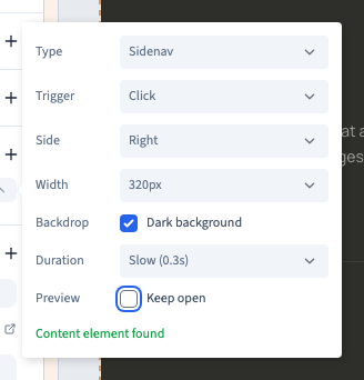
Choose Sidenav when a visitor benefits from seeing a larger area of content beside the page. Choose the side and width. On a narrow screen, check that the content and its close control fit.
Could not play. Try the video controls.
5. Keep tooltips short
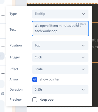
Choose Tooltip and enter a short hint in Text. Check the available trigger options. The example uses Click so the hint can also be opened by touch. Keep information that everyone needs visible on the page.
Could not play. Try the video controls.
6. Test opening and closing
Publish to a private preview and try each trigger. Check that the content starts closed, opens with the selected gesture and closes when expected. Test Escape and any visible close control, particularly on a small screen.
Could not play. Try the video controls.