
Find the common theme settings
The theme gathers settings shared by elements and pages. It helps keep a consistent identity through colours, fonts, buttons and rich-text presentation.
Before changing a value, choose the scope you need: the site, one element, or selected words.
1. Open the right theme
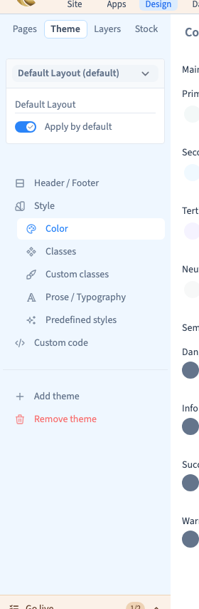
Open a page in Design and choose Theme in the left column. The selector at the top identifies the theme being edited. Check its name if the project contains several themes.
Apply by default chooses the theme followed by pages using the default theme. It is not a publication button. A page can use a particular theme, so check its page settings before concluding that a change has been ignored.
Could not play. Try the video controls.
2. Choose the right panel
| Goal | Panel |
|---|---|
| Define colour roles and shades | Color |
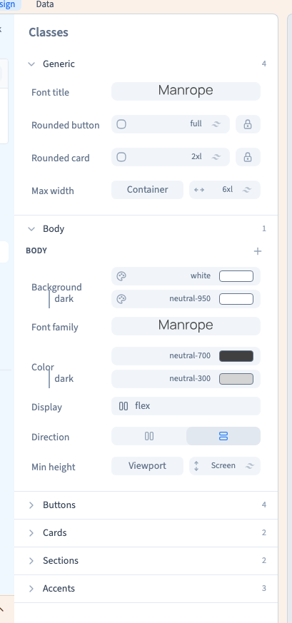
| Choose common fonts, corners and button or card styles | Classes |
| Style articles and rich fields consistently | Prose / Typography |
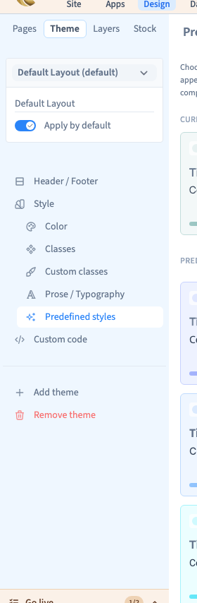
| Apply a proposed combination of styles | Predefined styles |
| Find the page's shared sections | Header / Footer |
Although Classes sounds technical, this panel provides visual controls. You can choose a font, rounded corners or colours without writing code.
3. Understand local exceptions
Changing a palette value affects elements using that role and shade. An element with its own colour can remain unchanged.
A common heading font is not necessarily the font of every piece of text. A family chosen directly on an element, or formatting applied to selected words, can override it. Inspect the element's local settings before changing the theme repeatedly.
4. Verify before publishing
Keep the page visible while adjusting the theme. Compare a heading, paragraph and button, then another page and smaller widths.
Save the project. Saving and publishing are separate actions: use a published staging preview to check the visitor result before production.
Continue
Prepare the palette · Choose common fonts · Check a page's theme