Apply and adjust shared visual styles
A shared style gives several elements a common appearance. Define it once in the theme, then apply it to the intended elements. They can keep different content and destinations.
The controls below are visual Expert controls. No class editing is needed.
1. Apply a theme style
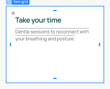
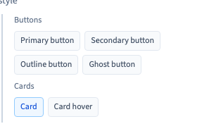
Select a button or container, using Layers when necessary. In Background, use + and choose Theme style. A primary button style is added by default. Choose the intended button or card style in the visual selector.
A new button choice replaces the preceding button style. A card choice is distinct, so remove a default button style if your container should only use Card. The recording assigns Card to two real containers this way.
A style does not create a destination. Configure the link separately for a button that should navigate.
Could not play. Try the video controls.
2. Edit the common appearance
Open Theme, then Classes. Groups organise Generic, Body, Buttons, Cards, Sections and Accents. Generic includes heading font, common corner settings and maximum width.
Open the relevant style and change a property. The recording adds opacity to Card, sets 75% and verifies that both assigned cards change. This strong difference is for comparison; keep final text sufficiently readable.
An element using only local values does not receive a shared style automatically. When a shared style is applied, some of its properties can override corresponding local values while leaving other local settings in place.

3. Add or remove a property
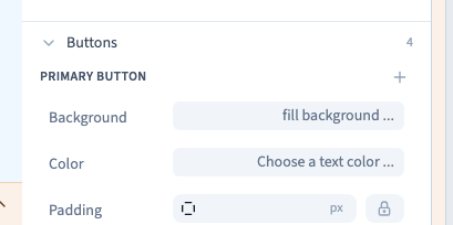
Use + inside a compatible style to add a visual property. Existing properties are not offered twice. Choose a value after adding it.
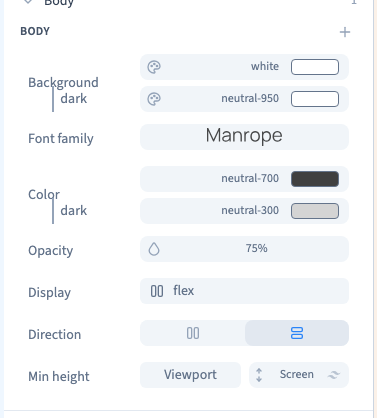
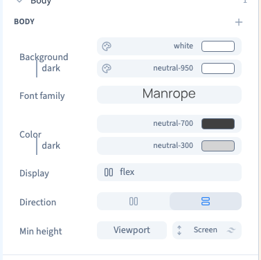
Hover over its row and use the property's remove command to remove an added property. This affects all elements using that style. Essential properties, such as the body's font, may not offer removal.
The recording first adds body opacity, compares 75%, then removes it and verifies that body opacity returns while its essential font control remains. Body affects the page as a whole, including its images and text.
4. Use conditions deliberately
Compatible styles, including buttons, can offer conditions such as Hover. Give the normal line a value, then add the conditional line and its value. Removing that condition should retain the normal value.
The Card hover name identifies a shared style. Add a Hover condition to a new property when it should change only during hover; the name alone does not make every newly added property conditional.
The recording also assigns the card hover style to the second card, compares 50% opacity during hover with its normal 75%, and checks the return.
Test each user of the style. A screen preview and a screen condition are different things: viewing a phone frame does not create a width rule.

5. Detach an exception and check persistence
Save theme changes before returning to the page. Select an element and click its active Theme style choice to remove that style. Local values for properties previously covered by it can then become visible again.
The demonstration detaches one card: it returns to full opacity while the other stays at the shared 75% setting. Re-add Theme style with + if its control disappears after removing the last style.
Save, reload and compare two style users and an exception. Review other pages using that theme and the visitor preview at small and wide sizes. To reuse structure and content as well as appearance, use components.