
Create and adjust the site palette
The palette provides common colours. A button can use one Primary shade while a background uses Neutral. Shared roles make it easier to keep the site coherent.
1. Open the palette
In Design, open Theme, check the selected theme and choose Color. The main roles are Primary, Secondary, Tertiary and Neutral.
Semantic colours carry meaning: Danger, Info, Success and Warning. Preserve that meaning in messages even when adapting the shades to your identity.
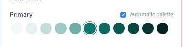
2. Read the shade numbers
Each role has shades from 50 to 950. Lower numbers are normally lighter and higher numbers darker; 500 acts as the base.
Two elements using Primary may use different shades. Editing only Primary 500 does not necessarily change an element using Primary 600: those are separate values.
3. Edit a shade independently
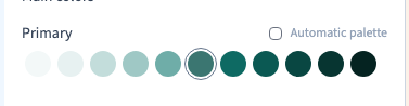
Turn off Automatic palette for the role. Open the required shade and choose a colour visually. The other shades remain independent.
This suits a precise brand palette or a contrast adjustment that should not regenerate the whole family. The demonstration changes 500 and checks that 600 stays the same.
Could not play. Try the video controls.
4. Generate related shades
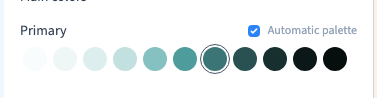
Turn on Automatic palette, open the base colour and choose a new colour. Related shades for that role are generated together.
Generation replaces that role's shades. Record any important manual adjustments before switching back to automatic mode.
The selector also offers a Hex value. Paste a known brand code in one operation, then check the final displayed value and result. The recording uses the visual selector.
5. Check the actual page
Inspect text, backgrounds, buttons and links that use the palette. Another shade or local colour can explain an unchanged element.
Look for light text on light backgrounds and dark text on dark backgrounds. Do not make colour the only way to understand an important message. Compare several pages and widths, save and review staging before production.