
Improve text alignment and spacing
Readable text has lines that are easy to follow, regular spacing and a colour that stands out from its background. These controls affect the whole selected element. To change just a few words, use inline formatting instead.
In Expert, select a heading or paragraph and find Text. Use the group's + button to add a missing setting. These are visual controls; no code is needed.
1. Choose an alignment
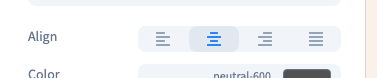
Add Align and compare left, centre, right and justified text. Alignment positions the words within the element's width; it does not move the element itself.
Start with left alignment for a paragraph of several lines. Centre alignment often suits a short heading. Check gaps between words before keeping justified text in a narrow column. The demonstration compares centre alignment and then returns to the left.
Could not play. Try the video controls.
2. Give lines room to breathe
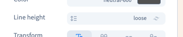
Open Line height and compare the offered values. This is the distance between lines within one text element, rather than a margin separating paragraphs.
The demonstration selects Loose to make the difference visible. Then choose a value suited to your own text. Very tight lines are difficult to follow; excessive distance makes it harder to recognise a paragraph as a whole.
3. Adjust letter spacing
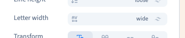
Open Letter width and compare Wide with Normal. This changes the distance between letters, not their shapes.
A pronounced spacing can work for a small label or short heading. Begin with neutral spacing for long text and judge it at its real reading size. The recording returns to Normal after the comparison.
4. Choose a readable colour
Open the text colour and choose a shade while looking at the actual background. The example chooses a dark theme colour on a light card. A palette alone does not guarantee readable contrast on every background.
Check text over photographs and in every state where its background changes. The colour picker does not replace a contrast check.
5. Compare widths and save
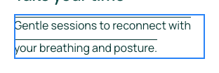
Check phone, tablet and desktop previews. A narrower paragraph has more lines even when the font size stays the same. Read without zooming and look for overflow. Save and reload to check that your settings persist.
Continue
Format selected words · Choose font, size and weight · Use screen rules