
Find why the mobile layout differs from desktop
1. Compare the same page across screen sizes
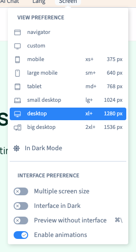
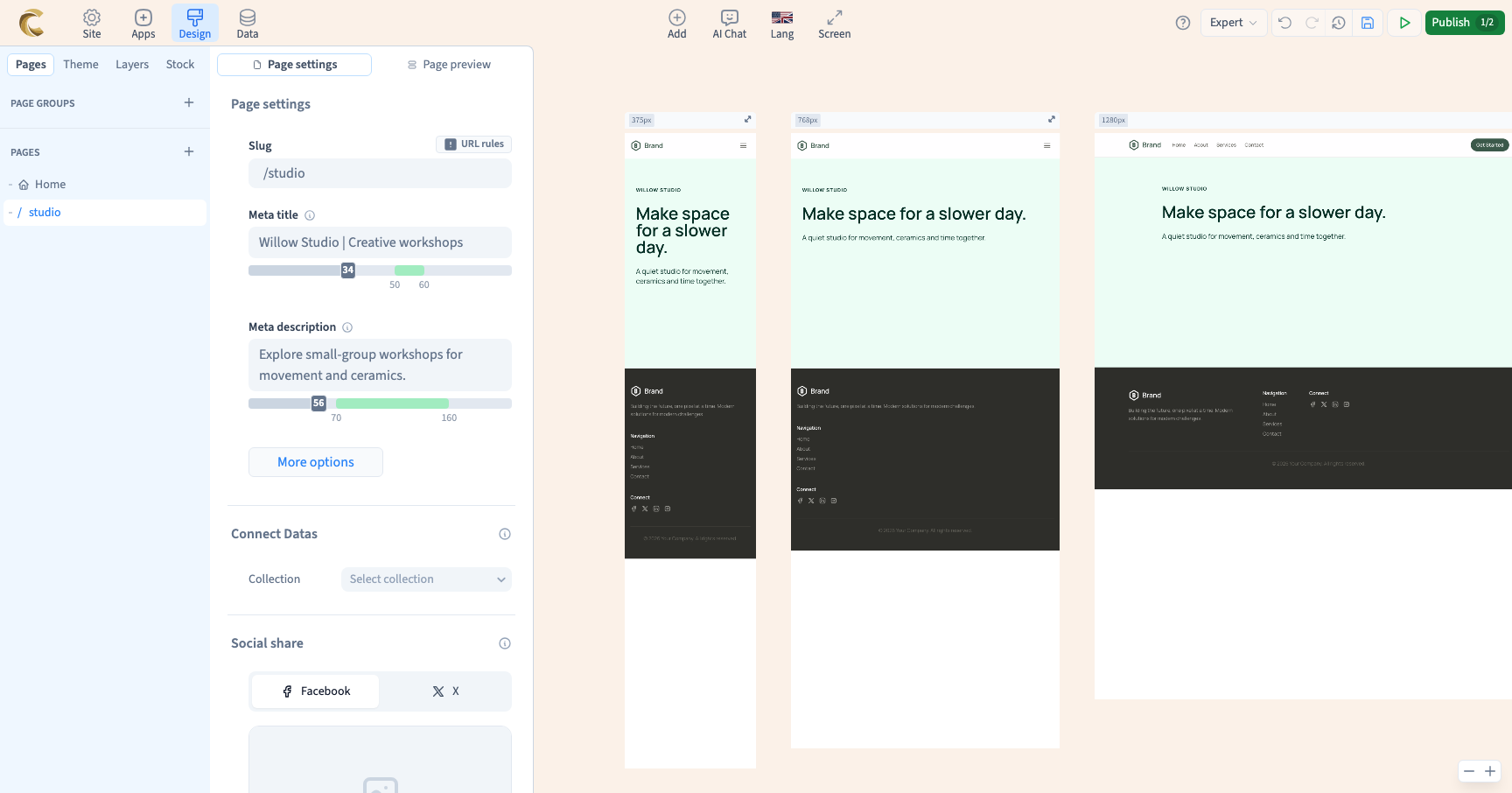
Open Screen. Display more than one width and compare the same page, language and content. Check whether the change appears only on mobile, on one tablet width or on every frame.
Could not play. Try the video controls.
2. Check the active style rule
Select the affected element. Inspect which screen condition and state you are editing. A frame’s width lets you inspect a result. Use the style conditions to make a rule apply only at certain widths.
3. Find where overflow starts
Check the element, its card, its container and the section. Look for fixed widths, long words, gaps, wide media and grid column counts. Adapt the smallest relevant setting and compare again.
4. Confirm the published result
Save, publish a private test version and view representative content on a narrow screen. If the issue persists, include the width, selected layer, active rule and expected result.
See also Publish and open a staging preview.