

Sections · Call to action
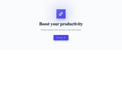
Simple Centered CTA
A title and a button, centered — the classic way to close a page and convert the visitors your content has just convinced.
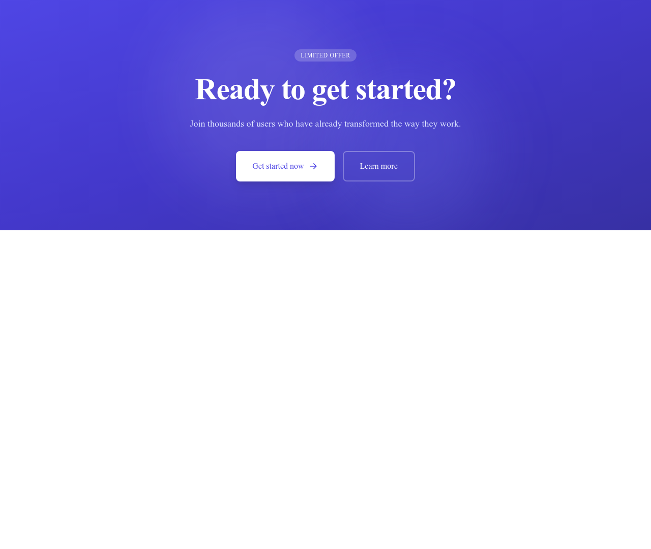
What this block contains
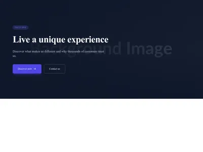
CTA Simple Centered is a section from the Call to action category made of 1 heading, 1 text paragraph, 2 buttons, 1 icon and 2 links. Its copy ships in 3 languages (German, Spanish and French).
- 1 heading
- 1 text paragraph
- 2 buttons
- 1 icon
- 2 links
Details
- Category
- Call to action
- Type
- Section (full width)
- Editing
- Visual editor, no code
- Keywords
- centeredsimpleconversion
Use it in three steps
- 1 Open your siteCreate a free Communik site, or open one you already have.
- 2 Insert itIt lands on your page with your fonts and brand colors applied.
- 3 Make it yoursEdit text, images and colors visually, then publish when ready.
More in Call to action
See all Call to action
Guide
Every effective page ends by asking. The centered CTA is the simplest, most reliable closer: one line that restates the value, one button that names the action. Place it after your proof — features, testimonials, pricing — when the visitor's decision is warm.
Copy, colors and button target are editable in the Communik builder; the block inherits your theme so it matches the page instantly.
Browse other CTA styles — with image, with newsletter form — or see how pricing sections pair with a closing CTA.
Questions
Where should I place this block?
At the end of the page, after your strongest proof. Long pages can repeat it once mid-scroll without feeling pushy.
What makes a good CTA line?
Verb + outcome + low friction: “Create your site today — free, no card required”. Avoid vague labels like “Submit” or “Learn more”.
Can the button link anywhere?
Yes — internal page, external URL, anchor or form. Set the target directly in the editor.
Keep exploring
About Sections
Browse about sections templates
Blog Sections
Browse blog sections templates
Commerce Sections
Browse commerce sections templates
Blog Module
Complete blog feature with multiple design variants
About Page Templates
Full page layouts in the about category
Templates for Healthcare
Templates designed for healthcare businesses
YouTube Templates
Templates with YouTube integration support
Your next site starts here.
Everything here is one click away.
Every section, component, page and module in this library is ready inside the Communik editor, styled with your brand.
Free to start. No credit card.