
Sections · 45 items
Call to Action Blocks Designed to Maximize Click-Through
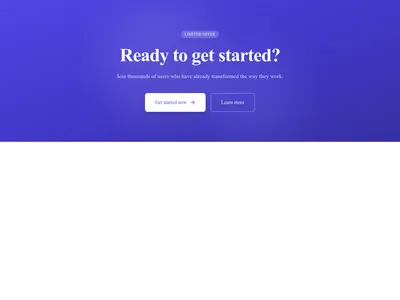
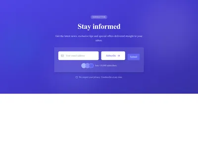
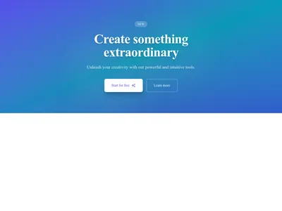
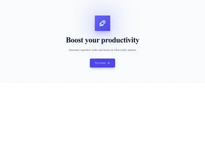
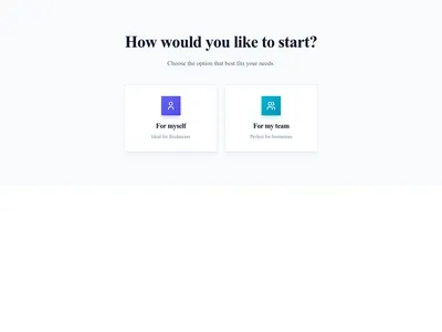
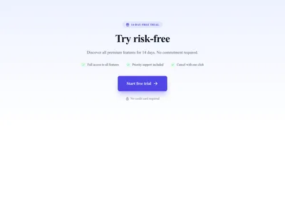
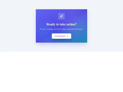
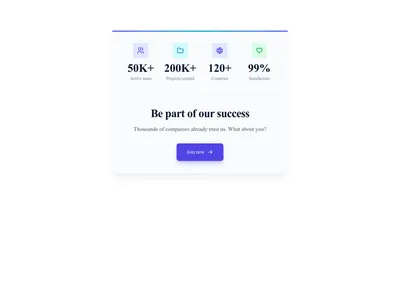
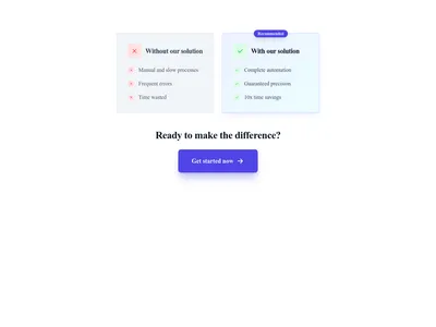
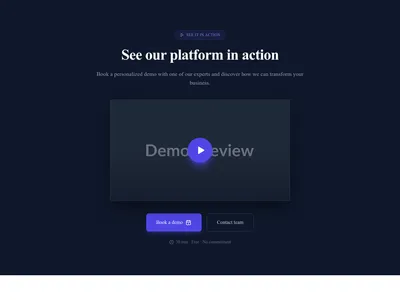
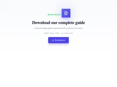
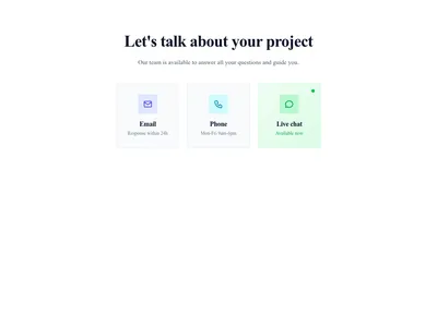
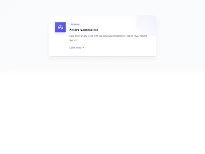
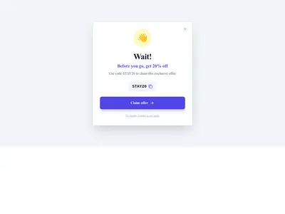
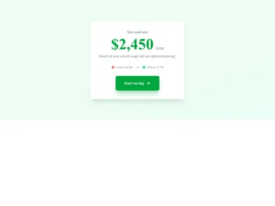
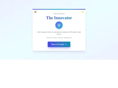
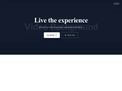
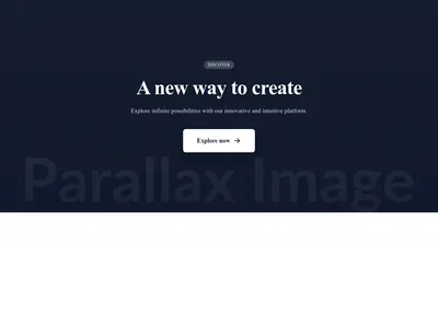
Conversion-focused CTA sections from bold banners to subtle inline prompts. Each design is crafted to drive signups, downloads, and purchases.
Browse · Categories
Call to Action Blocks Designed to Maximize Click-Through
45 items



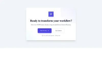
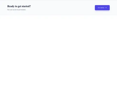
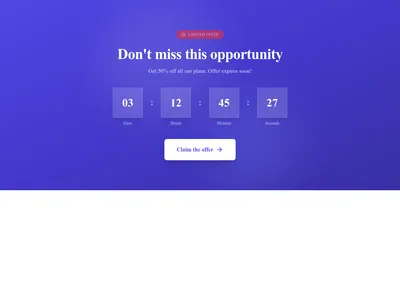

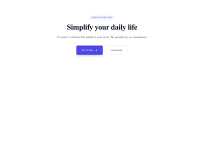







Nothing matches this filter.
Guide
Every page needs a clear next step for the visitor. A call to action tells people exactly what to do — sign up, buy, download, or get in touch. Our 45 CTA templates are designed with conversion psychology in mind: strong contrast, concise copy, and strategic placement patterns that have been proven to increase click-through rates across industries.
CTA Styles for Every Context
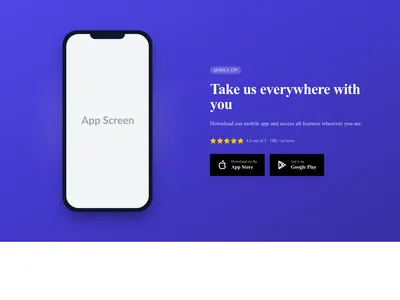
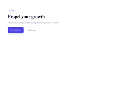
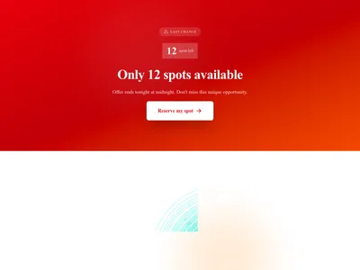
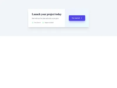
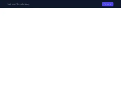
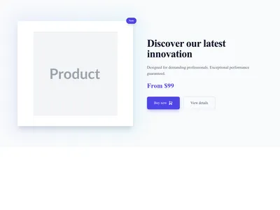
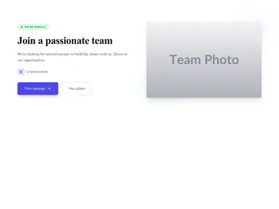
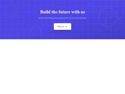
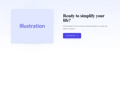
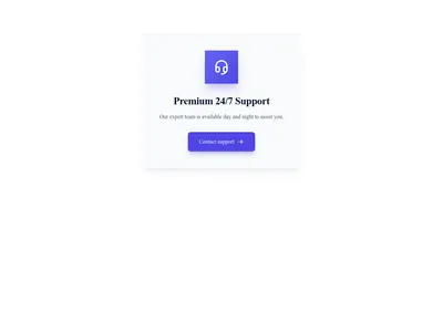
Full-width banner CTAs work best as a closing section — a bold visual summary at the bottom of a page that urges action before the visitor hits the footer. Inline CTAs sit within content sections and feel natural in long-form pages or blog posts. Split CTAs pair a compelling image with a headline and button side by side, ideal after a features section. Floating bar CTAs stick to the top or bottom of the viewport for persistent visibility without being intrusive — they stay visible even as the visitor scrolls through other sections.
Writing CTA Copy That Converts
Many CTAs use first-person language ("Start my free trial" rather than "Start your free trial"), a wording worth A/B testing with your own audience. Be specific about the value ("Get 50 templates free" beats "Sign up"). Create urgency where genuine ("Offer ends Friday"). Pair the primary button with a secondary link for visitors who aren't ready ("Learn more" or "See pricing"). Avoid vague labels like "Submit" or "Click Here" — they provide no motivation to act.
Strategic CTA Placement
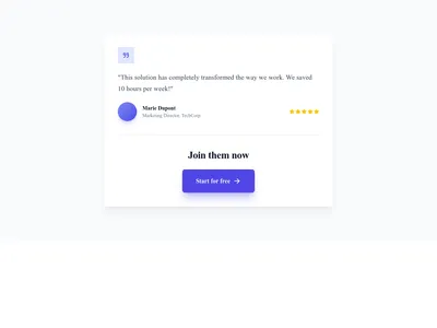
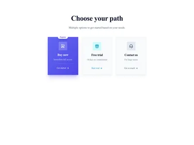
Place a CTA after your hero section, again after your testimonials, and as a closing section before the footer. On long landing pages, repeat the CTA every 2-3 sections with slightly different copy to catch visitors at different stages of their decision. Use pricing tables as high-intent CTAs for visitors ready to compare plans, and contact forms as low-commitment alternatives for those still exploring.
Questions
How many CTAs should a landing page have?
A landing page should have 2-4 CTA instances. Place one above the fold, one after your value proposition, and one as a closing section. Using the same action with varied wording prevents CTA fatigue while reinforcing the conversion goal.
What color should my CTA button be?
Your CTA button should contrast sharply with its surroundings. There is no universally "best" color — what matters is visibility. A bright button on a neutral background draws the eye. Test different colors to find what resonates with your audience.
What is the ideal CTA button text length?
Keep CTA button text between 2-5 words. Action verbs perform best: "Get Started Free," "Download Now," or "See Pricing." Avoid vague labels like "Submit" or "Click Here."
Keep exploring
About Sections
Browse about sections templates
Blog Sections
Browse blog sections templates
Commerce Sections
Browse commerce sections templates
Blog Module
Complete blog feature with multiple design variants
About Page Templates
Full page layouts in the about category
Templates for Nonprofit
Templates designed for nonprofit businesses
WhatsApp Templates
Templates with WhatsApp integration support
Your next site starts here.
Everything here is one click away.
Every section, component, page and module in this library is ready inside the Communik editor, styled with your brand.
Free to start. No credit card.