
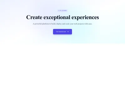
Hero Simple Centered
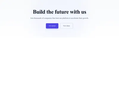
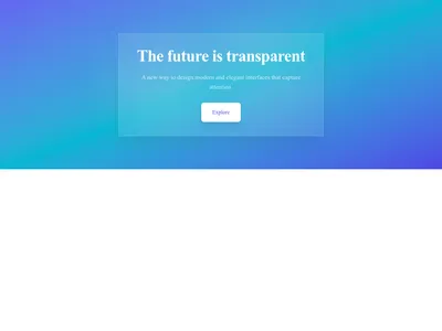
Centered hero with heading, subheading, and call-to-action button on a soft gradient
Hero
Bold, attention-grabbing hero sections designed to communicate your value proposition in seconds. Full-screen backgrounds, video heroes, split layouts, animated text, and gradient overlays.
59 items
Centered hero with heading, subheading, and call-to-action button on a soft gradient
Hero


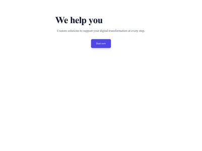
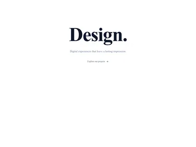
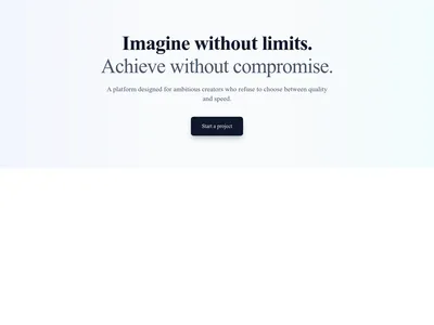


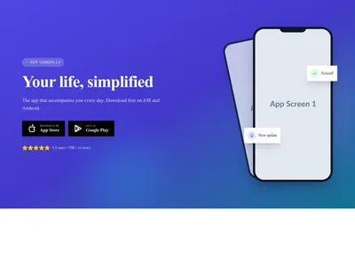
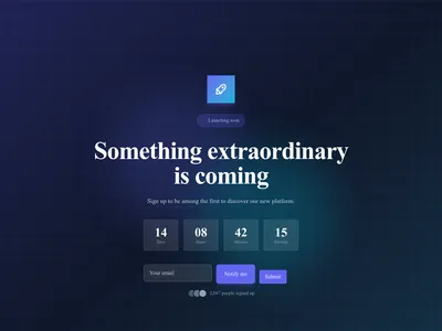
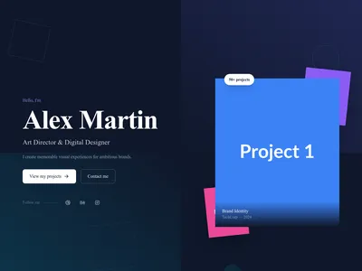
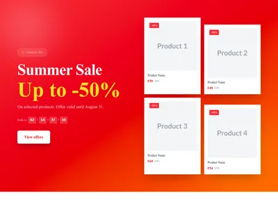
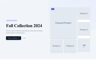
Online store hero promoting a sale or seasonal discount with a shopping call to action
Hero
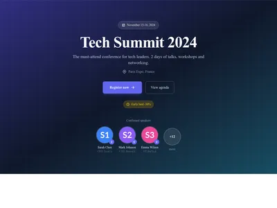
Event hero presenting a conference with its date, venue and registration button
Hero
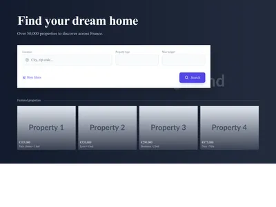
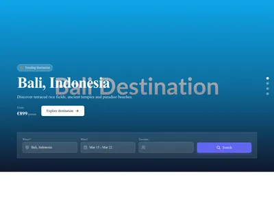
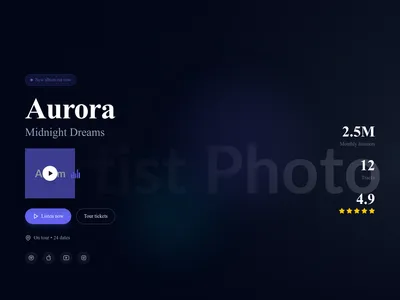
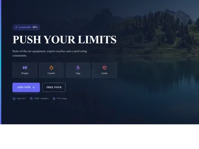
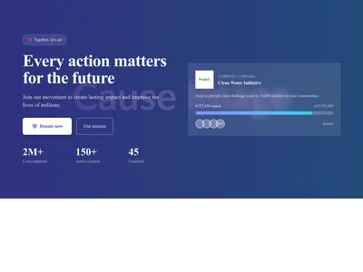
Nonprofit hero presenting a cause with an emotional message and a donation button
Hero
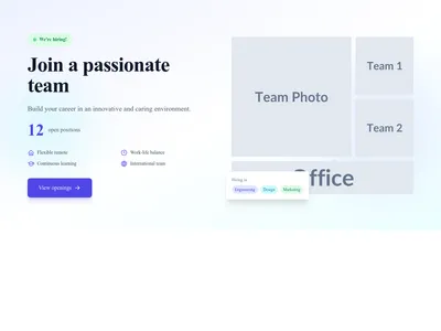
Careers page hero inviting candidates to browse open positions and join the team
Hero

Webinar hero with session details and a registration form to save a seat
Hero
Nothing matches this filter.
Guide
The hero section is the first thing visitors see when they land on your page. Research shows you have roughly three seconds to convince someone to stay, which is why a well-crafted above-the-fold design matters more than almost any other element on your site. These 59 hero section templates give you a head start with proven layouts that combine striking visuals, clear messaging, and compelling calls to action.
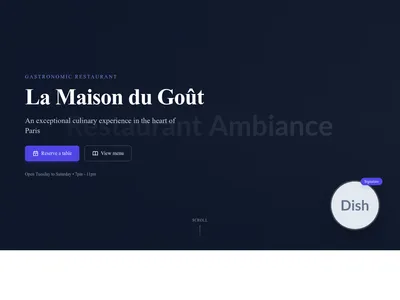
Full-screen image heroes create maximum visual impact and work best for brands with strong photography — think restaurant sites showcasing a signature dish or portfolio sites leading with a hero project. Split-screen heroes pair a headline on one side with an image or illustration on the other — the go-to layout for SaaS products and startup landing pages. Video background heroes add motion and storytelling, perfect for agencies and creative brands. Minimalist text-only heroes emphasize the message itself, favored by minimal designs that let typography do the heavy lifting.
Keep your headline under 10 words and ensure it communicates a clear benefit. Place your primary call to action above the fold with strong contrast — visitors should never have to scroll to find the next step. Use a single hero image or video rather than a busy collage. Ensure text remains legible over background media by using overlays or choosing templates with built-in contrast handling. Add a subtle scroll indicator to encourage exploration below the fold.
Hero images are typically the Largest Contentful Paint (LCP) element on a page, making them critical for Core Web Vitals scores. Our templates use responsive image srcsets with WebP format, lazy loading for below-fold heroes, and optimized video embeds with poster frames to keep load times fast. Pair your hero with a lightweight navigation header above it and consider adding a logo cloud directly below for instant social proof.
A hero section is the large, prominent banner at the top of a webpage. It typically includes a headline, subtext, a call-to-action button, and a background image or video. It's designed to immediately communicate the page's main message.
An effective hero section has a clear, concise headline, a compelling visual element, a visible call-to-action, and fast loading performance. It should communicate your value proposition within three seconds of a visitor landing on the page.
Images work best when you have strong photography and want fast load times. Videos are ideal for storytelling and complex products, but they increase page weight. If using video, keep it under 15 seconds, mute by default, and provide a static fallback for slow connections.
Use a semi-transparent overlay (dark or light depending on text color), position text on a less detailed area of the image, or choose templates with built-in gradient overlays that ensure contrast automatically.
Every section, component, page and module in this library is ready inside the Communik editor, styled with your brand.
Free to start. No credit card.