

Sections · 24 items
Professional Navigation Headers for Any Website
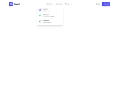
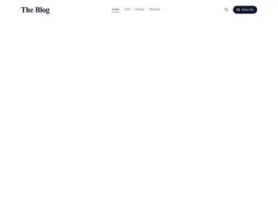
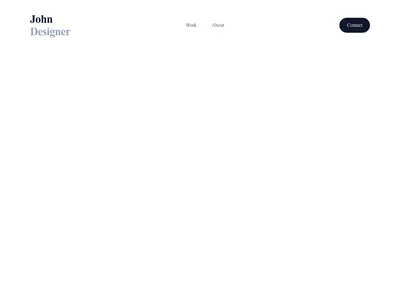
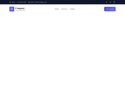
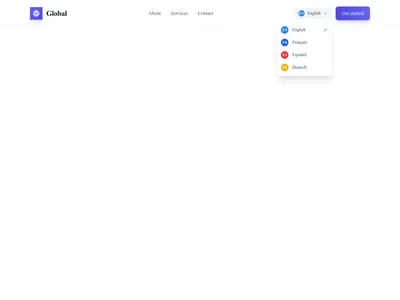
Responsive navigation headers with mega dropdowns, sticky scroll behavior, transparent overlays, and mobile-first hamburger menus. Fully accessible and keyboard-navigable.
Browse · Categories
Professional Navigation Headers for Any Website
24 items











Nothing matches this filter.
Guide
The header appears on every page of your website, making it the single most-seen element in your entire design. A great navigation bar helps visitors find what they need in seconds; a poor one sends them to a competitor. Our 24 header templates cover every major navigation pattern with pixel-perfect execution and full accessibility support.
Header Patterns Explained
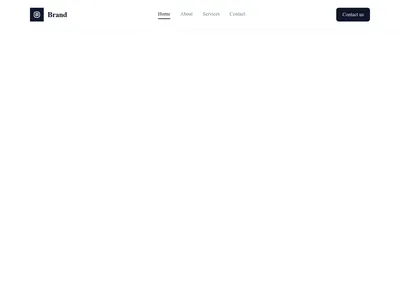
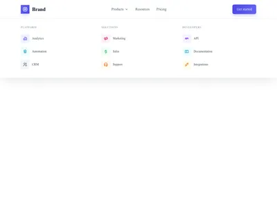
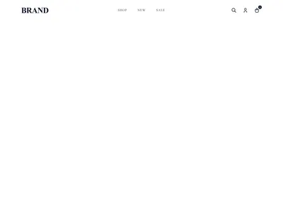
Simple horizontal navbars work for sites with 3-6 top-level links — clean, fast, and familiar. Mega menus handle complex navigation with dozens of links organized into categorized columns — essential for e-commerce stores and large corporate sites with deep content hierarchies. Transparent headers overlay the hero section for an immersive, full-bleed visual effect popular on landing pages. Sticky headers remain visible as the user scrolls, keeping navigation accessible at all times without consuming space on initial load.
Mobile Navigation
All 24 header templates include a responsive mobile version with smooth slide-in or dropdown hamburger menus. Mobile menus support nested submenus with accordion-style expansion, search bars, and CTA buttons. They are built with touch targets sized for fingers (minimum 44px tap area) and proper focus management for keyboard accessibility. On mobile, the header transforms automatically — no extra configuration needed.
Customization Tips
Keep your navigation to 5-7 top-level items for optimal usability — more than seven creates choice overload. Place your most important call-to-action button in the header for persistent visibility across every page. Use your logo as a home link (visitors expect it). Match the header style to your footer design for visual consistency across the page. For dark-themed sites, use a dark header with light text. Our dark templates include matching headers designed for seamless integration.
Questions
Should my website header be sticky?
Sticky headers improve navigation on long pages by keeping links accessible. They work best on content-heavy sites. For short landing pages, a static header is fine. Ensure your sticky header is compact (50-70px) so it doesn't consume too much screen space on mobile.
What is a mega menu?
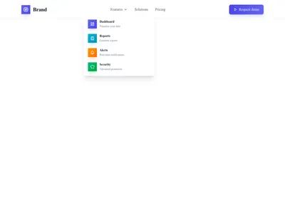
A mega menu is a large dropdown panel that appears on hover or click, displaying navigation links organized into columns and categories. It's ideal for sites with many pages, like e-commerce stores, universities, or media outlets.
How many items should be in the main navigation?
Keep top-level navigation to 5-7 items. More than seven creates choice overload. If you have more sections, group them under dropdown sub-menus or mega menu panels.
Keep exploring
About Sections
Browse about sections templates
Blog Sections
Browse blog sections templates
Call to action Sections
Browse call to action sections templates
Blog Module
Complete blog feature with multiple design variants
About Page Templates
Full page layouts in the about category
Templates for Healthcare
Templates designed for healthcare businesses
Stripe Templates
Templates with Stripe integration support
Your next site starts here.
Everything here is one click away.
Every section, component, page and module in this library is ready inside the Communik editor, styled with your brand.
Free to start. No credit card.