

Components · 409 items
Reusable UI Components for Modern Websites
Smaller, reusable design elements — cards, badges, buttons, inputs, modals, and more — that fit inside sections to build rich interfaces.
Browse · Categories
Reusable UI Components for Modern Websites
409 items
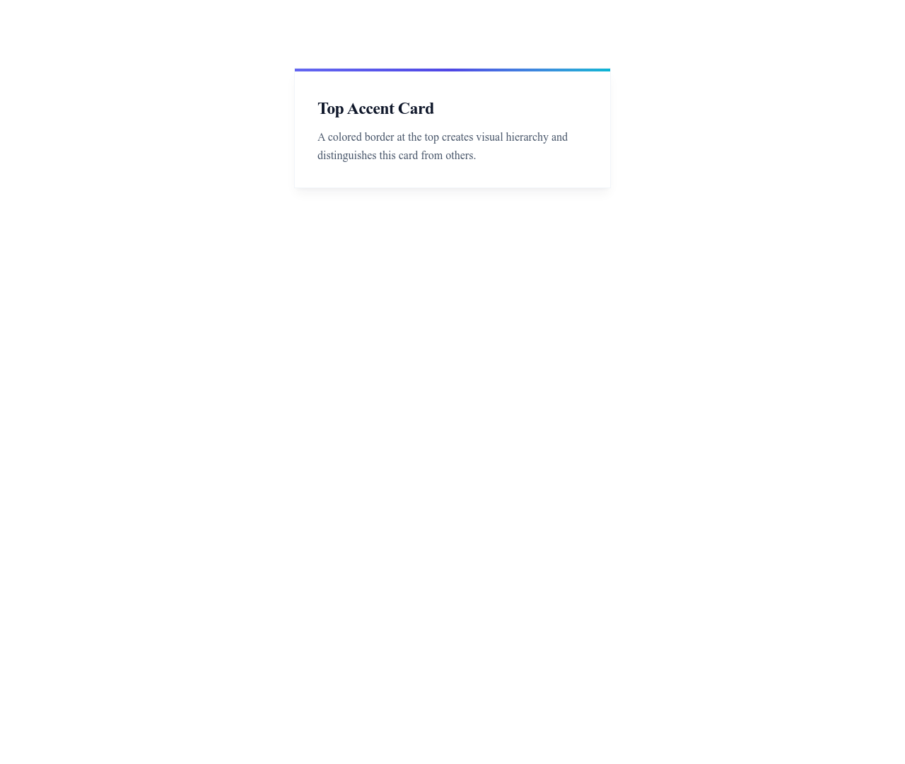
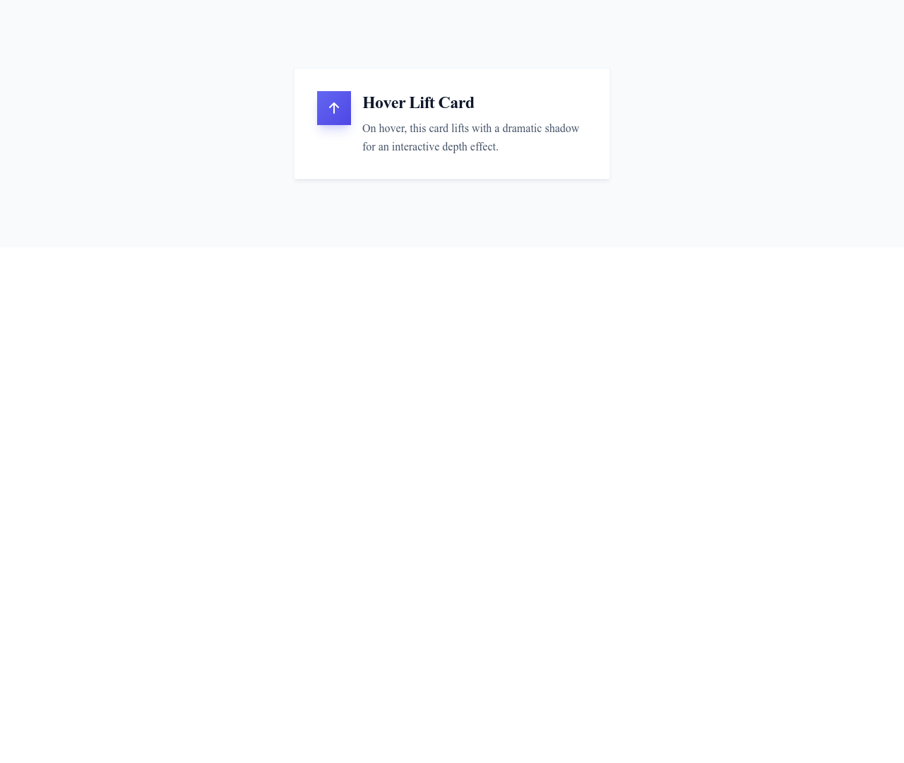
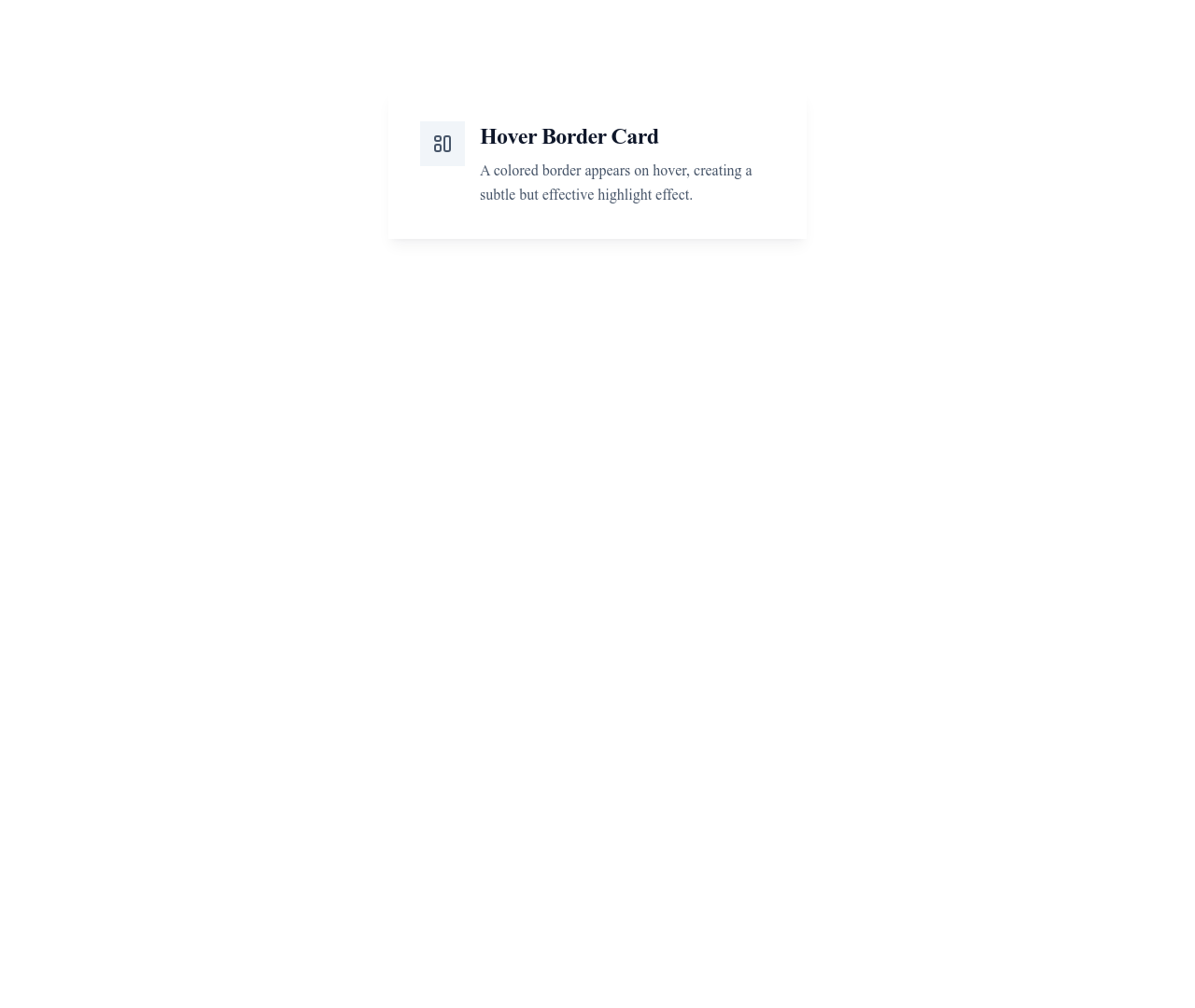








Card User Horizontal
Horizontal user card with the avatar on the left and name, title and bio on the right
Cards


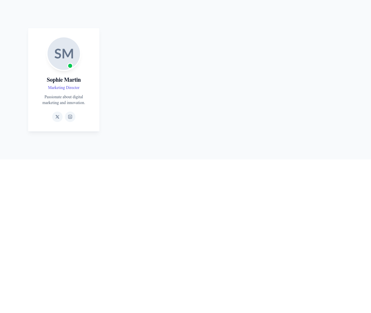
Card User Social
User profile card with avatar, name, short bio and a row of social media icons
Cards


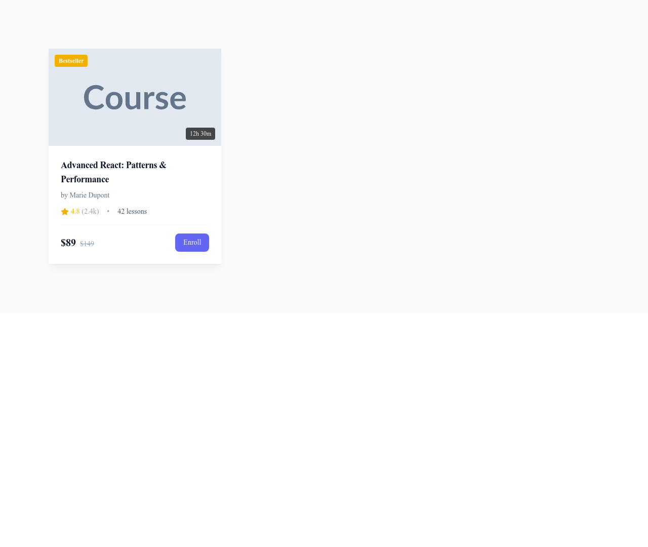


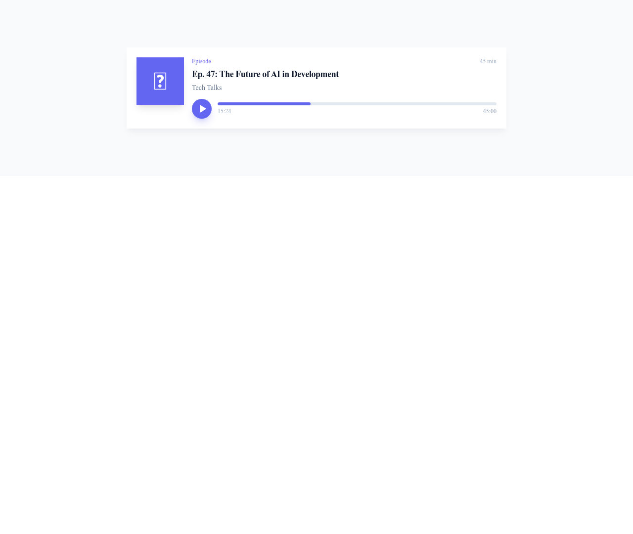


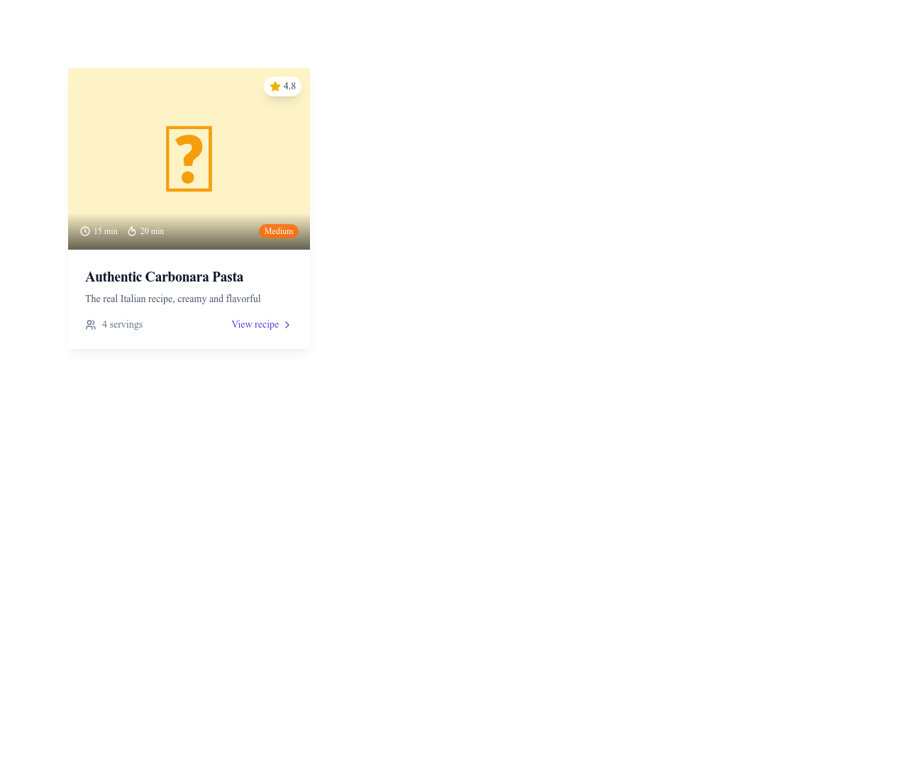

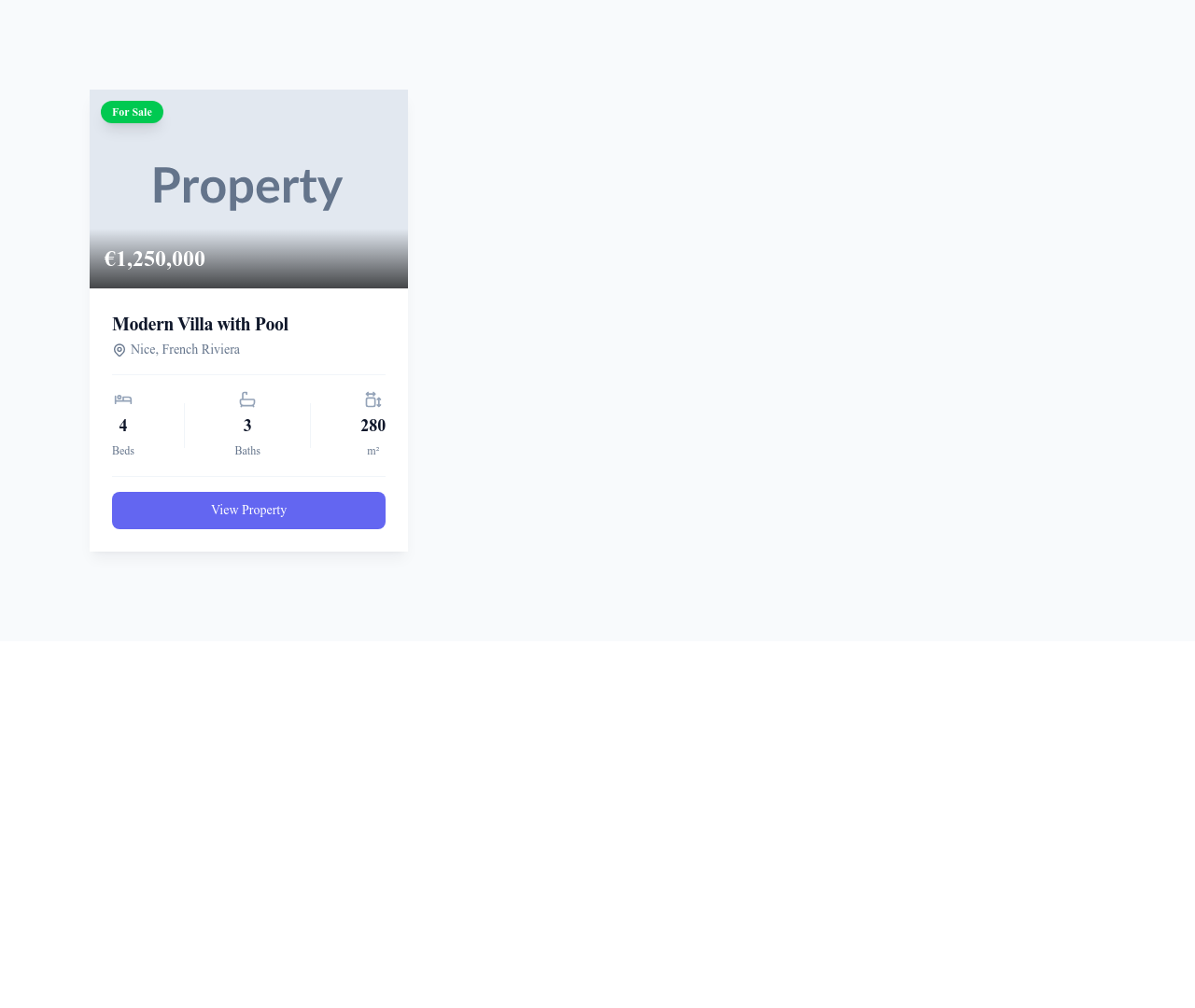

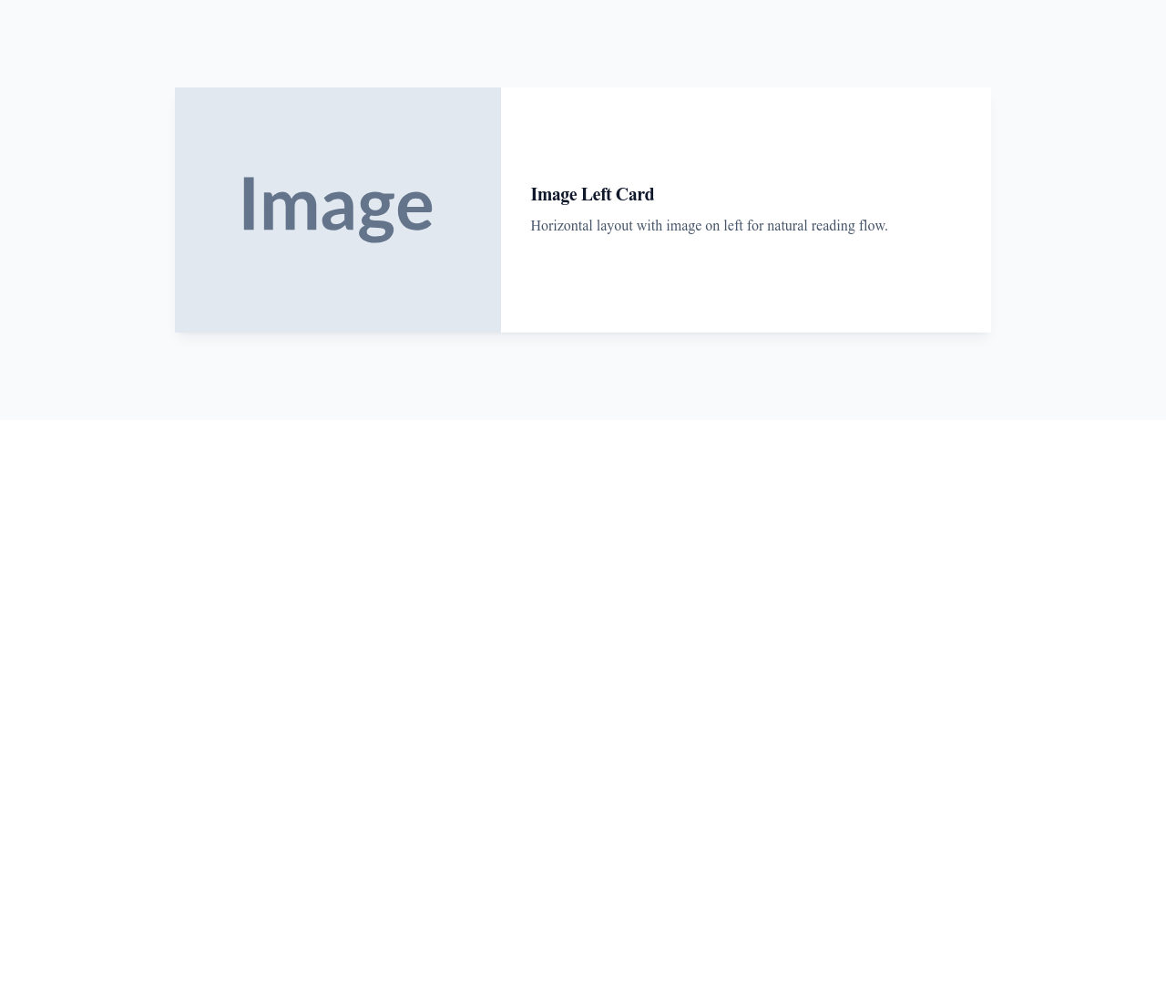
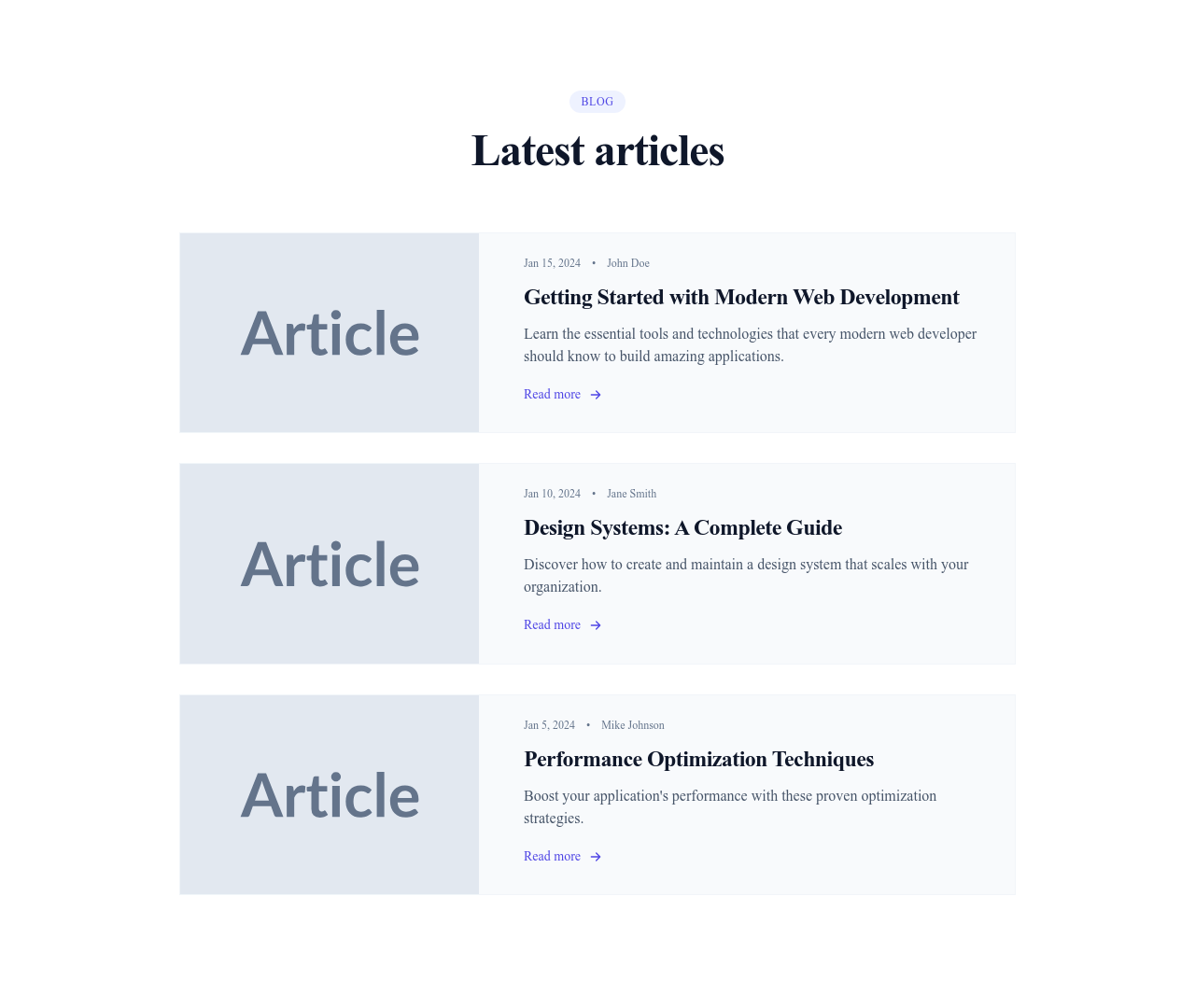
Card Article Horizontal
Horizontal article card with the image on the left and category, title, excerpt and details on the right
Cards
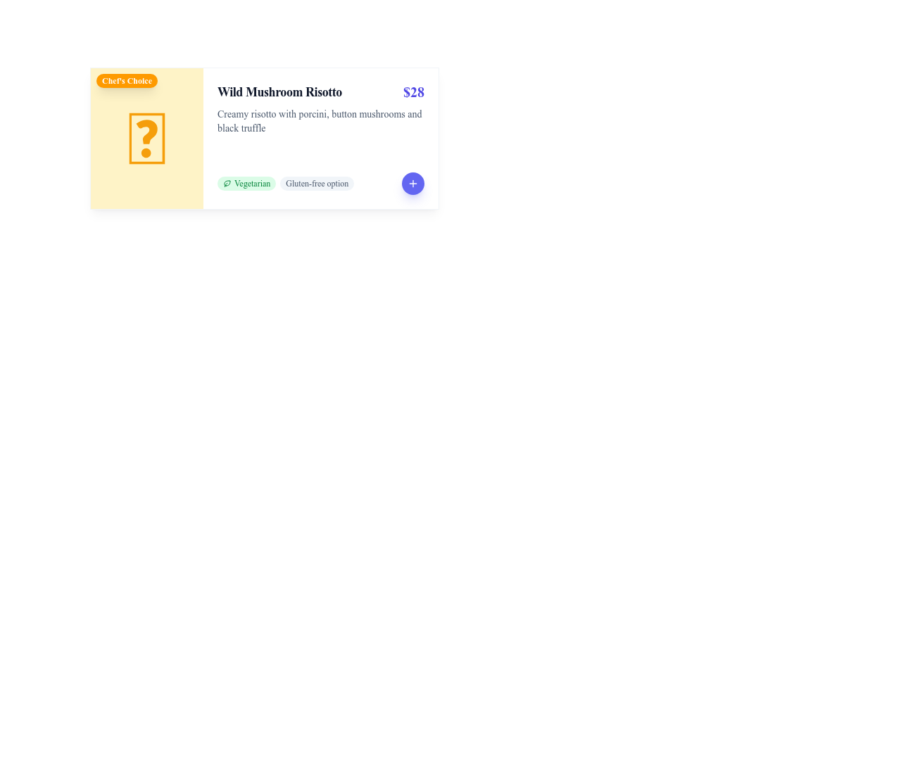

Card Article Minimal
Clean article card without an image, showing category, title, excerpt and date
Cards


Card Stat Trend
Metric card showing a key number, its label and a trend indicator with percentage change
Cards


Card Weather
Weather card showing the city, a weather icon, the temperature and current conditions
Cards


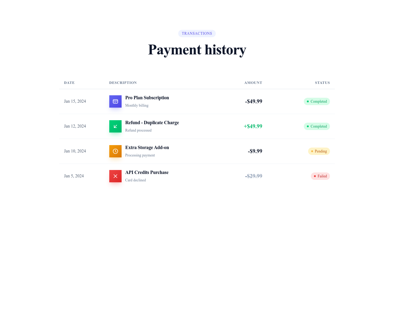

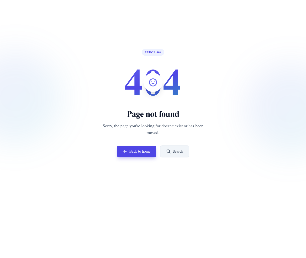
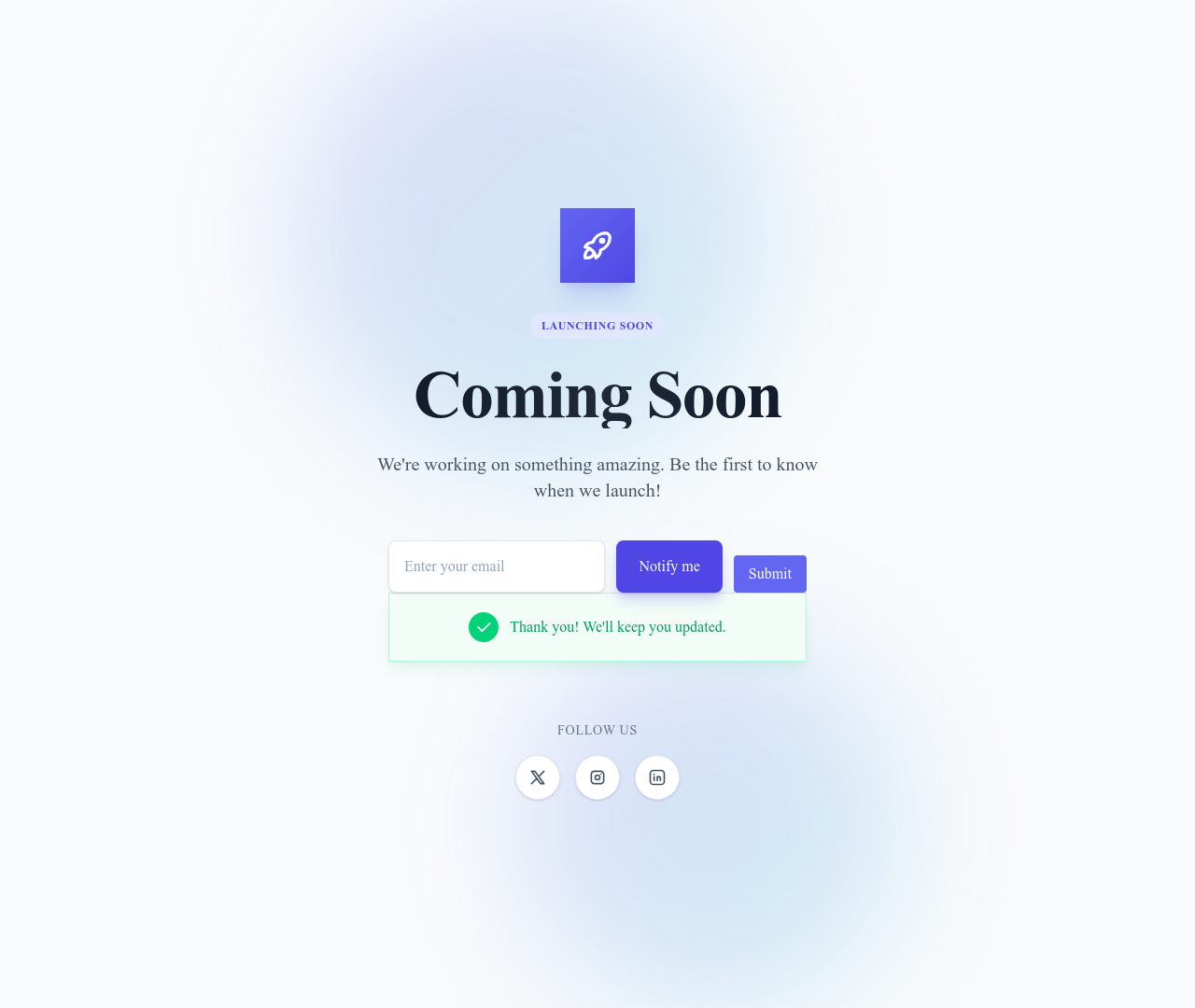

Dark Mode Toggle
Toggle button that lets visitors switch the site between light and dark mode
Utilities


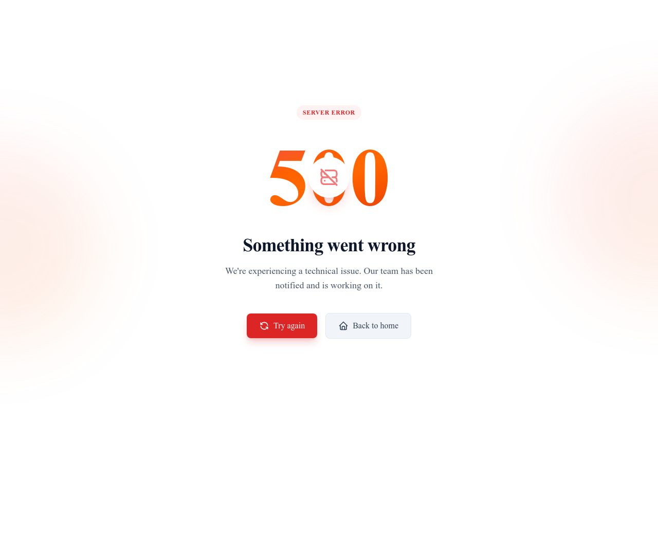

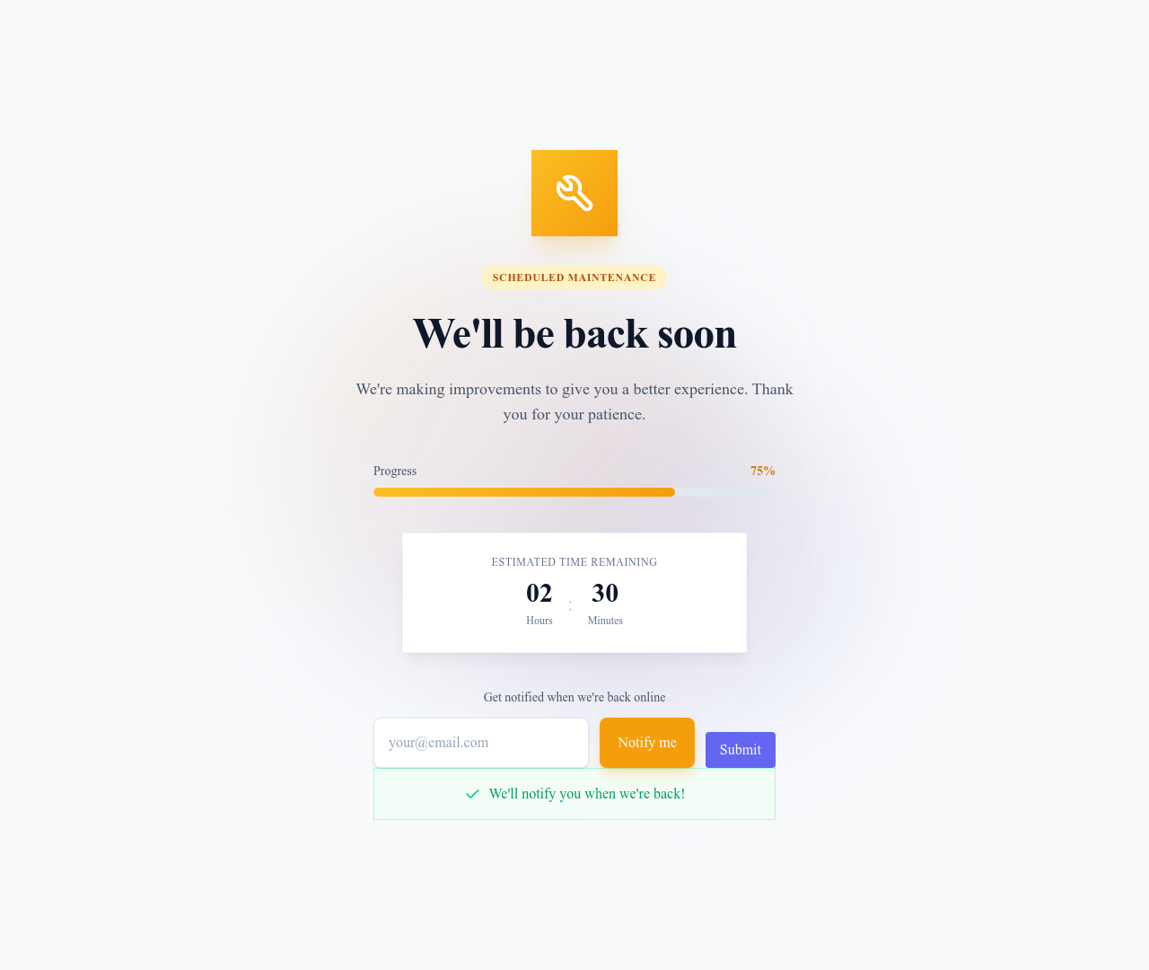



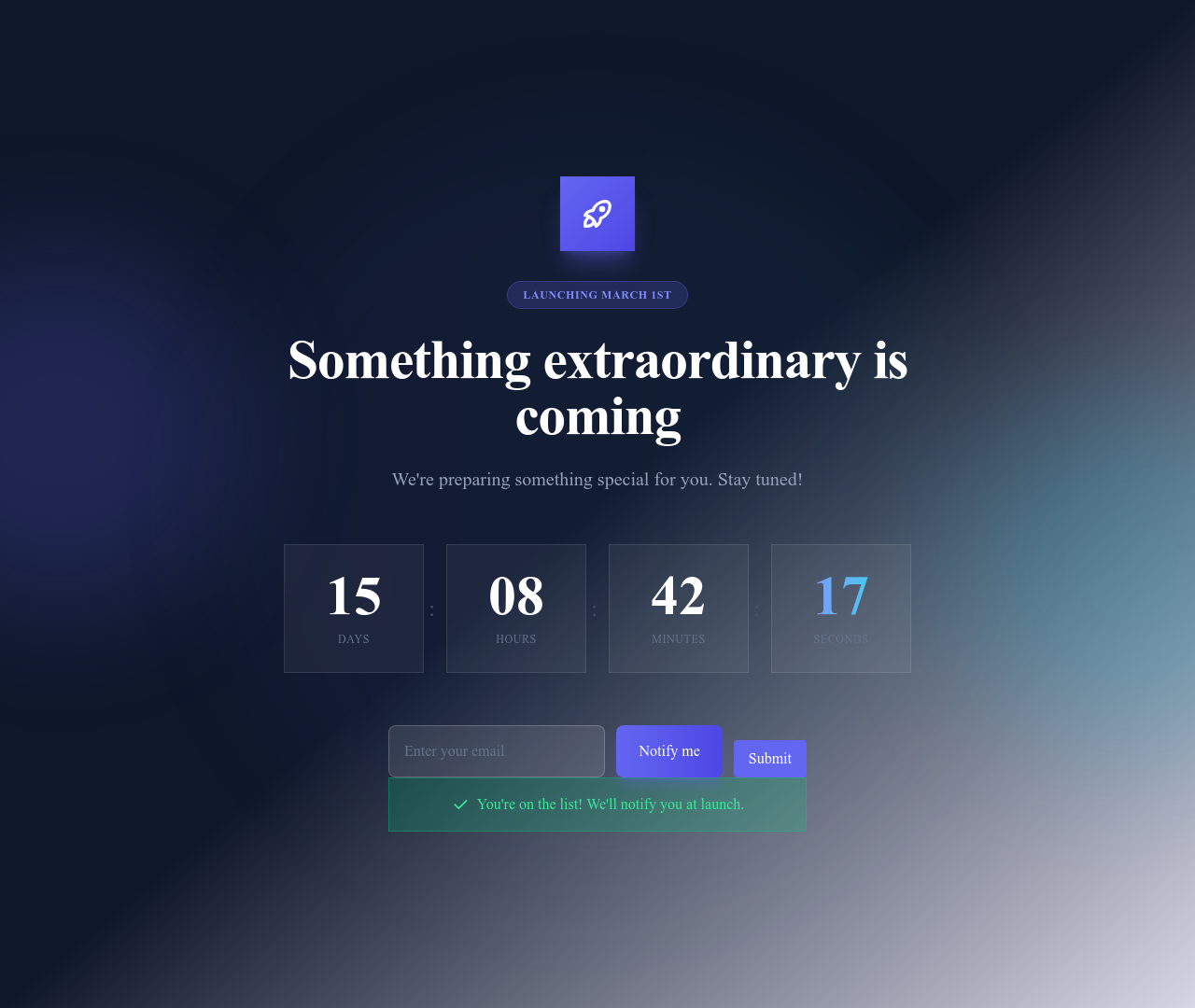
Countdown
Countdown timer showing the days, hours, minutes and seconds left before an event
Utilities





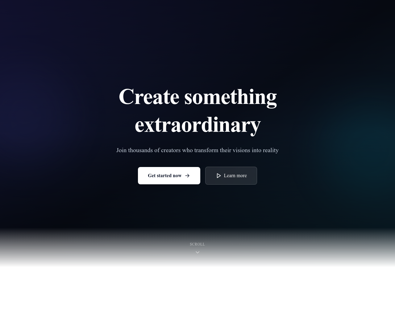
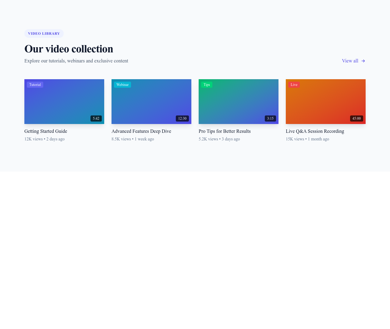
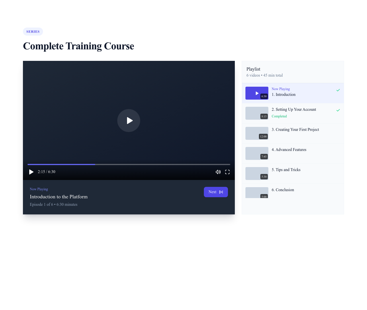
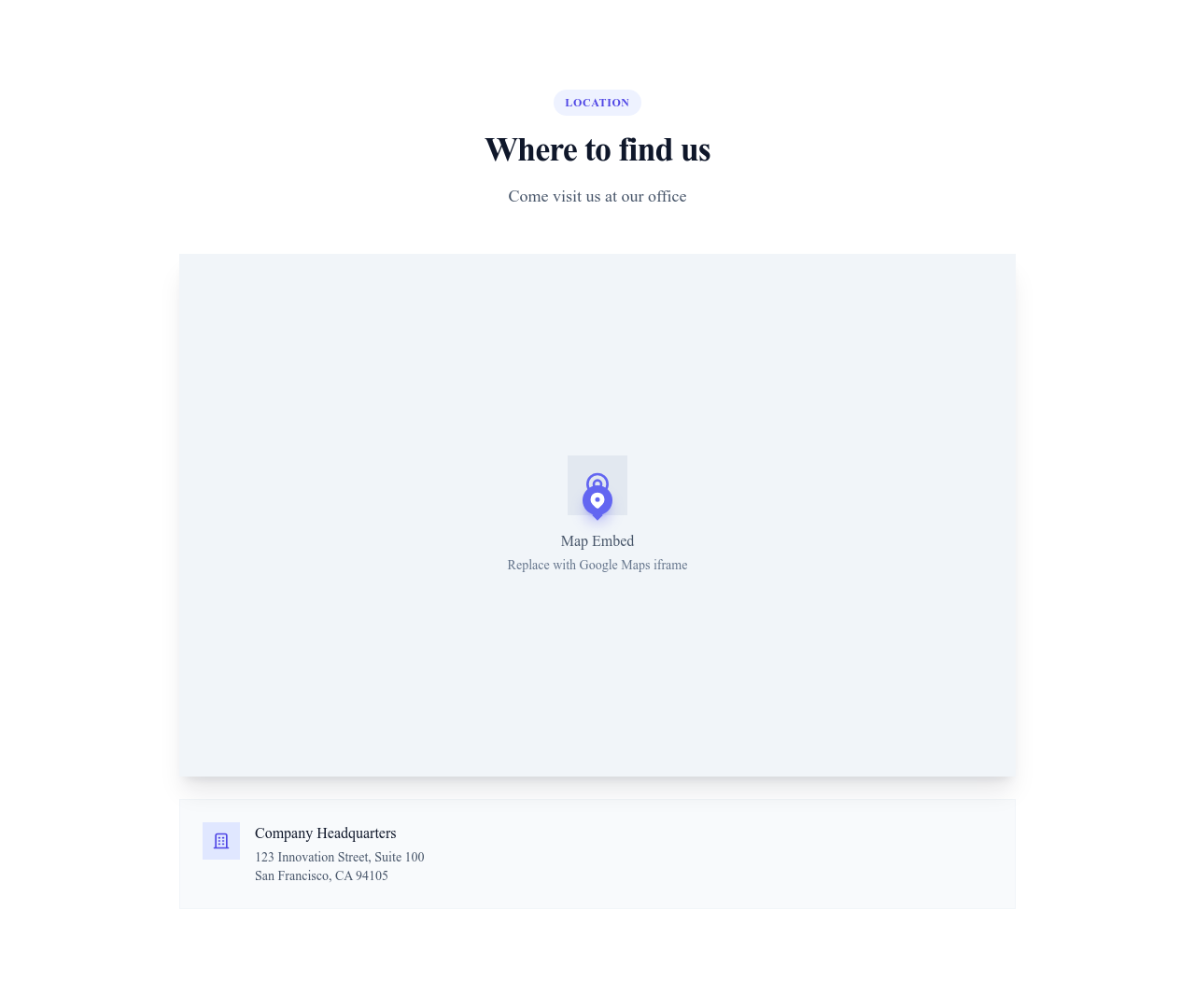




Divider Diagonal
Diagonal separator that creates an angled transition between two sections
Utilities





Button Full Width
Full-width button that stretches across its container, ideal for forms and mobile
Buttons


Button Floating (FAB)
Floating action button fixed in a corner of the screen for a key action
Buttons


Input Rounded
Fully rounded text input field with a soft pill shape for forms and search bars
Inputs


Badge Verified
Round verified badge with a checkmark that marks an authentic account or product
Badges


Avatar Placeholder
Placeholder avatar with a generic silhouette for profiles without a photo
Avatars


Dialog Delete
Delete confirmation dialog with a red trash icon, a warning and cancel or delete buttons
Modals

Dialog Success
Success dialog with a green check icon, a confirmation message and an OK button
Modals


Container Medium
Medium-width container that centers content with a comfortable reading width
Layout


Section Dark
Section with a dark background for contrast and emphasis between lighter sections
Layout


Banner Announcement
Announcement banner across the top of the page for news or a special offer
Alerts


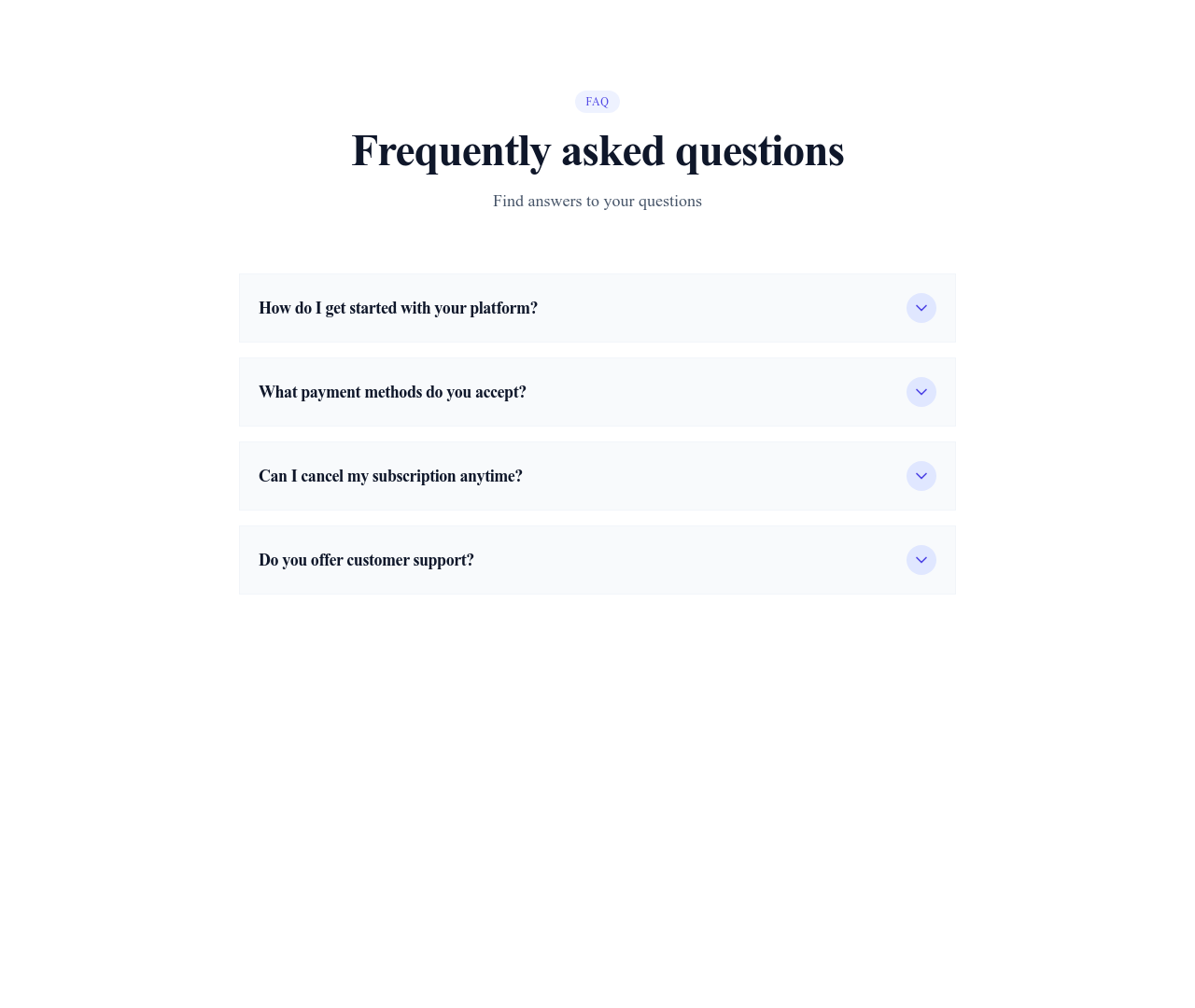
Accordion Plus Minus
Accordion with a plus icon that turns into a minus when a panel opens
Accordions


Accordion Nested
Multi-level accordion with panels nested inside other panels for deep content
Accordions


Steps Horizontal
Horizontal stepper that shows progress through a multi-step form or process
Navigation


Nothing matches this filter.
Guide
While sections form the skeleton of a page, components are the organs that make it functional. Our UI component library provides 300+ elements you can drop into any section or page layout to build rich, interactive interfaces without writing custom CSS. Every component is self-contained, responsive, and designed to harmonize with others.
Component Categories
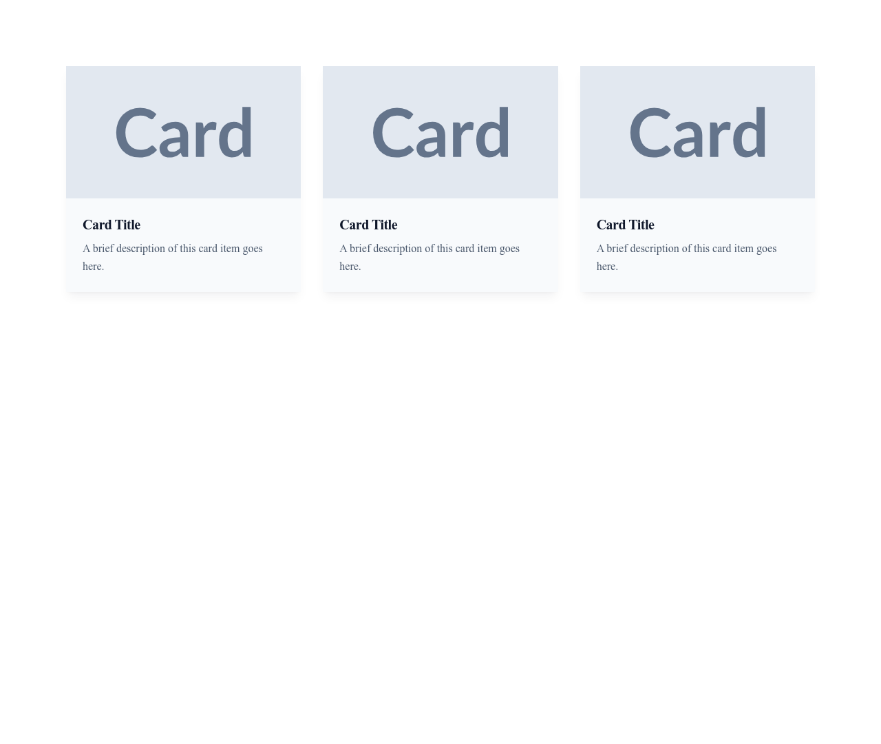
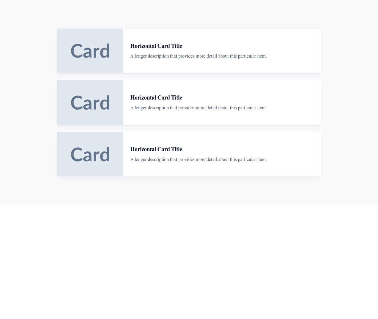
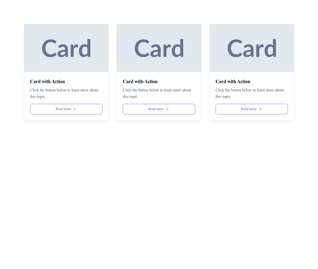
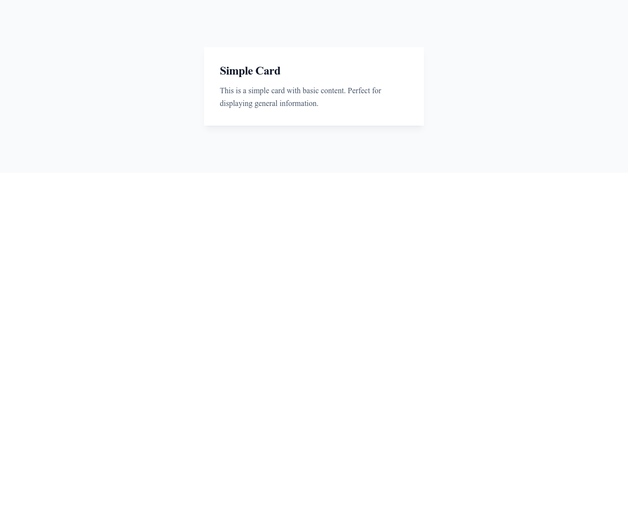
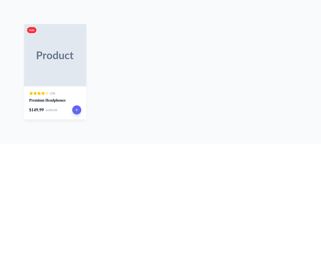
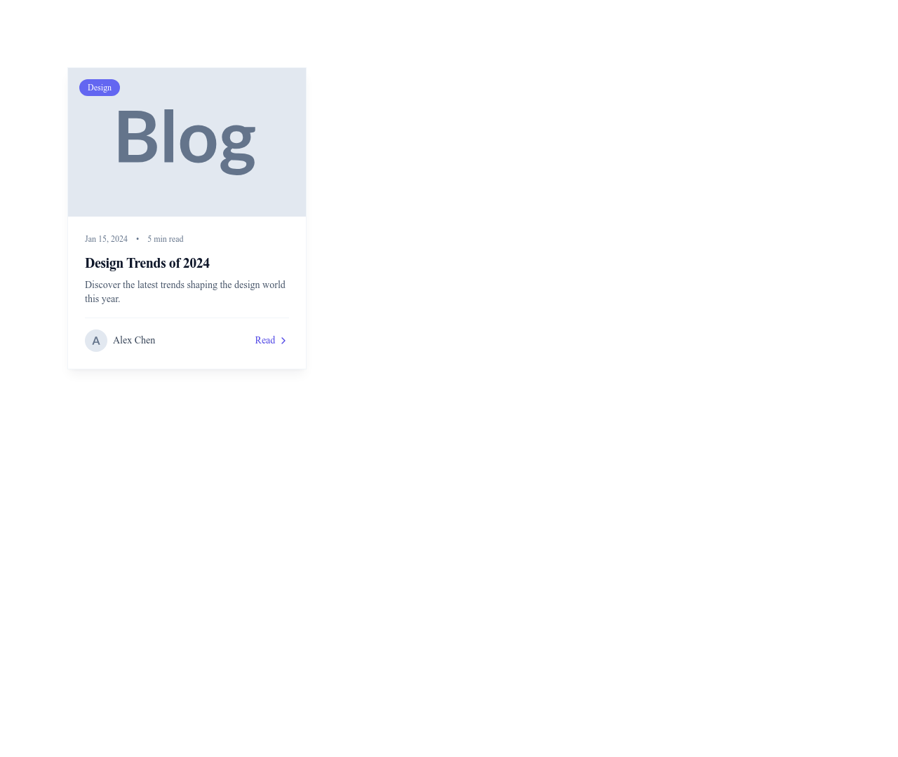
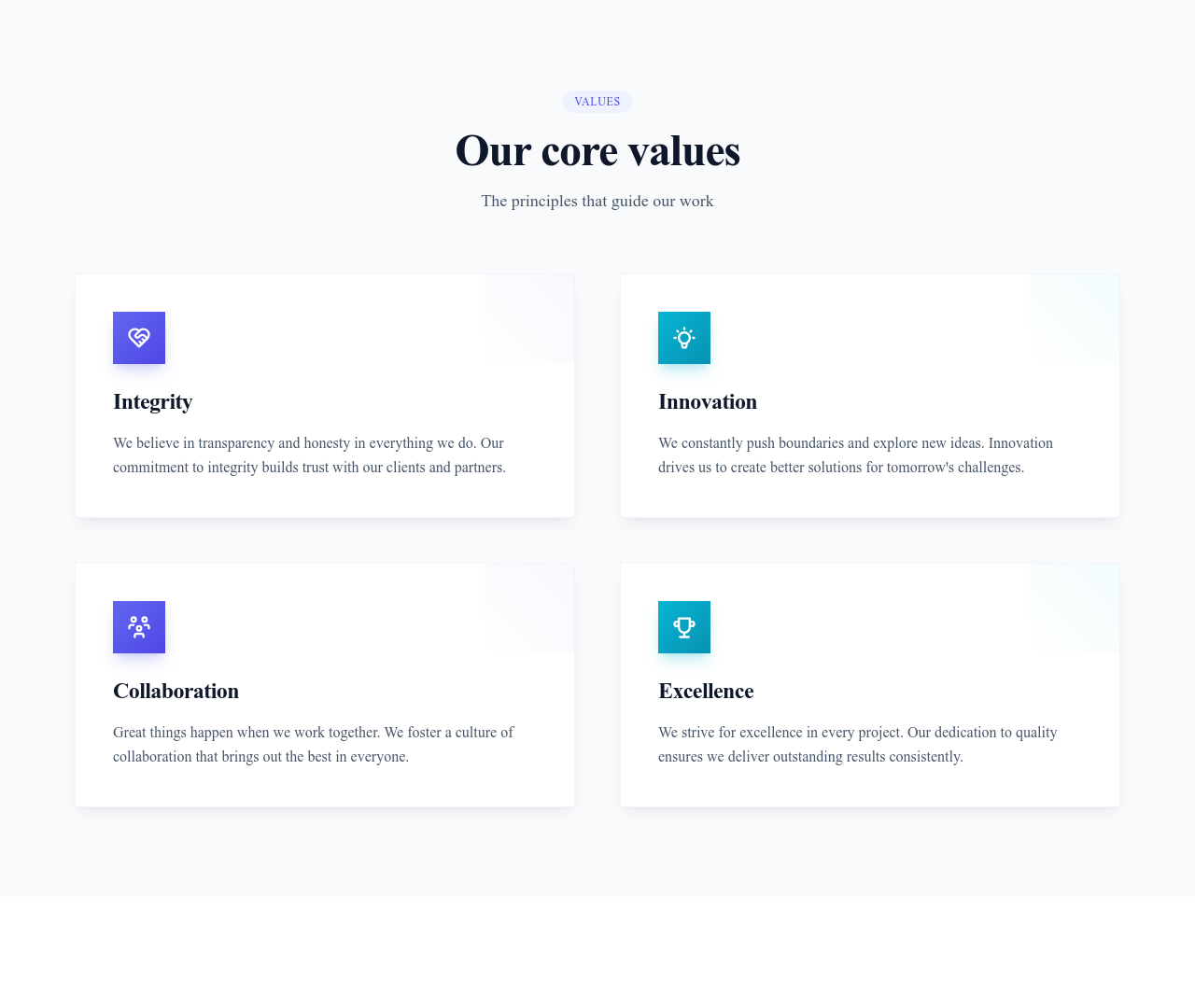
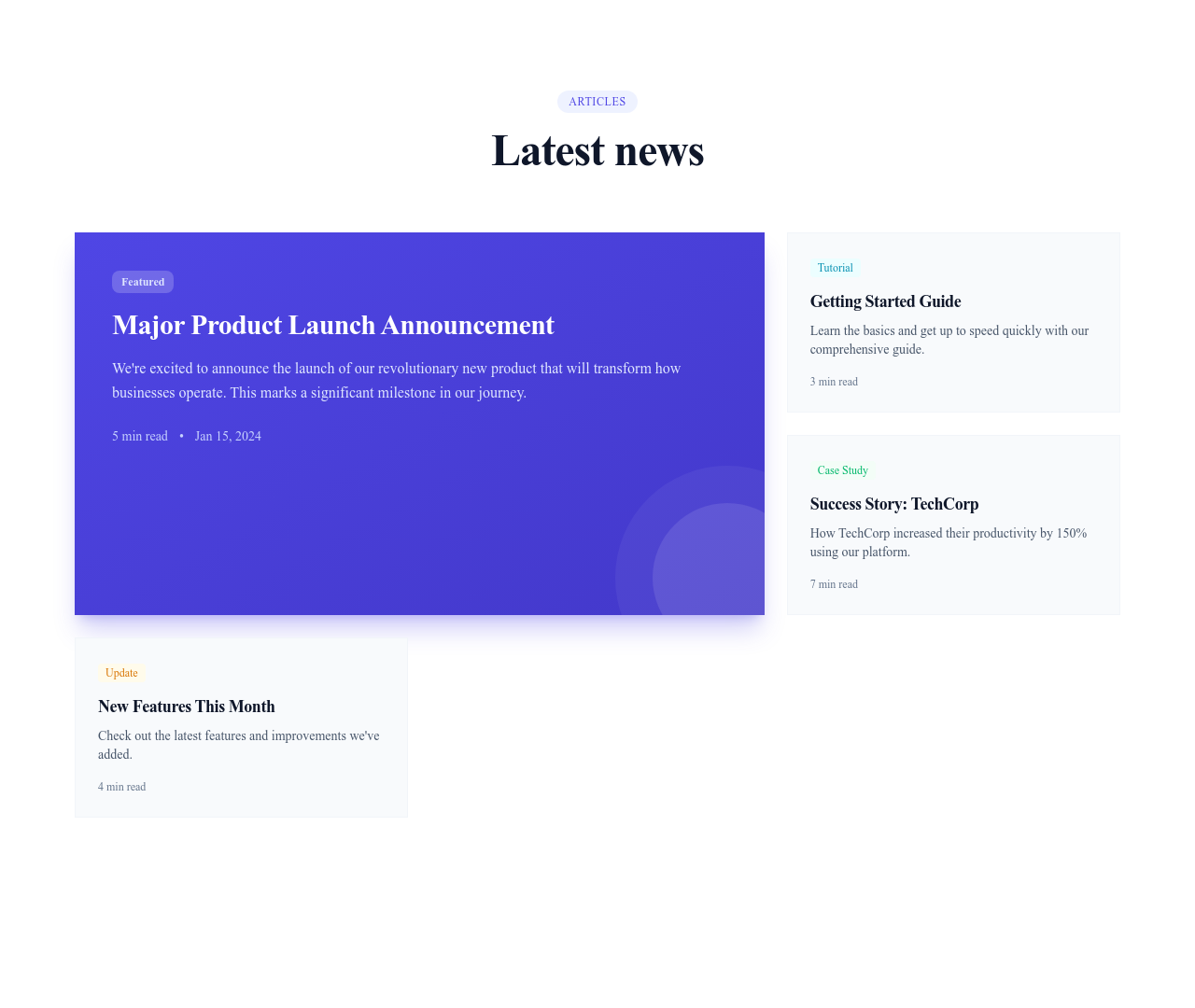
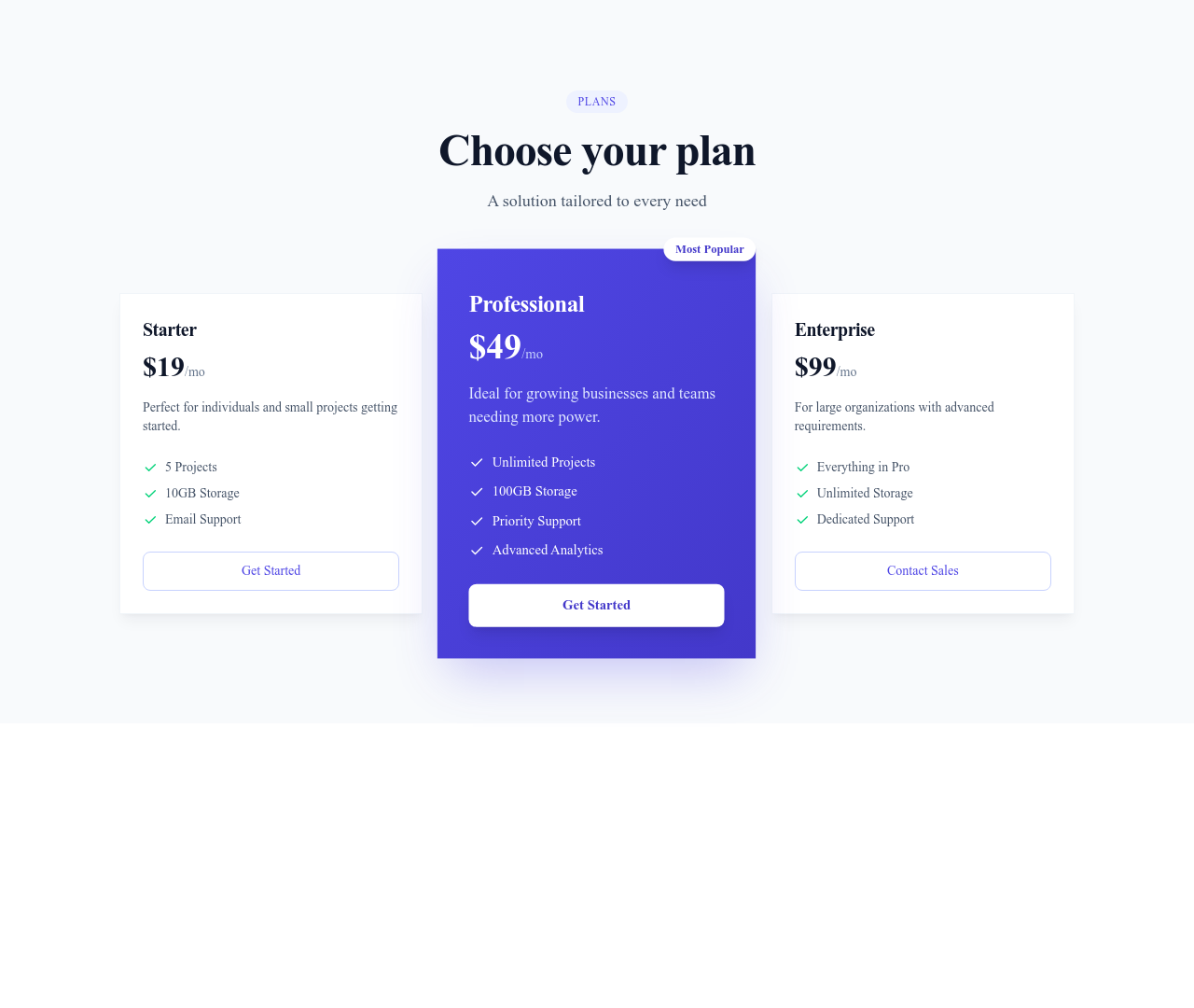
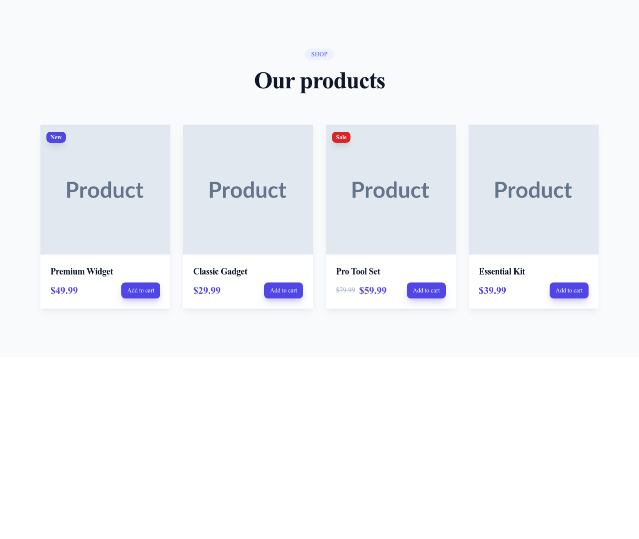
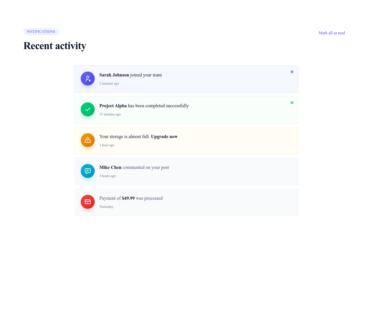
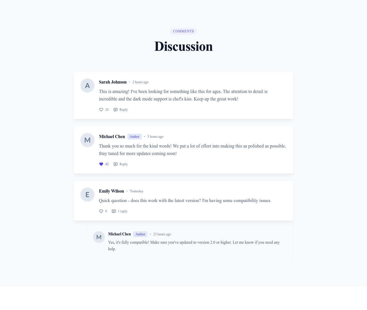
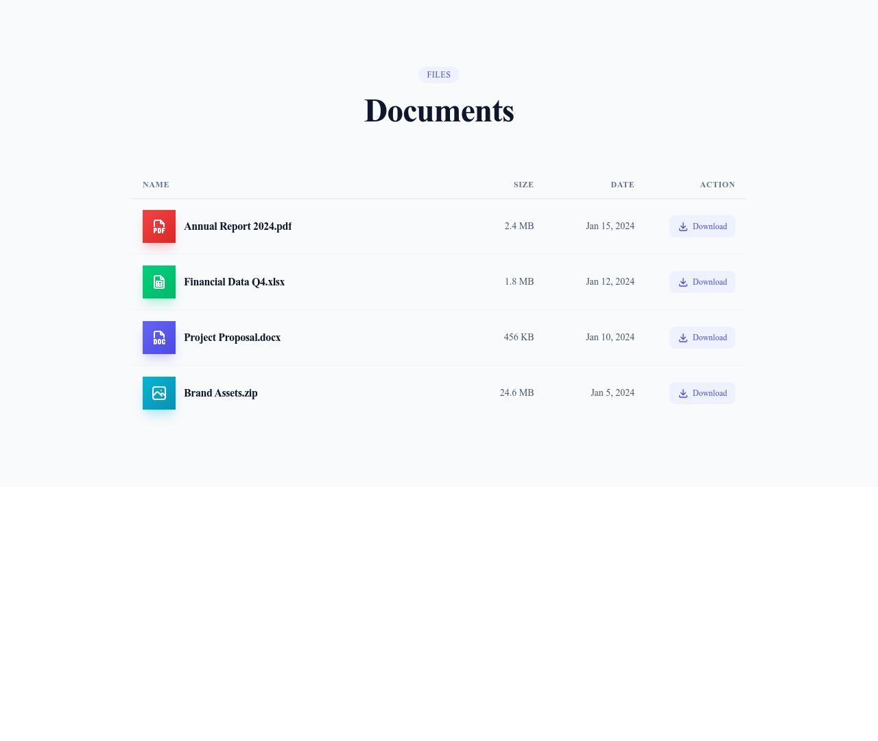
Card components are the most versatile — use them for blog posts, products, team members, or feature highlights. Form inputs handle text fields, selectors, toggles, and file uploads with consistent styling across browsers. Modals and dialogs present focused content without leaving the page. Badges, tags, and avatars add visual metadata to lists and profiles. Tables display structured data with sorting and responsive horizontal scrolling for mobile. Buttons, alerts, progress indicators, and dividers round out the collection with essential interface elements.
How Components Differ From Sections
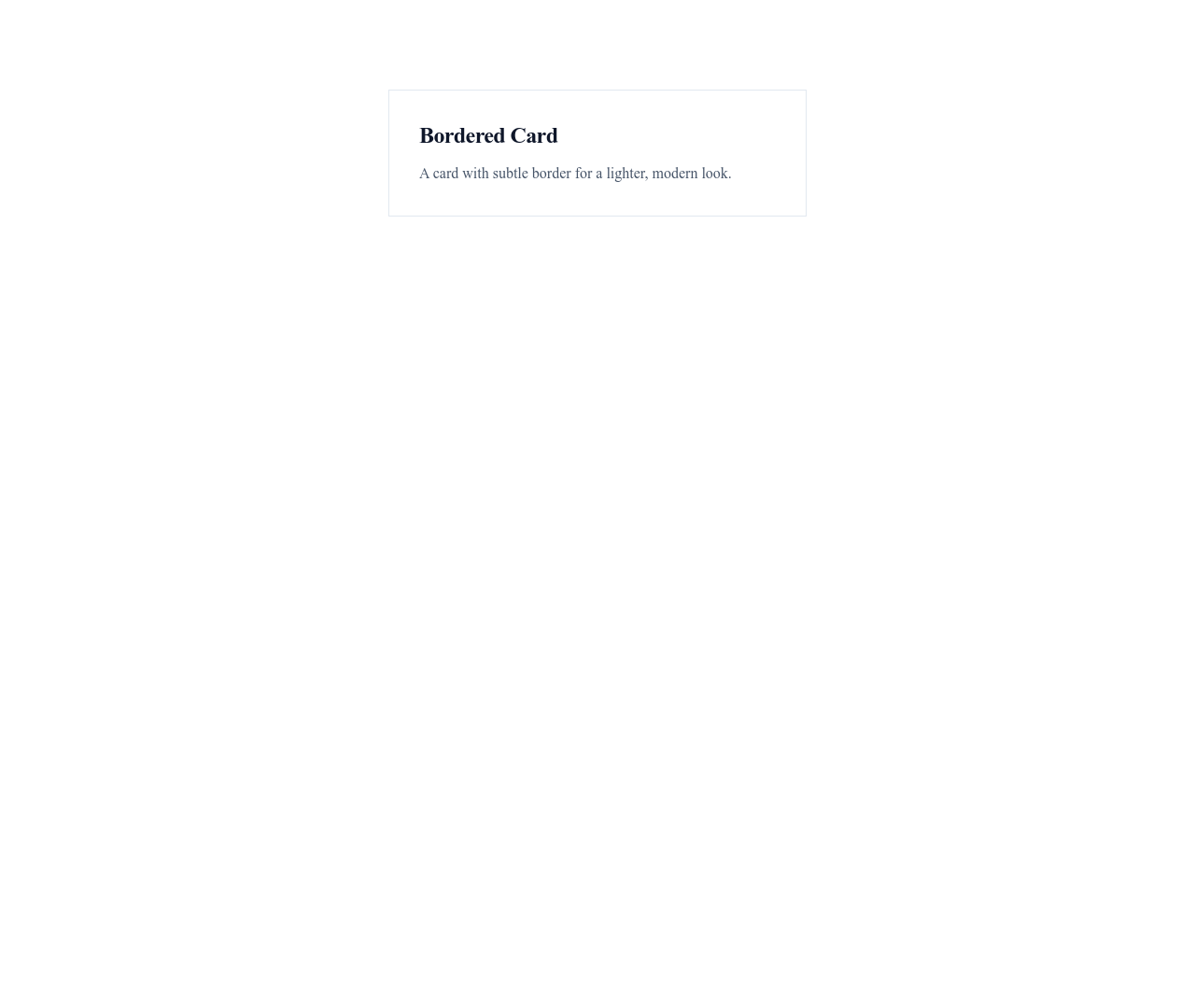
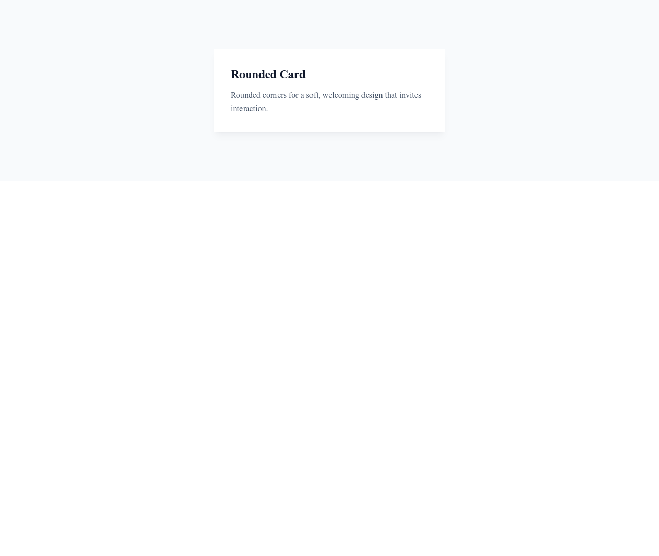
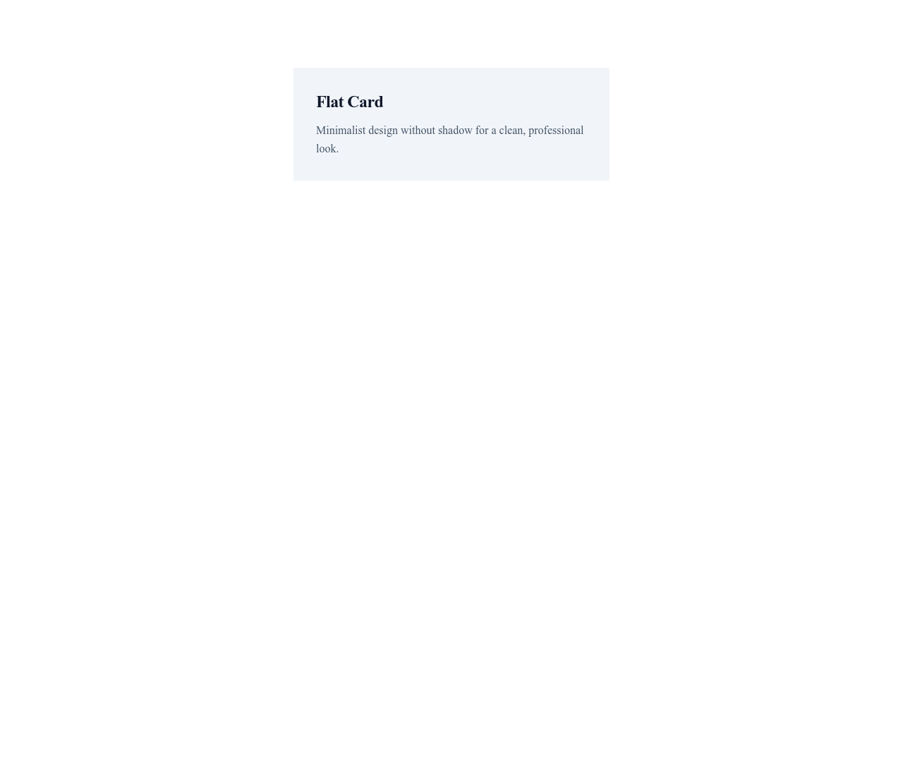
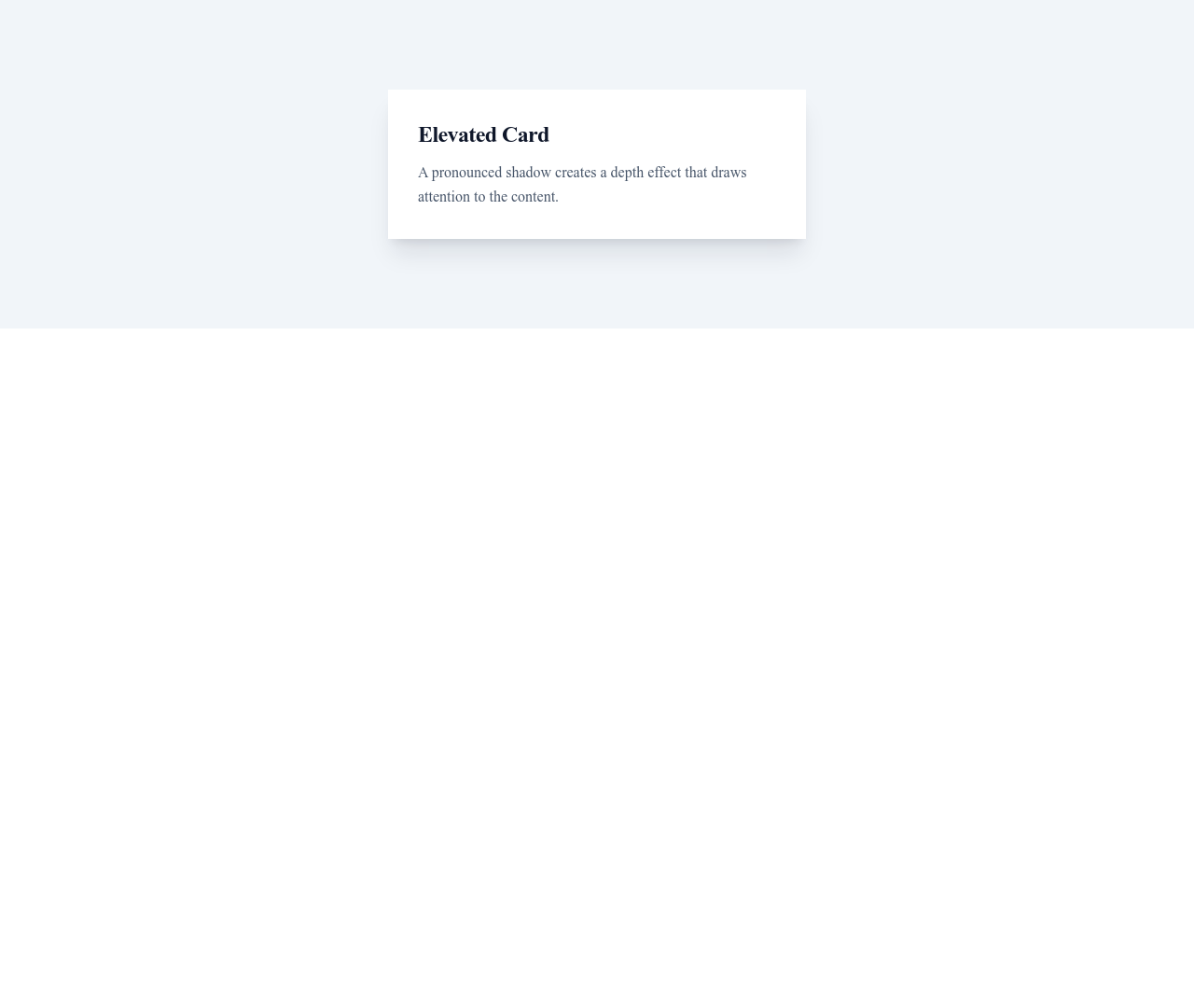
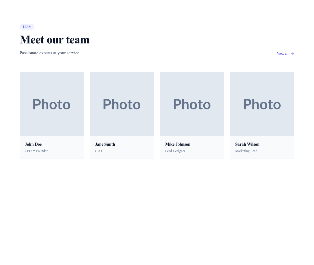
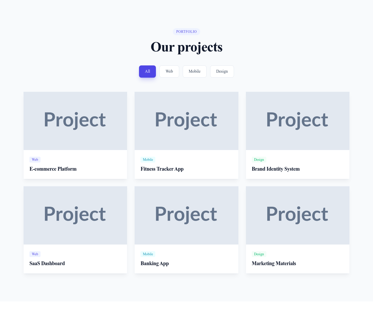
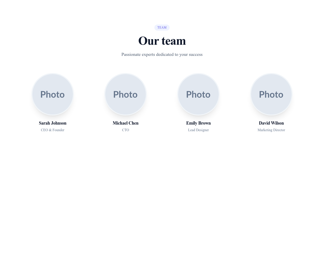
Sections are full-width, self-contained blocks (think: a pricing table that spans the entire page). Components are smaller pieces that live inside sections. A "team section" might use card components for each team member, badge components for roles, and avatar components for photos. This modular approach lets you customize sections at the finest level of detail without rebuilding from scratch.
Built With Tailwind CSS
Every component uses Tailwind CSS utility classes, making them easy to customize directly in the markup. Need to change a card's border radius? Swap rounded-lg for rounded-xl. Want different spacing? Adjust the padding utilities. The consistent styling system means all components look harmonious together, whether you are building a SaaS dashboard, a product catalog, or a creative portfolio. Components also inherit your site's theme colors, so they adapt when you switch between dark and minimal styles.
Questions
What is the difference between a component and a section?
A section spans the full width of the page and serves as a standalone content block (hero, pricing, footer). A component is a smaller, reusable element (card, button, badge) that lives inside a section. You compose sections from components.
Can I use these components outside Communik?
Yes. Components are built with standard HTML and Tailwind CSS classes. You can copy the markup into any project that uses Tailwind CSS. They are not locked to the Communik platform.
How do I customize component colors?
Components inherit your site's theme colors (primary, secondary, neutral). To change a specific component, edit its Tailwind classes in the code editor — swap color utilities like bg-primary-500 to bg-blue-600 or any color you prefer.
Keep exploring
Accordions Components
Browse accordions components templates
Alerts Components
Browse alerts components templates
Avatars Components
Browse avatars components templates
Blog Module
Complete blog feature with multiple design variants
About Page Templates
Full page layouts in the about category
Templates for Healthcare
Templates designed for healthcare businesses
Stripe Templates
Templates with Stripe integration support
Your next site starts here.
Everything here is one click away.
Every section, component, page and module in this library is ready inside the Communik editor, styled with your brand.
Free to start. No credit card.