

Components · 73 items
Card Components for Every Type of Content
Versatile card components for blog posts, products, profiles, features, and statistics. Includes image cards, horizontal cards, overlay cards, and interactive hover effects.
Browse · Categories
Card Components for Every Type of Content
73 items






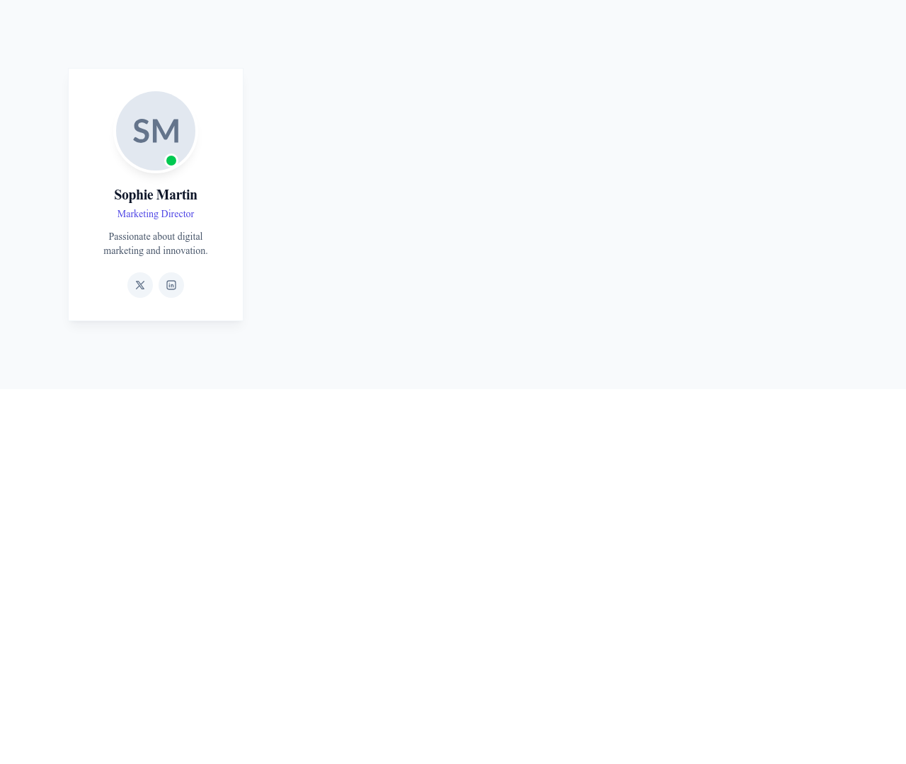



Card User Horizontal
Horizontal user card with the avatar on the left and name, title and bio on the right
Cards
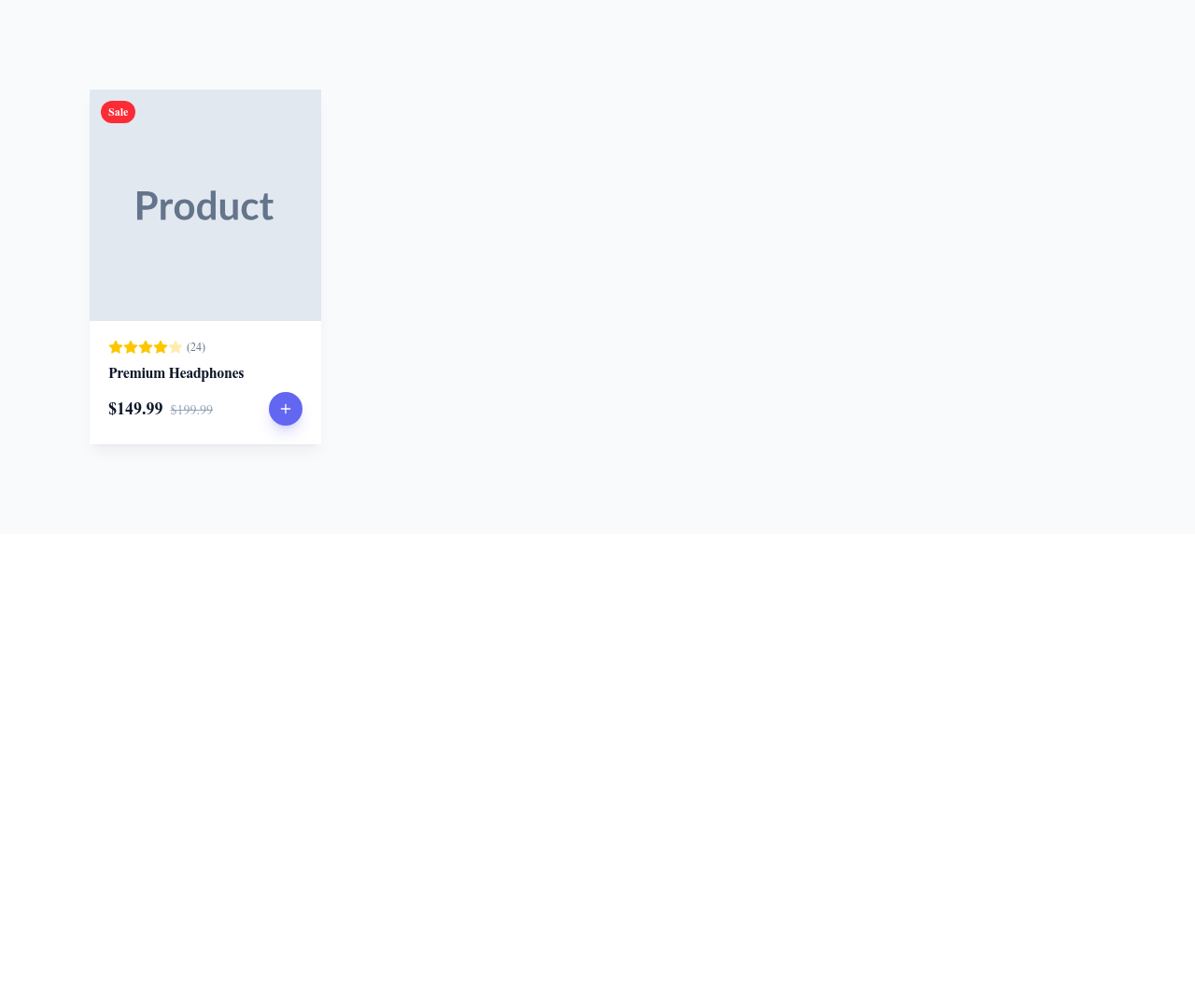


Card User Social
User profile card with avatar, name, short bio and a row of social media icons
Cards



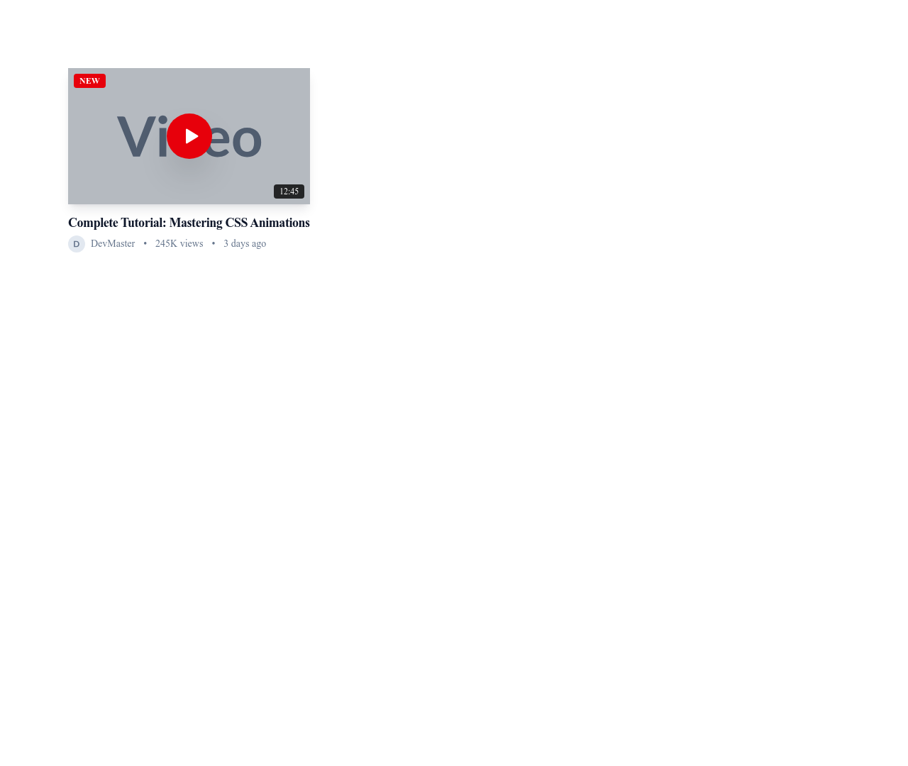
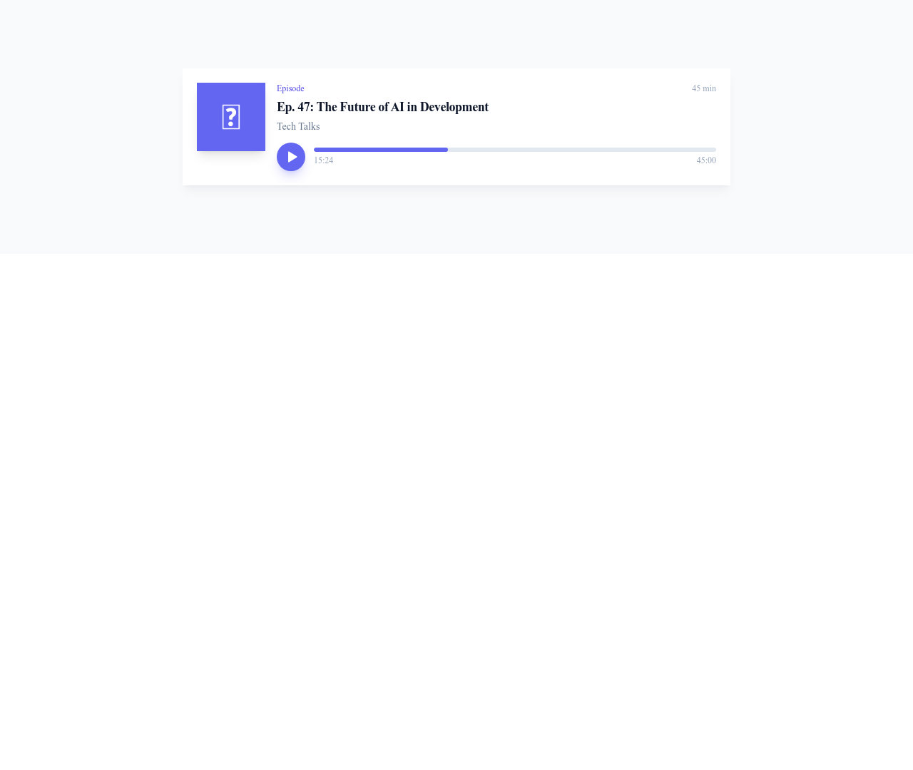


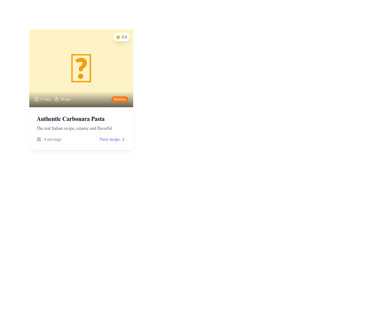

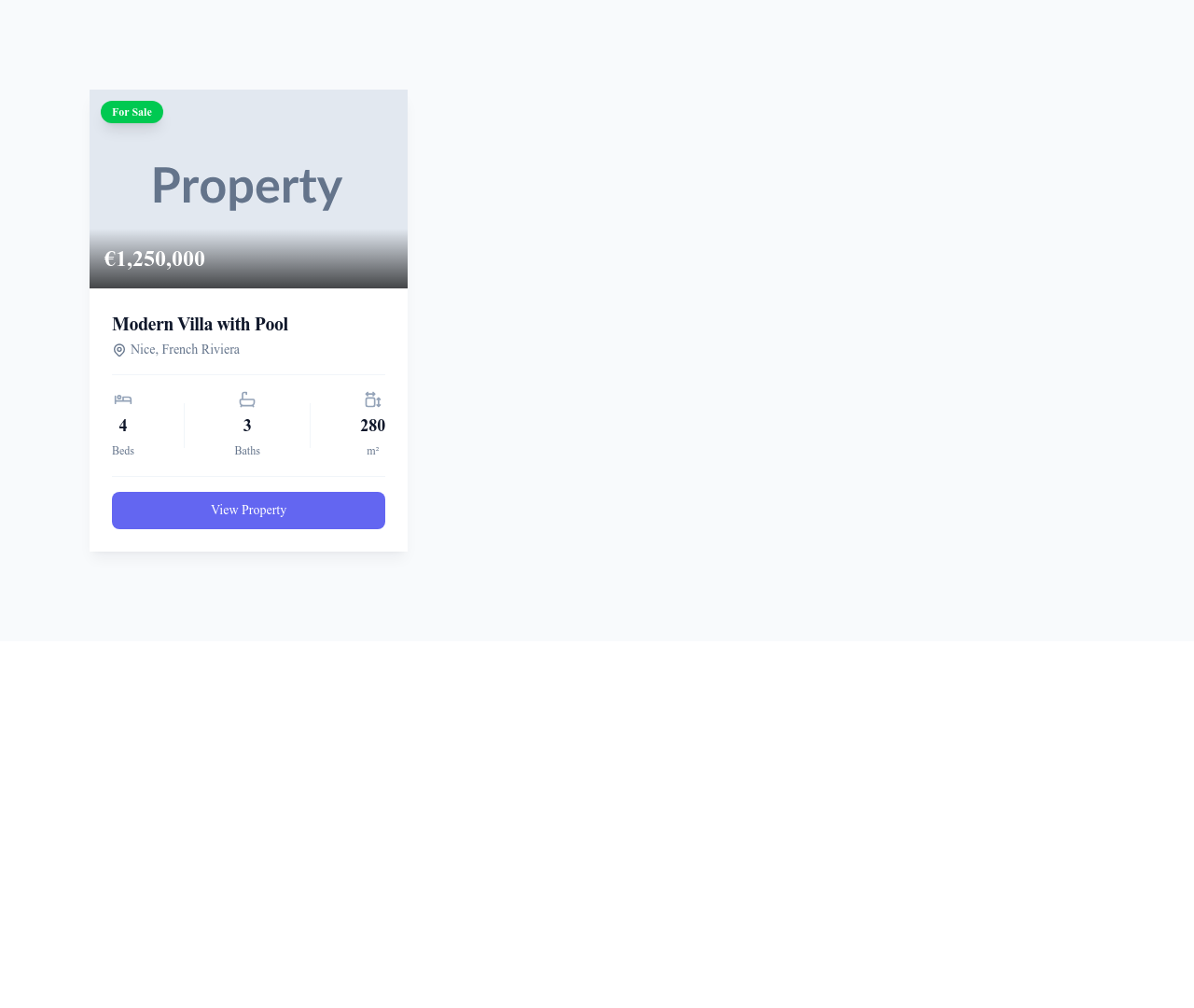

Card Article Horizontal
Horizontal article card with the image on the left and category, title, excerpt and details on the right
Cards

Card Article Minimal
Clean article card without an image, showing category, title, excerpt and date
Cards


Card Stat Trend
Metric card showing a key number, its label and a trend indicator with percentage change
Cards


Card Weather
Weather card showing the city, a weather icon, the temperature and current conditions
Cards


Nothing matches this filter.
Guide
Cards are the Swiss Army knife of web design. They package content — an image, a title, a description, and an action — into a tidy, scannable unit that works in grids, carousels, and lists. Our 73 card templates cover every content type you will encounter when building a website, from simple text cards to richly interactive product showcases.
Card Variations
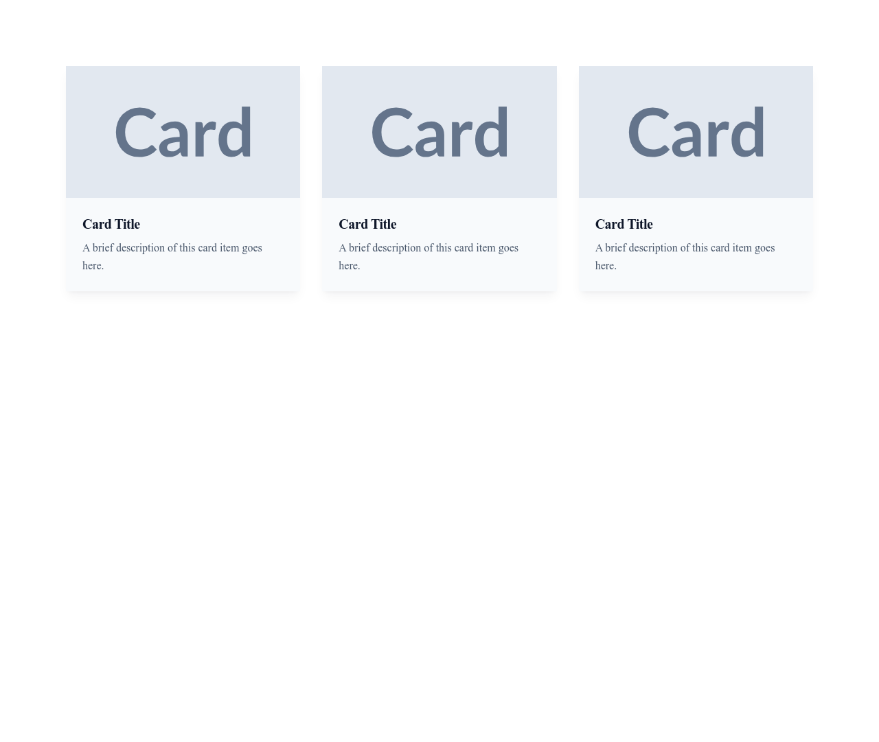
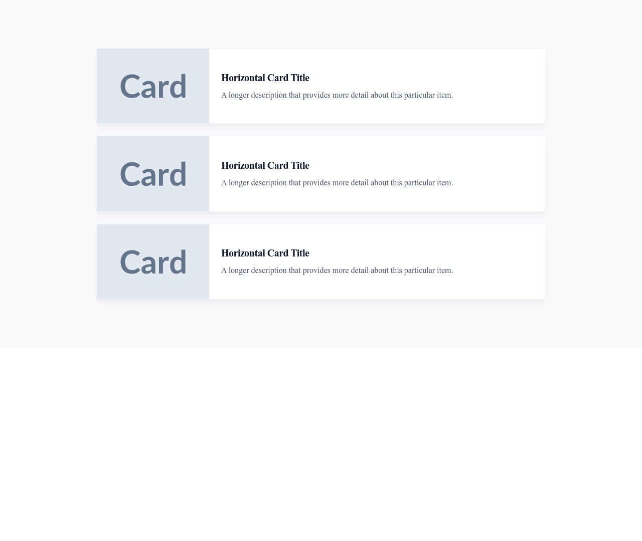
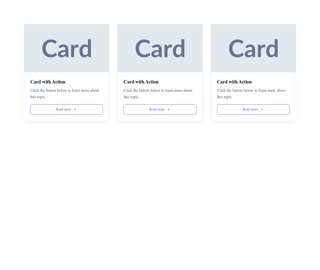
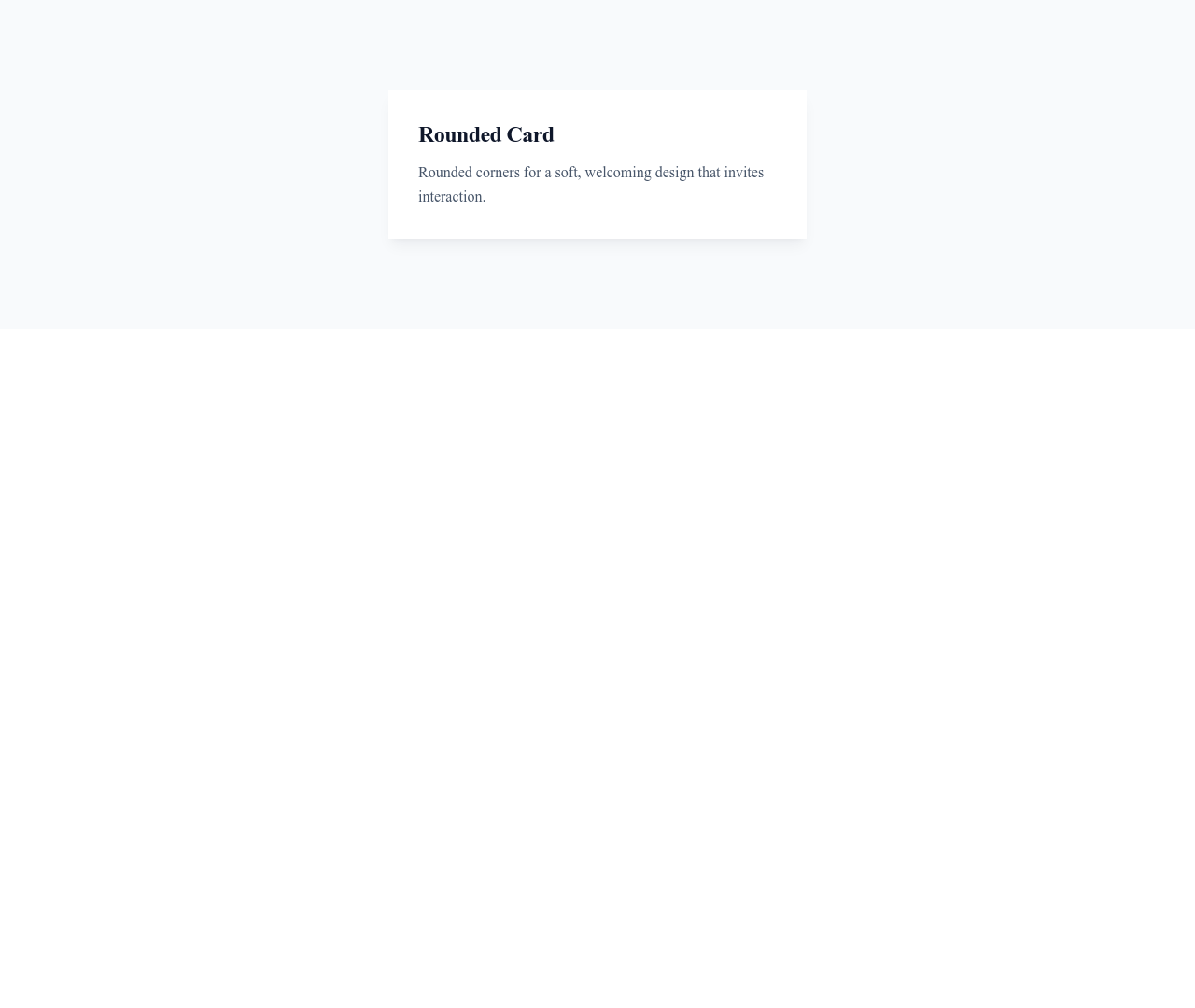
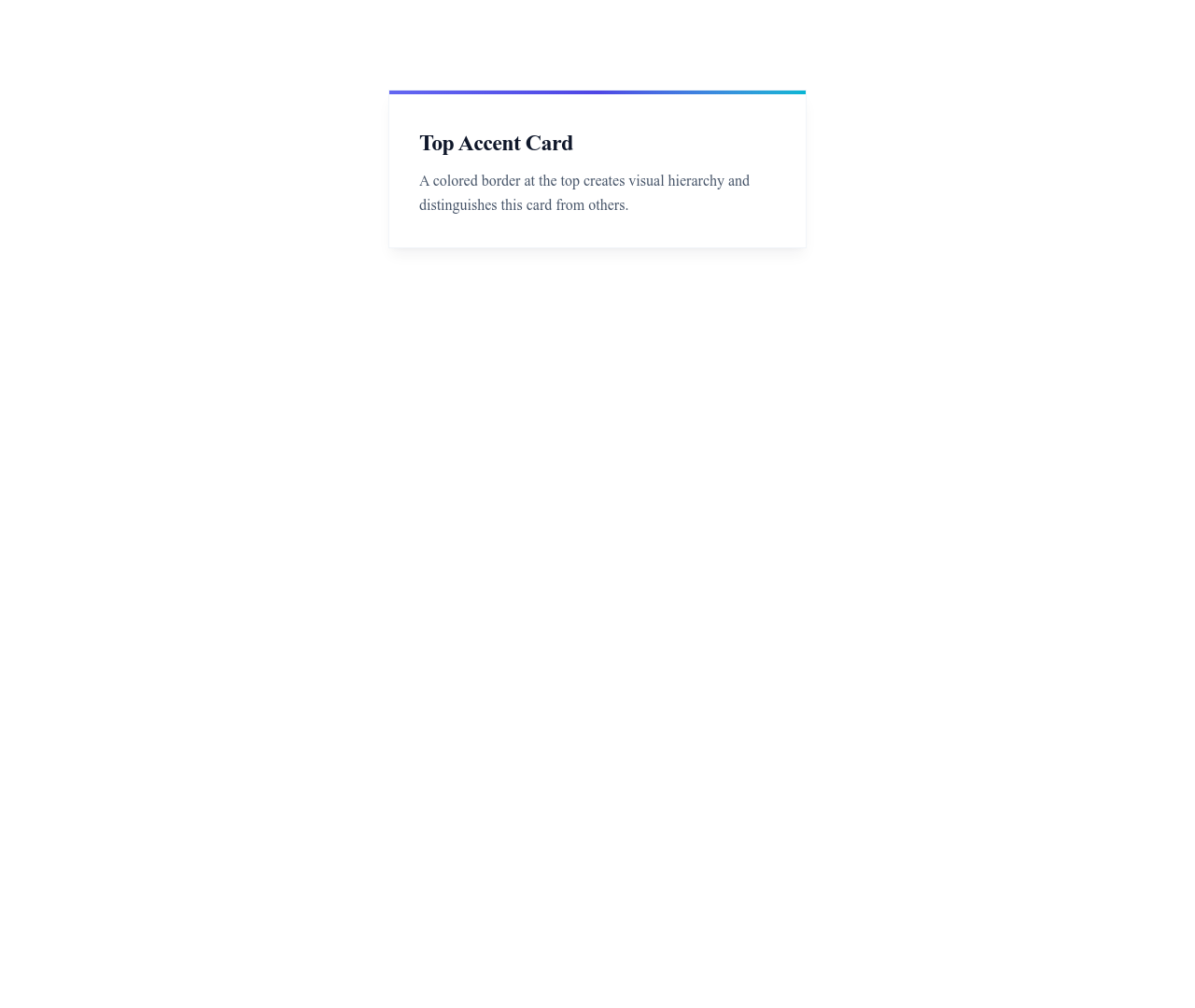
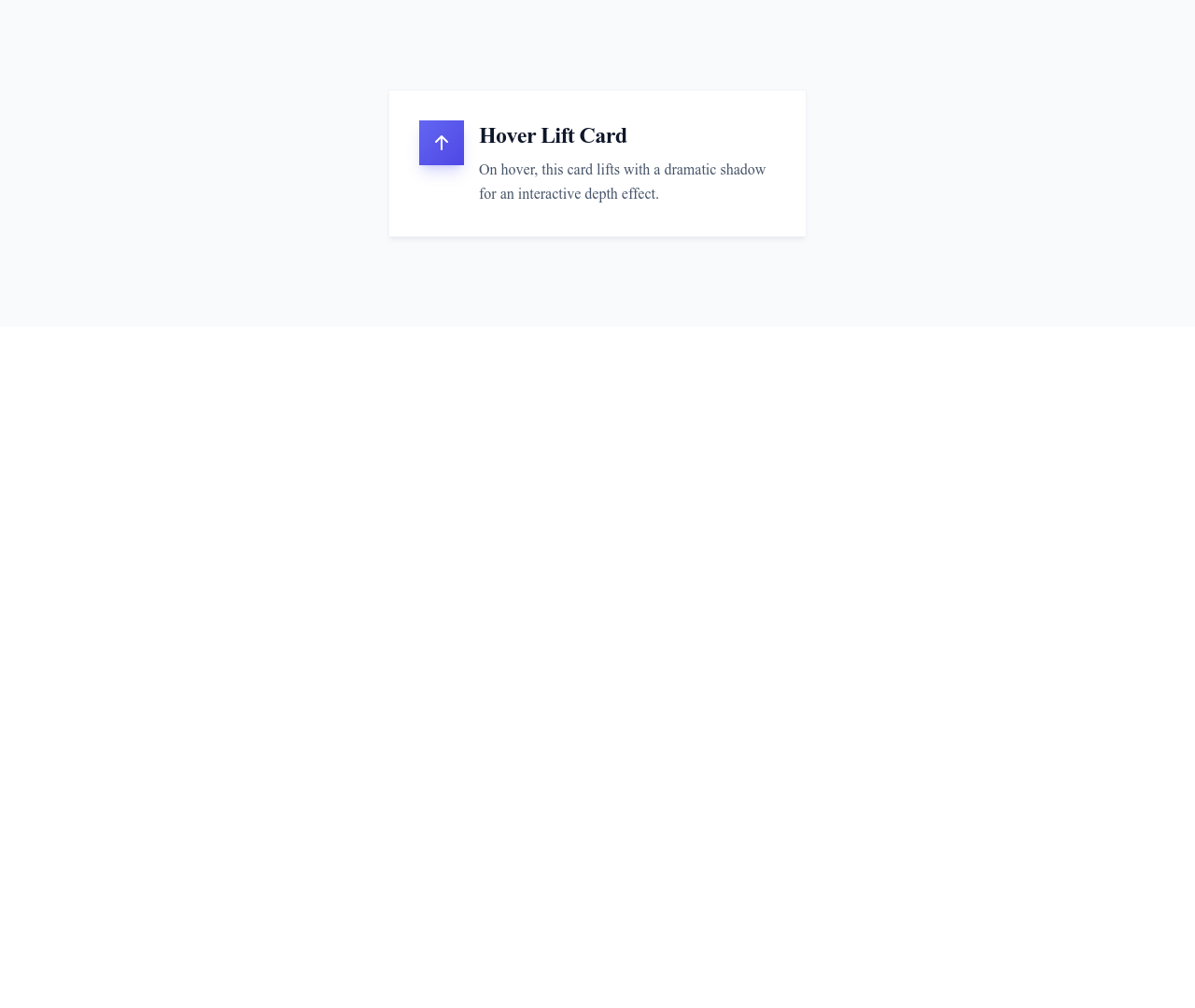
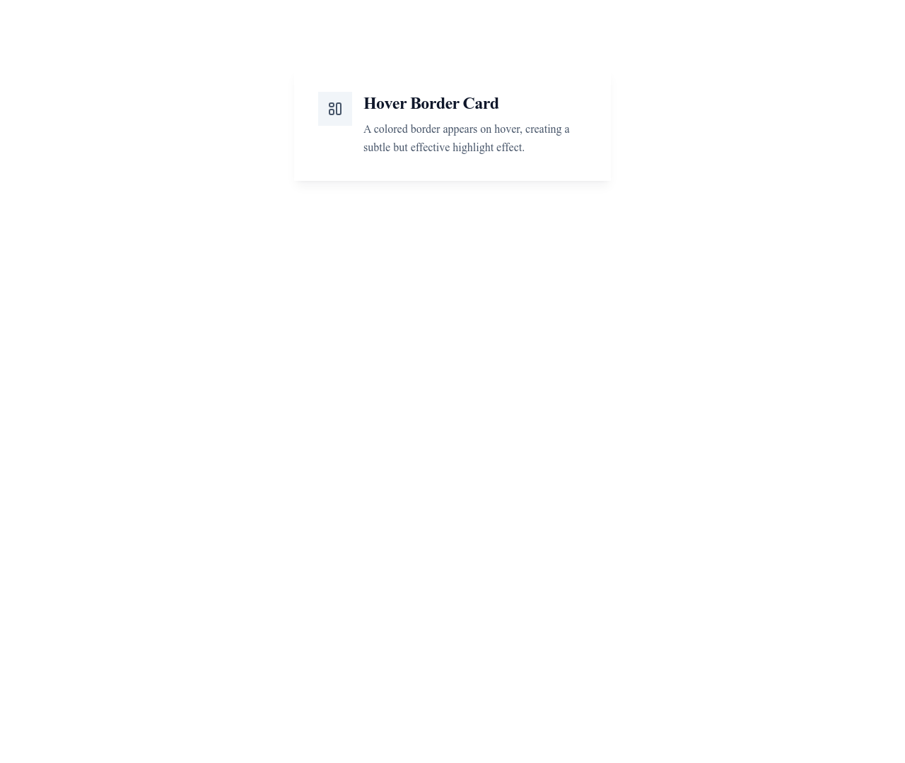
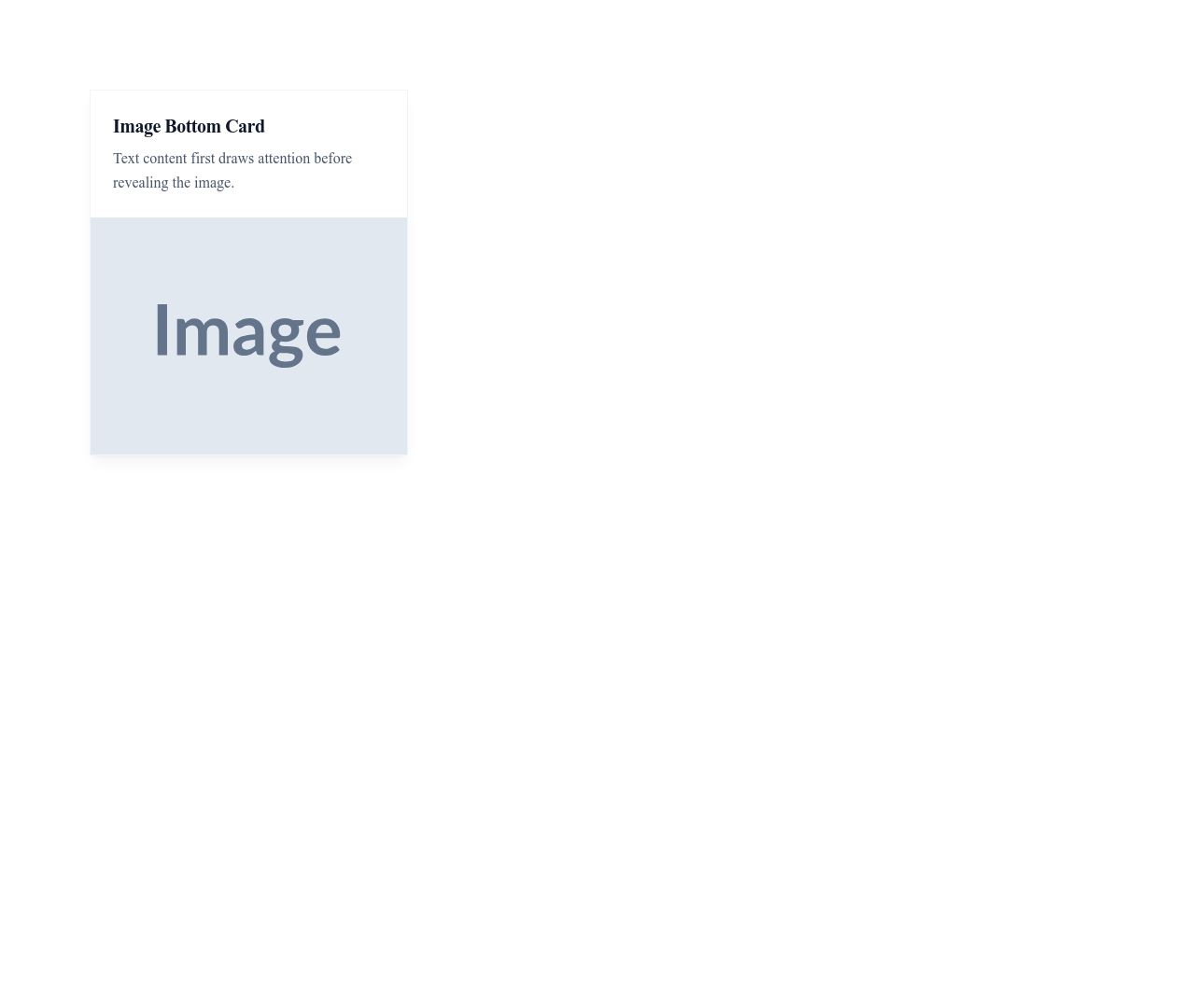
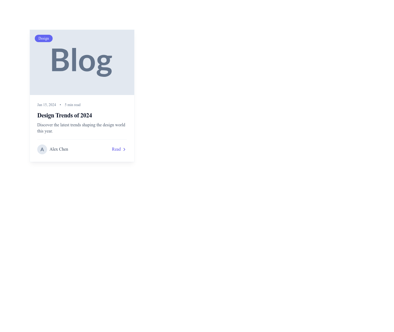
Vertical image cards are the classic layout for blog posts, news articles, and products: image on top, text below, action at the bottom. Horizontal cards place the image to the side, ideal for search results, compact listings, and sidebar widgets. Overlay cards layer text on top of an image with a gradient for a dramatic, editorial look popular on portfolio sites. Interactive cards feature hover effects — scale, shadow lift, or color shift — that invite clicks and signal interactivity to the user.
Using Cards Effectively
Display cards in responsive grids: 3 columns on desktop, 2 on tablet, 1 on mobile. Keep card titles under 60 characters and descriptions under 120 characters for consistent grid alignment. Use consistent image aspect ratios across a card grid to avoid ragged layouts — 16:9 for landscape content, 4:3 for products, and 1:1 for profile avatars. Add action buttons or links at the bottom of each card for clear navigation.
Cards in Context
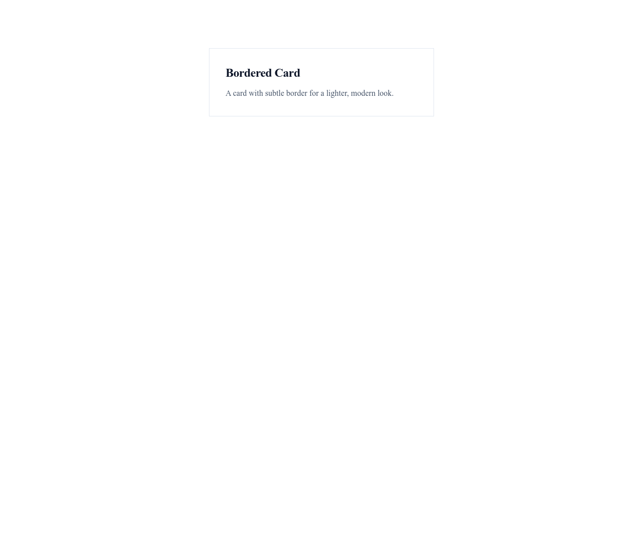
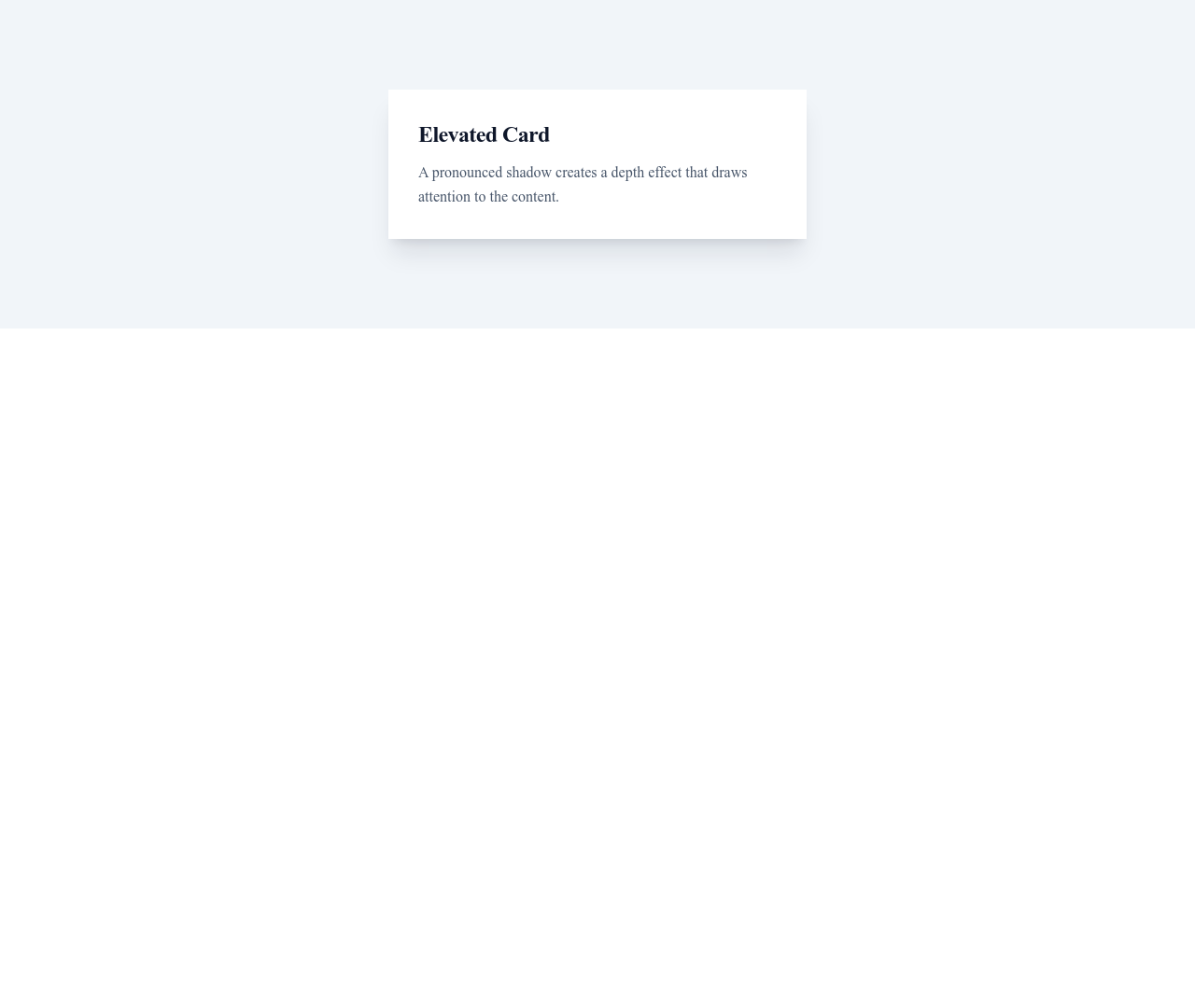
Use product cards in your e-commerce module, blog post cards in a blog module, and profile cards in testimonial sections or team pages. Combine feature cards with a hero section to create a compelling landing page. Cards also work beautifully in dark mode designs with subtle border accents and elevated shadows. For minimal sites, use borderless cards with generous whitespace for an airy, refined look.
Questions
What is a card component in web design?
A card is a rectangular container that groups related content — typically an image, heading, short description, and action button. Cards are used to present items in scannable grids, like product listings, blog posts, or team members.
How many cards should I display per row?
Use 3-4 cards per row on desktop, 2 on tablet, and 1 on mobile. For very information-dense cards, 2 per row on desktop may be better. Avoid more than 4 per row as cards become too narrow to read.
Can I add hover effects to cards?
Yes. Many of our card templates include built-in hover effects: shadow elevation, scale transforms, color overlays, and button reveals. Hover effects signal interactivity and improve click-through rates.
What image aspect ratio should I use for cards?
Use 16:9 for content cards (blog, news), 4:3 or 1:1 for product cards, and 1:1 for profile/avatar cards. Consistency within a grid is more important than the specific ratio — mixed ratios create a messy layout.
Keep exploring
Accordions Components
Browse accordions components templates
Alerts Components
Browse alerts components templates
Avatars Components
Browse avatars components templates
Blog Module
Complete blog feature with multiple design variants
About Page Templates
Full page layouts in the about category
Templates for Healthcare
Templates designed for healthcare businesses
YouTube Templates
Templates with YouTube integration support
Your next site starts here.
Everything here is one click away.
Every section, component, page and module in this library is ready inside the Communik editor, styled with your brand.
Free to start. No credit card.