
Templates · 84 items
Minimal Website Templates: Less Is More
Clean, simple templates with generous whitespace, restrained color palettes, and refined typography. Perfect for brands that value elegance and clarity.
Browse · Categories
Minimal Website Templates: Less Is More
84 items
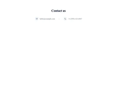
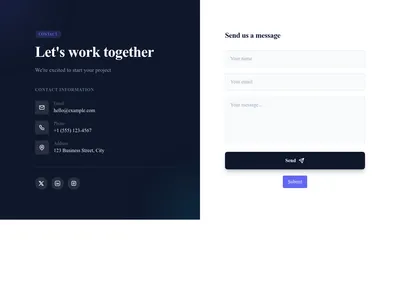
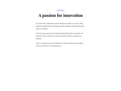



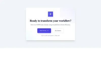

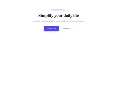


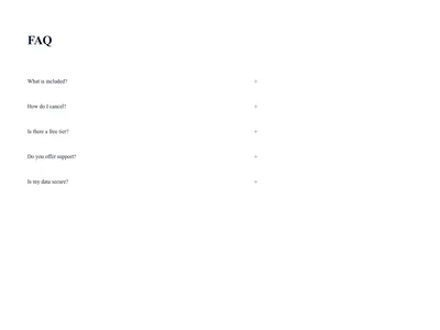
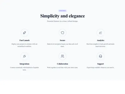
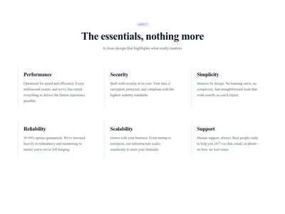



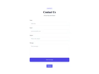


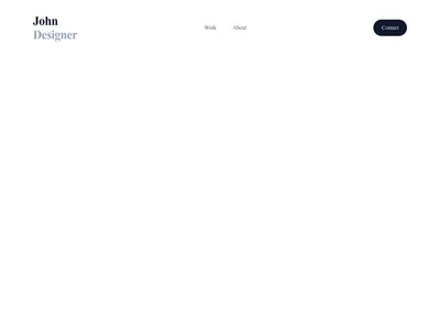
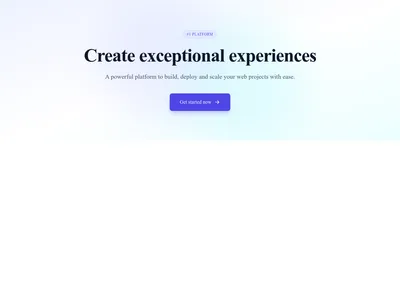
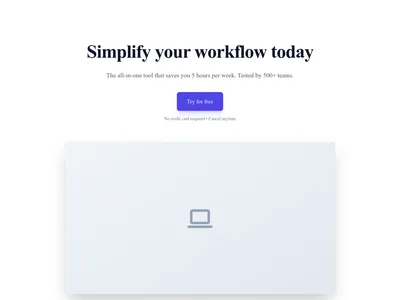
Hero Simple Centered
Centered hero with heading, subheading, and call-to-action button on a soft gradient
Hero
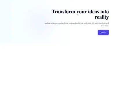
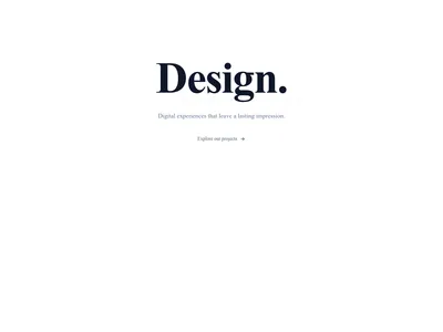

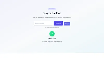

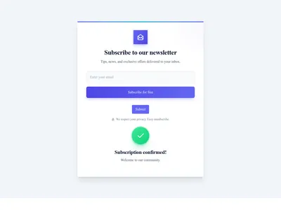
Newsletter Inline Simple
Compact inline newsletter form with input and button side-by-side
Newsletter


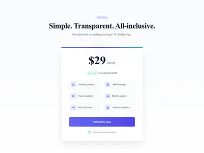

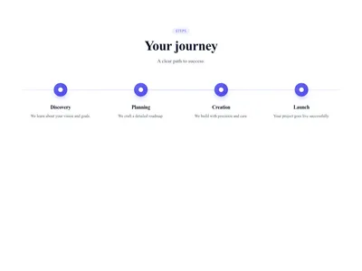
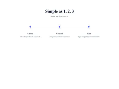
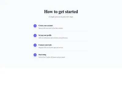
Steps Vertical Simple
Simple vertical list of numbered steps that walks visitors through a process
Steps & process

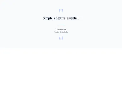
Testimonial Card Minimal
Minimal testimonial card showing only the quote and the customer name
Testimonials


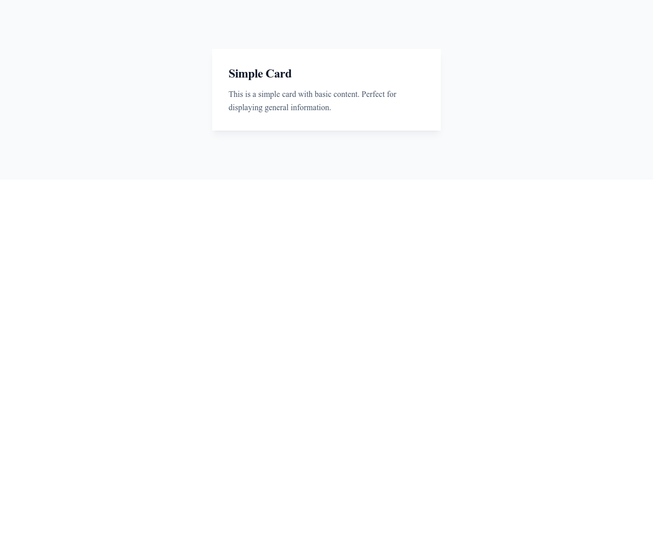
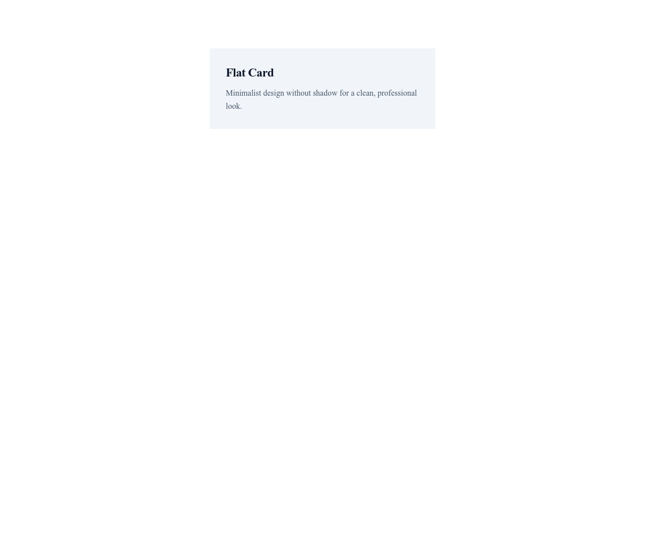

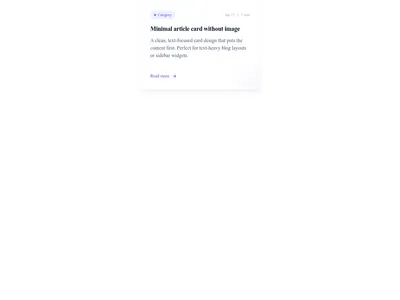
Card Article Minimal
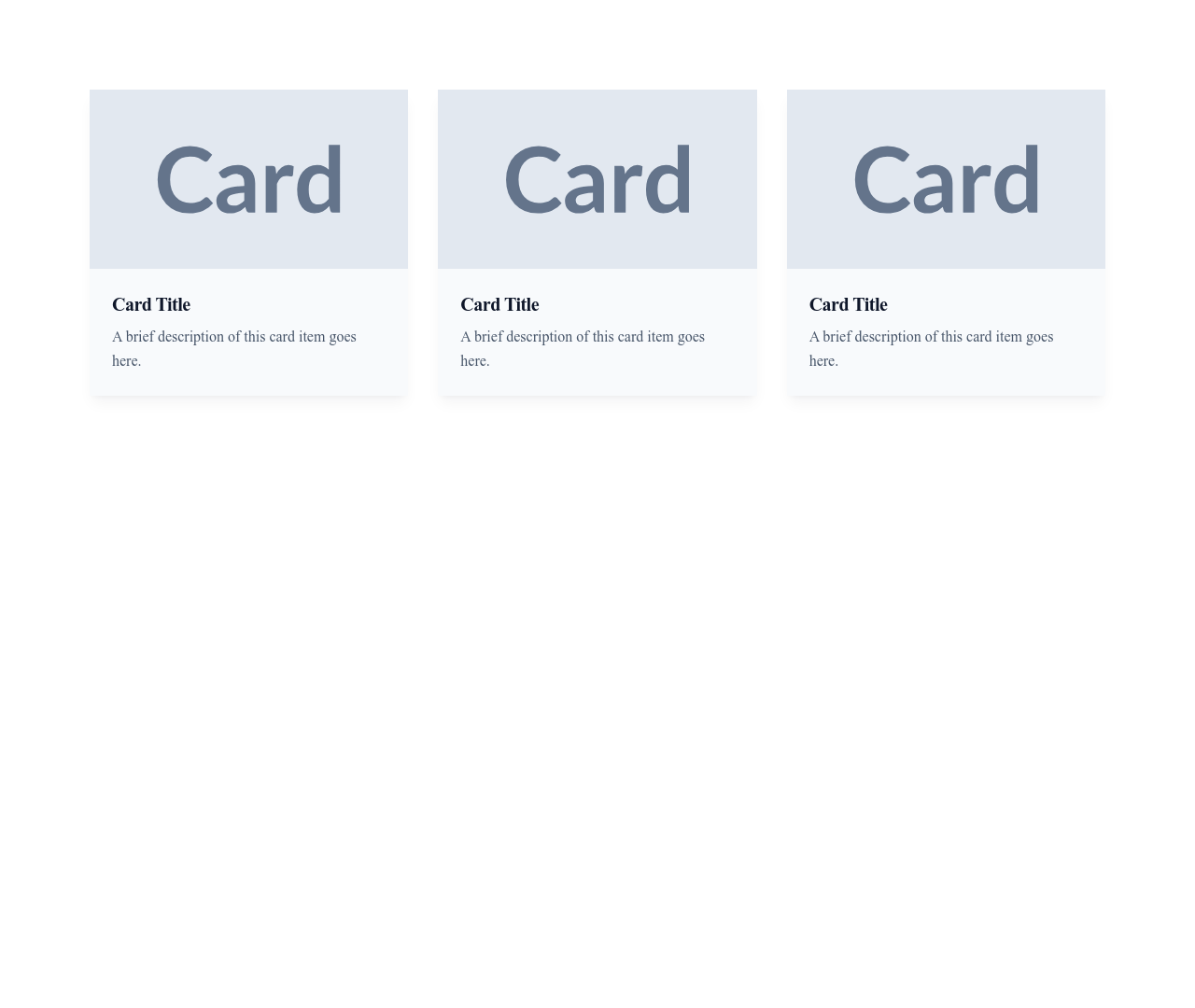
Clean article card without an image, showing category, title, excerpt and date
Cards


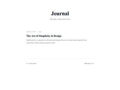
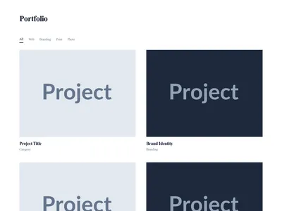
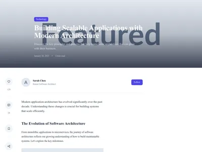
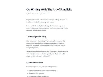
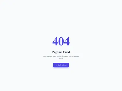
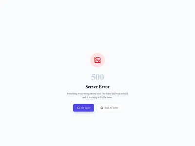
500 Server Error
Simple server error page with reassuring message and retry button
Error · 1 sections

SaaS Modern
Minimalist and modern SaaS homepage with hero, features, pricing, and testimonials
Landing · 9 sections

Nothing matches this filter.
Guide
Minimalism in web design is about reducing cognitive load — every element earns its place on the page. No decorative clutter, no gratuitous animations, no visual noise. Our minimal templates embrace whitespace, clear typography, and purposeful content to create websites that feel calm, confident, and effortlessly professional. They load faster, communicate more clearly, and age better than trend-heavy designs.
The Anatomy of Minimal Design
Minimal templates share key characteristics: generous whitespace, a restrained color palette (usually 2-3 colors plus neutrals), large serif or sans-serif typography that does the heavy lifting of establishing hierarchy, and high-quality imagery used sparingly for maximum impact. Navigation is simplified — often a single horizontal menu or a discreet hamburger icon with a clean header. Content is concise, with short paragraphs, clear headings, and plenty of breathing room.
Who Benefits From Minimal Design
Minimal templates are ideal for creative portfolios where the work should speak for itself without design distractions, personal brands that want a polished and professional online presence, luxury products that convey exclusivity through visual restraint, and SaaS products that need clarity over complexity. They also work exceptionally well for blog-focused sites where long-form reading comfort and content legibility matter more than visual flair.
Building a Minimal Site
Start with a text-focused hero section — a bold headline with generous padding and a single CTA button on a clean background. Use a lightweight navigation header with minimal menu items. Add content sections with ample breathing room between elements. Choose testimonial blocks with simple quotation marks rather than elaborate card designs. Finish with a slim footer containing only essential links. If you want the opposite aesthetic, explore our dark mode templates for high-contrast drama and visual intensity.
Questions
Is minimal design the same as empty design?
No. Minimal design is intentional — every element has a purpose. Empty design is just blank space with no thought behind it. Minimal sites use whitespace strategically to guide the eye, create hierarchy, and let content breathe.
What fonts work best for minimal websites?
Clean sans-serif fonts (Inter, Helvetica, DM Sans) work for modern minimalism. Elegant serif fonts (Playfair Display, EB Garamond) add sophistication. Avoid decorative or display fonts that compete with the content. Stick to 1-2 font families maximum.
How many colors should a minimal palette have?
Use 1-2 brand colors plus a neutral palette (black, white, grays). The primary color should be used sparingly — on CTA buttons, links, and key accents. Let the neutrals dominate. A monochrome palette with one accent color is a classic minimal approach.
Can minimal templates support complex content?
Yes. Minimalism is about presentation, not content limitation. You can build feature-rich pages — pricing tables, product catalogs, dashboards — with minimal styling. The key is clean typography, consistent spacing, and removing decorative elements.
Your next site starts here.
Everything here is one click away.
Every section, component, page and module in this library is ready inside the Communik editor, styled with your brand.
Free to start. No credit card.