
Set the gap between layout children
Gap sets a regular distance between children of a Flex or Grid container. It does not add space between the container border and its content.
1. Select the parent
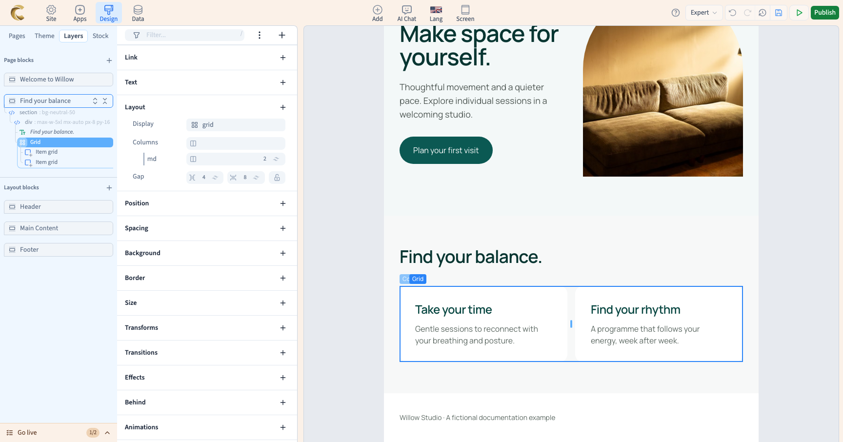
Open Layers and select the container of the elements to space. Find Gap in Expert → Layout. If it is not offered, check Display: gap applies to Flex and Grid layouts. Selecting text inside a card does not select the parent of all cards.
2. Choose a shared value
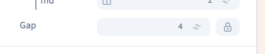
Open Gap and choose a preset. Read the displayed unit rather than assuming the number is in pixels. In the demonstration, 4 means 1 rem, equivalent to 16 px at the site's reference size. It does not mean 4 px. Custom values use the numeric field and available units.
Could not play. Try the video controls.
3. Separate the two axes
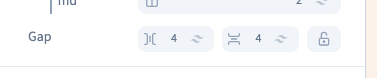
Use the grouping control to show horizontal and vertical values. The horizontal gap separates columns or neighbours in a row. The vertical gap separates rows.
The demonstration keeps a 16 px horizontal gap and sets the vertical gap to 32 px. A vertical gap may have no visible effect while all cards remain on one row. It becomes useful when the grid has more rows or a flexible row wraps.
4. Adapt to screen width
Add a rule on Gap to keep a suitable base value for mobile and another from the desired breakpoint. The rule belongs to the parent's gap setting; it does not rewrite margins on each child. Merely changing the preview frame creates no rule.
5. Remove a gap and investigate remaining space
Removing a screen-specific value can reveal the base gap. If space remains, inspect child margins and the parent's distribution of free space as well. Use Padding for distance between content and its border.