
Create and adjust a grid
A grid arranges a container's children in columns and rows. It suits services, products and presentation cards.
1. Select the parent of the cards
In Layers, select the container holding the cards. In Expert → Layout → Display, choose Grid. The parent defines the grid; each card remains a child with its own text, images and dimensions. For a group that follows one axis, Flex may be simpler.
2. Set the columns
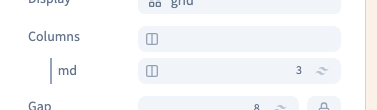
Open Columns in Layout. Add the setting with the group's + if needed. Start with two or three columns on a wide screen. When there are more cards than columns, the remaining cards continue on another row; no content is deleted.
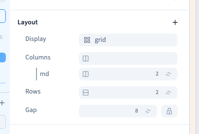
In the English demonstration, the two existing cards are compared in three columns, then two. We edit the existing tablet-and-up line, rather than replacing every rule with one value.
Could not play. Try the video controls.
3. Let rows form or define them
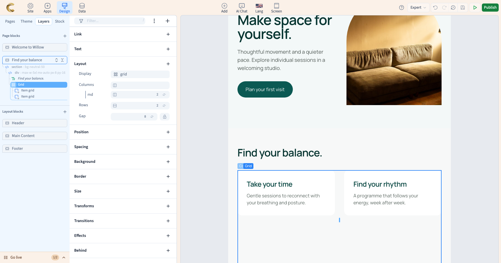
The grid normally creates rows as required. This is often enough for a content list. Add Rows when the design needs an explicit row structure, then choose the number. The demonstration defines two rows while keeping both cards.
A row setting does not replace the dimensions of the cards or their content. Avoid fixing heights too early: longer titles and translations may need more room.
4. Set the spaces
Gap sets the distance between grid cells. A shared value affects both axes; separate values distinguish horizontal and vertical space. Use Padding for space between the grid border and its content, and Margin for space outside the grid.
5. Change one card's placement
Keep the parent selected to change the shared grid. To change a single card, select that direct child in Layers, add the grid-item setting in Layout item and open its selector. Choose how many columns or rows it occupies and its own alignment.
This changes the card's placement, not the parent's column count. A large span may be unsuitable on a narrow screen.
6. Compare widths and remove values carefully
Keep a readable one-column base where appropriate, add wider-screen rules and inspect intermediate widths too. A tablet-and-up rule can continue applying on desktop; it is not limited to the tablet frame.
Removing a screen-specific column value may reveal the base value. Removing Columns does not delete cards. After changing Display, inspect the remaining settings: incompatible Flex or Grid settings may have been removed. Use Undo if you were only comparing alternatives.