
Set dimensions and their limits
A narrow card, an overflowing image or an overly tall block often comes from its size settings. Start by deciding what should determine the size: content, its parent or the viewport.
1. Select the right box
Switch to Expert and select the element in the preview. In Layers, check that it is the box you want to resize rather than just its heading. In Size, add Width or Height if needed. Resizing one card does not directly resize its neighbours.
2. Choose what determines the dimensions
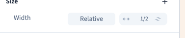
Open the width selector and compare the available choices.
| Choice | Result | Example |
|---|---|---|
| Auto | The browser calculates size according to layout | A card in a grid |
| Fit | The box tries to fit its content | A small badge |
| Full | The box fills its parent's available width | A button inside a card |
| 50% | The box uses half of its parent width | An element in a wider area |
| A viewport-based value | Size follows the window rather than the parent | An introductory area |
Compare 50% with Full. A width of 100% refers to the parent, which may occupy only part of the page. For height, Auto lets content determine the required space. A value such as 25vh is a quarter of the viewport height and does not guarantee that text fits inside.
Could not play. Try the video controls.
3. Use a fixed value carefully
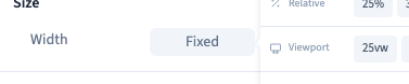
The selector includes fixed-size controls and a slider. Refine the number with the keyboard. The demonstration checks 220 px. Pixels give a precise size; rem follows the reference text size. Choose the unit before refining the number.
A fixed size can suit a small visual element. For paragraphs, prefer automatic height or a minimum height so the box can grow when a translation is longer.
4. Add minimum and maximum limits
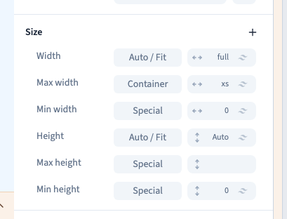
Add minimum or maximum width or height in Size. A minimum prevents shrinking below the limit; a maximum prevents exceeding it. Maximum width can limit a readable content area while allowing it to shrink.
Limits work alongside the main dimension. If 50% seems ineffective, check for a minimum width. If text overflows, inspect height limits too. The demonstration checks all four limit settings, compares a viewport-based height and returns to automatic height.
5. Remove a value and check mobile
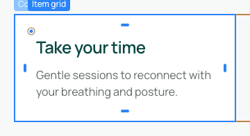
Remove only the unwanted value with its removal command. Another rule or a template value may reappear; removing Width does not necessarily mean Auto.
Compare widths. Changing the frame does not create a mobile rule. Check that text is readable, buttons remain accessible and no minimum width exceeds the narrow frame.