
Arrange elements in a row or column
To arrange buttons in a row or cards in a column, select their parent container. Its children then follow the shared layout.
1. Start with a flexible container
Select the parent in Layers. In Expert → Layout, choose Flex in Display. If a setting is missing, use the Layout group's + button to add it. Available settings depend on the selection and its layout.
2. Set the direction
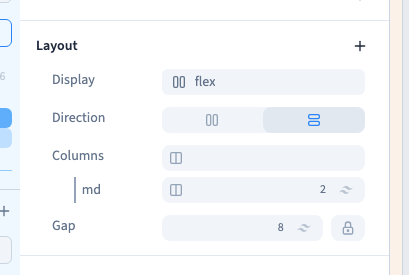
Add Direction, then choose a row for horizontal flow or a column for vertical flow. Reversed directions run along the same axis in the opposite direction.
Direction changes layout, not the children's text. A visually reversed order should not compensate for a confusing structure. Keep a sensible order in Layers for reading and keyboard navigation too.
Could not play. Try the video controls.
3. Allow wrapping
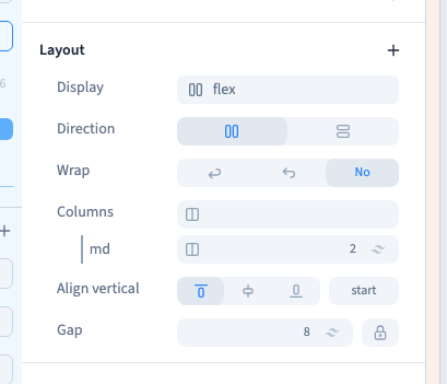
Wrapping allows children to continue on another line when the available space runs out. This is useful for a row of buttons on a narrow screen. Without wrapping, children stay on one line and may shrink or overflow, depending on their dimensions.
Reverse wrapping reverses the formed lines and is rarely needed for a first layout. Clicking an already active choice can remove that value. Do not click it again merely to keep it selected; use Undo to restore a previous state.
4. Understand the two alignment axes
| Direction | Main axis | Cross axis |
|---|---|---|
| Row | Horizontal | Vertical |
| Column | Vertical | Horizontal |
Main-axis alignment distributes free space along the row or column. Cross-axis alignment positions children in the other direction. Check the direction and the preview when an alignment seems to act on the wrong axis.
Start, centre and end place the group or its children within available space. Distributing free space between items is different from setting a fixed gap.
5. Add a regular gap
Set Gap on the parent to keep a common distance between children. This is usually easier to maintain than adding different margins to every button. If nothing changes, check the selected parent and the rule line you are editing.
6. Adapt or remove a setting
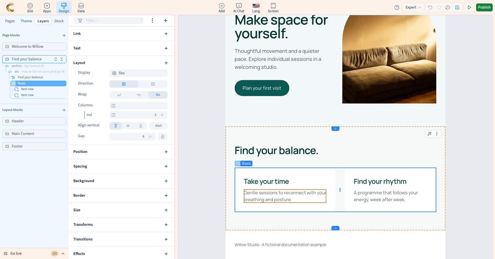
For a column on mobile and a row on wider screens, use a column as the base value and a row on an appropriate screen rule. Changing the preview width does not create that rule.
Removing a value removes it only in its scope. The base value or normal browser behaviour may become visible again. Inspect the result before assuming the setting has stopped working.