
Choose and customise an icon
A clear icon can help visitors recognise an action or idea. Use a familiar shape and keep an understandable label for important commands.
1. Select the icon element
In Design, choose Expert and select an icon in the page or in Layers. Open its icon setting in the visual panel. An image element has different controls; use the image selector for photographs and ordinary image files.
2. Search the library
Open the icon selector, choose a collection and search by name. The demonstration chooses Lucide, searches for heart and applies that result.
English search terms often match the library names. Choose a consistent family so that stroke weight and shapes fit together. Selecting an icon changes this element, rather than replacing every icon on the site.
Could not play. Try the video controls.

3. Set a readable size
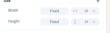
Set Width and Height in Size. Use equal values for a square icon. In the demonstration, the value 16 corresponds to 64 px.
The icon's size and the clickable area's size are different things. Leave enough room around a small icon, particularly for a phone control.
4. Choose a theme colour
Open the text colour and choose a theme shade. Library icons designed to use the current text colour follow that choice. The recording checks the heart's actual stroke colour as well as its dimensions.
Colour alone should not communicate an essential state. Use a label or another recognisable sign as well.

5. Save and inspect the visitor result
Save, reload and check that the pictogram remains. Inspect the published page at desktop and phone widths. Look for sufficient contrast, clear shapes and sensible spacing.
A missing result can come from an unavailable library request or an unsuitable search term. Try the exact icon name and wait for loading to finish.