
Sections · Features
Features Grid — 3 Columns
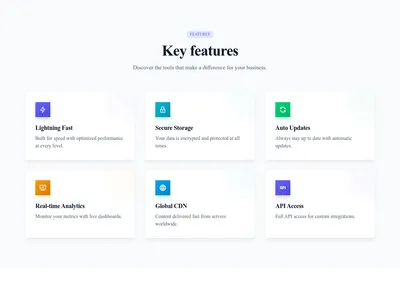
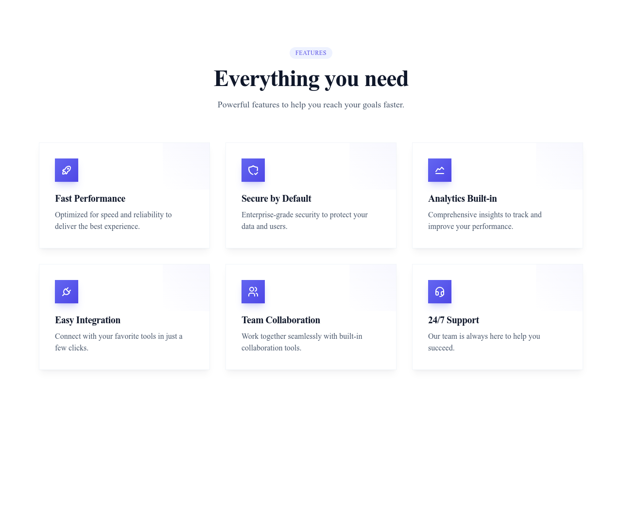
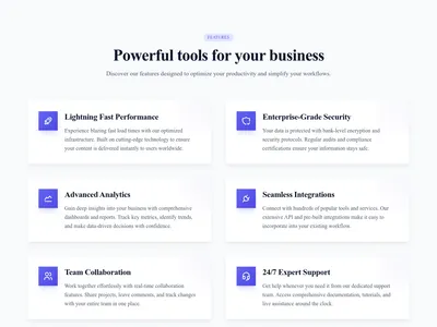
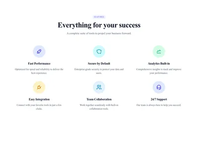
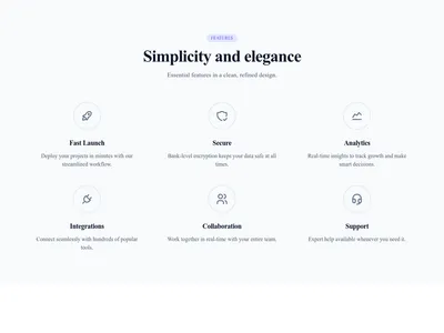
Six features in three columns, each with an icon and a short description — the workhorse layout of every product page.
What this block contains
Features Grid 3 Columns is a section from the Features category made of 7 headings, 7 text paragraphs and 6 icons. On desktop its content is laid out in 3 columns, stacked on mobile. Its copy ships in 3 languages (German, Spanish and French).
- 7 headings
- 7 text paragraphs
- 6 icons
- 3-column grid
Details
- Category
- Features
- Type
- Section (full width)
- Editing
- Visual editor, no code
- Keywords
- gridiconsservices
Use it in three steps
- 1 Open your siteCreate a free Communik site, or open one you already have.
- 2 Insert itIt lands on your page with your fonts and brand colors applied.
- 3 Make it yoursEdit text, images and colors visually, then publish when ready.
More in Features
See all Features
Guide
The 3-column features grid is where you turn claims into specifics: six concrete capabilities, each with an icon for instant scanning and one sentence of substance. Visitors rarely read feature pages linearly — this grid rewards the scan.
Icons come from the built-in library (thousands of options), and every title and description is editable in the Communik builder. Need eight features? Add a row; the grid stays balanced.
Follow it with social proof and a call-to-action, or compare with the alternating layout for storytelling.
Questions
How do I choose the six features?
Pick the capabilities that answer your visitors' top objections, not an exhaustive list. Specific beats generic: “Publishes in one click” beats “Easy to use”.
Can I change the icons?
Yes — every icon opens a searchable library with thousands of choices, recolorable to your theme in one click.
Grid or alternating layout?
Grid for scannable breadth (many features, equal weight); alternating image/text for depth on 3-4 flagship features.
Keep exploring
About Sections
Browse about sections templates
Blog Sections
Browse blog sections templates
Call to action Sections
Browse call to action sections templates
Blog Module
Complete blog feature with multiple design variants
About Page Templates
Full page layouts in the about category
Templates for Education
Templates designed for education businesses
Calendly Templates
Templates with Calendly integration support
Your next site starts here.
Everything here is one click away.
Every section, component, page and module in this library is ready inside the Communik editor, styled with your brand.
Free to start. No credit card.