
Sections · Features
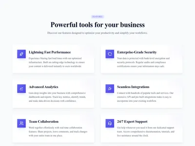
Features as Cards
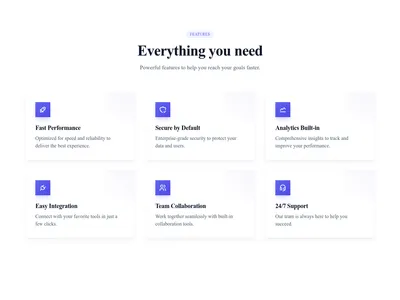
Each feature in its own card with a subtle hover effect — more visual presence than a plain grid, ideal when features deserve the spotlight.
What this block contains
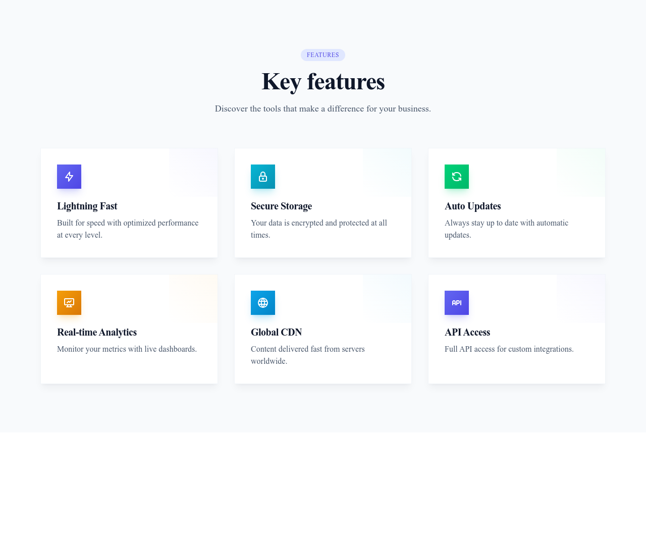
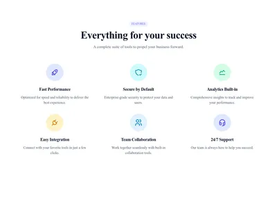
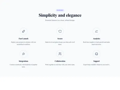
Features Grid Cards is a section from the Features category made of 7 headings, 7 text paragraphs and 6 icons. On desktop its content is laid out in 3 columns, stacked on mobile. Its copy ships in 3 languages (German, Spanish and French).
- 7 headings
- 7 text paragraphs
- 6 icons
- 3-column grid
Details
- Category
- Features
- Type
- Section (full width)
- Editing
- Visual editor, no code
- Keywords
- gridcardshoverservices
Use it in three steps
- 1 Open your siteCreate a free Communik site, or open one you already have.
- 2 Insert itIt lands on your page with your fonts and brand colors applied.
- 3 Make it yoursEdit text, images and colors visually, then publish when ready.
More in Features
See all Features
Guide
Cards give each feature a stage of its own: a contained surface, room for an icon and two lines of text, and a hover effect that makes the page feel alive. Choose this layout when your features are differentiators, not commodities.
Cards reflow automatically from three columns to one on mobile. Colors, borders, shadows and hover behavior are all theme-aware and editable in the Communik builder.
Works beautifully right under a hero section; close the page with a CTA block.
Questions
When should I use cards instead of a plain grid?
When each feature deserves visual weight of its own — typically 3 to 6 differentiating capabilities rather than a long checklist.
Can I disable the hover effect?
Yes — hover styles are editable like any other style property; tone them down or remove them entirely.
Do the cards adapt to my theme?
Yes. Cards inherit your site's colors, radius and shadows, so they match the rest of your design out of the box.
Keep exploring
About Sections
Browse about sections templates
Blog Sections
Browse blog sections templates
Call to action Sections
Browse call to action sections templates
Blog Module
Complete blog feature with multiple design variants
About Page Templates
Full page layouts in the about category
Templates for Education
Templates designed for education businesses
Instagram Templates
Templates with Instagram integration support
Your next site starts here.
Everything here is one click away.
Every section, component, page and module in this library is ready inside the Communik editor, styled with your brand.
Free to start. No credit card.