
Choose an appropriate visual effect
An effect should help people understand the page: distinguish a card, soften a secondary element or give an image a particular atmosphere. Choose that purpose before combining settings.
1. Choose according to the result
| Goal | Prefer | Check |
|---|---|---|
| Give a card depth | Shadow | It may extend outside the card |
| Fade an entire card | Opacity | Text and images fade too |
| Change a photograph's rendering | Filters | Several filters can accumulate |
| Change scenery behind a surface | Behind group | The surface must let the scenery show through |
These effects change how content is displayed rather than replacing the saved content.
2. Give depth with a shadow
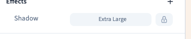
Select the card, then add Shadow in Expert → Effects. Compare restrained presets. A very dark or extended shadow can make the page visually heavy. An element shadow follows its box; it is not a shadow applied to text letters.
Choose a shadow and its colour
Could not play. Try the video controls.
3. Fade an element with opacity
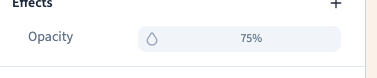
Opacity affects the entire element and its children. To soften only the background while keeping text sharp, start with background colour transparency instead.
Zero opacity makes an element invisible. It does not mean the element is deleted, its layout space disappears or its interactions stop.
Could not play. Try the video controls.
4. Filter an image
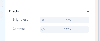
Select the image rather than the whole card when text should remain unaffected. Blur, brightness, contrast, saturation, grayscale, sepia and inversion change its appearance. Compare one filter at a time before combining them. Removing a filter does not delete the photograph.
Could not play. Try the video controls.
5. Understand effects behind a surface
The Behind group changes scenery seen through an element. A backdrop blur can soften a photograph behind a translucent panel. An opaque panel may hide the result. This is separate from blurring a selected Image element and deserves a test in visitor preview.
Filter the scenery behind a panel
6. Keep the page easy to read
Check text, buttons and hover states. Compare narrow and wide screens and test visitor preview, because a transparent or invisible surface can still be interactive. Reserve strong effects for limited areas. Save when the effect supports reading, rather than simply because a setting exists.