
Adapt the menu for desktop and phone
Changing a menu's presentation keeps its entries. Choose how the bar appears on desktop and how navigation opens on a phone. Judge the result beside the actual logo, labels and theme.
1. Choose the desktop presentation
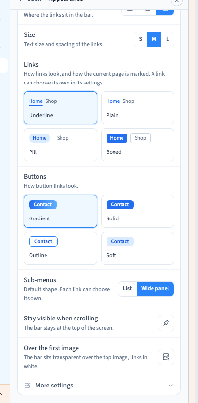
In Site menu, open Appearance. Desktop settings separate alignment, size, link and button styles, and sub-menu shape.
Choose List for a few destinations or Wide panel for a full-width presentation in columns. An individual parent can override the menu-wide sub-menu shape.
An older menu may offer conversion to current settings. If a warning says some sub-links are hidden, review their destinations before publishing.
Could not play. Try the video controls.
2. Adjust links and buttons
Alignment places entries in the bar. Size affects their text and spacing. The visual link and button samples let you choose their appearance without code. Individual entries may retain their own styles.
A custom design can override some controls. If a setting is disabled, read the explanation before making repeated changes that cannot affect the current design.
3. Choose and test the phone menu
Five phone presentations serve different needs:
- Drawer opens a side panel, with one sub-menu open at a time.
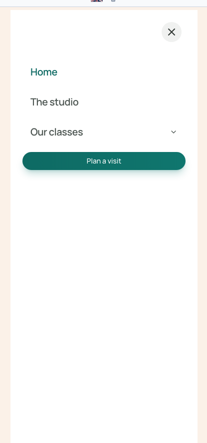
- Full screen covers the screen and suits a short menu.
- Accordion unfolds below the bar and can keep several sections open.
- Popover shows a card below the button, with indented sub-links.
- Levels replaces the current list with the next level and provides a way back.
The recording chooses Full screen, switches to a 375 px phone frame and enables visitor preview. It then opens the actual menu, checks “Plan a visit” and closes it. Choosing an appearance card alone does not test the visitor interaction.
4. Configure scrolling and the breakpoint
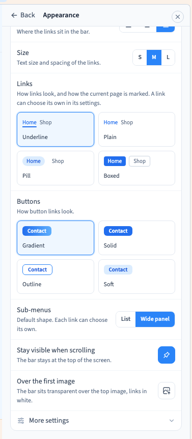
Stay visible when scrolling keeps the bar at the top. Over the first image places a transparent bar over the start of the page, with light links. Check that the actual background makes those links readable.
In More settings, choose the width at which the desktop bar becomes a menu button. This breakpoint belongs to the menu; the builder's frame width is how you test it.
When a main button exists, the option to keep it visible can retain it next to the phone menu icon. Check that it fits with your logo and label. Sub-menu arrows can also be configured here.
5. Verify the interaction and save
Save and reopen the page. Test opening, closing and following links at desktop, phone and intermediate widths. On the published site, check scrolling, the active-page indication and keyboard use.
A bar that overflows just before its breakpoint still needs attention. Shorter labels or an earlier switch can improve it without code.