
Create a rich sub-menu panel
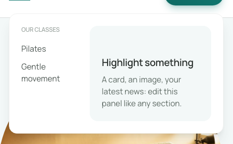
A rich sub-menu can present cards, an image or a short introduction. On a phone, the entry's ordinary sub-links remain the navigation path. Prepare those links even when the desktop panel already contains buttons.
1. Prepare the parent and its links
Open Site menu and create a top-level entry such as “Our classes”. Add the destinations phone visitors need below it. Use clear labels and real pages.
Rich content belongs to a top-level entry. A nested link does not open another rich section at a fourth level.
2. Create the panel content
Select the top-level entry, then choose Design a rich panel under Panel content. Communik creates a reusable section with starter text and links, and shows it in the page's panel.
This is editable site content. Replace the starter wording and verify its links before publishing.
Could not play. Try the video controls.
3. Edit it like a section
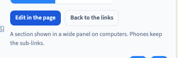
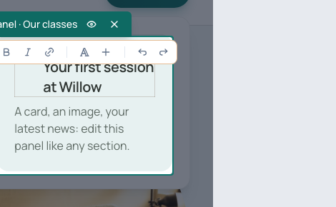
Choose Edit in the page. Normal builder gestures apply: edit text in Easy, or use Expert visual controls to adjust elements and layout.
The recording replaces the starter heading with “Your first session at Willow”. You can then organise columns, replace images or connect collection content through their respective controls.
The panel is a component. Keep the editing context in mind: changes to its model affect its uses, while instance customisation has a different scope.
4. Keep phone navigation useful
The rich panel appears on desktop. Phones retain the parent's sub-links. Adding a button only inside the rich content does not automatically create a phone entry.
Switch to a phone frame, open the menu, then open “Our classes”. Check the destinations prepared earlier. Manage those sub-links separately from the rich panel's cards.
5. Return to ordinary links when needed
Back to the links removes this entry's association with the rich panel and returns to its sub-links. This does not mean that the reusable component has been deleted from stock.
Save, reopen the page and check the association. Before delivery, try the published navigation on desktop and phone.