
Find the settings available for an element
The settings panel changes with your selection. Text offers its font; an image offers its file; a container organises its children. Use this page to find the right group and understand why a control may be absent.
1. Find a setting
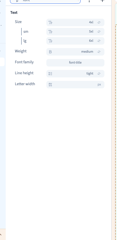
In Design, select the element and choose Expert to browse its visual settings. Type a name such as font into Filter…. Clear the search before exploring another group.
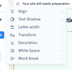
A group's + lists the settings you can add to that selection. It is not the same list for every element.
Could not play. Try the video controls.
2. Understand missing controls
A control can depend on the element type, its parent or a choice already made. Flex and Grid child settings apply to an element inside that layout. A video's playback threshold accompanies automatic playback, while its poster is relevant to manual playback.
For layout settings, select the container in Layers, rather than its text. For a file, select the image or video. Check filters and the group's + before concluding that a setting is missing.

3. Choose the right group
The following names provide an index of the native settings registry. They do not mean that every setting is available on the current selection.
| Group | Settings to look for |
|---|---|
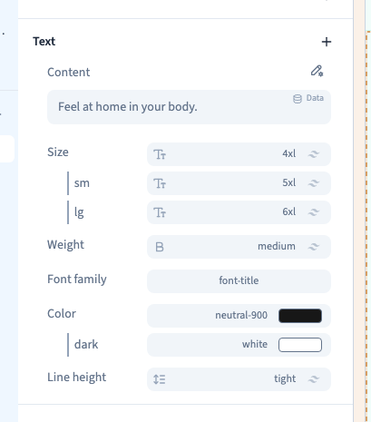
| Text | Content, size, weight, font family, alignment, colour, text shadow, line height, letter spacing, case, decoration, decoration colour, whitespace, word break and list style |
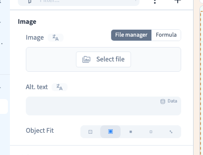
| Images and icons | Image file, alternative text, object fit and icon |
| Video | YouTube ID, video file, autoplay, playback threshold, poster, controls and looping |
| Size | Aspect ratio, width and height, minimums, maximums and overflow |
| Layout | Display, direction, wrapping, columns, rows, justification, alignment, gap and stacking order |
| Flex or Grid child | Size, placement and alignment within the parent layout |
| Spacing | Padding and margin |
| Position | Position and coordinates |
| Background | Theme style and background |
| Border | Border, colour, line style, rounded corners and ring |
| Transforms | Rotation, scale, skew, translation and origin |
| Transitions | Transition, delay and duration |
| Effects | Shadow, shadow colour, opacity, blur, brightness, contrast, saturation, greyscale, sepia and inversion |
| Behind | Blur, brightness, contrast, saturation and opacity behind the element |
| Animations | Animation settings |
| Link | Destination and link title |
| Mouse and interactivity | Cursor, text selection and pointer events |
| Visibility | Conditions |
| Events | Events and overlays |
| Lists and data | Lists, collections and external APIs |
| Forms | Form configuration |
| Embedded content | Embedded source |
| Attributes | Tag, ID, element name, accessibility and SEO schema |
| Element-specific controls | Pagination, address, zoom and type, depending on the target |
4. Recognise a specialised editor
Some settings open another panel or editor. A text colour control can also offer a text gradient; a background can offer an image, gradient or solid colour. The image library and font selector have their own controls.
Return to the element panel to check scope. An element colour, a theme colour and formatting applied to a few words affect different things.
5. Recognise plugin settings
A plugin element may add controls for a carousel, image strip, counter, data filters, navigation, forum, authentication or scroll-triggered appearance. Availability depends on the selected element and the project's plugins.
Select the relevant element first. Plugin options complement the usual size, colour and layout groups.
6. Check scope before changing a value
Identify whether a value is shared, belongs to a screen rule or applies in a state such as hover. Looking at a mobile frame does not automatically restrict your change to mobile.